

OVERVIEW
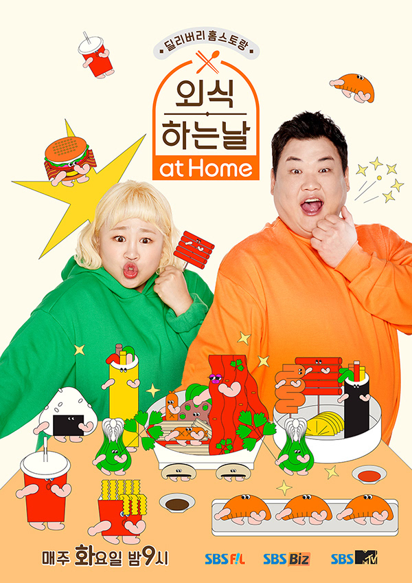
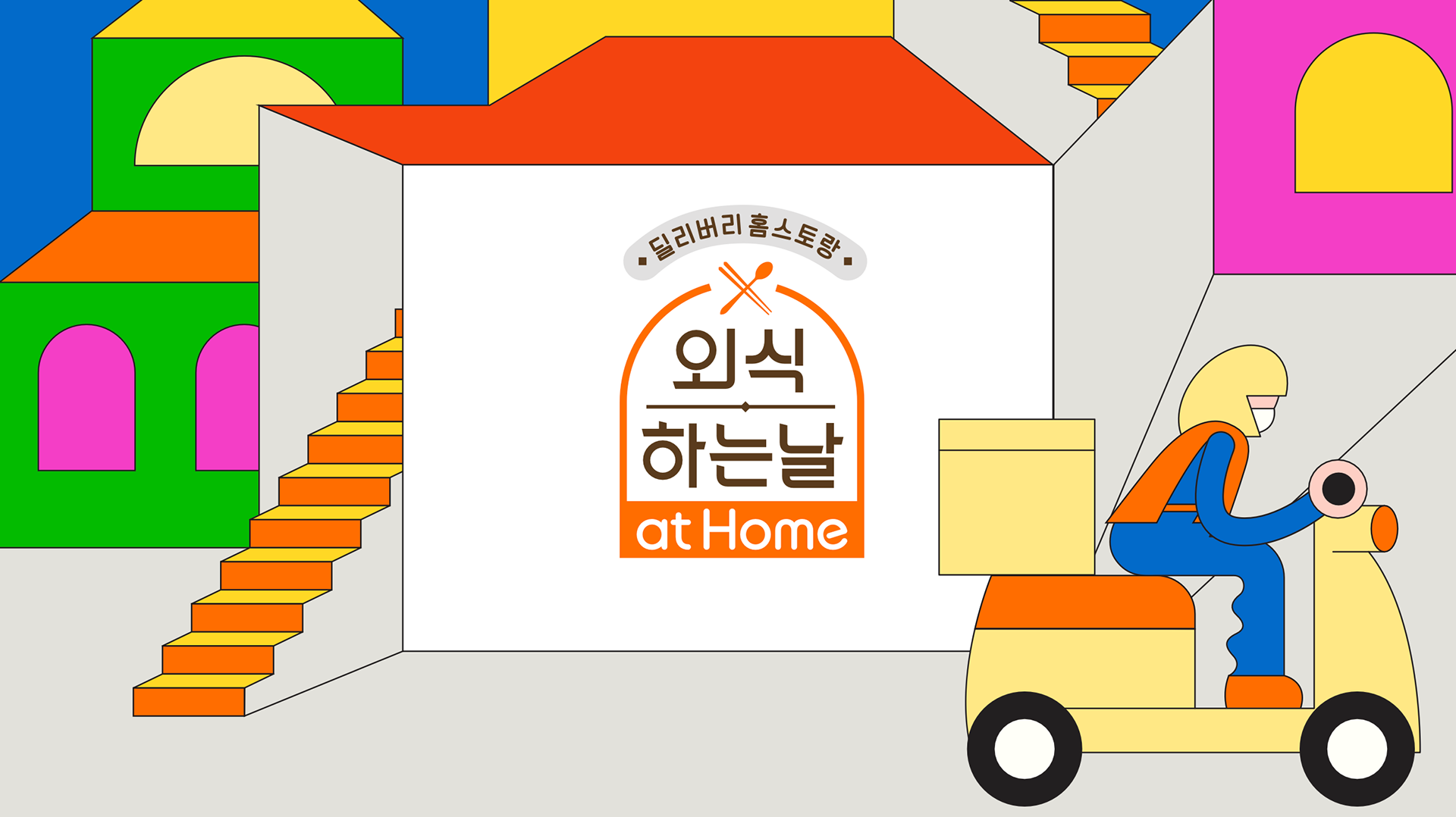
2021년, WILLO는 SBS FiL 예능 프로그램 외식하는 날 at home의 타이틀 디자인 패키지를 제작했습니다. 코로나19로 외식이 어려웠던 시기, 배달 음식이 주목받던 시대상을 배경으로 “집에서 즐기는 외식의 하루”를 발랄하게 풀어낸 이 프로그램은, 미식가 코미디언 김준현과 홍윤화의 케미와 함께 많은 사랑을 받았습니다. WILLO는 본 프로젝트에서 포스터 디자인, 로고 버전 디벨롭, 메인 타이틀 애니메이션, 트랜지션, 엔딩 크레딧 등 전체 온에어 패키지를 제작하였고, 톡톡 튀는 컬러와 유쾌한 리듬의 그래픽 연출로 프로그램의 핵심 톤앤무드를 시각적으로 완성했습니다.
In 2021, WILLO created the full title design package for The Best Hit at Home, a variety show aired on SBS FiL. Set during the height of the pandemic, when dining out was restricted and delivery culture was booming, the show reimagined “eating out at home” with a bright and playful tone, led by food-loving comedians Kim Jun-hyun and Hong Yoon-hwa, and quickly gained wide popularity. WILLO was responsible for the poster design, logo development, main title animation, transitions, and end credits, delivering a package that visually captured the show’s bubbly energy and cheerful rhythm through bold color and expressive motion graphics.
FINAL OUTPUT
COLORFUL & QUIRKY!
본 프로젝트의 전체적인 톤앤매너는 “컬러풀하고 엉뚱한” 분위기를 중심으로 설정되었습니다. 코로나 시국 속 외식의 어려움이라는 현실적 상황을 담고 있지만, 그 속에서도 위축되기보다는 오히려 상황을 유쾌하게 즐기는 긍정의 에너지를 담아내고자 했습니다. 디자인 요소 전반에 걸쳐 톡톡 튀는 컬러감과 유머러스한 감각, 그리고 상황극처럼 과장된 그래픽 리듬감을 더해, “집에서도 충분히 즐거운 외식이 가능하다”는 프로그램의 메시지를 시각적으로 명확하게 전달하고자 했습니다.
The overall tone and manner of this project was centered around a “colorful and quirky” visual mood. While the show reflects the reality of the pandemic era—where dining out became difficult— the design focused less on restriction and more on expressing a cheerful, optimistic spirit that embraces the situation with playful energy. With vibrant colors, humorous visual cues, and an almost theatrical sense of graphic rhythm, the package aimed to visually reinforce the show’s message : that even at home, dining can still feel fun, special, and full of personality.
CHARACTER DESIGN
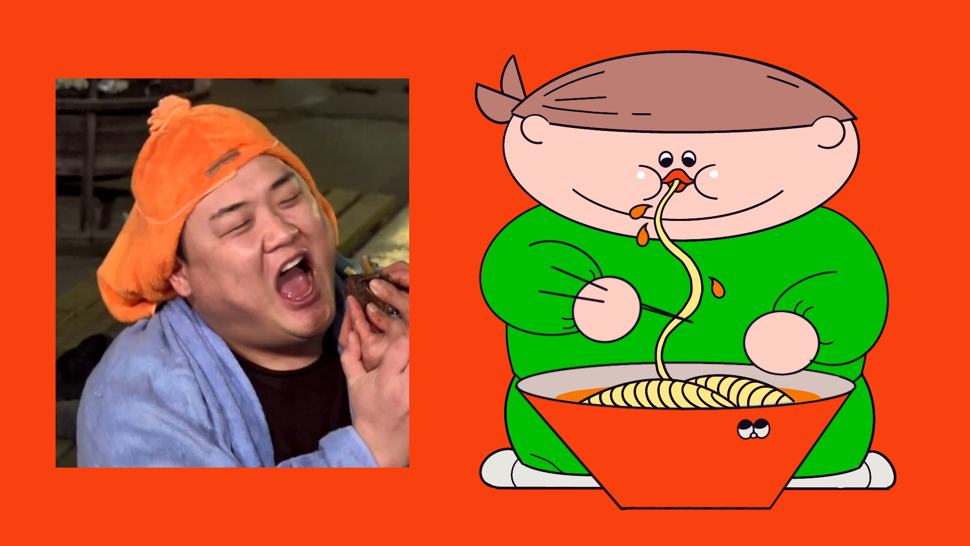
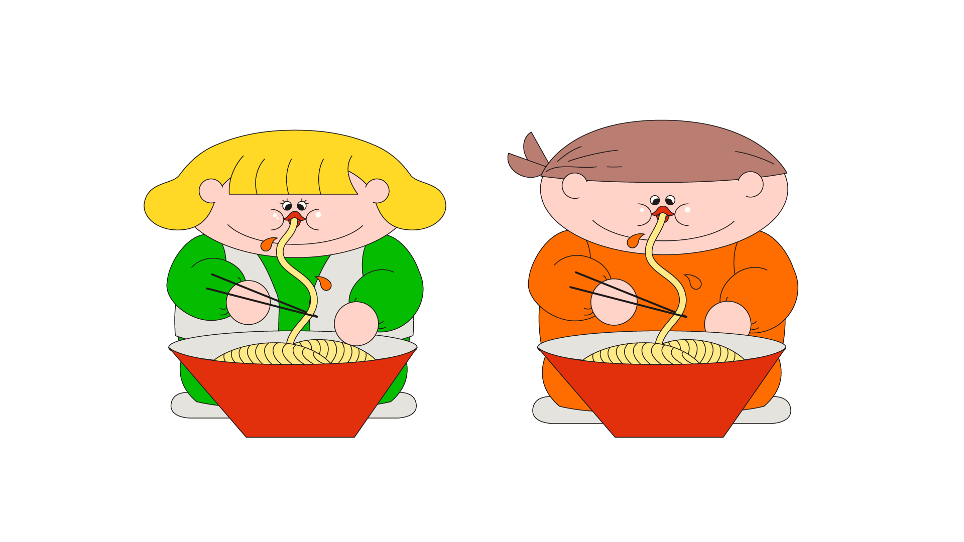
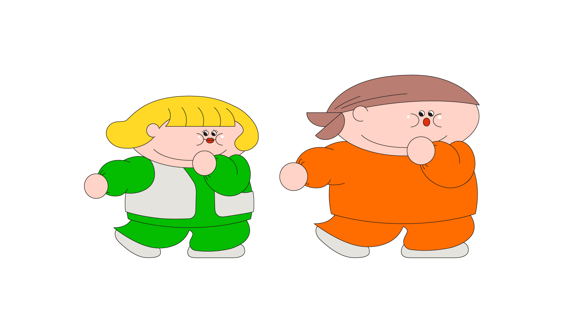
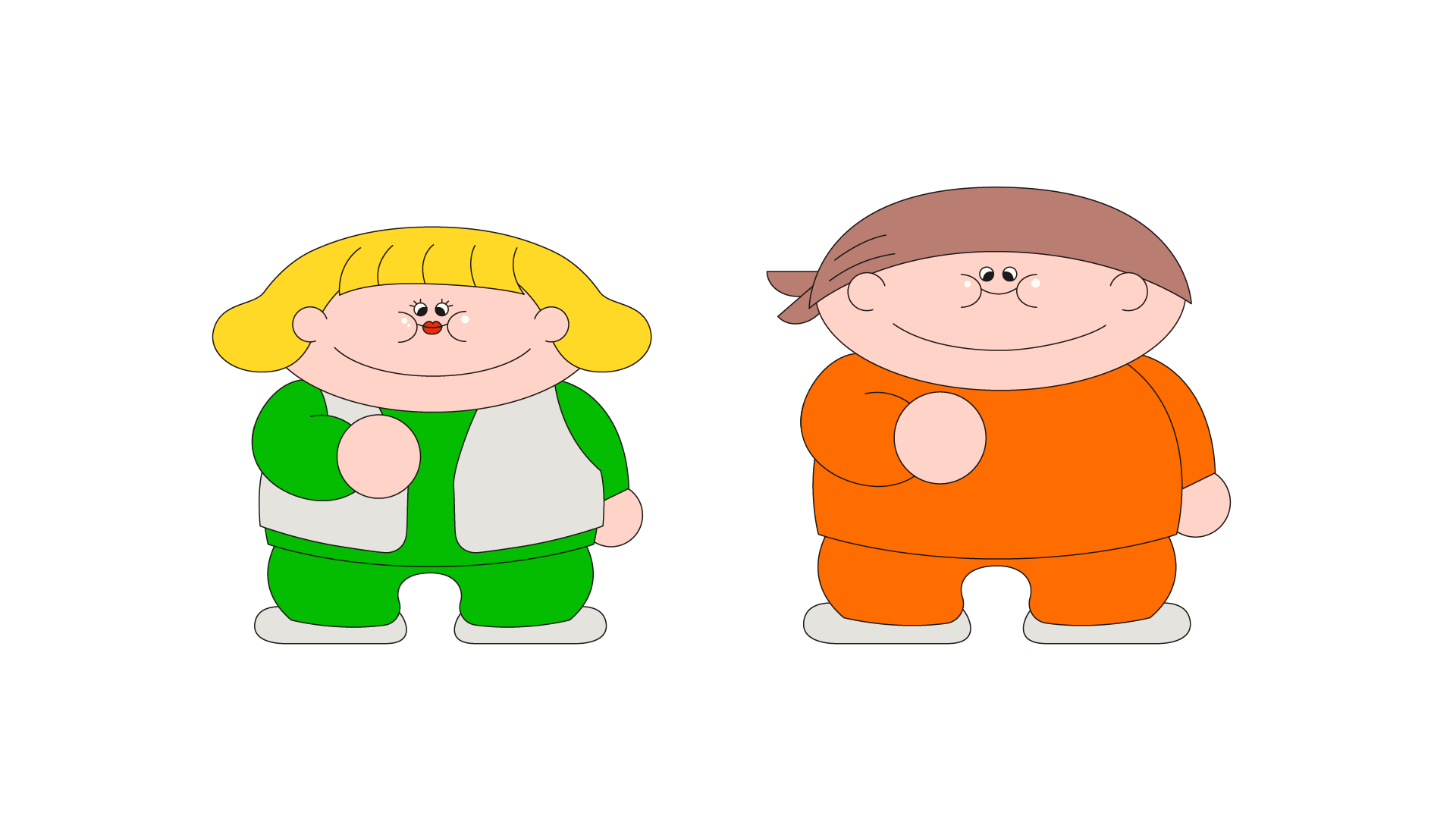
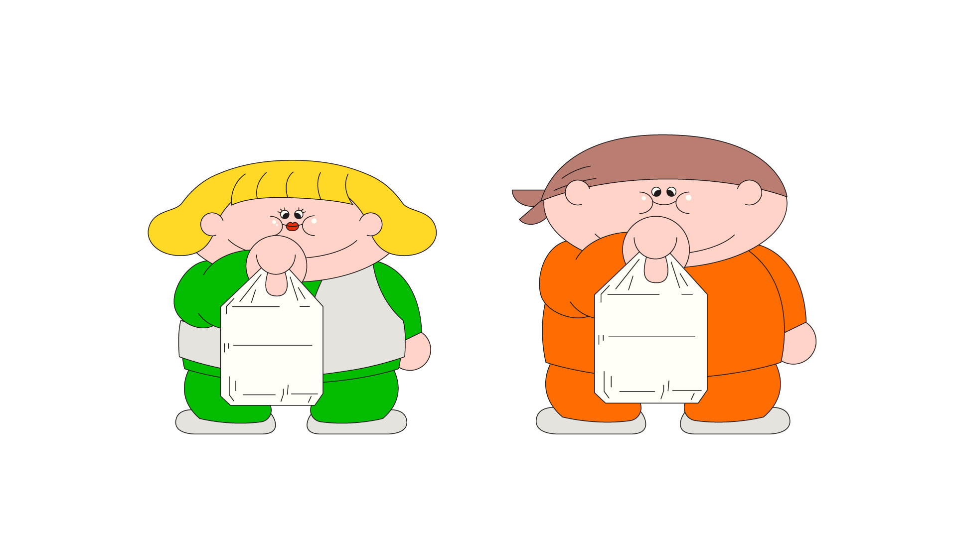
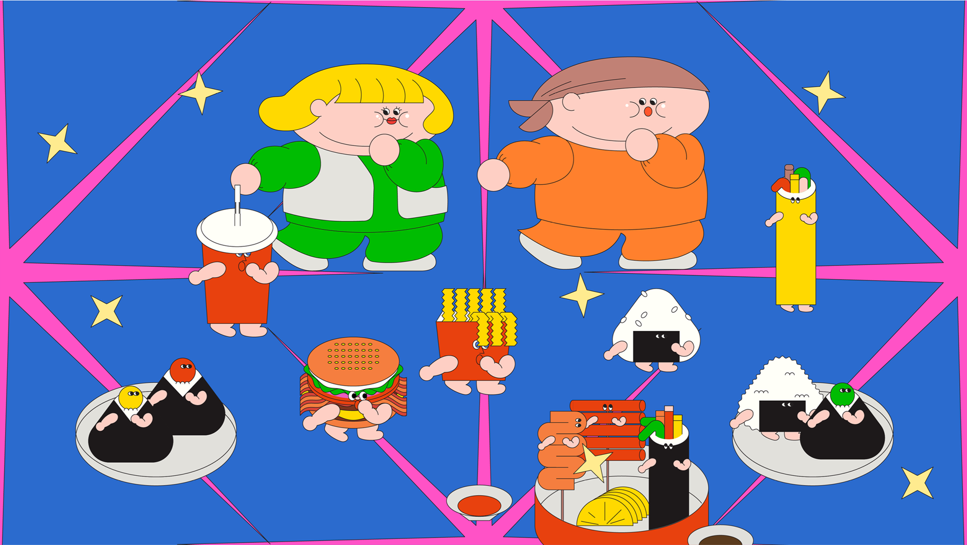
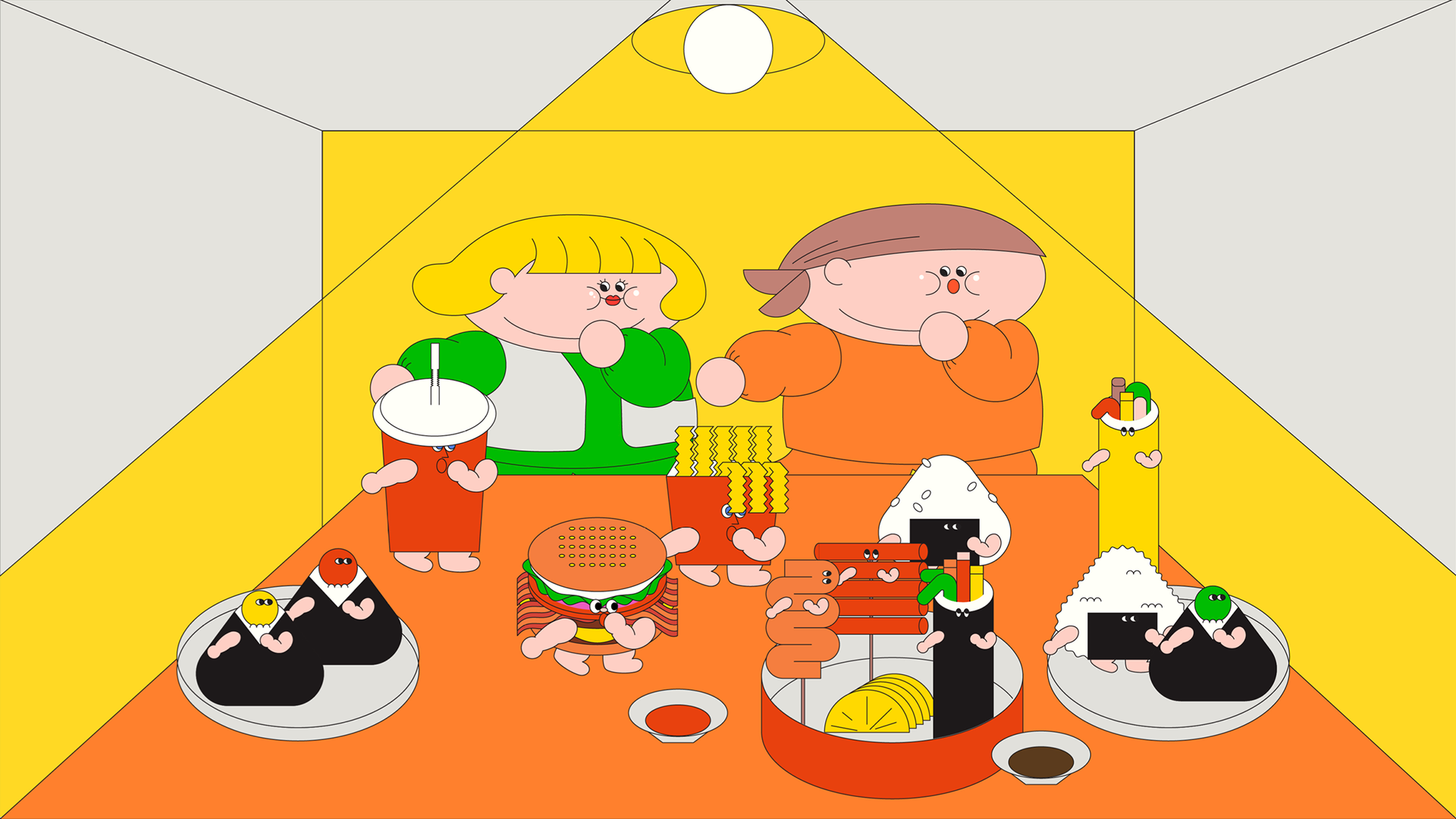
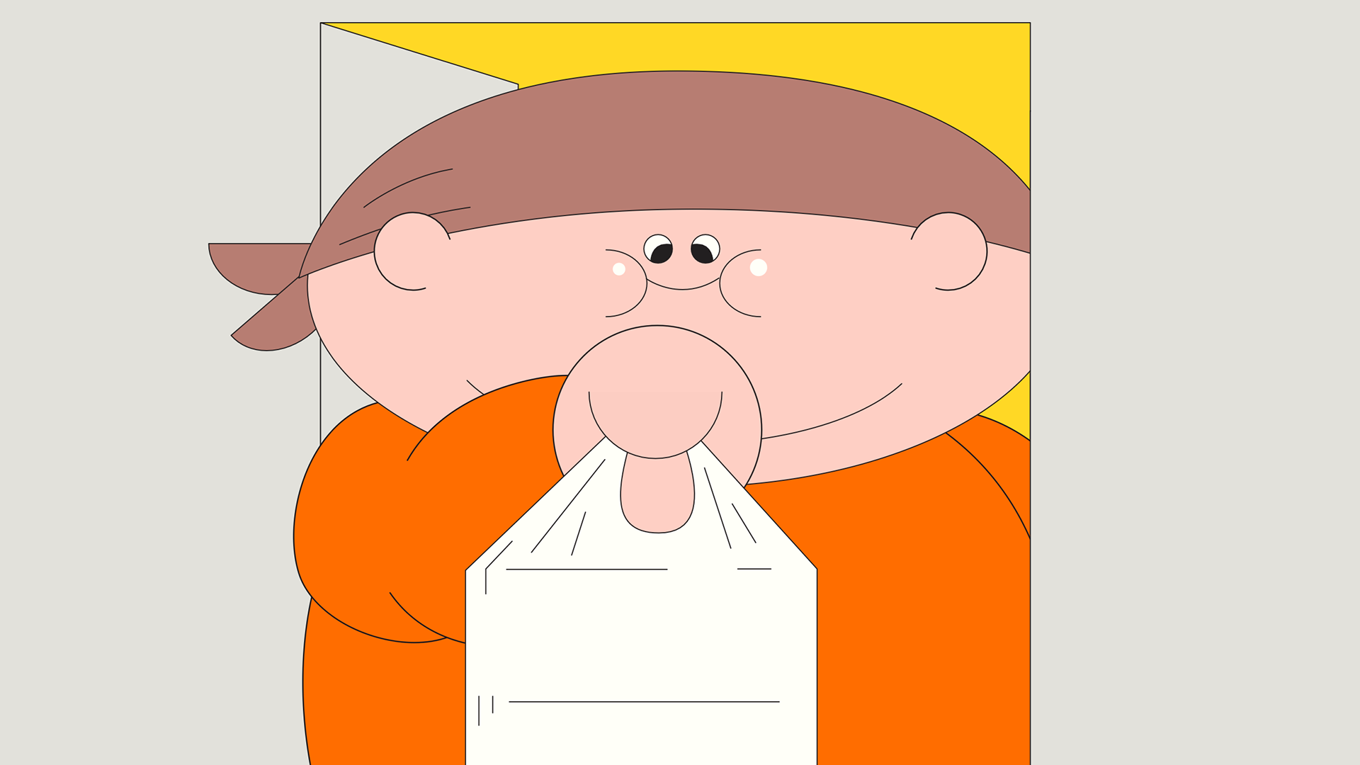
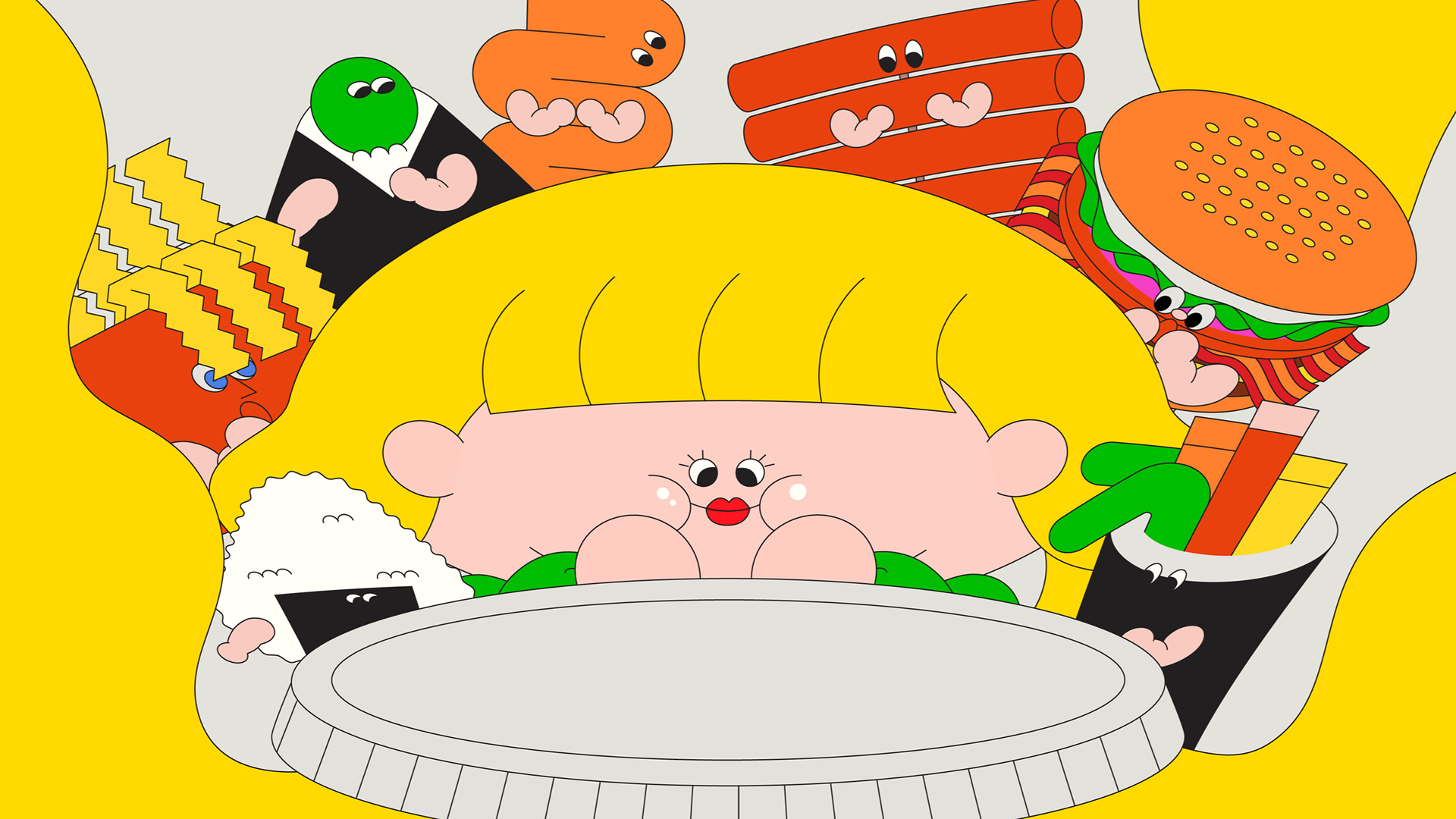
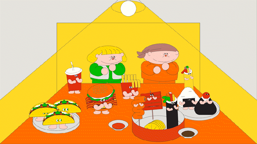
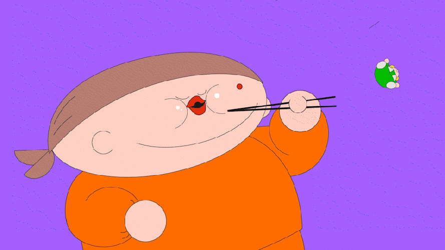
많은 시청자들의 사랑을 받은 두 출연진의 매력을 담기 위해, 캐릭터 디자인에 특히 공을 들였습니다. 단순하고 동글동글한 인상을 중심에 두고, 첫인상만으로도 미소가 지어질 수 있도록 특히 "귀여움"에 초점을 맞춰 디자인을 전개했습니다. 편안한 홈웨어 스타일은 물론, 김준현 씨의 수건 디테일, 홍윤화 씨의 금발 단발머리와 통통한 볼살 등 출연진만의 특징을 포인트로 살려, 프로그램의 유쾌한 정서를 직관적으로 표현했습니다.
To reflect the charm of the two beloved cast members, special care was given to the character design. We focused on creating simple, rounded, and endearing silhouettes that would make viewers smile at first glance, with an emphasis on cuteness and lighthearted appeal. Details like Kim Jun-hyun’s signature towel, Hong Yoon-hwa’s blonde bob haircut, and their adorably full cheeks were key elements in expressing each personality while keeping the visuals relaxed and relatable—just like their cozy homewear.
KEY VISUAL SKETCH

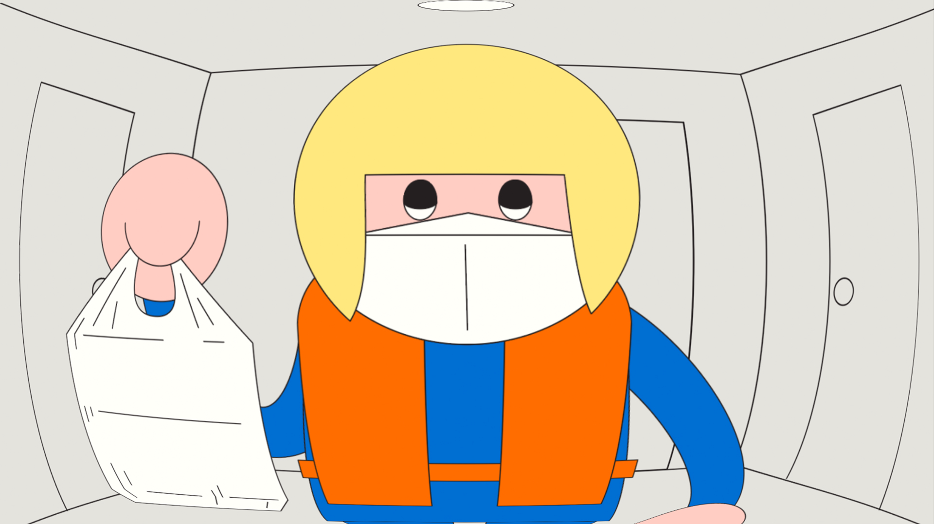
THE DELIVERY RIDER
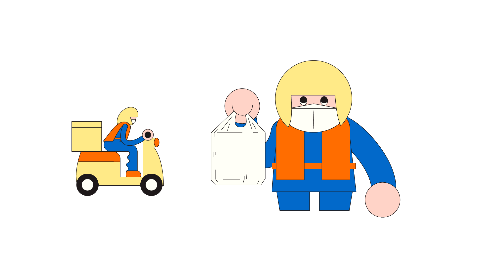
마스크와 헬멧을 착용한 배달기사는 코로나 시대, 우리 곁을 지켜준 고마운 존재였습니다. 이 상징적인 인물을, 프로그램의 주인공인 넉넉하고 친근한 두 출연진과 대비되도록 민첩하고 슬림한 실루엣으로 디자인하여, 극적인 형태적 긴장감을 더했습니다. 현실을 반영한 이 캐릭터는 시대성과 유머를 동시에 전달하는 장치로 작동합니다.
The delivery rider—wearing a mask and helmet—was designed as a symbolic figure of gratitude, representing those who supported us through the pandemic. In contrast to the show’s main characters with their soft, rounded silhouettes,
the rider was illustrated with a slimmer, more agile figure, creating a visual balance that highlights both realism and contrast. This character serves as a subtle yet meaningful nod to the time period, while adding a layer of humor and relatability.
the rider was illustrated with a slimmer, more agile figure, creating a visual balance that highlights both realism and contrast. This character serves as a subtle yet meaningful nod to the time period, while adding a layer of humor and relatability.
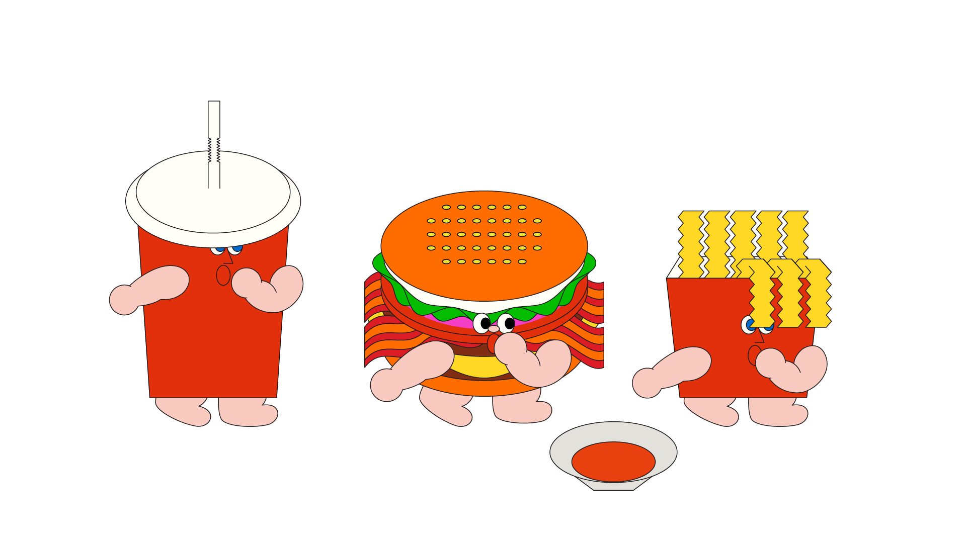
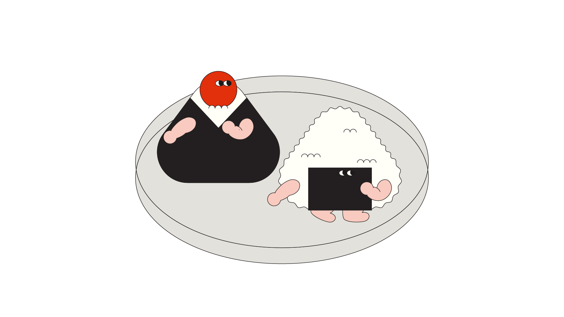
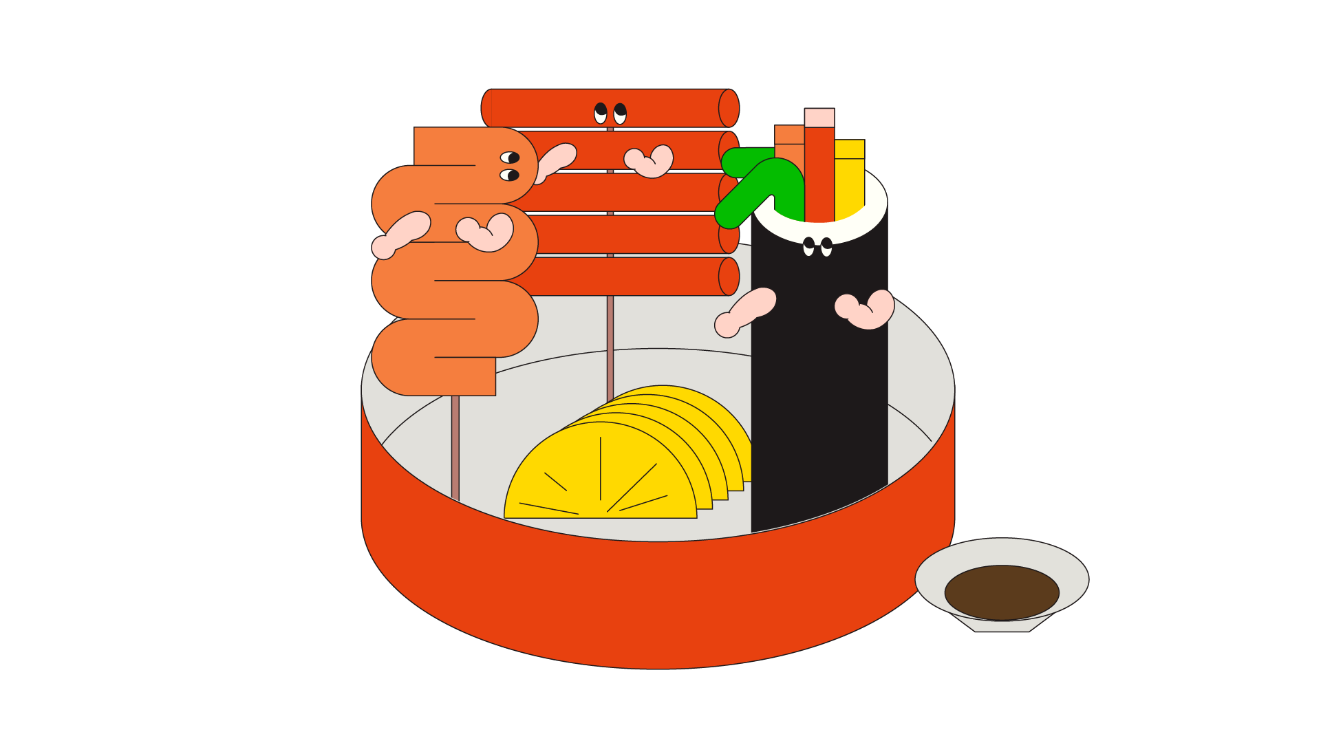
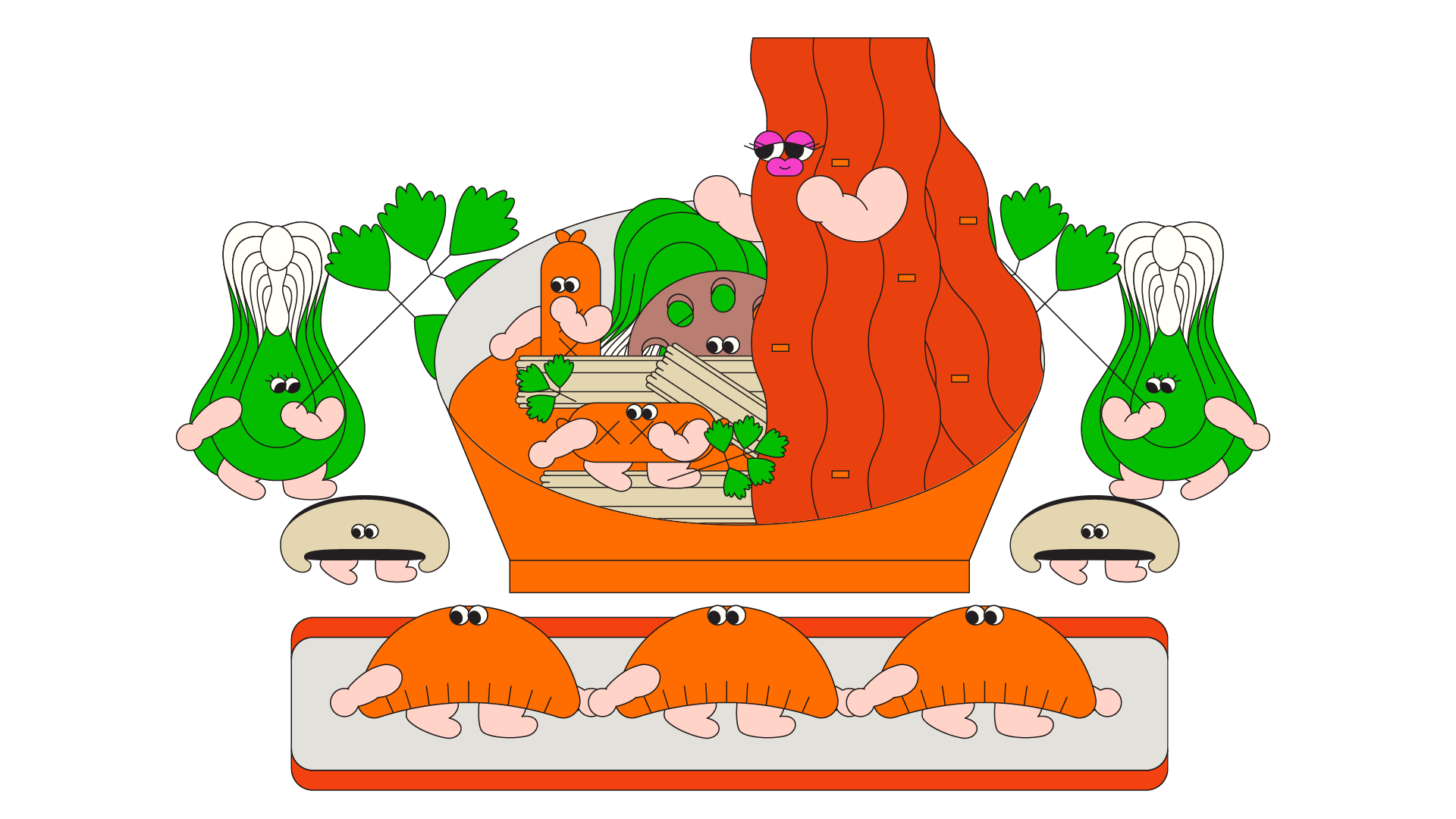
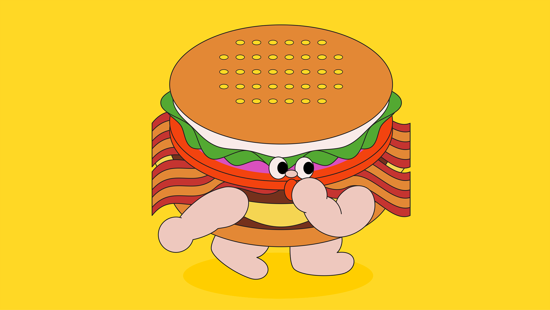
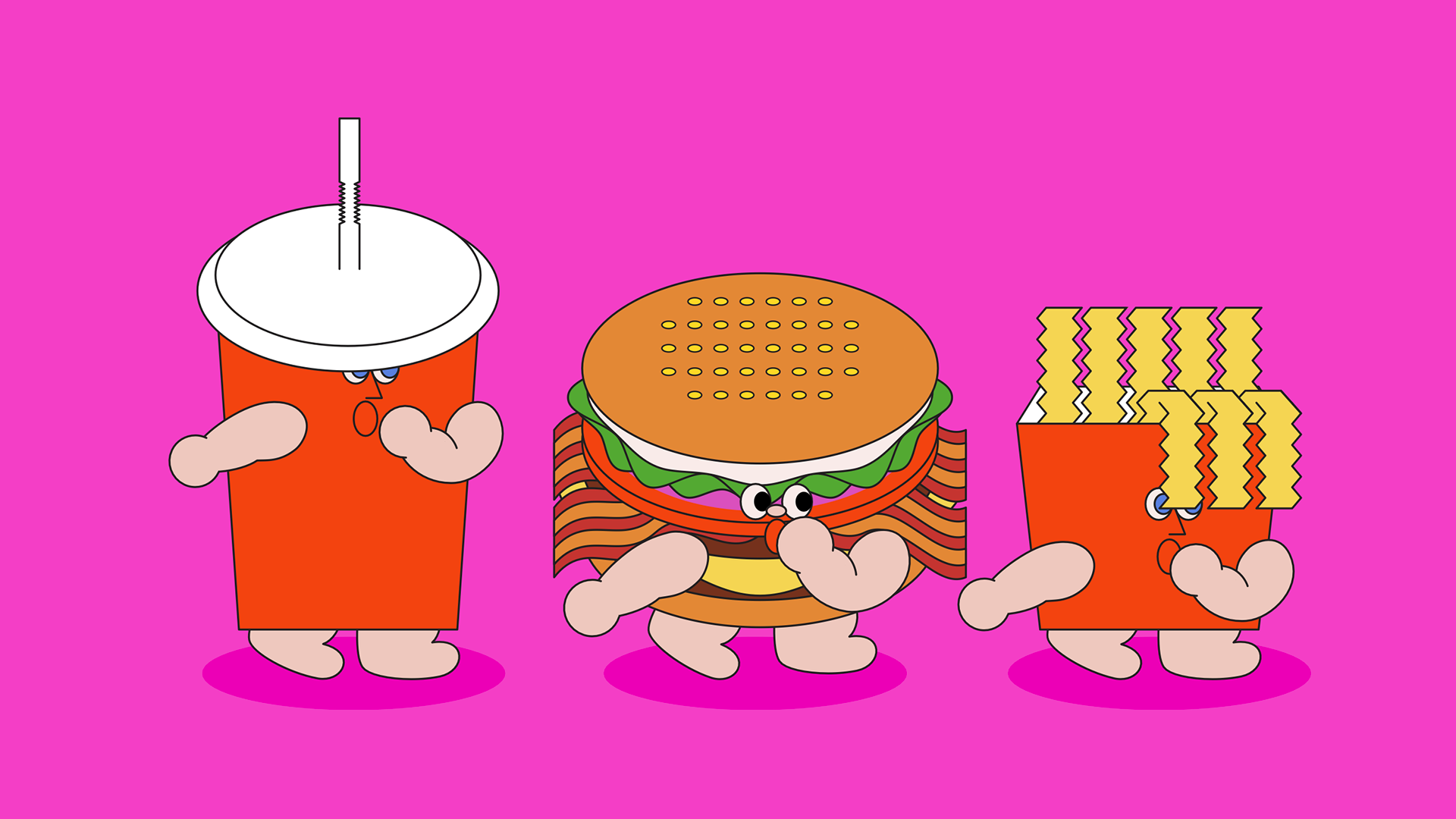
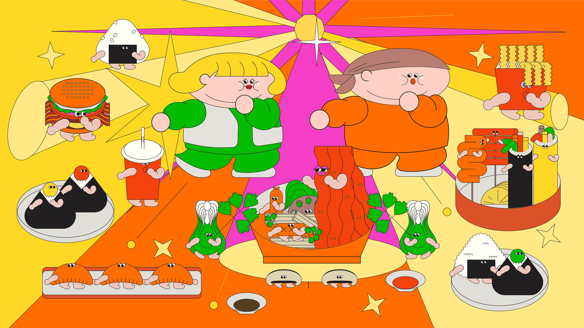
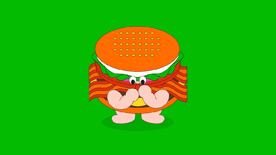
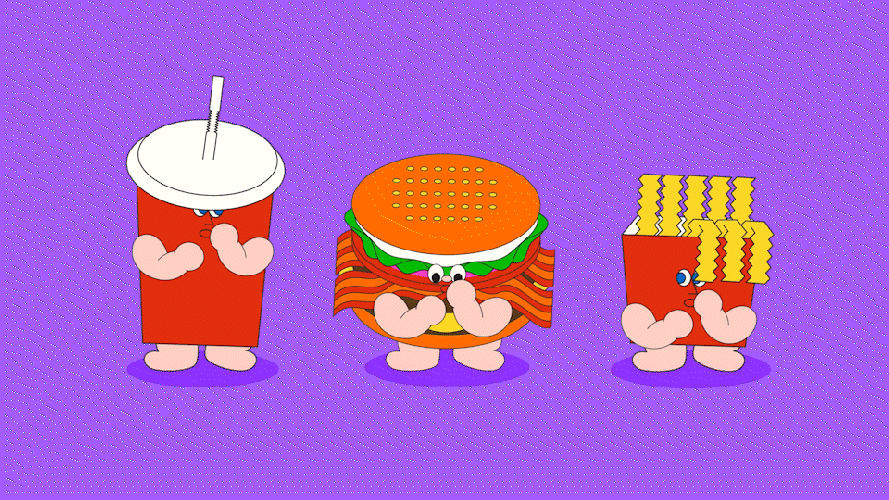
FOOD CHARACTERS
인물 캐릭터들의 디자인적 DNA를 이어받아, 이번 프로젝트의 핵심 재미 요소로 자리잡은 것이 바로 음식 캐릭터들입니다.
버거, 김밥, 떡볶이부터 마라탕까지. 배달음식의 교과서 같은 메뉴들이 작고 귀여운 형태와 표정으로 재탄생했으며, 전체적인 유쾌한 무드와 톤을 유지하면서도, 보는 이에게 직관적인 재미와 감각적인 디테일을 선사합니다.
이 작은 캐릭터들이 만들어내는 리듬감과 위트를 꼭 즐겨주세요!
Carrying over the visual DNA established in the main character designs, the food characters became the visual “kick” of the project—a core element of fun and charm. From classic delivery favorites like burgers, kimbap, tteokbokki, and triangular gimbap, to trendier picks like mala soup, each dish was reimagined with adorably simple shapes and expressive faces. While staying in tune with the overall playful mood, these characters bring rhythm, personality, and delightful detail to the scenes.
We invite you to enjoy the little moments they create!
POSTER DESIGN
TITLE STYLE FRAMES
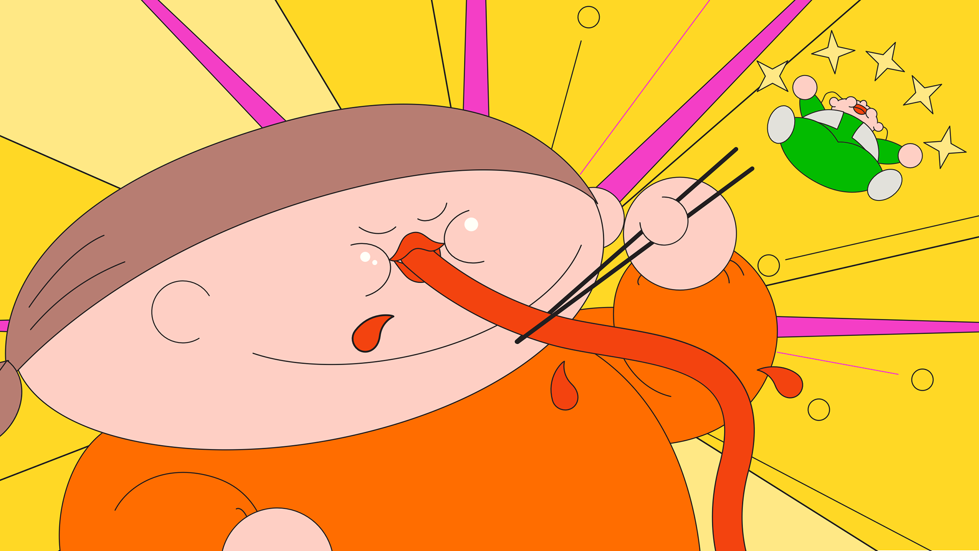
타이틀은 첫 장면부터 시청자의 시선을 확실히 사로잡을 수 있도록 맥락 없이 음식 캐릭터들이 자유롭게 홈파티를 벌이고 있는 장면으로 과감하게 시작했습니다. 처음부터 끝까지 이어지는 강렬한 귀여움을 인식시키기 위해, 캐릭터들의 귀염뽀짝한 댄스 동작을 더해 생동감을 높였습니다. 전체적으로는 발랄한 컬러감과 팝한 디자인을 통해 보는 이에게 기분 좋은 리듬감과 긍정적인 에너지를 전달하고자 했습니다.
To immediately hook the viewer from the very first frame, the title sequence opens with a playful, out-of-context scene where food characters are throwing a home party. We wanted the mood of bold cuteness to carry through the entire sequence, so we added adorable little dance moves to each character for extra charm and rhythm.
With vibrant colors and a cheerful, pop-inspired design, the title delivers a sense of fun, energy, and good vibes right from the start.
With vibrant colors and a cheerful, pop-inspired design, the title delivers a sense of fun, energy, and good vibes right from the start.


ANIMATION SCENES
애니메이션에서는 씰룩씰룩 리듬을 타는 귀여운 동작들에 특히 신경을 썼습니다. 그중에서도 마치 주먹을 입에 넣는 듯한 포즈가 이 프로젝트의 키 액션으로, 음식 캐릭터들의 사랑스러움을 유머러스하게 강조해줍니다. 정신없이 번쩍이는 그래픽과 색감으로 연출된 특별한 홈파티를 함께 즐겨주세요! 유쾌하고 과장된 이 한 장면 속에, 이 프로젝트의 모든 무드가 담겨 있습니다.
The animation focused on cute, bouncy dance movements that match the playful rhythm of the title. A key pose—where the character appears to shove its tiny fist into its mouth - became a signature moment, adding extra charm and humor to the scene. With flashing colors and a whirlwind of party energy, this chaotic little home celebration captures the full spirit of the project. We hope you enjoy the dance as much as we did!
TRANSITION


CREDIT
[SBS FiL] 외식하는 날 at Home (Eat Out at Home)
On Air : SBS FiL, 2021
Client : SBS FiL
Project Manager : Borim Lee
Production : Willo
Production : Willo
Creative Director : Jisun Kim
Supervisor : Heejin Choi
Design, Animation : Jisun Kim, Heejin Choi