
Willo collaborated with the construction company Noudit last year to undertake the branding for the E-Mapo Festival. The E-Mapo Festival was organized around the newly opened Noudit Hongdae building in Mapo-gu, with the aim of fostering community engagement. The Noudit Hongdae building features a large courtyard-like central plaza.
Logo Branding
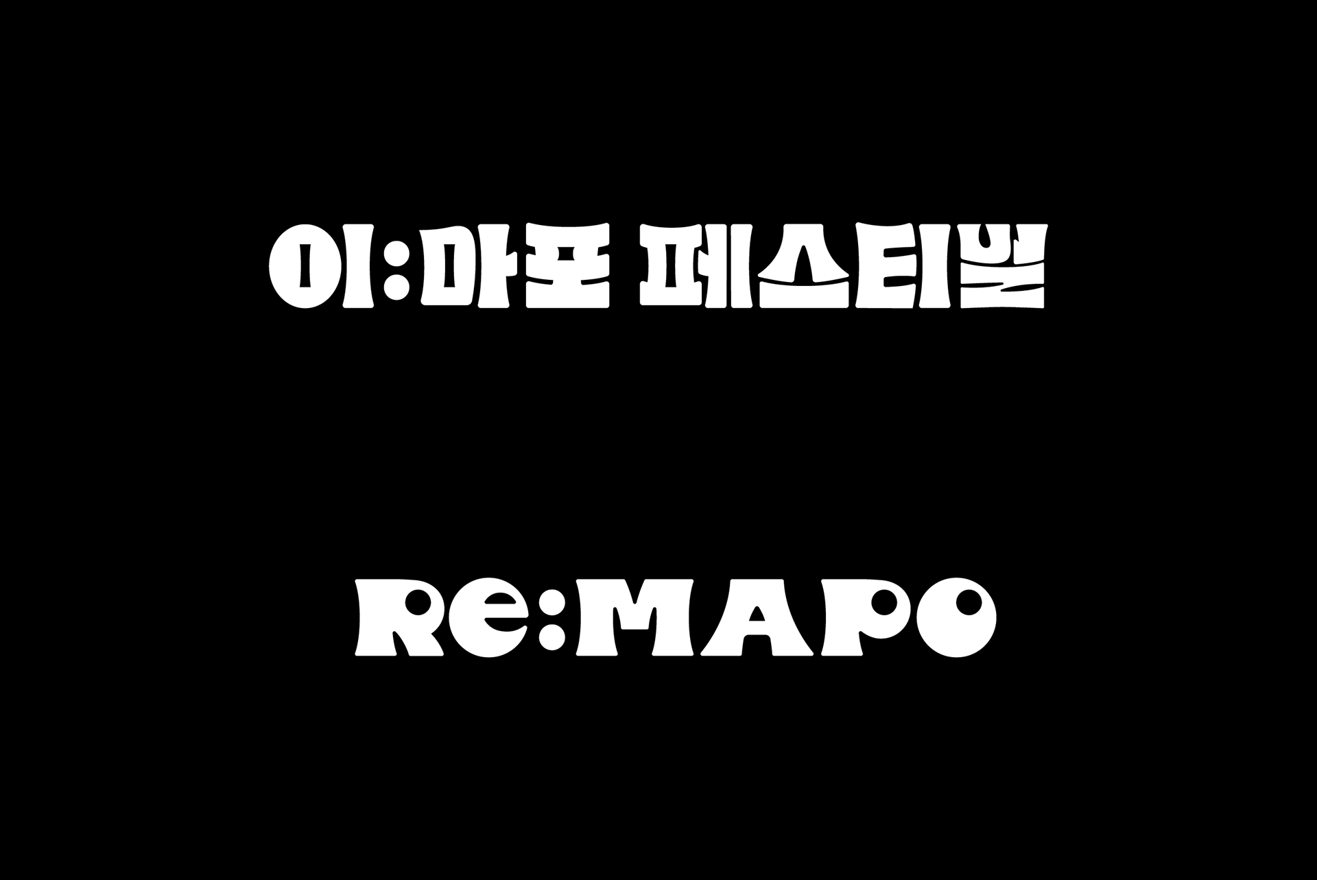
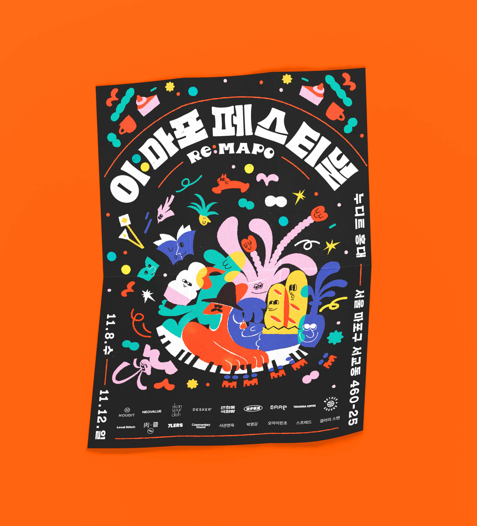
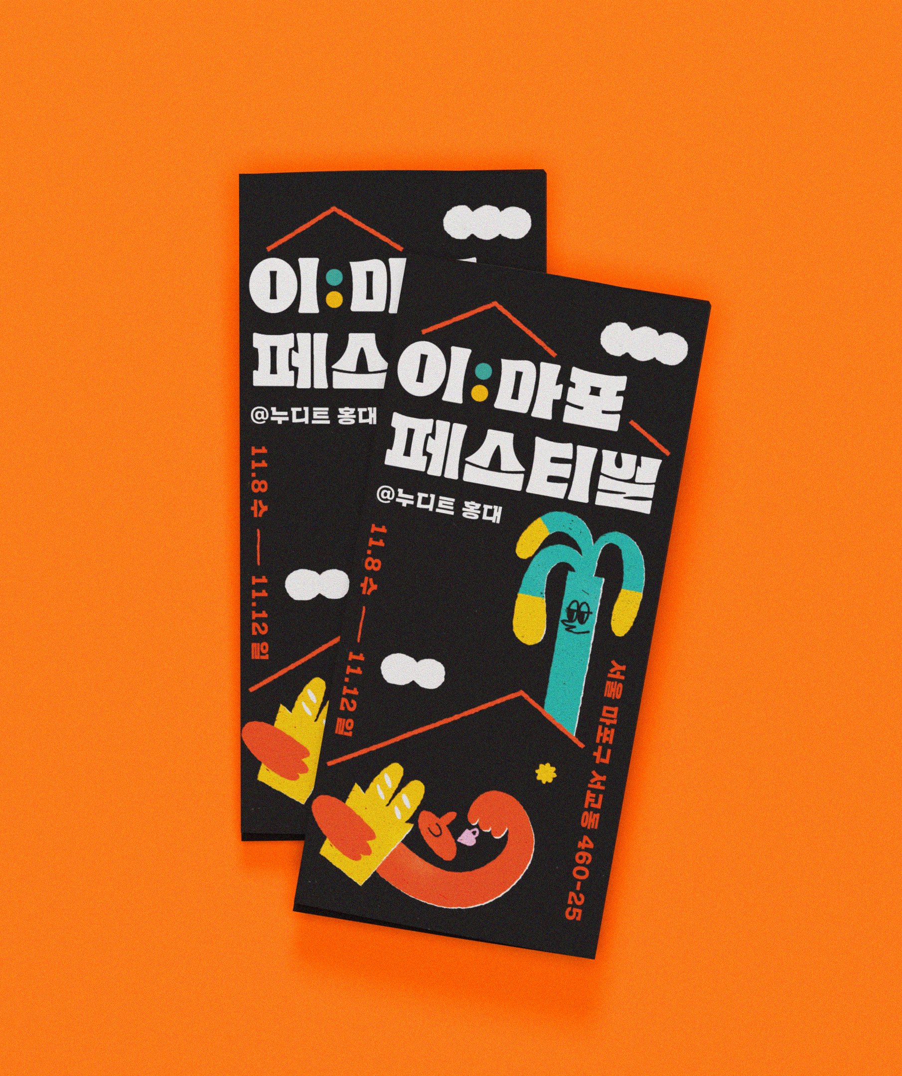
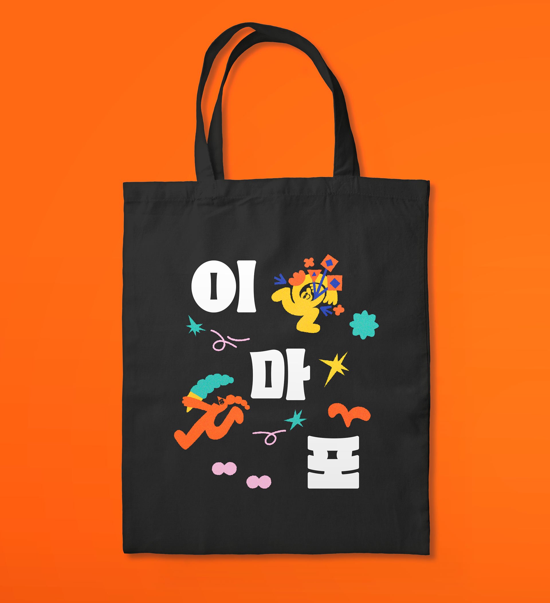
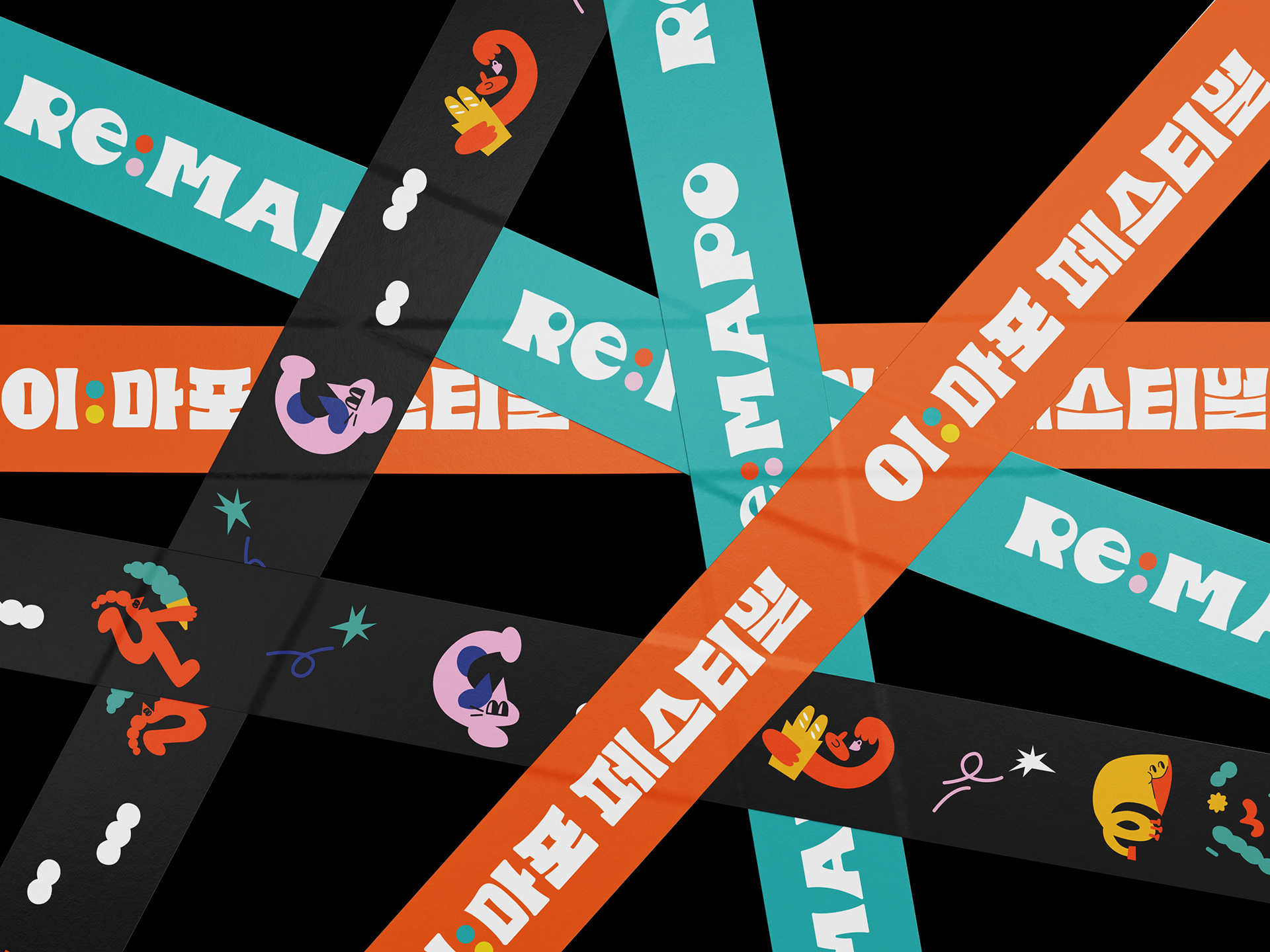
We developed a round and bold design inspired by European retro type, with the Korean name "이:마포" incorporating the meaning of RE:. The circles in the glyph were used as confetti elements in the design to visually express the festival's identity and vision.
Key Visual Concept
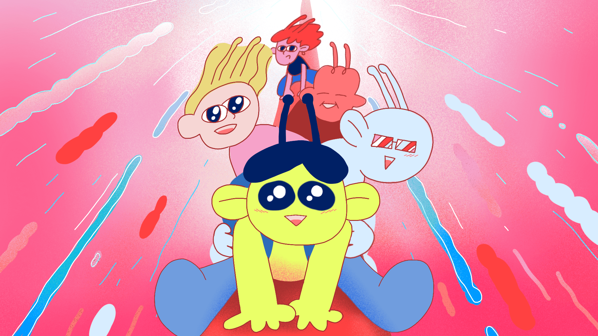
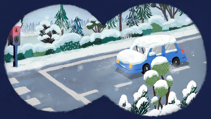
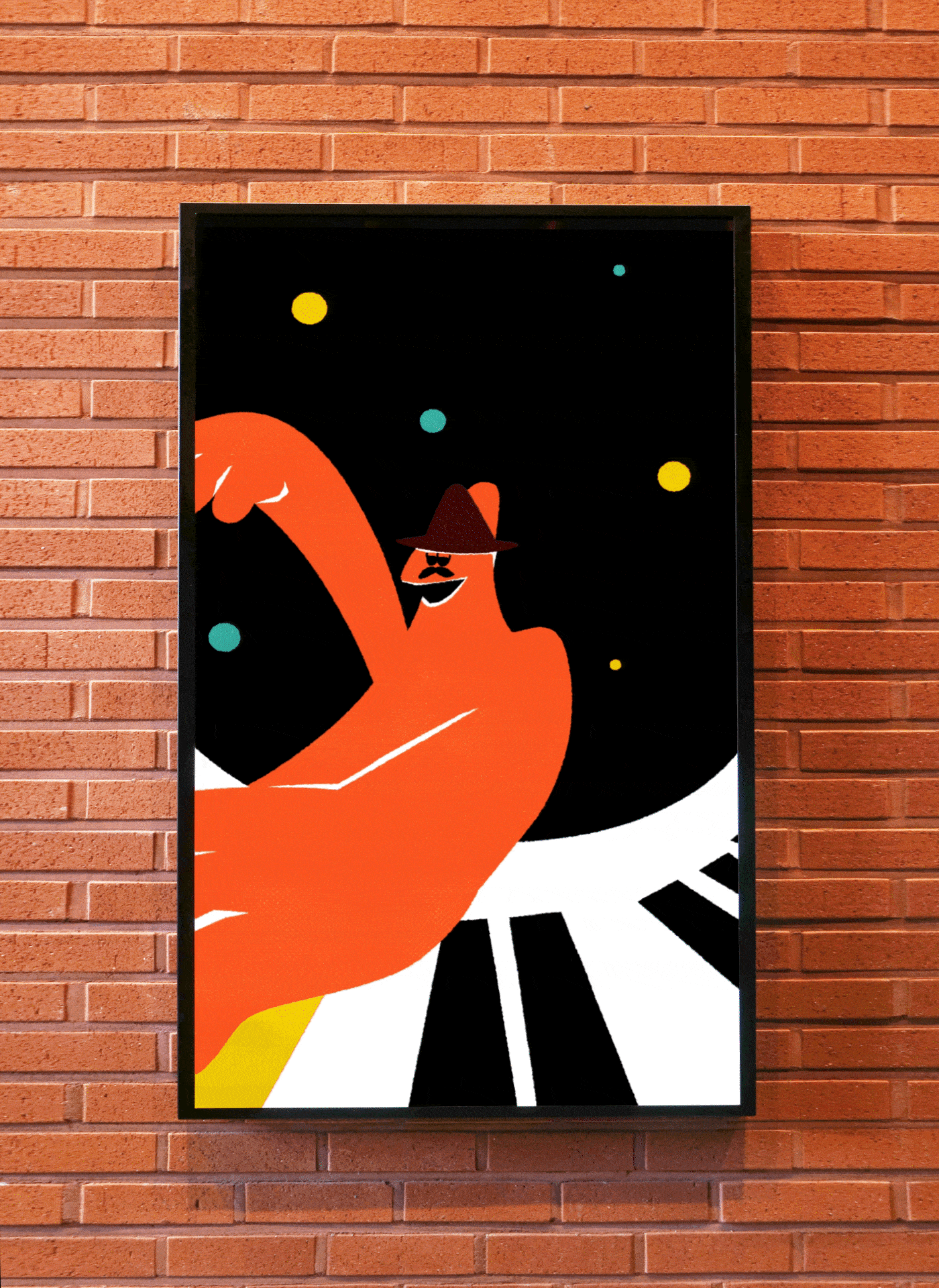
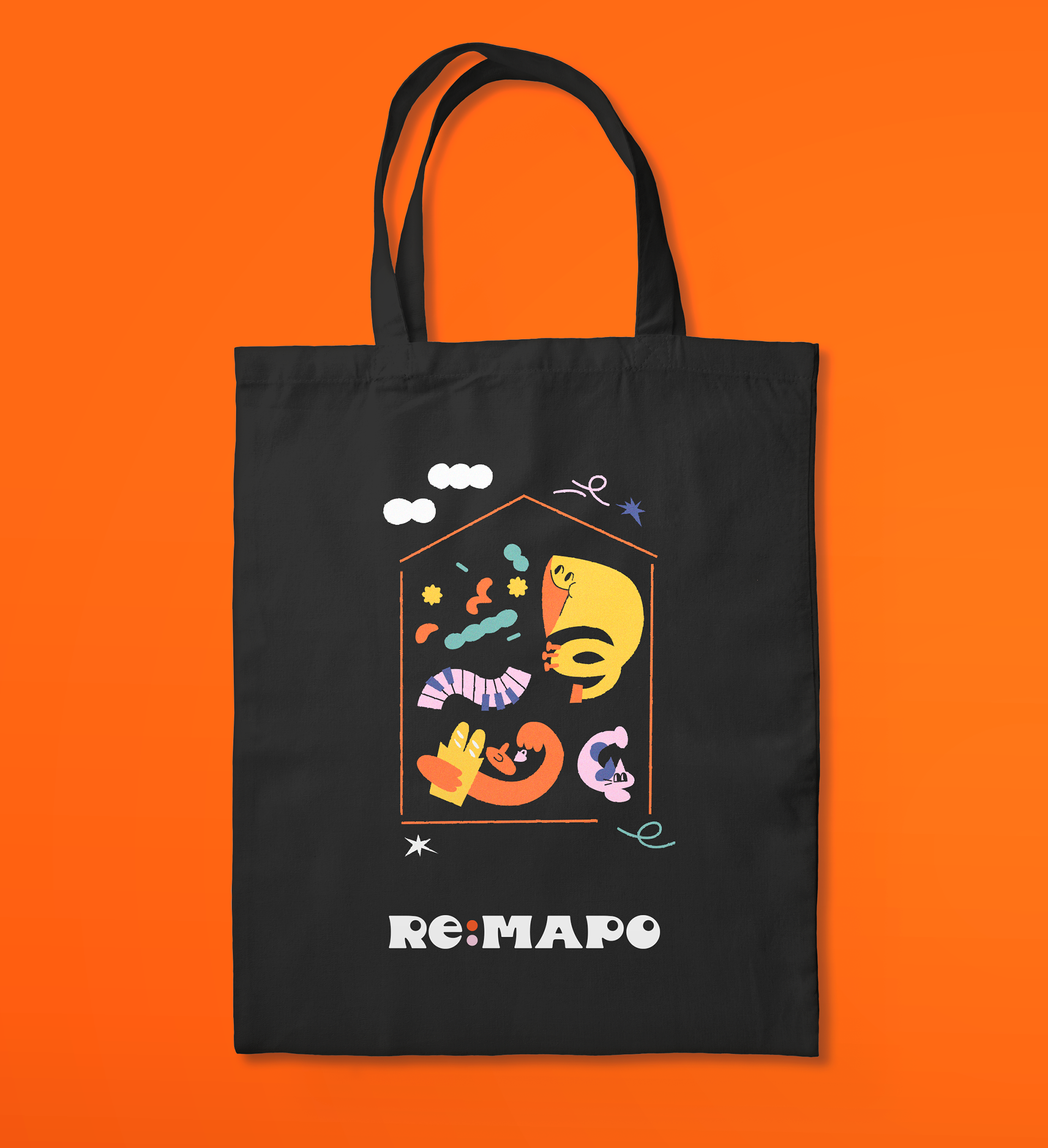
The key visual concept was "Unexpected Encounters," inspired by the question, "What happens in the Noudit Plaza?" The concept depicted diverse shapes of people, figures, and colors coming together, expanding, overlapping, and reacting to create unexpected encounters. The visual keywords were bustling, interactive, and analog.

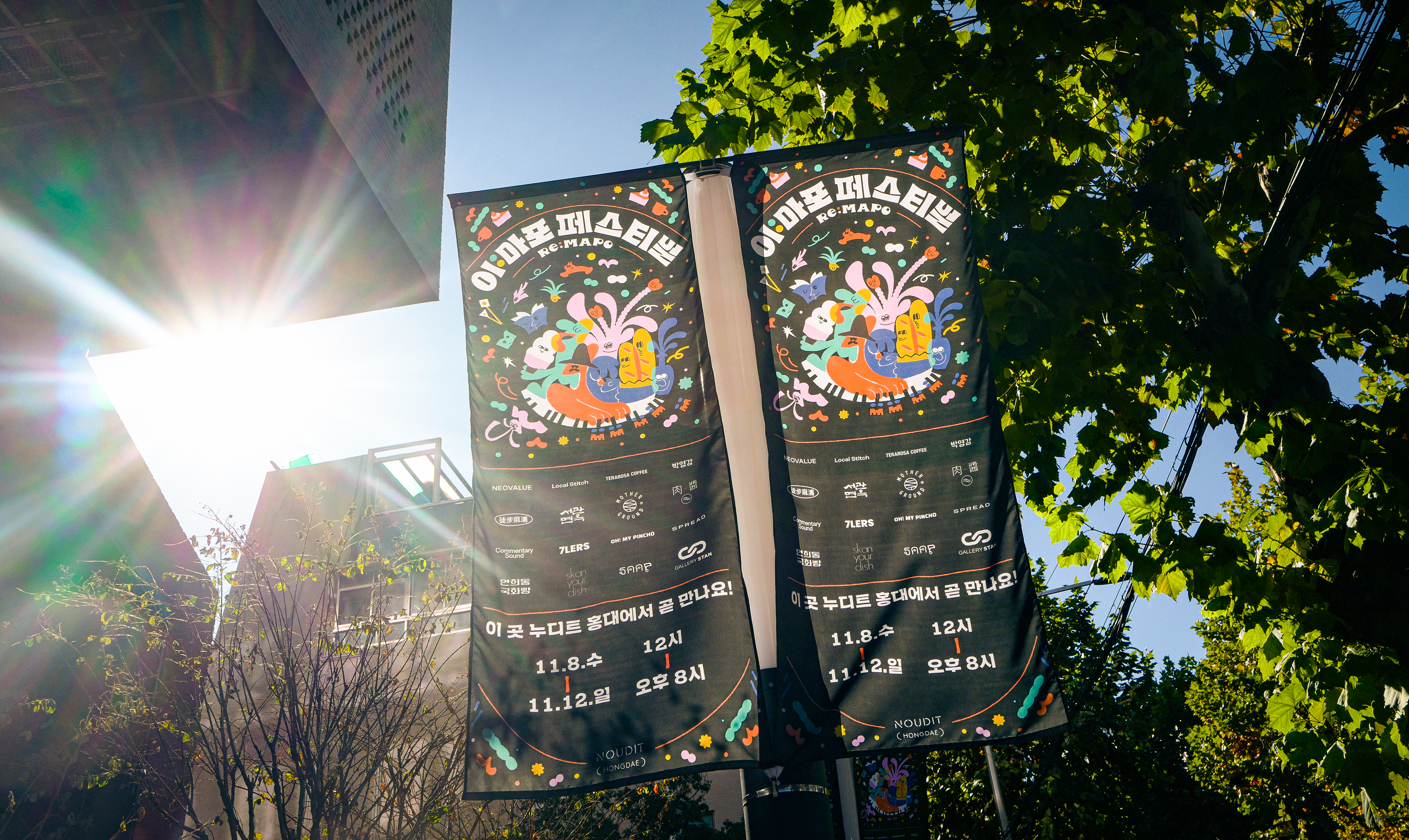
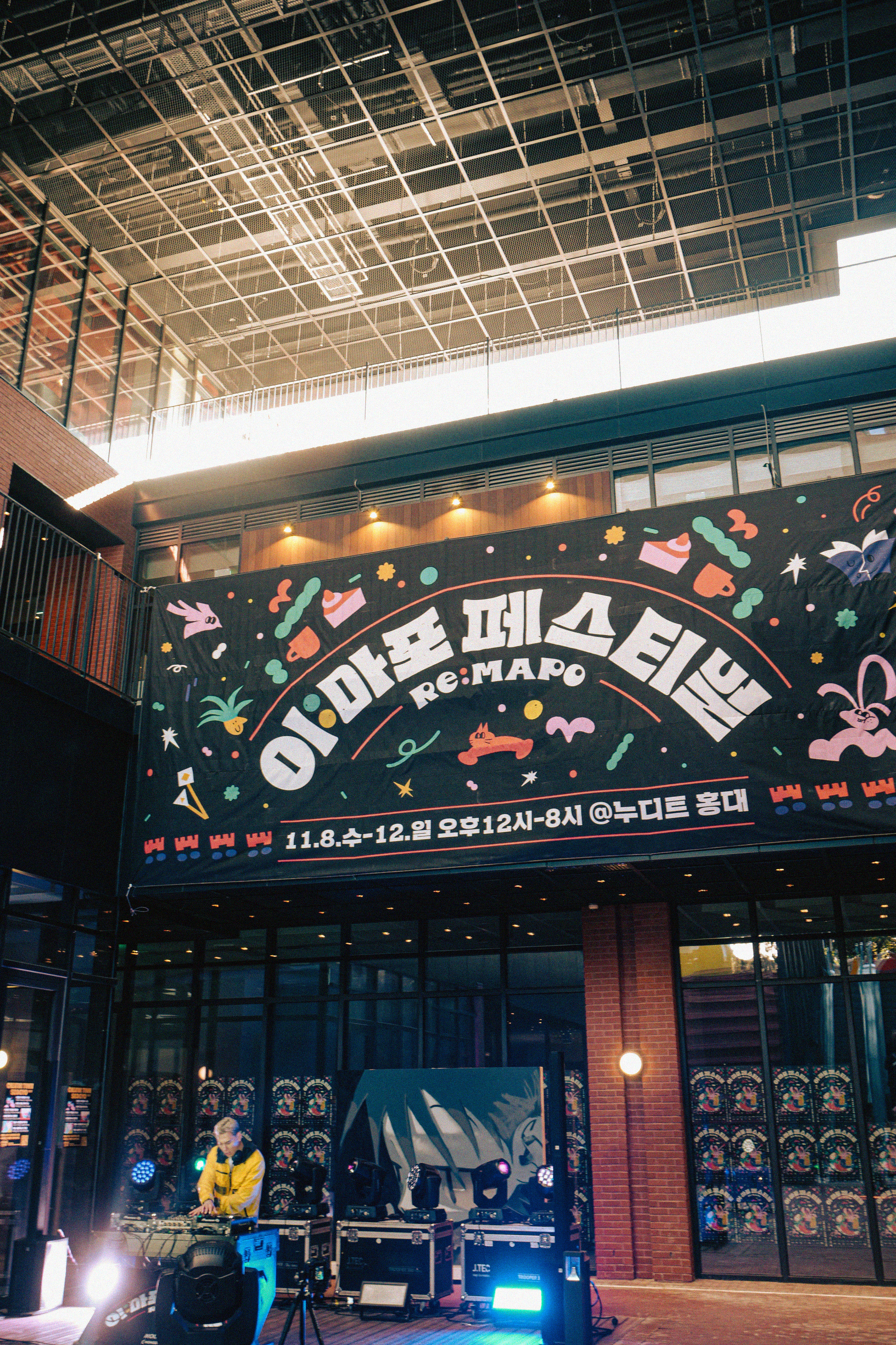
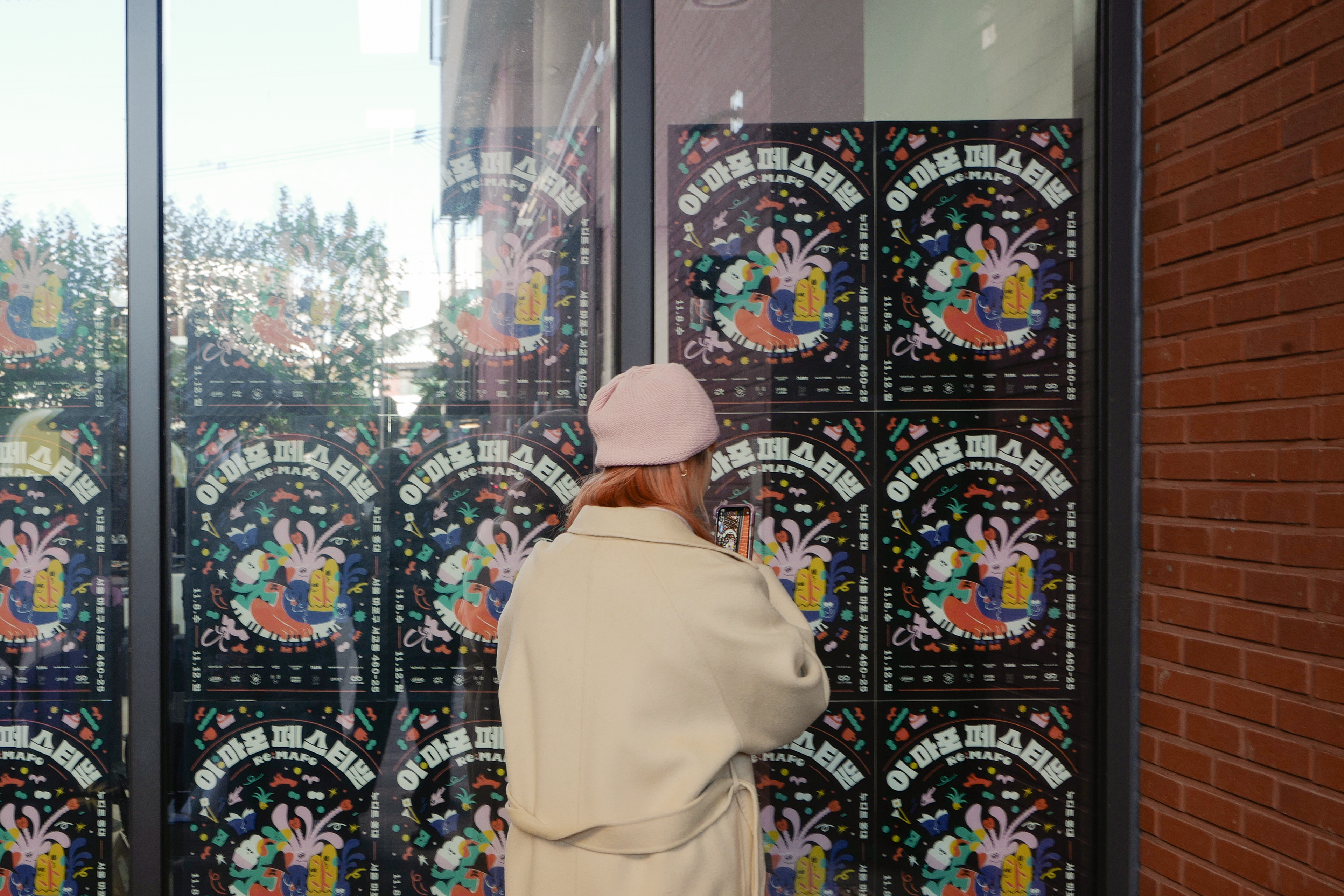
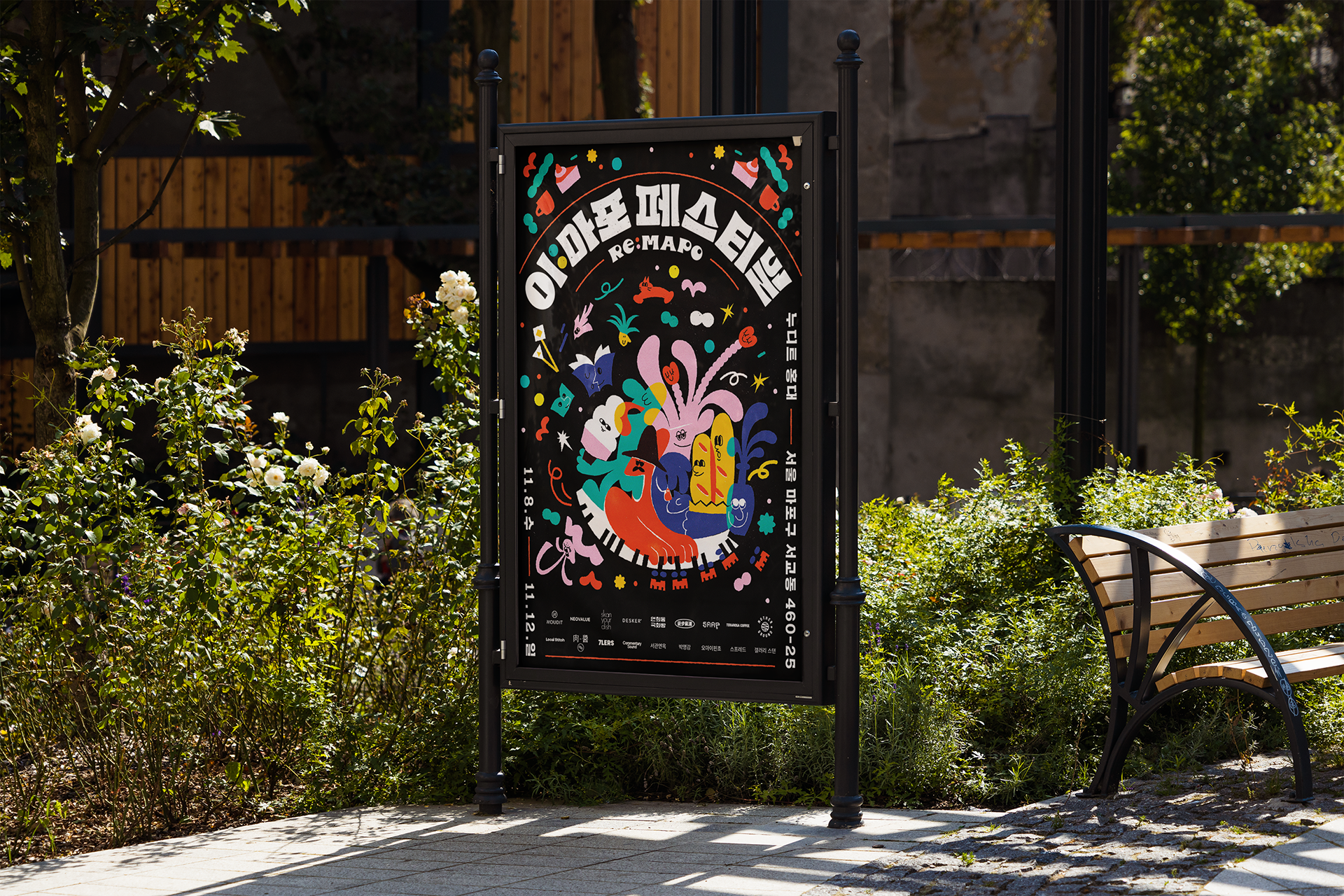
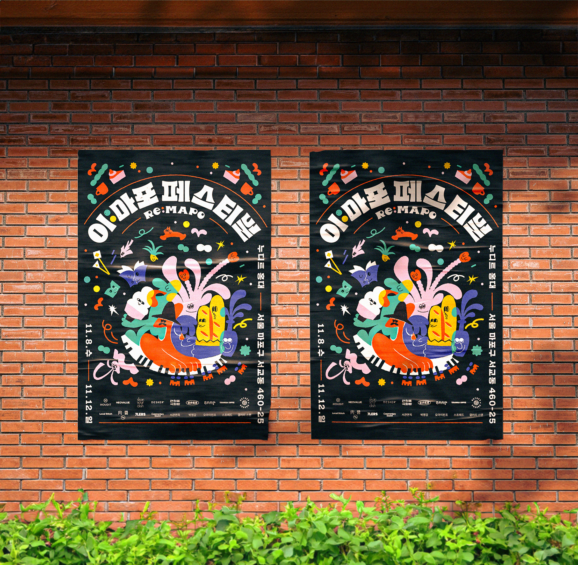
Tone and Mood & Poster Design
The poster design featured vivid, colorful illustrations that created a lively and vibrant atmosphere, capturing the energetic spirit of the festival. The vibrant elements coming together aimed to convey the festival's energy to visitors.
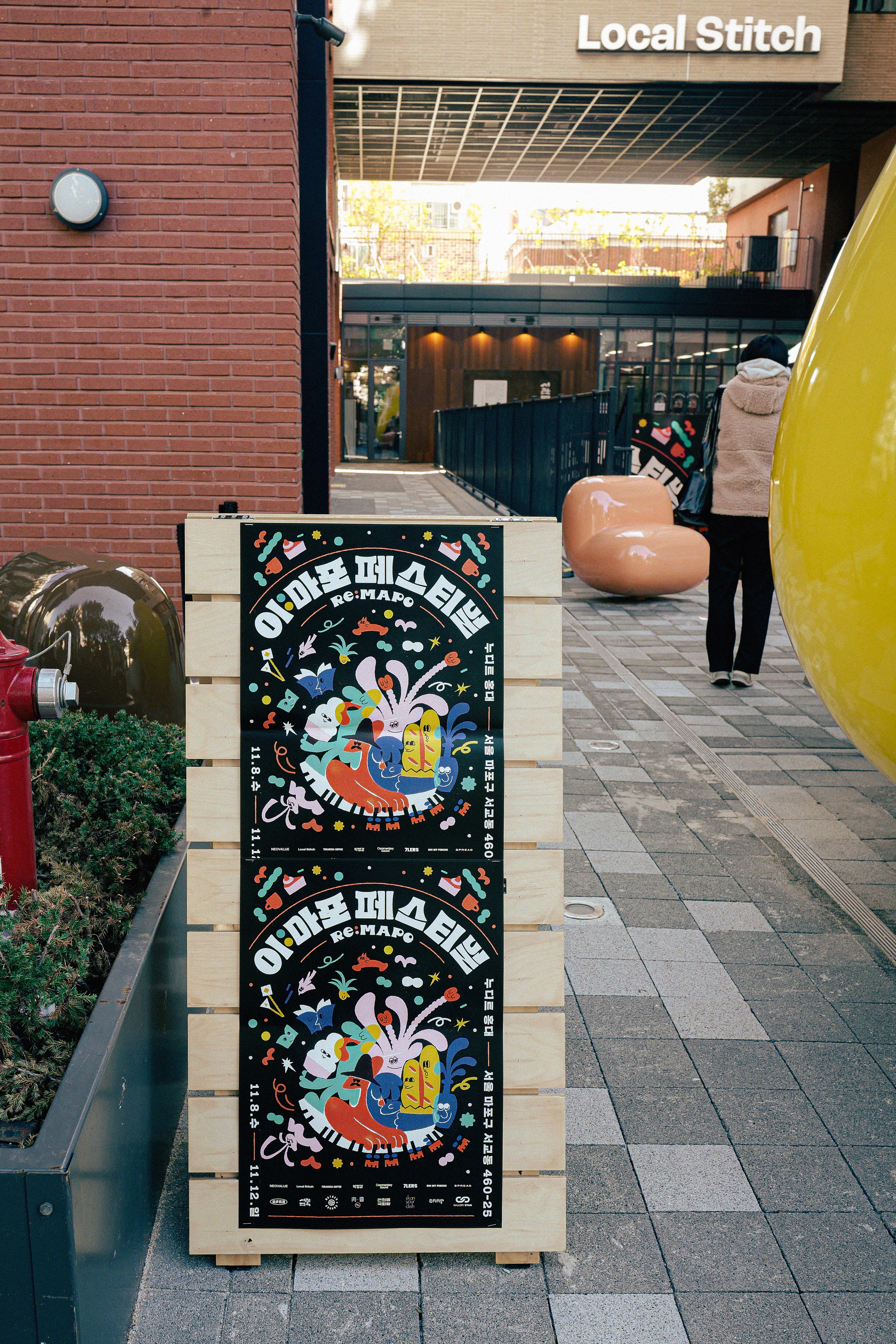
The E-Mapo Festival was designed to be a beloved local event for Mapo-gu residents and visitors. Various small businesses from the community, including food, beverage, crafts, creators, and art galleries, were invited to participate. The event, held over three days, strengthened the connections within the local community.

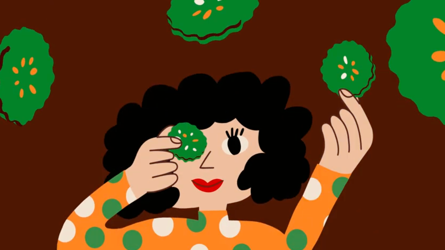
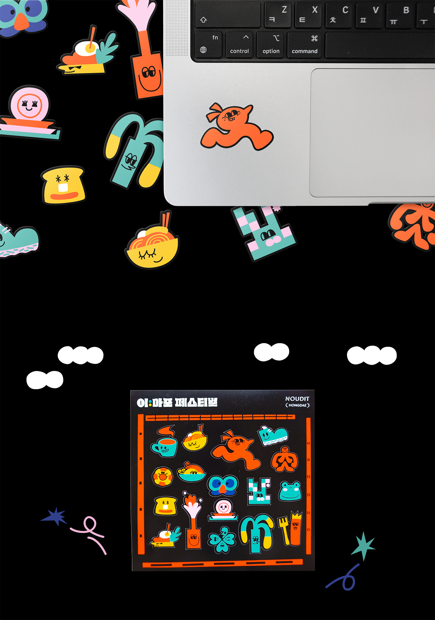
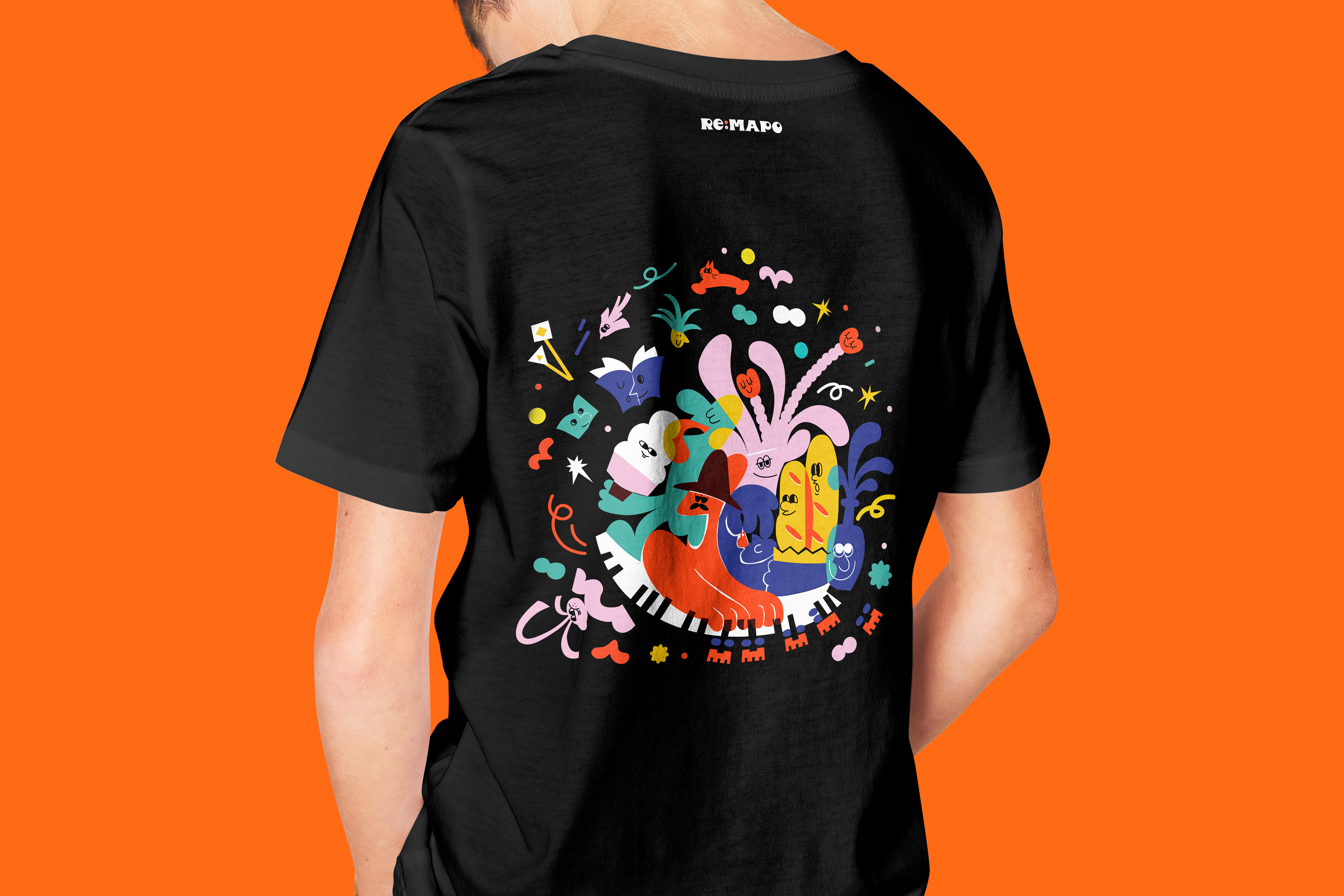
Character Design
We created unique characters to bring more vibrancy to the festival, providing visitors with a friendly and enjoyable image. Specifically, the vendors at the E-Mapo Festival were characterized in the key visual style, reinterpreting their features.
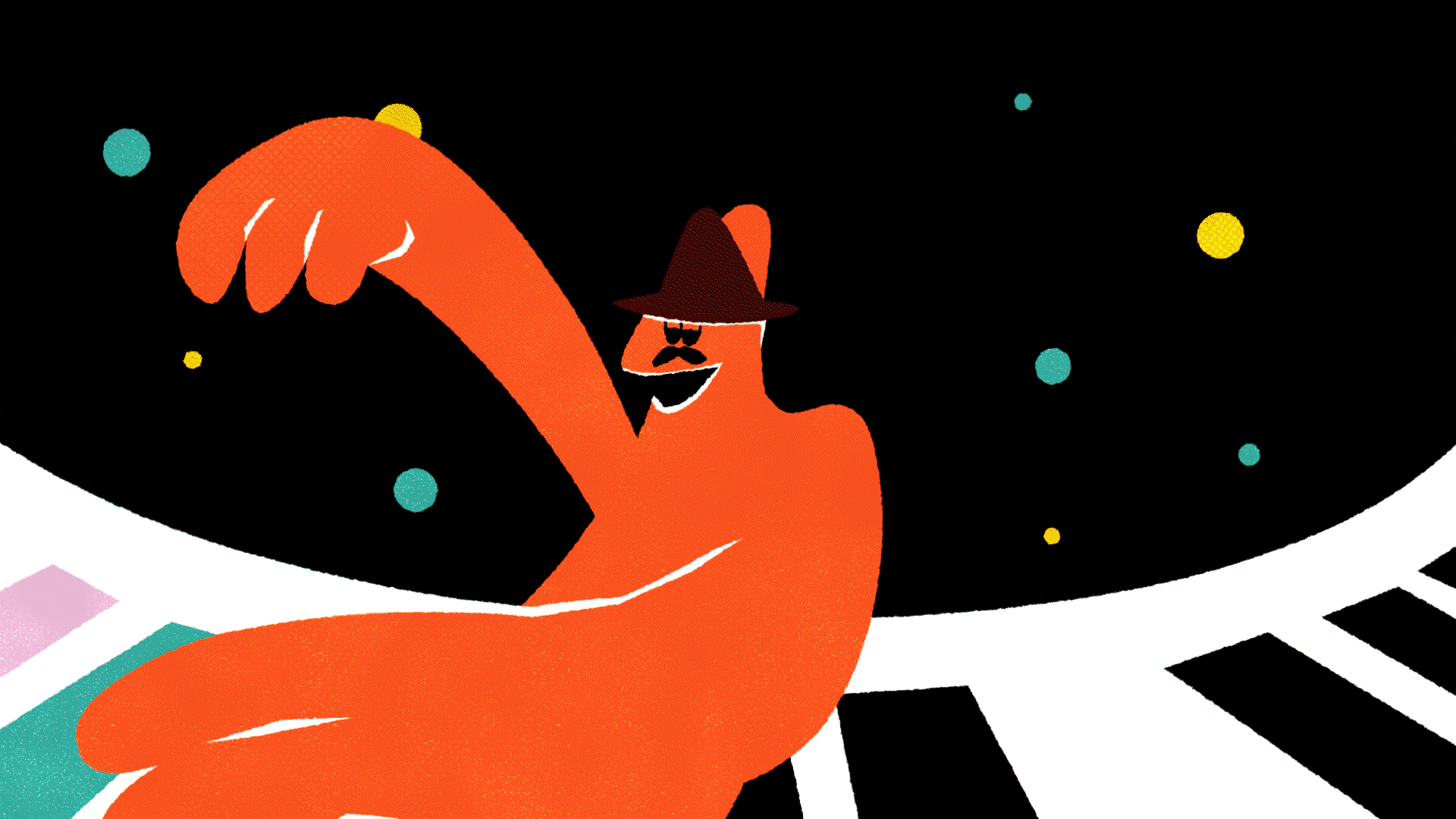
Teaser Video Production
We produced a short animated teaser video showcasing a festival scene where various people come together. The simple composition conveyed a powerful and joyful feeling, and it received positive feedback.
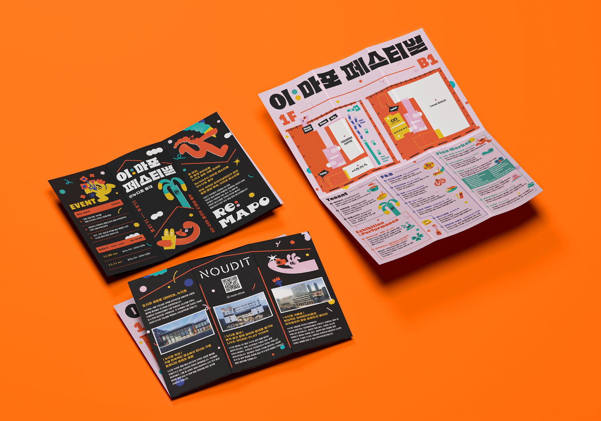
Brochure Design
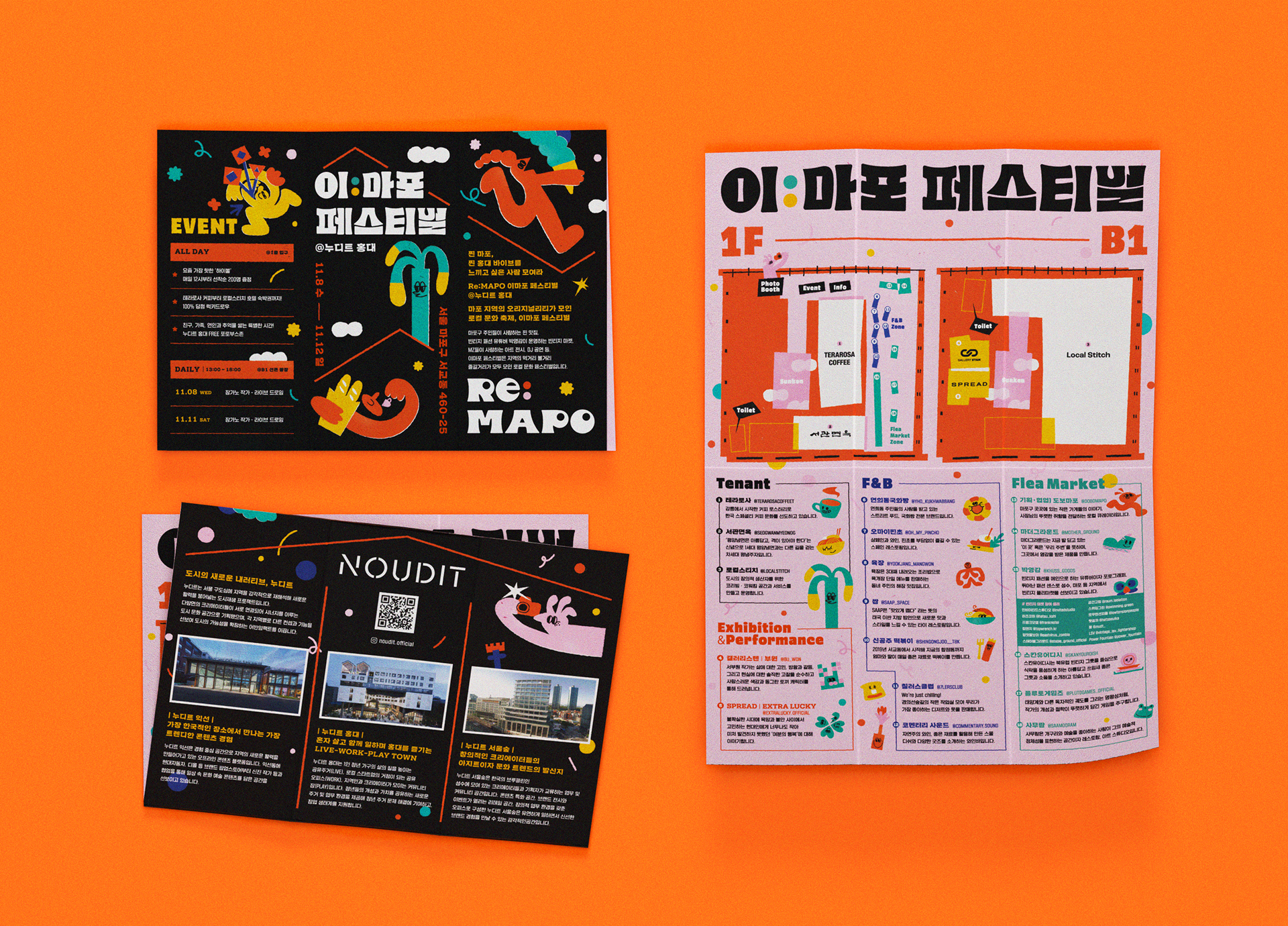
The brochure was designed within the unified style of the key visual concept, making it easy for attendees to view the map and seller information.
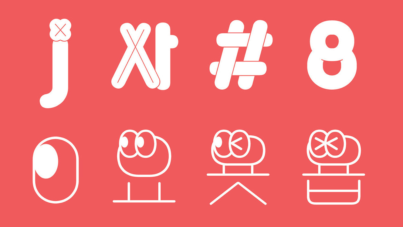
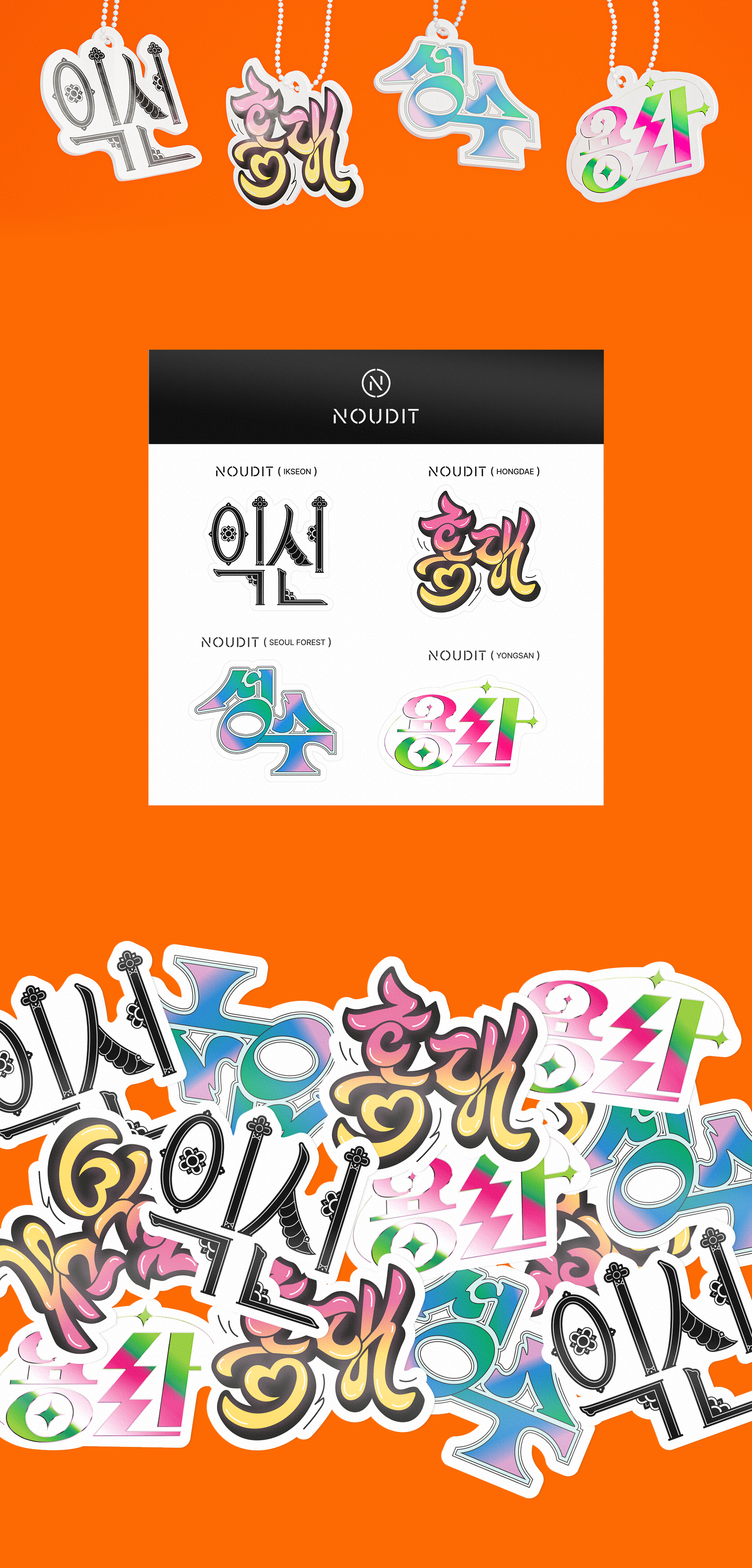
Korean Lettering Design
We designed Korean lettering for four local areas in Seoul where Noudit is located, reflecting the unique characteristics of each region.
The E-Mapo Festival was a great success, receiving enthusiastic responses from local residents and visitors. Willow Studio's creative designs and meticulous work added vitality to the event, providing an unforgettable experience for all the participating small businesses and attendees.
[Noudit] 이마포 페스티벌 디자인 PKG
Release : NEOVALUE, 2023
Client : NEOVALUE
Project Manager : Yuwon Ann
Production : Willo
Creative Director : Jisun Kim
Supervisor : Heejin Choi
Project Manager : Jisun Kim, Heejin Choi
Design Planning : Jisun Kim, Saemi Park, Sook young Ahn
Logo Design : Jisun Kim
Key Visual Design, Character Illustrations : Sook young Ahn
Poster Design : Jisun Kim, Sook young Ahn
Teaser Design & Animation : Sook young Ahn
Hangul Lettering Design
Hondae : Heejin Choi
Seongsu : Heejin Choi
Ikseon : Saemi Park
Yongsan : Jisun Kim
Broucher Design : Heejin Choi