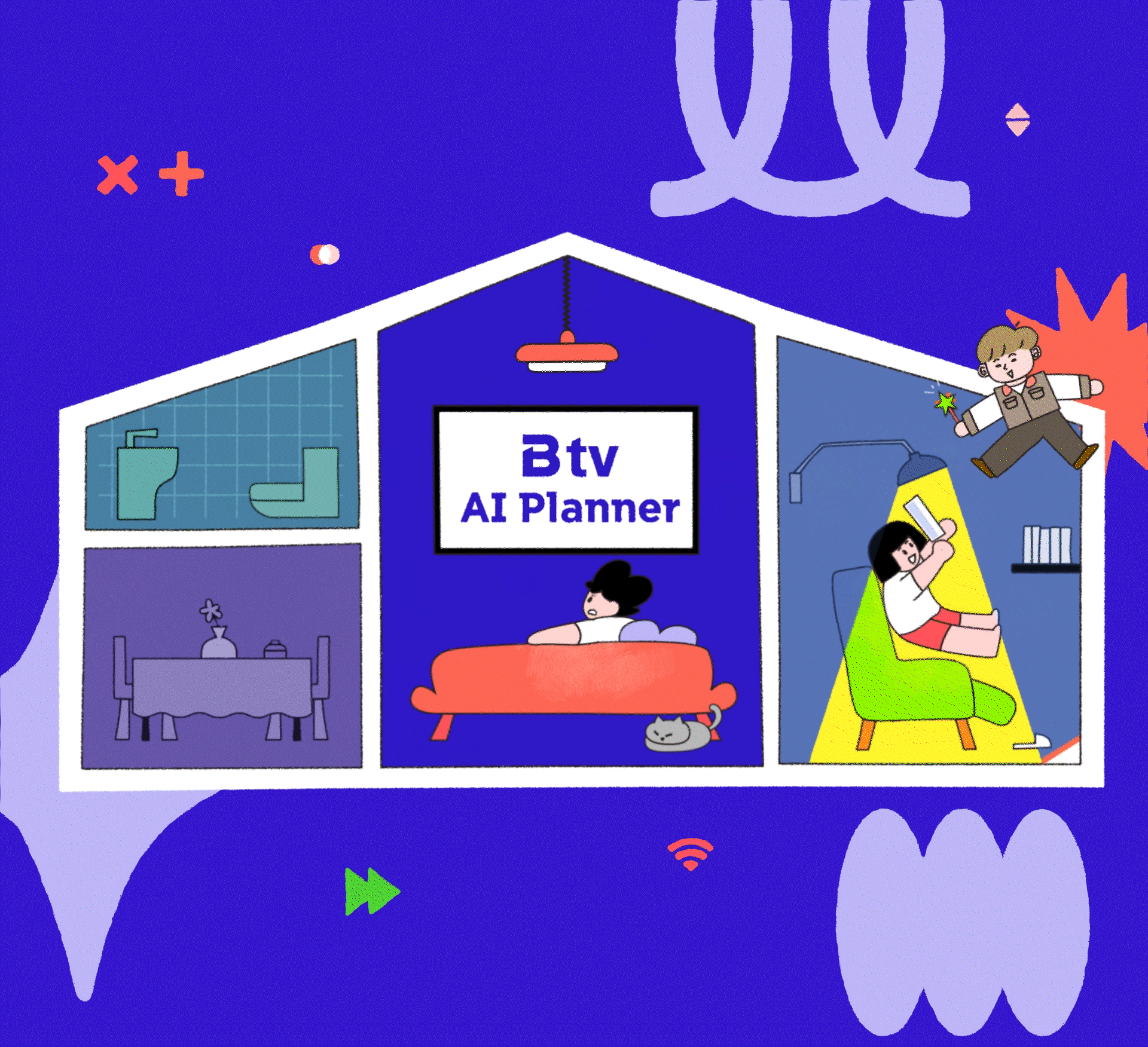
B tv AI Planner
OUTLINE
SK 브로드밴드(SK Broadband)는 대한민국의 대표적인 유선 통신 및 IPTV 서비스 기업으로, 초고속 인터넷, 모바일, IPTV, AI 기반 서비스 등 다양한 솔루션을 제공하고 있습니다. 이번 AI Planner 영상 7종은 SK 브로드밴드의 서비스 매니저가 가정 방문 시, 고객에게 새로운 인터넷 및 모바일 서비스 혜택을 쉽고 친근하게 설명할 수 있도록 제작되었습니다. 비비드한 컬러와 친근한 캐릭터 디자인을 활용해 시각적 몰입도를 높였으며, 고객들이 정보에 빠르게 접근할 수 있도록 구성되었습니다.
SK Broadband is one of South Korea’s leading telecommunications companies, providing high-speed internet, mobile, IPTV, and AI-based services. The AI Planner video series (7 versions) was designed to help SK Broadband service managers clearly and engagingly explain new internet and mobile service benefits to customers during home visits. Using vivid colors and friendly character designs, the videos enhance visual clarity and make complex information more accessible to customers.
FINAL OUTPUTS
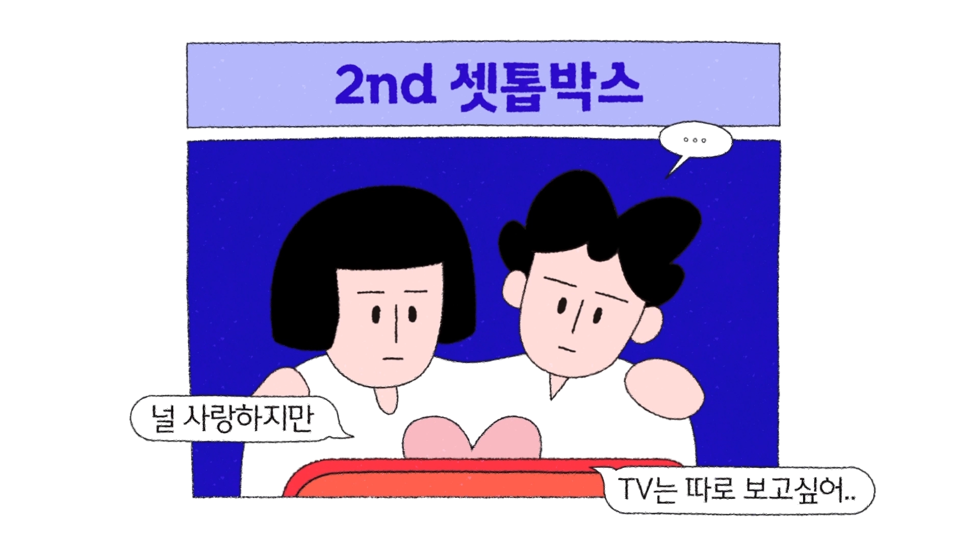
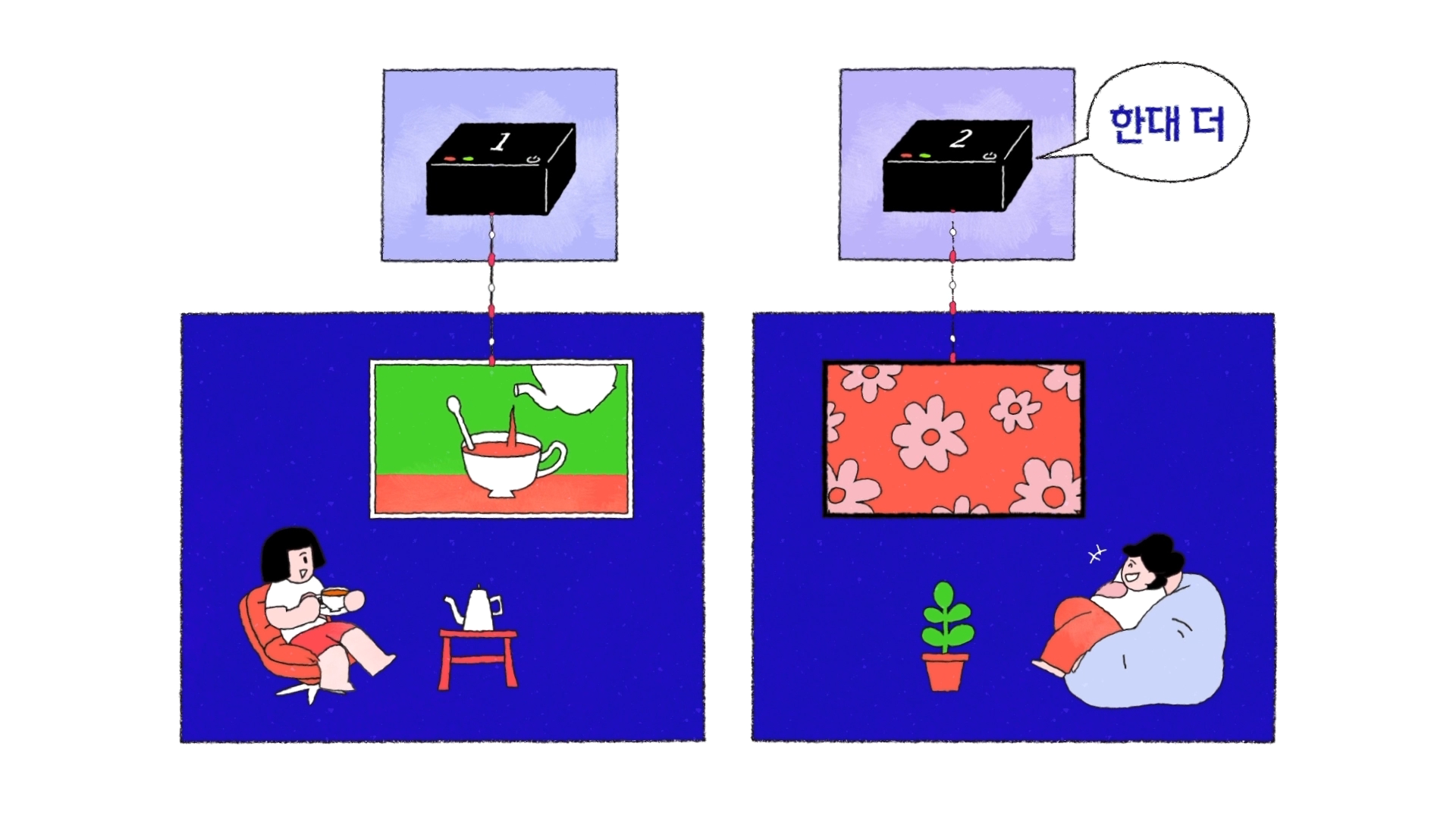
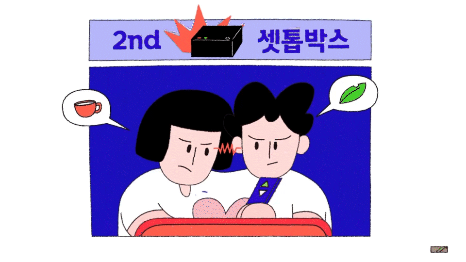
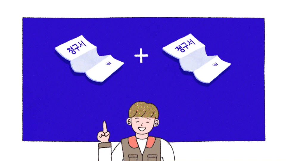
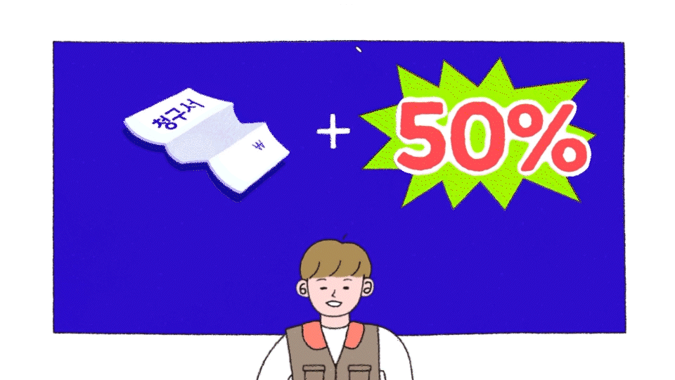
B tv AI Planner v1 - 2nd STB
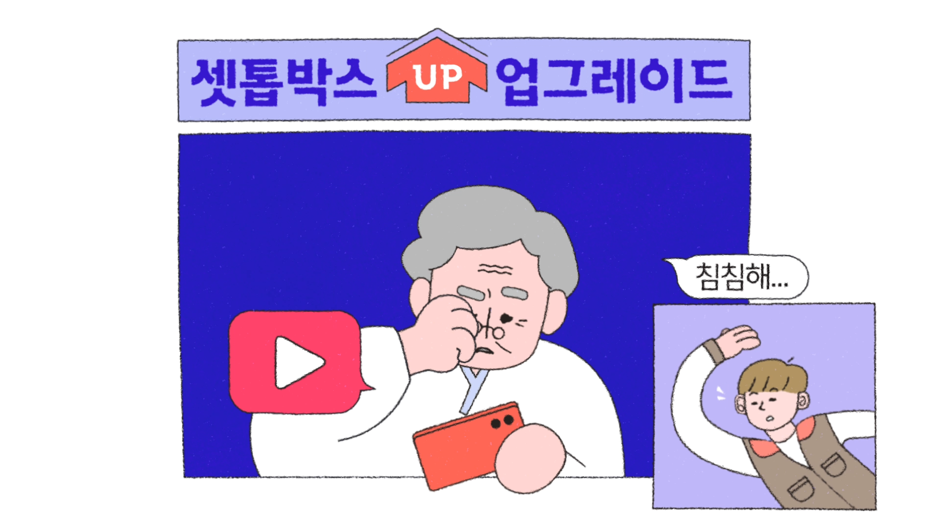
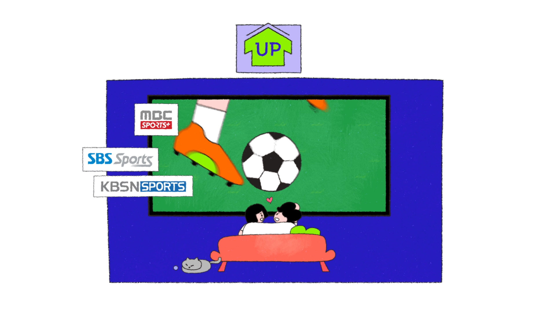
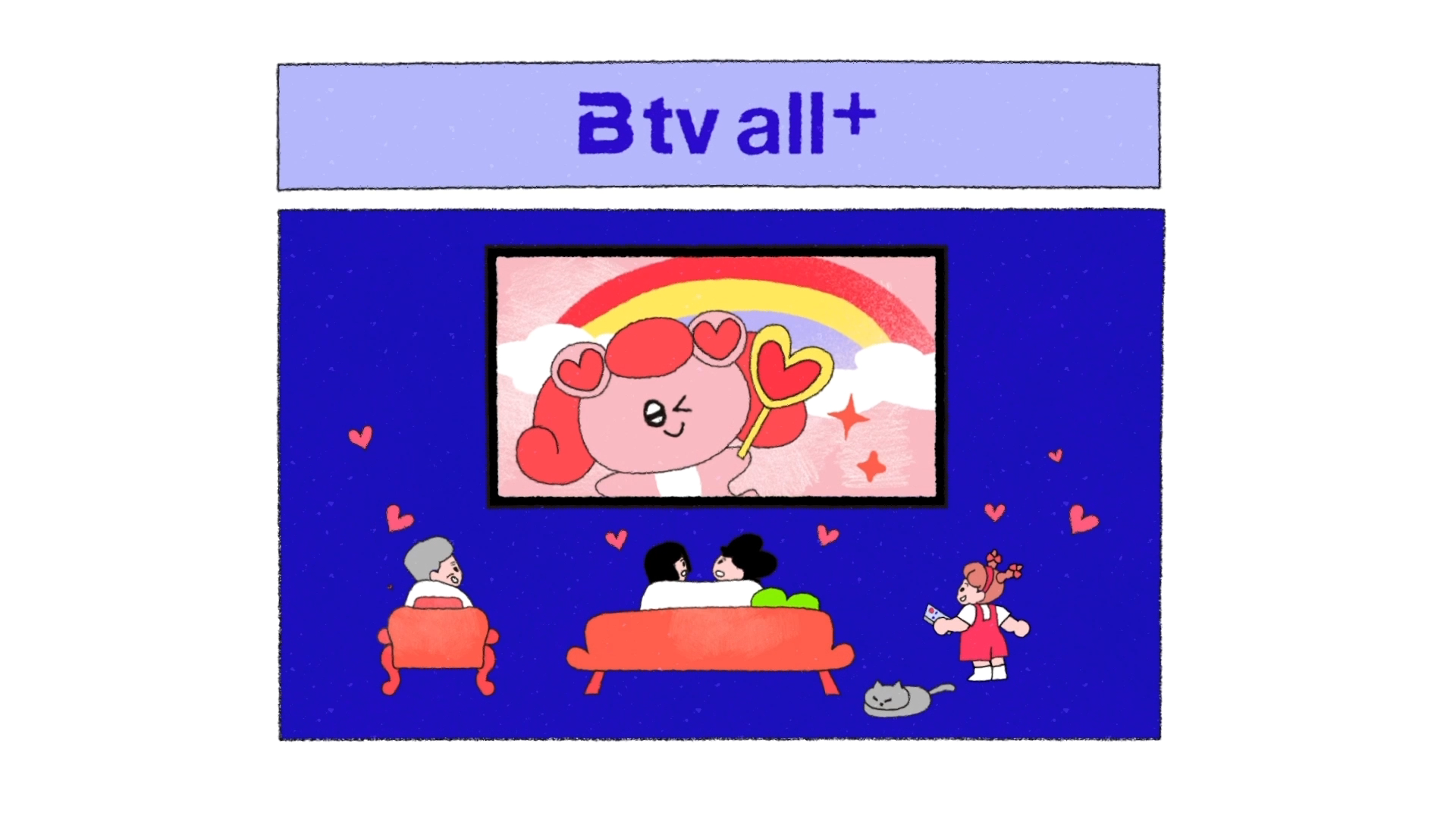
B tv AI Planner v2 - B tv Channel Upgrade
B tv AI Planner v3 - B tv Channel Upgrade
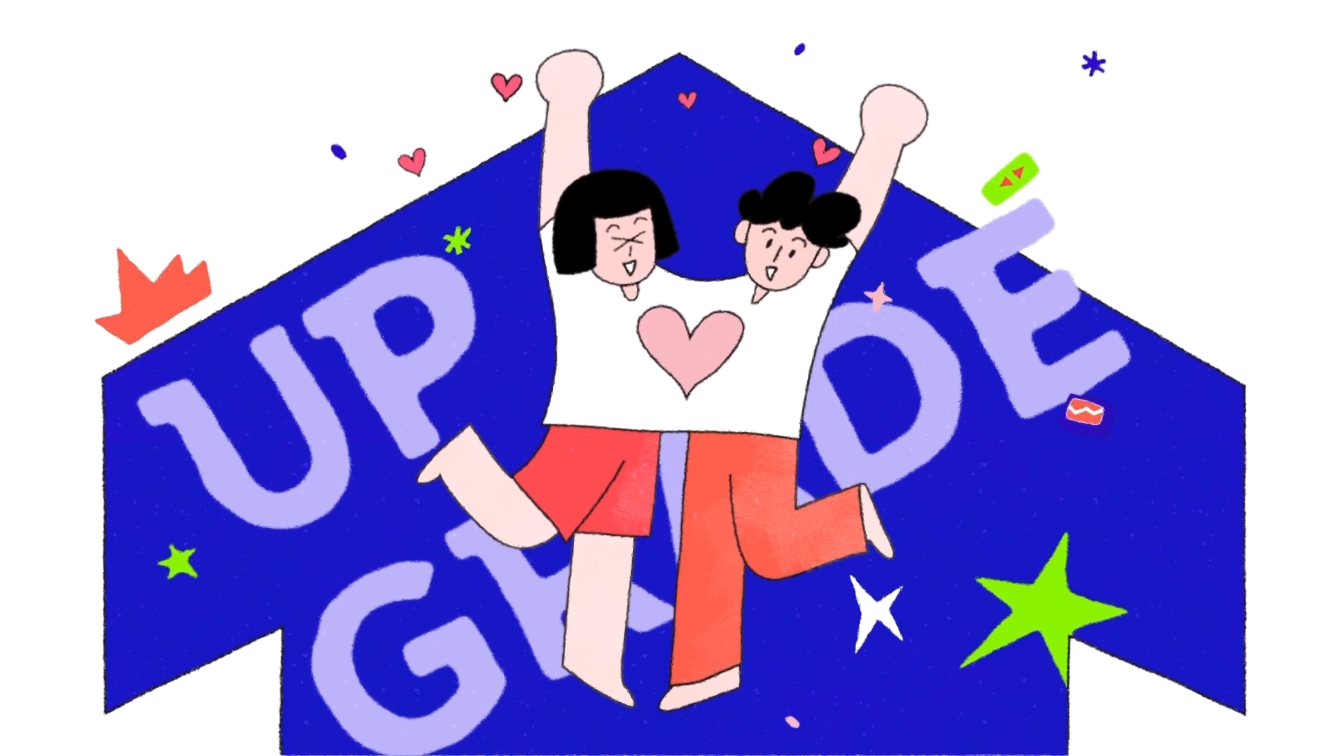
B tv AI Planner v4 - GIGA Internet Upgrade
B tv AI Planner v5 - GIGA Internet Upgrade
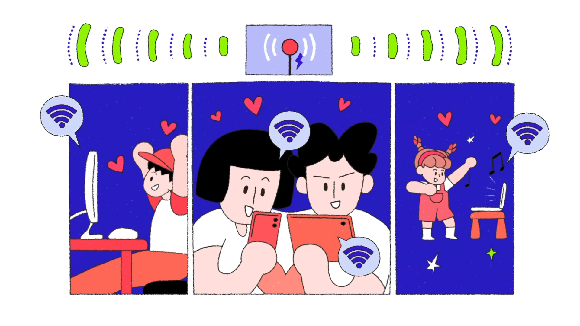
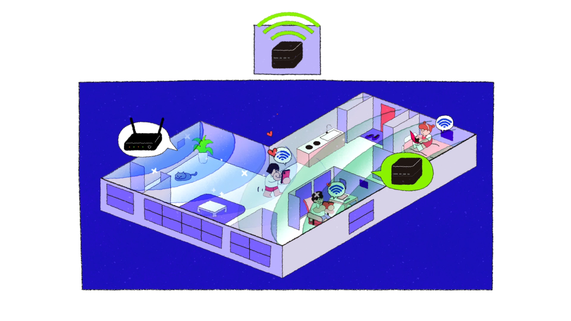
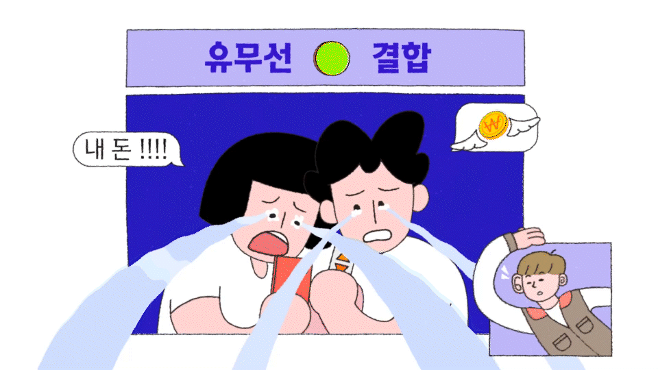
B tv AI Planner v6 - WIFI Wings
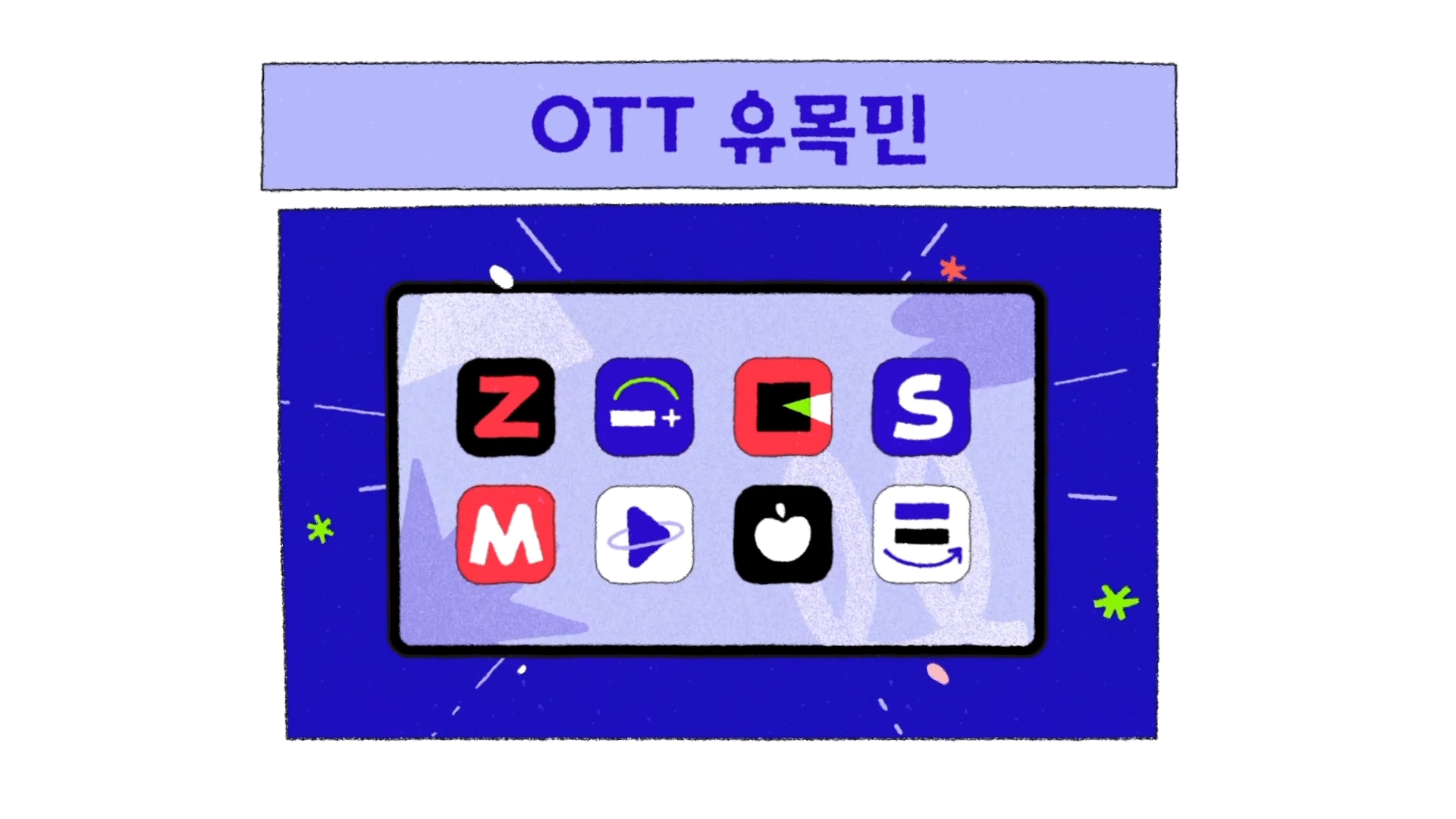
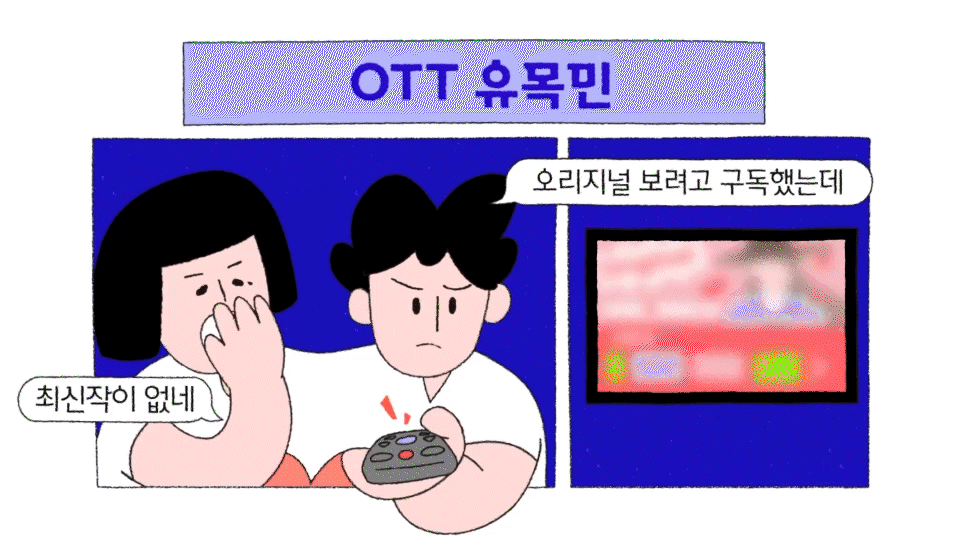
B tv AI Planner v7 - OTT Nomad
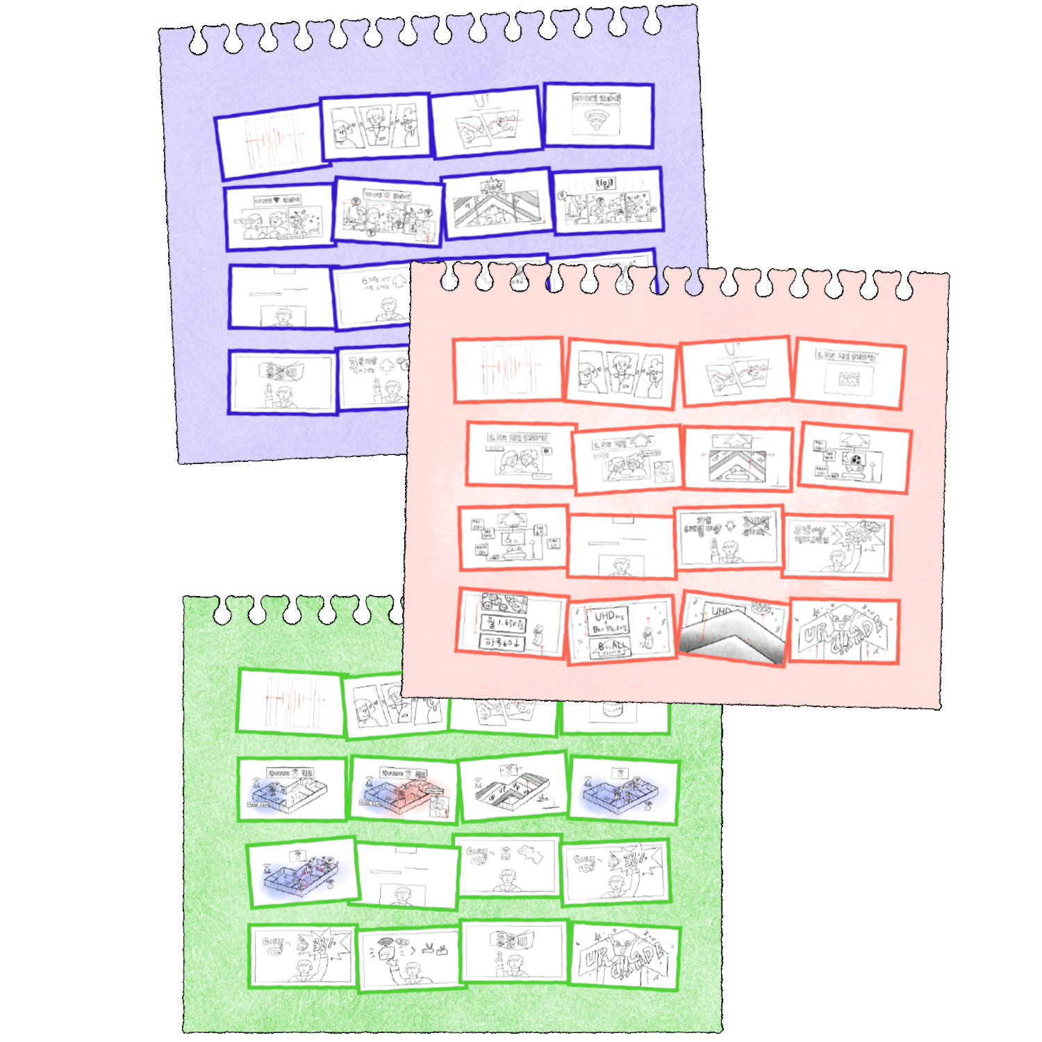
STORYBOARD
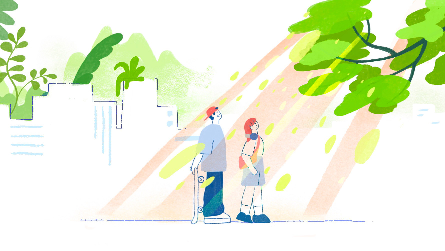
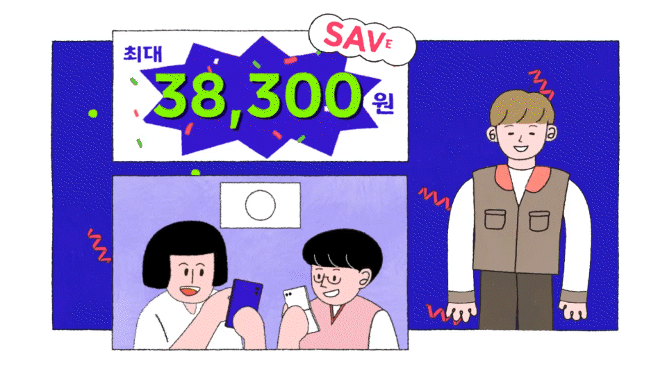
전체적인 스토리는 가정 내 커플과 가족을 중심으로 현실적인 인터넷 관련 문제와 해결책을 제시하는 짧은 이야기로 구성되었습니다. 고객이 지루함을 느끼지 않으면서도 자연스럽게 상품 설명까지 이어질 수 있도록 고민했으며, 각각의 버전에서 디자인적 통일감을 유지하면서도 적절한 변화를 주는 데 중점을 두었습니다.
The overall story revolves around realistic internet-related issues faced by couples and families at home, presenting practical solutions in short, engaging narratives. The key challenge was ensuring that the message was delivered in an entertaining and approachable way while maintaining a seamless transition into product explanations. Additionally, careful thought was given to balancing design consistency across versions while incorporating subtle variations.
CHARACTER DESIGN
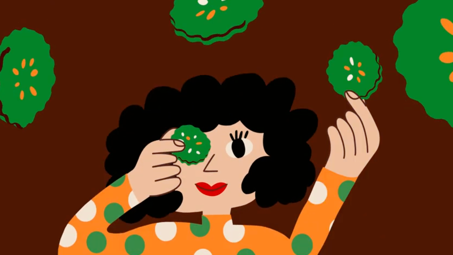
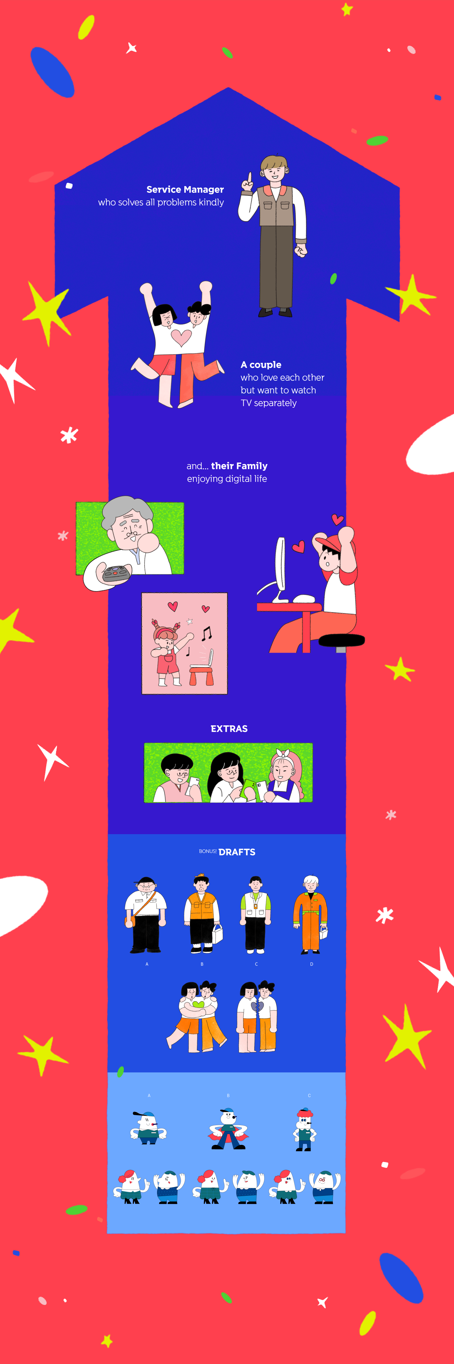
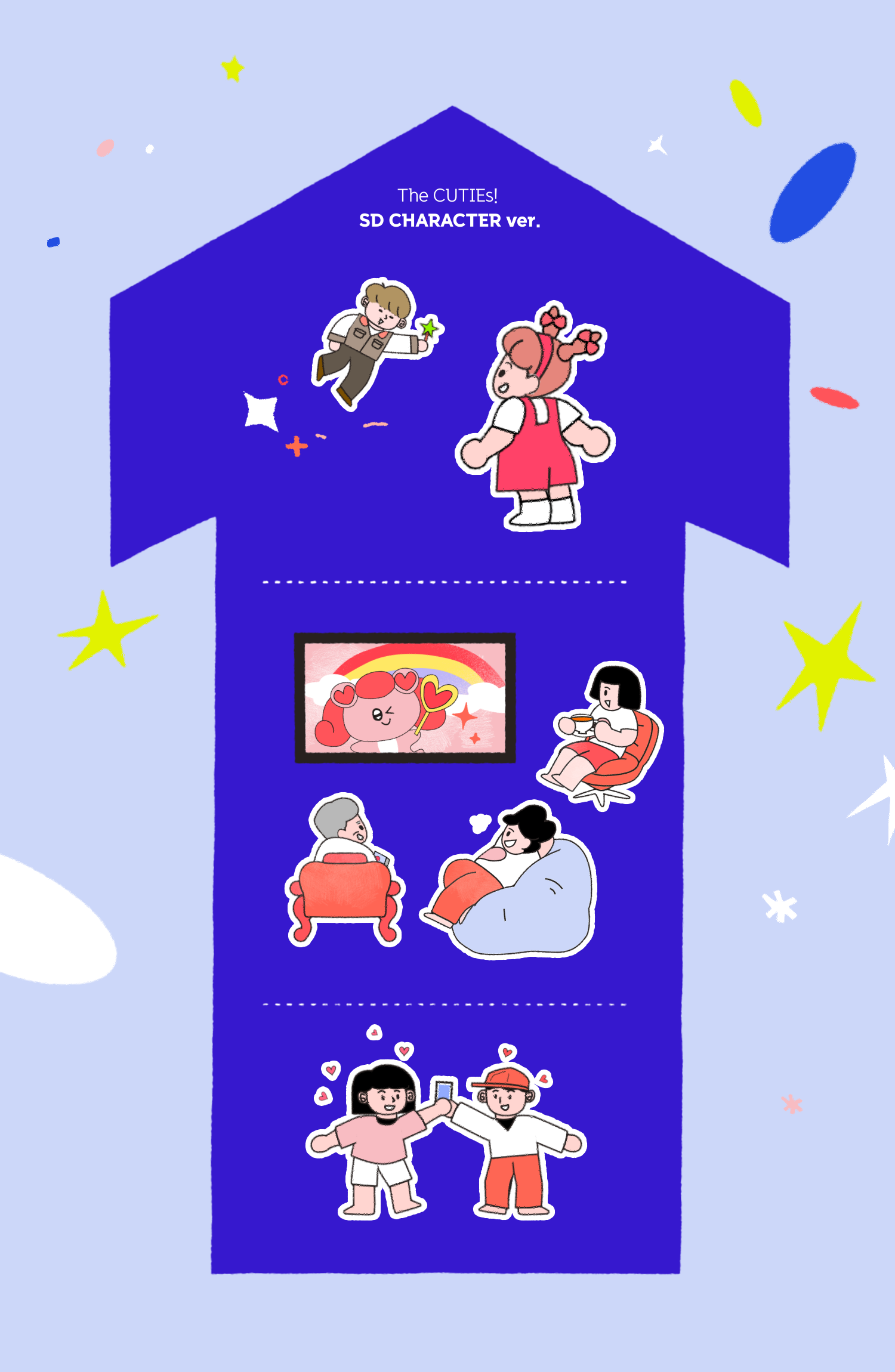
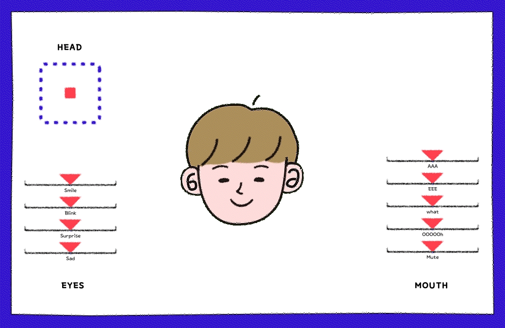
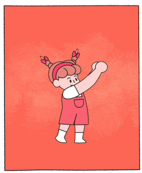
이 프로젝트에서 가장 중점을 둔 부분은 서비스 매니저 캐릭터 디자인입니다. 실제 서비스 매니저의 유니폼을 반영 하면서도 시각적인 흥미를 유지하는 것이 중요한 과제 였습니다. 여러 차례의 시도 끝에, 현실적인 착장을 구현 하면서도 친근한 인상을 주는 이목구비를 적용하고, 서비스 설명을 하는 자세를 흥미롭게 하기 위해 팔다리를 고무처럼 유연하게 디자인했습니다. 또한, 작은 크기로 응용될 경우에도 SD (Super Deformed) 비율을 활용해 원래의 인상을 유지하면서도 귀여운 이미지를 전달할 수 있도록 신경 썼습니다.
One of the most critical aspects of this project was the service manager character design. The key challenge was balancing a realistic uniform representation while maintaining visual appeal. After multiple design iterations, we successfully created a character with a friendly and approachable facial structure, flexible limbs for clearer service explanations, and an SD (Super Deformed) ratio to ensure that even at a smaller scale, the character retained its original impression while enhancing its cute and engaging appearance.
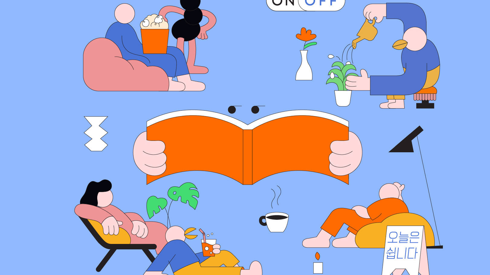
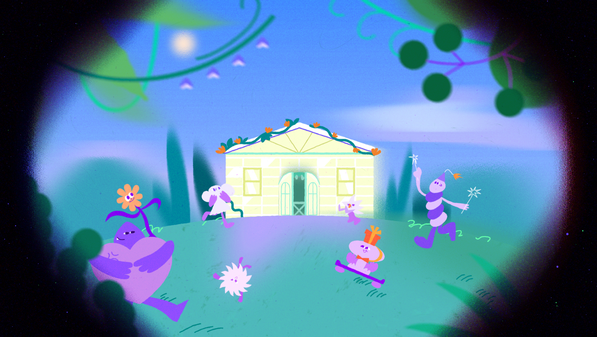
STYLEFRAMES
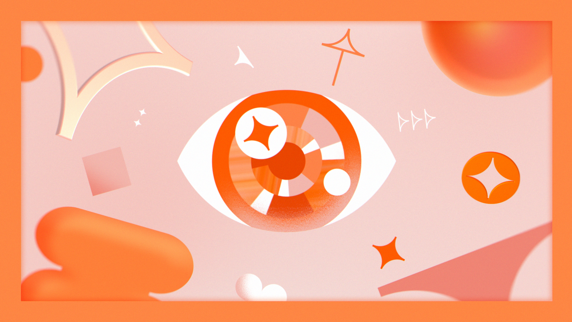
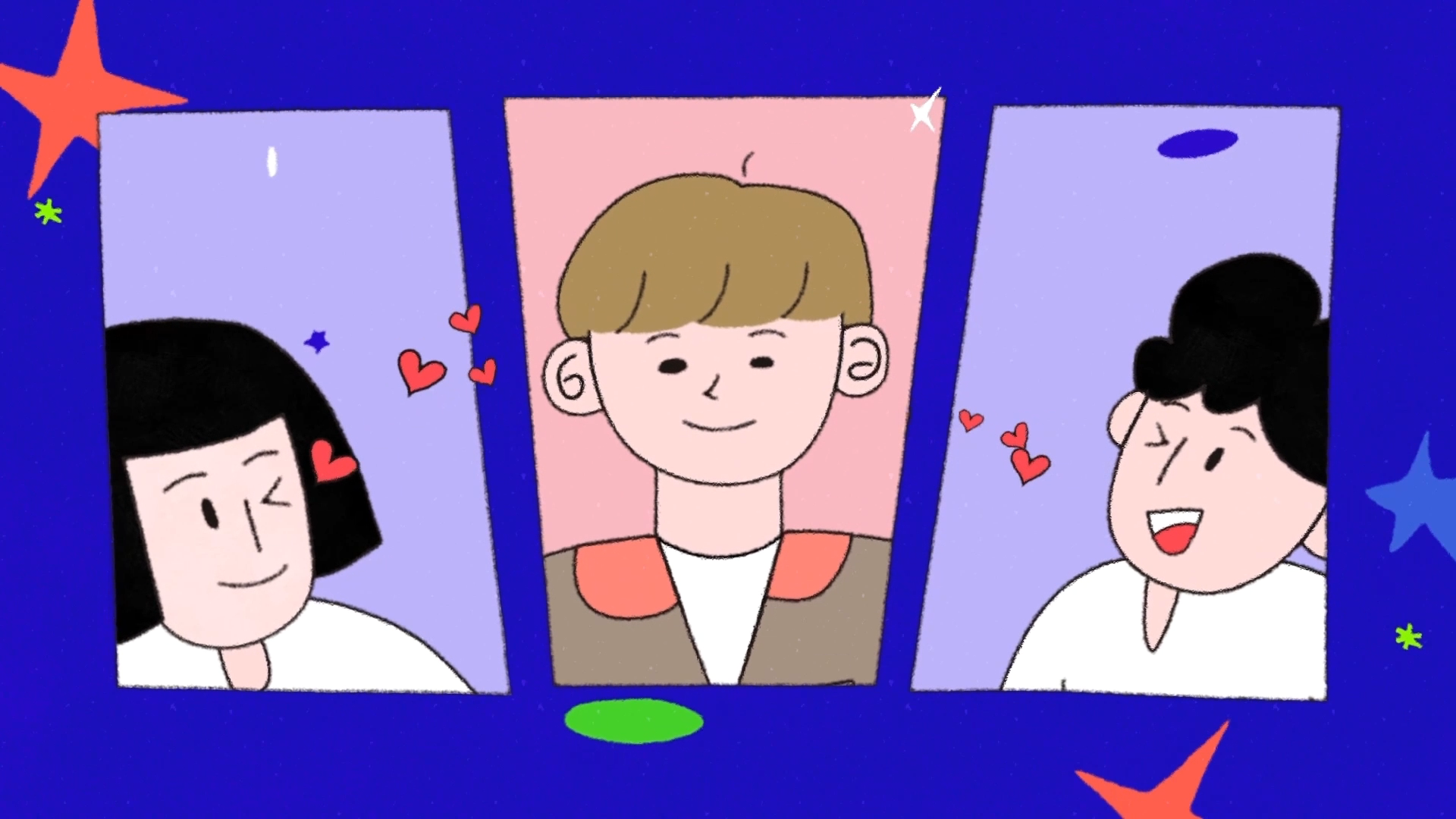
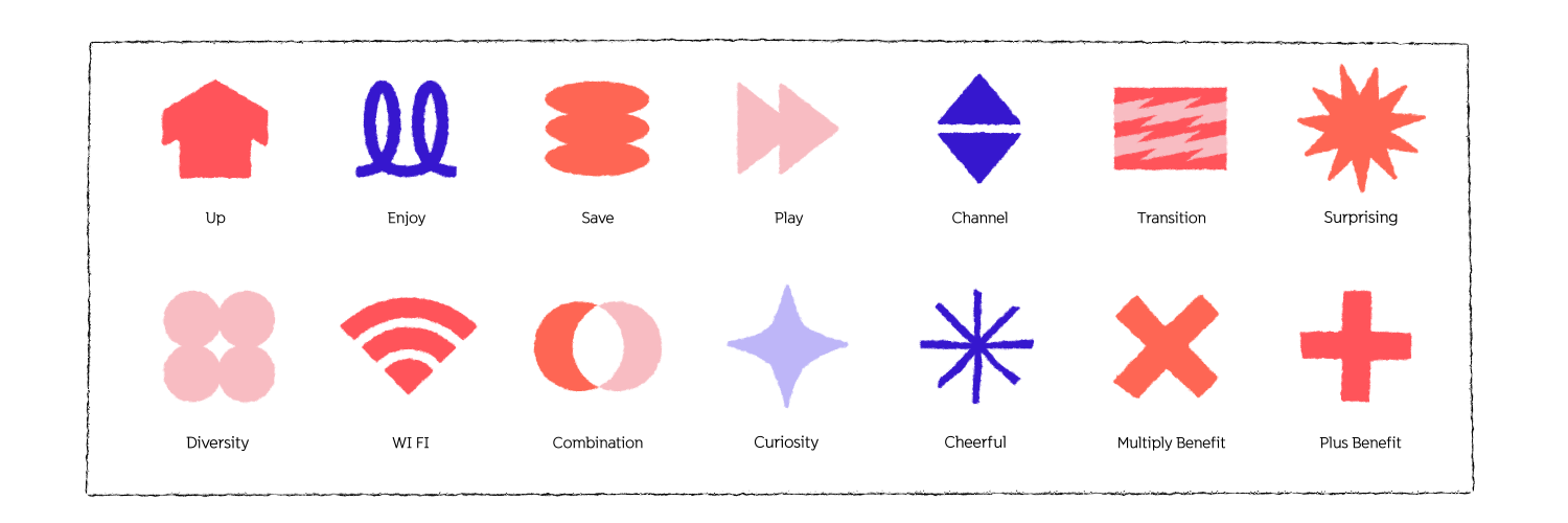
이번 프로젝트의 디자인 키 포인트는 핸드드로잉 느낌의 일러스트레이션과 한눈에 시선을 잡는 컬러 배합입니다. 브랜드 컬러를 기본으로 하되, 산뜻한 컬러 팔레트 안에서 제한된 색상을 활용하여 전체적인 통일감을 유지했습니다. 또한, 유동적으로 움직이는 프레임 디자인을 적용해 정돈된 레이아웃을 유지하면서도 시각적으로 혼란스럽지 않도록 조정했습니다. 인터넷 데이터와 정보 요소들은 그래픽적으로 도식화하여 트랜지션 및 디자인 모티브로 활용해 재미를 더했으며, 고객이 흥미를 느끼면서도 지나치게 만화적인 표현을 피하고 감도를 조절하여 적절한 밸런스를 유지했습니다.
The key design elements in this project are a hand-drawn illustration style and eye-catching color combinations. While based on the brand’s core colors, a fresh yet limited color palette was used to maintain a cohesive look. A dynamic frame composition ensured structured layouts that remained visually clear and engaging. Internet data and information were graphically stylized and integrated into transitions and design motifs, adding an element of fun while ensuring a seamless flow. The character design was carefully balanced to keep the visuals engaging without becoming overly cartoonish or monotonous.
ANIMATIONS
쉽고, 명료하면서도 흥미롭게! 애니메이션의 디테일은 트랜지션과 동작 애니메이션에 집중하였으며, 전체적인 통일된 포맷을 구축하는 데 많은 시간을 투자했습니다. 또한, 귀여운 엘리먼트들은 자칫 스킵될 수 있는 제품 정보를 더욱 흥미롭게 전달하며, 시청자의 시선을 효과적으로 유도하는 역할을 했습니다.
Simple, clear, and engaging! The animation details focused on transitions and motion animation, while significant time was dedicated to establishing a cohesive format. Additionally, cute design elements played a crucial role in making product information more engaging, ensuring that key details were not easily skipped by viewers.
Face Rigging
Character Animation


Symbol Design
Title Motion

Elements Animation
ENJOY ANIMATIONS!


CREDIT
Release : 2024
Client : SK Broadband
Project Manager : Seunghee Kang
Production : Willo
Creative Director: Jisun Kim
Managing, Storyboard : Jisun Kim
Design Planning : Jisun Kim, Saemi Park, SookYoung Ahn
Character Design, Lead Designer : Saemi Park
Character Proposal : Saemi Park, SookYoung Ahn
Style Frames : Saemi Park, SookYoung Ahn, Heejin Choi
Animation : Jisun Kim, Saemi Park, SookYoung Ahn, Heejin Choi, Chiara D'Ambrosio
Sound Designer : Chang-gyu Choi
Voice Recording : W Sound
Voice : Jihyung Ha
THANKS FOR WATCHING!