
OVERVIEW
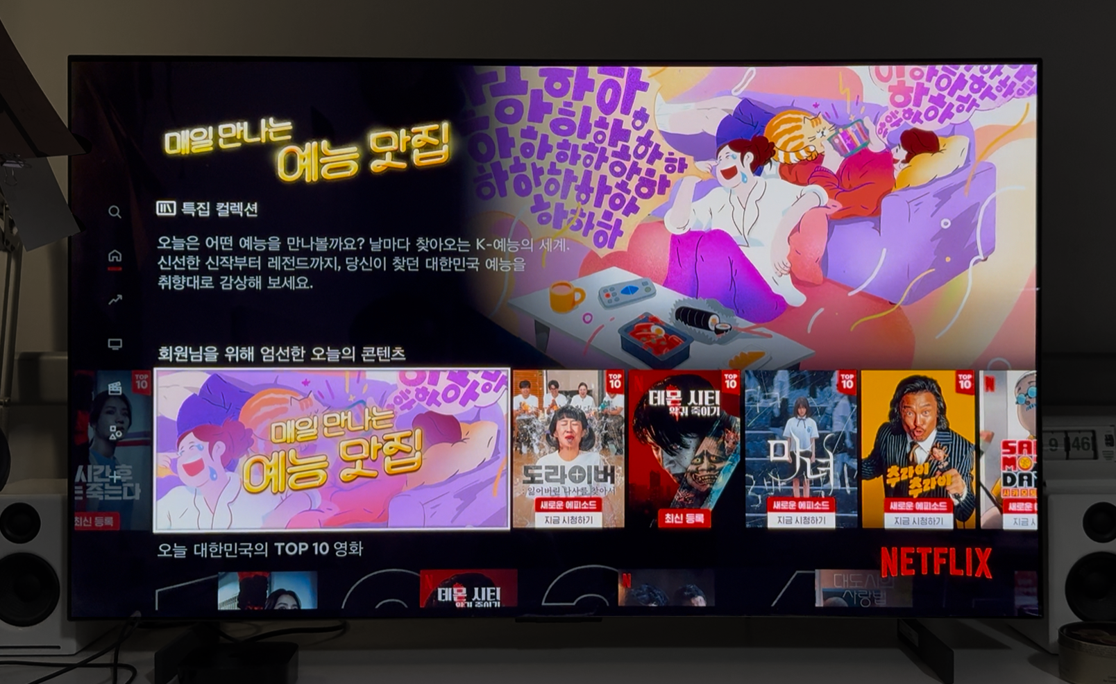
WILLO는 넷플릭스 코리아 예능 카테고리의 대표 이미지 아트워크를 디자인했습니다. 본 프로젝트는 예능 콘텐츠 카테고리의 얼굴이자, 넷플릭스 사용자에게 한국 예능의 첫 인상을 전달하는 핵심 시각물로서, 특정 출연자를 강조하기보다 한국 예능이 전달하는 공통된 ‘웃음의 온도’와 리듬에 집중해 시각화했습니다. 또한, 한국 시청자 특유의 시청 습관과 감각을 반영하여, 플랫폼 내에서 로컬 콘텐츠의 정체성을 자연스럽게 드러내는 디자인 솔루션으로 완성되었습니다.
WILLO designed the key artwork for Netflix Korea’s variety category page. Serving as the visual entry point for Korean variety content, this artwork was created to convey a broad sense of humor and rhythm unique to the genre, rather than spotlighting any specific show or personality. The design focuses on expressing the shared “temperature of laughter” and flow found across Korean variety shows, while also incorporating the viewing habits and emotional sensibilities specific to Korean audiences. The result is a visual identity that naturally blends local character with global platform clarity.
KEYWORDS & DRAFT DESIGNS
시청자의 첫인상에 해당하는 시각 콘텐츠인 만큼, 넷플릭스 코리아는 ‘예능’의 핵심 감정인 직관적이고 유쾌한 웃음이 명확히 드러나는 아트워크를 원했습니다. 이에 WILLO는 두 가지 키워드를 중심으로 초기 컨셉을 제안 했습니다 :
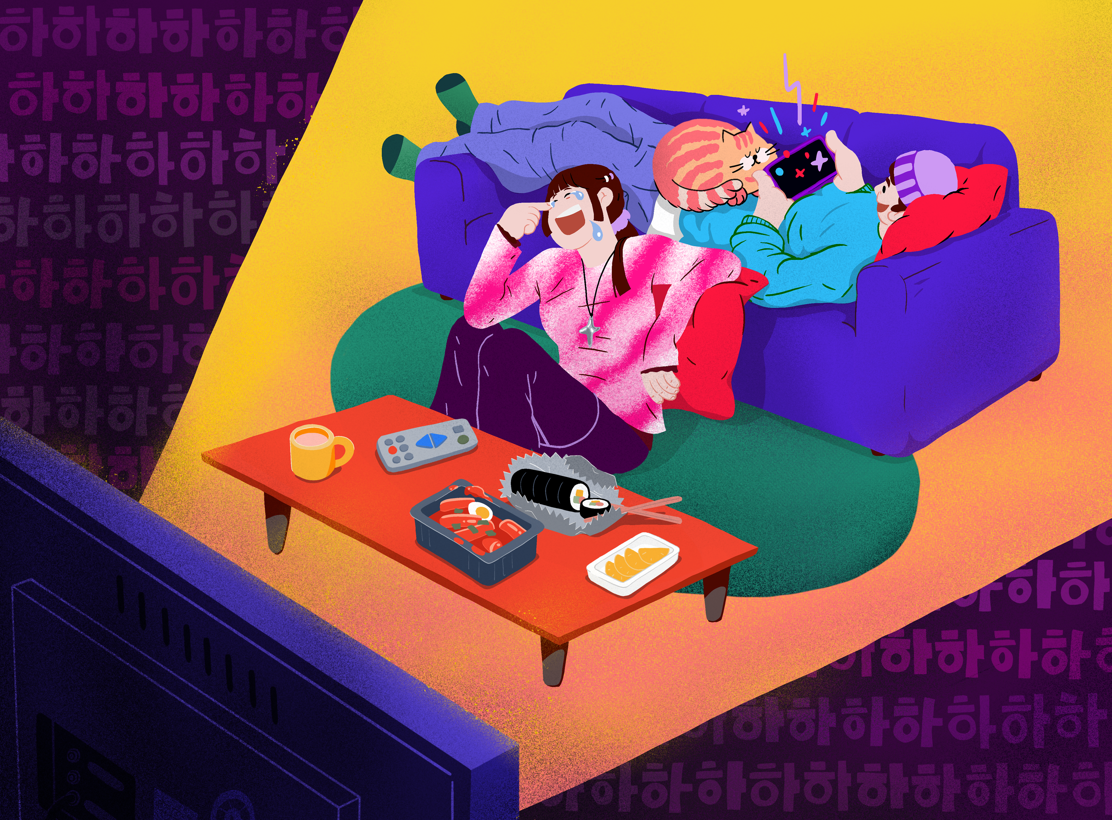
A. 소파에 누워 편하게 즐기는 ‘카우치 포테이토’
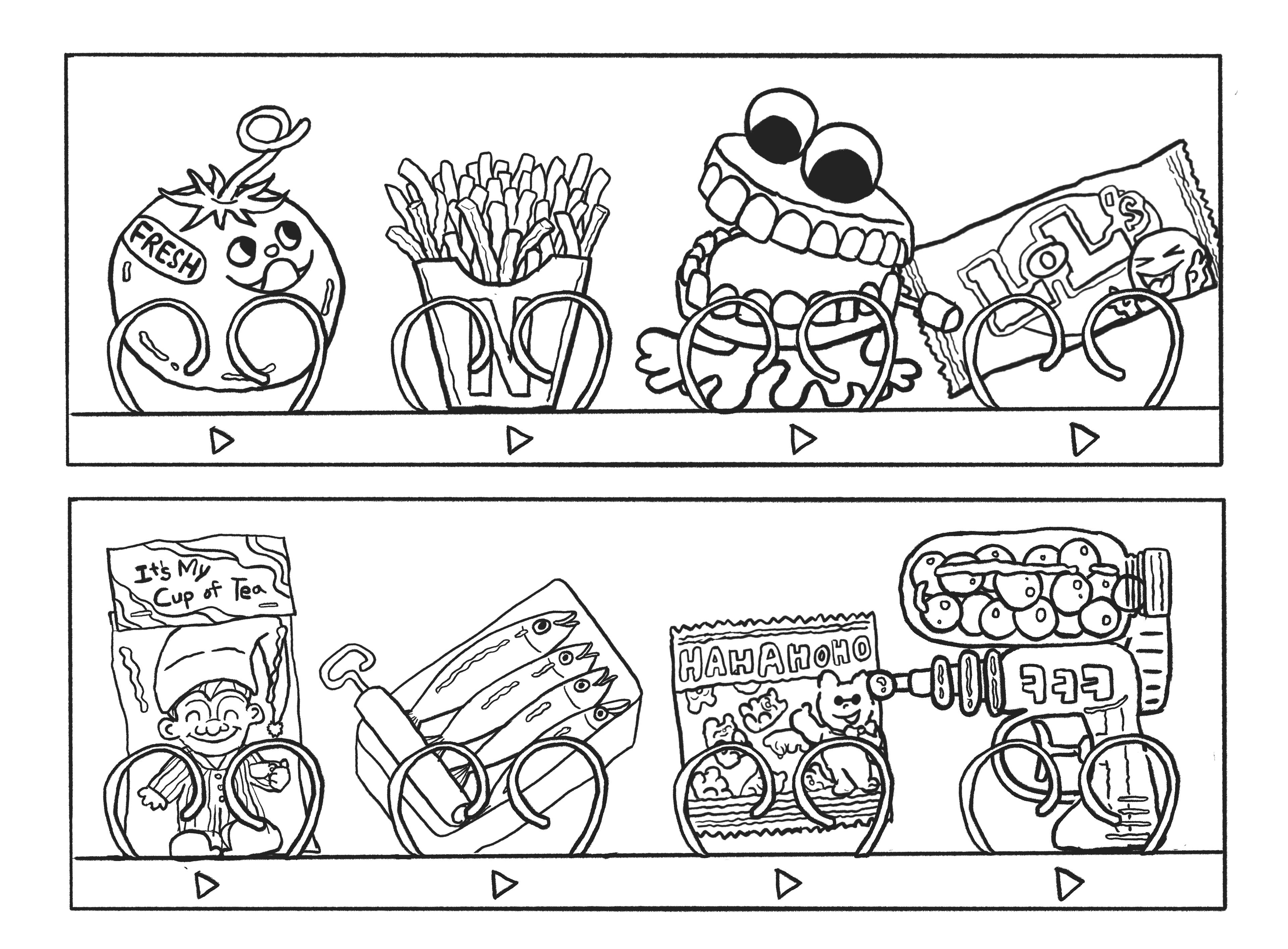
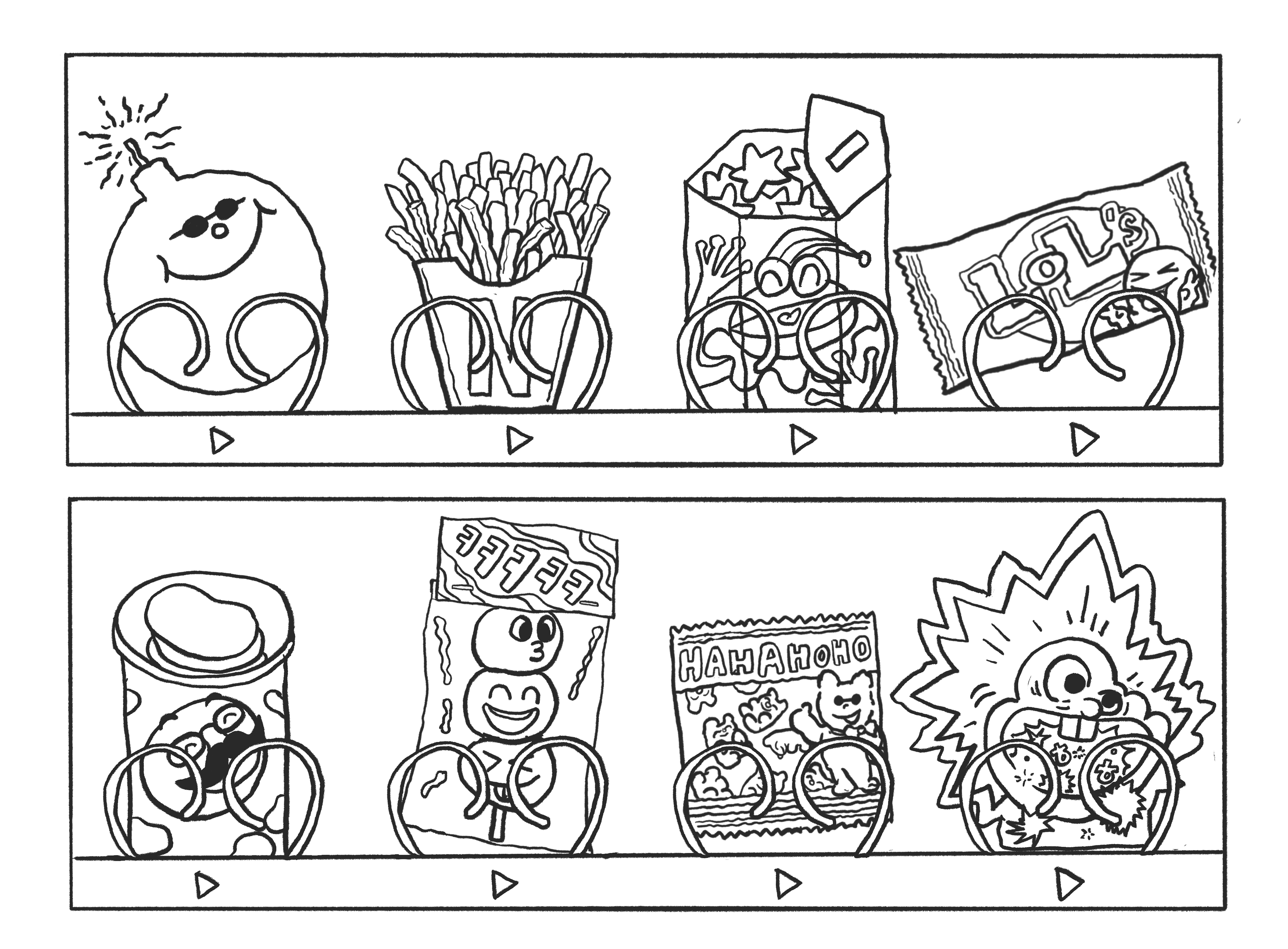
B. 명랑하고 다양한 귀여움을 담은 ‘스낵 자판기’
이 중 시청자와의 공감이 쉬운 ‘카우치 포테이토’ 컨셉이 우선 채택 되었지만, 해당 개념이 다소 미국적인 뉘앙스를 갖고 있다는 점에서 클라이언트는 한국인의 고유한 시청 습관을 반영한 로컬 무드의 컨셉 전환을 요청했습니다.
Since this artwork serves as a viewer’s first impression of the category, Netflix Korea emphasized the need to express a clear, cheerful sense of humor—the core of Korean variety shows. WILLO suggested two initial directions :
A. A “Couch Potato” concept evoking comfort and ease,
B. A “Snack Vending Machine” concept filled with bright, quirky charm.
Among them, the Couch Potato concept—built around everyday relatability—was initially chosen. However, as the term carries a distinctly Western nuance, Netflix requested a shift toward something more culturally relevant to Korean viewing habits.
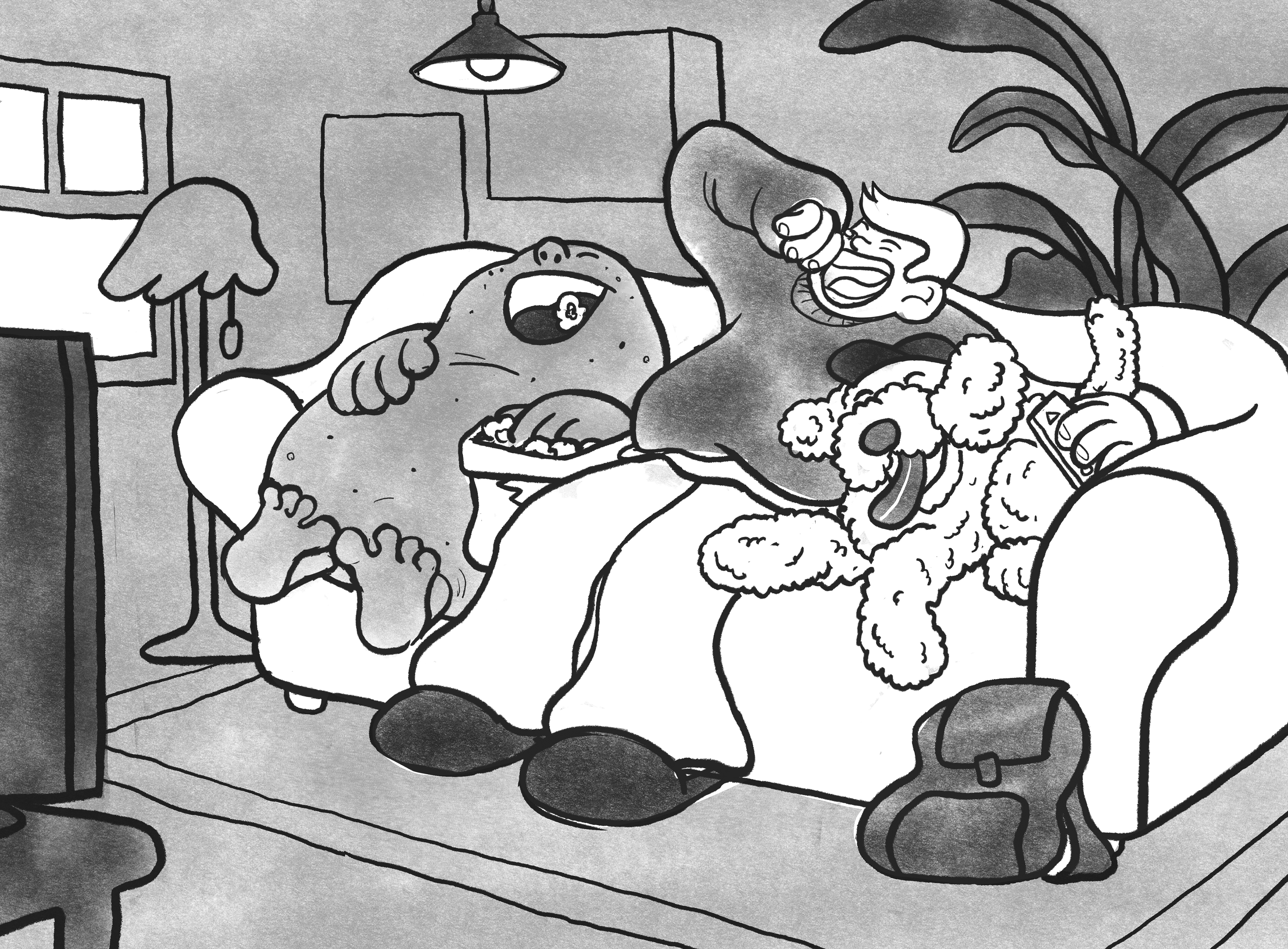
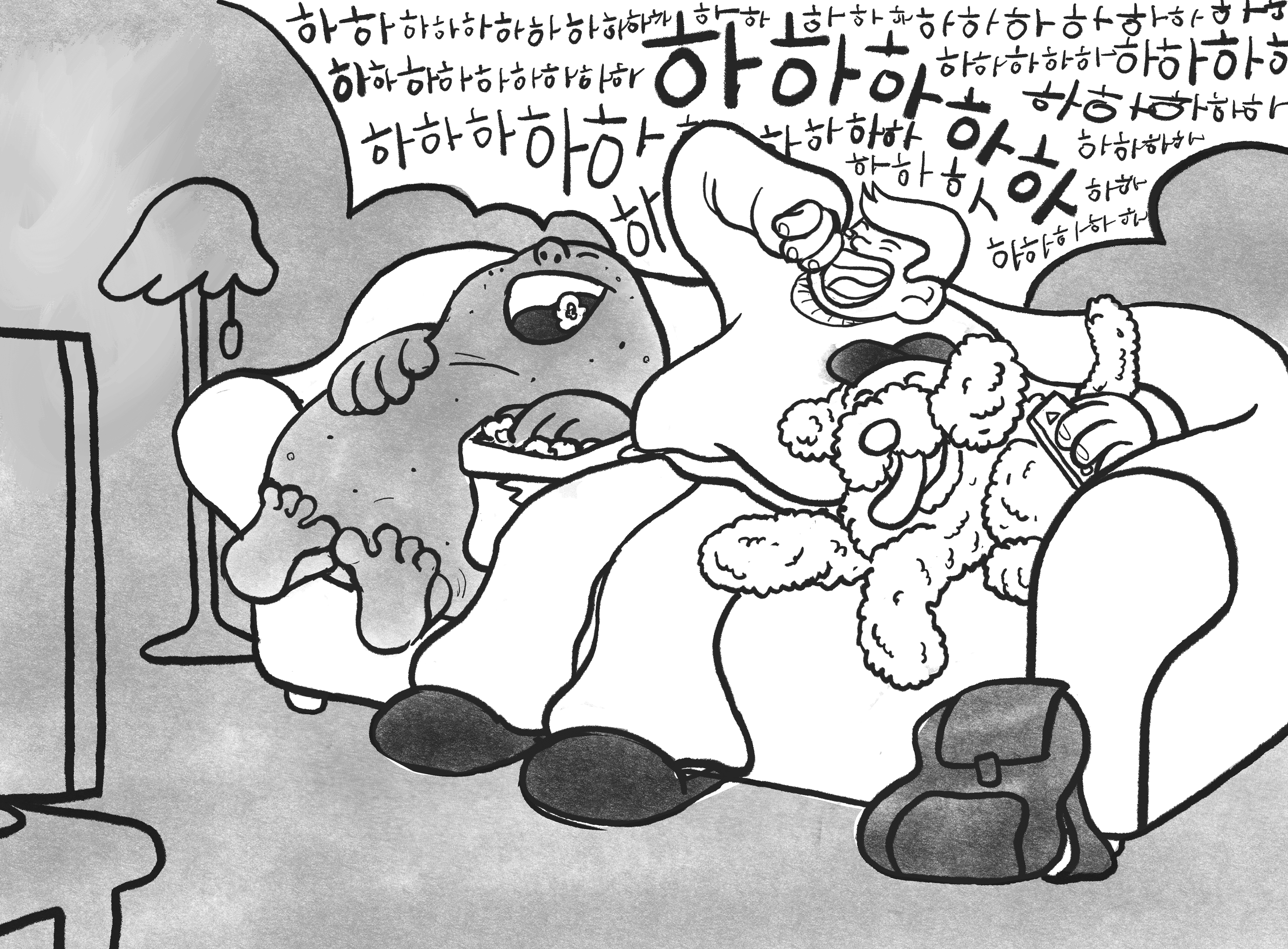
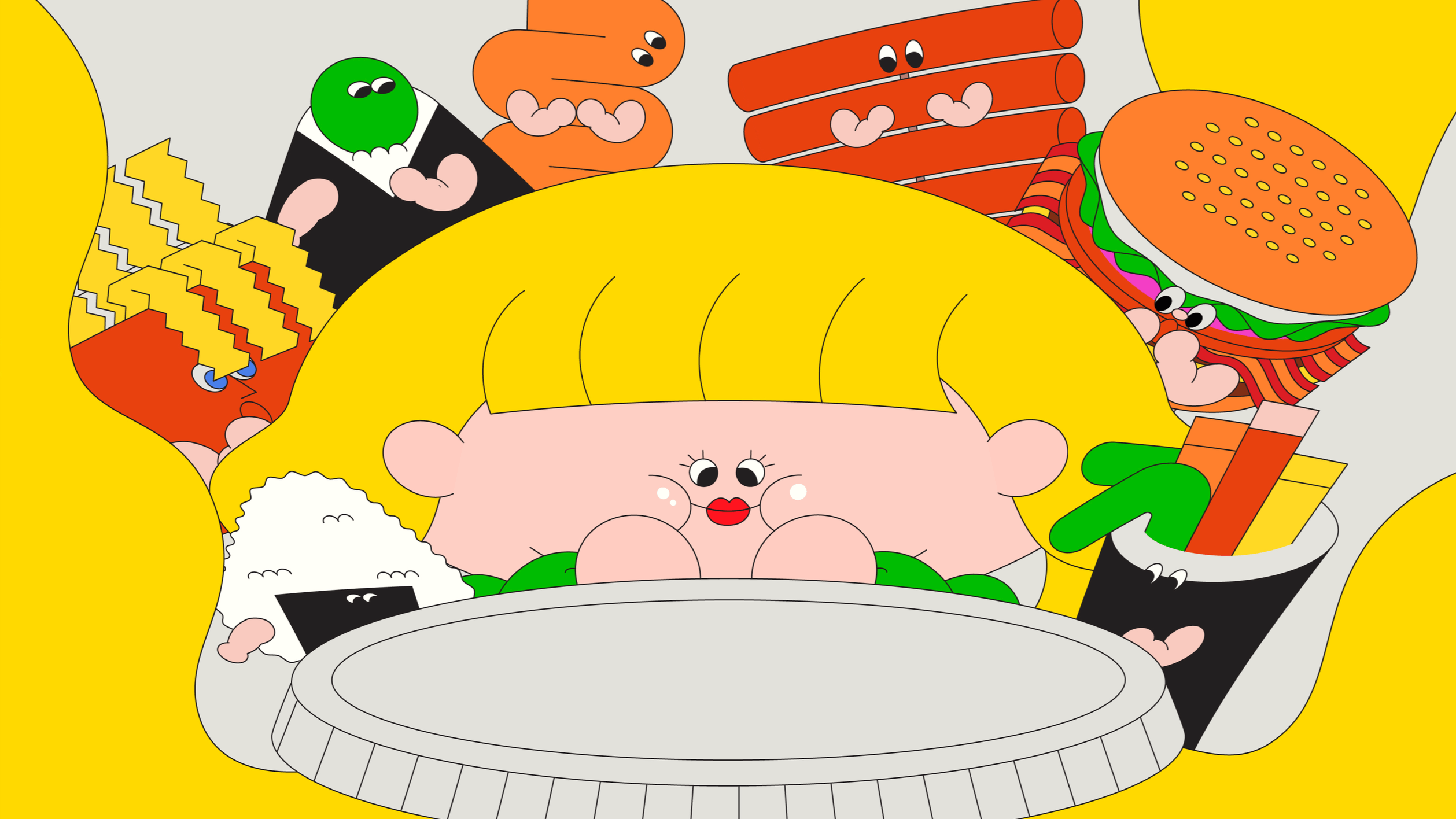
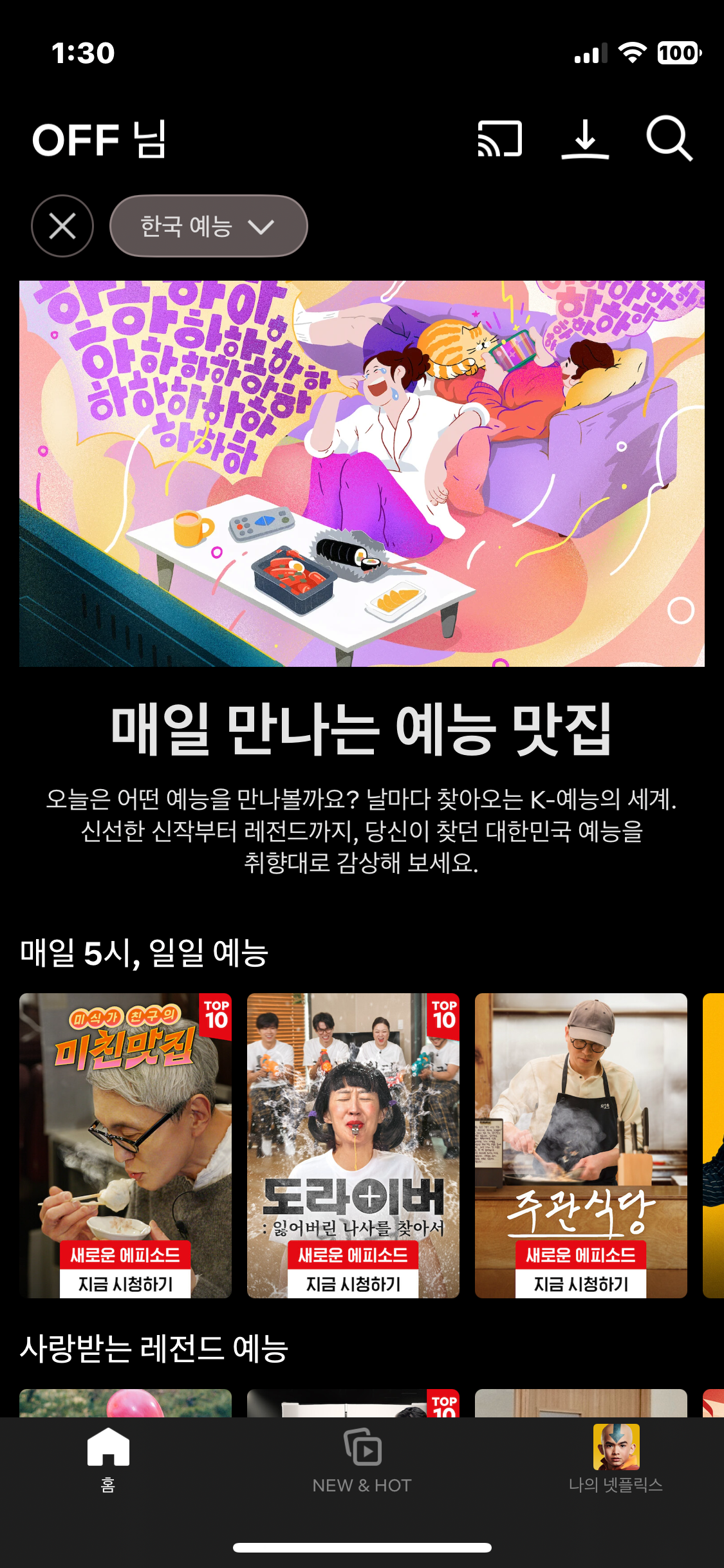
그 결과, TV 앞 밥상과 함께하는 ‘밥친구’ 콘셉트의 아트워크가 최종 선택되었습니다. 이는 한국 시청자들이 식사와 함께 예능을 즐기는 생활방식을 유쾌하게 담아낸 방향으로, 누구나 공감할 수 있는 로컬 감성 기반의 시각 언어로 완성되었습니다.
This led to the creation of the “Meal Buddy” concept, which reflects the familiar Korean routine of watching variety shows while eating in front of the TV. The final artwork embraces this everyday experience, forming a localized visual identity that’s warm, friendly, and instantly recognizable.
작은 디테일, 근데 꼭 곁들여야 할 "Small but significant detail"
작지만 중요한 디테일은 한국 시청자들이 콘텐츠를 소비하는 물리적 자세에서 드러납니다.
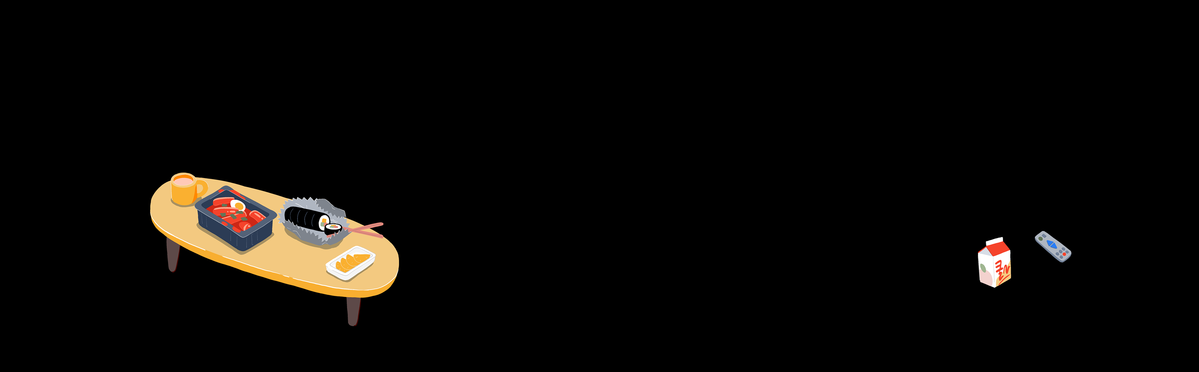
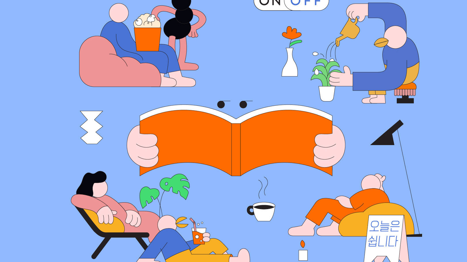
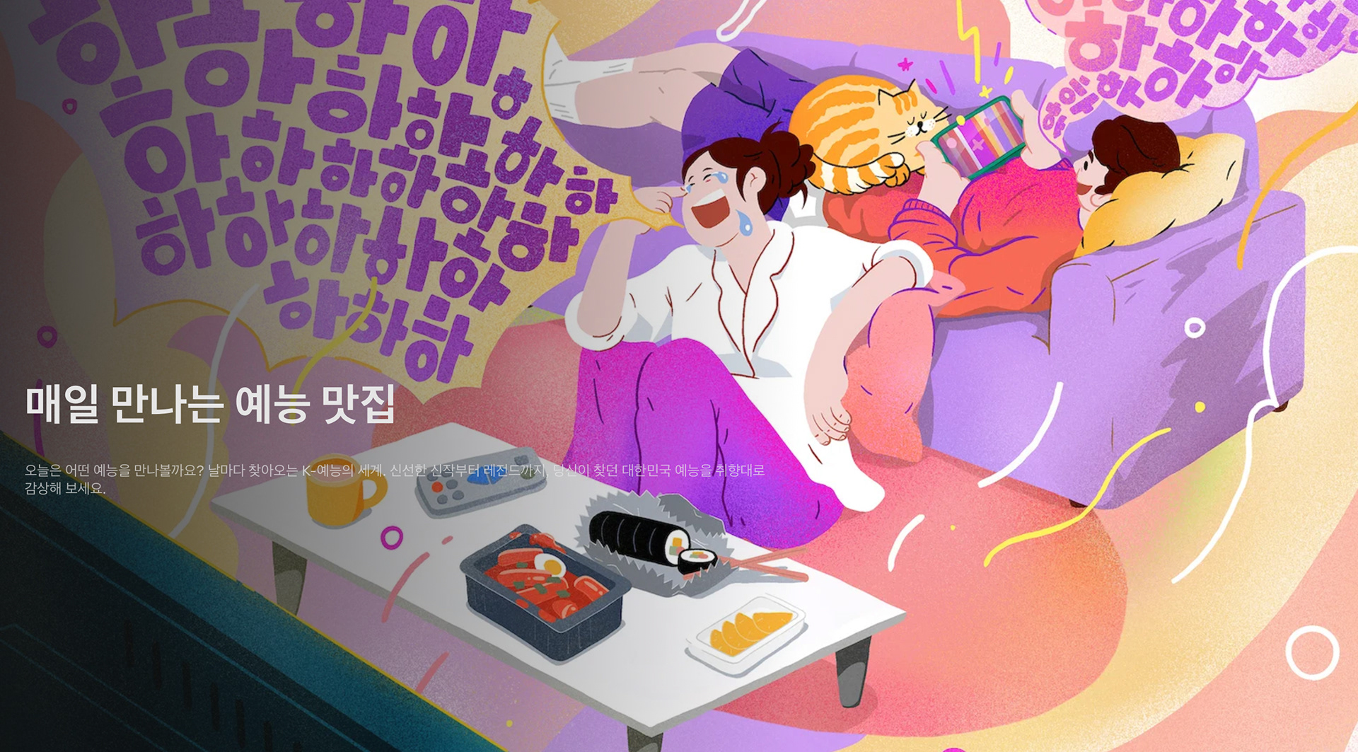
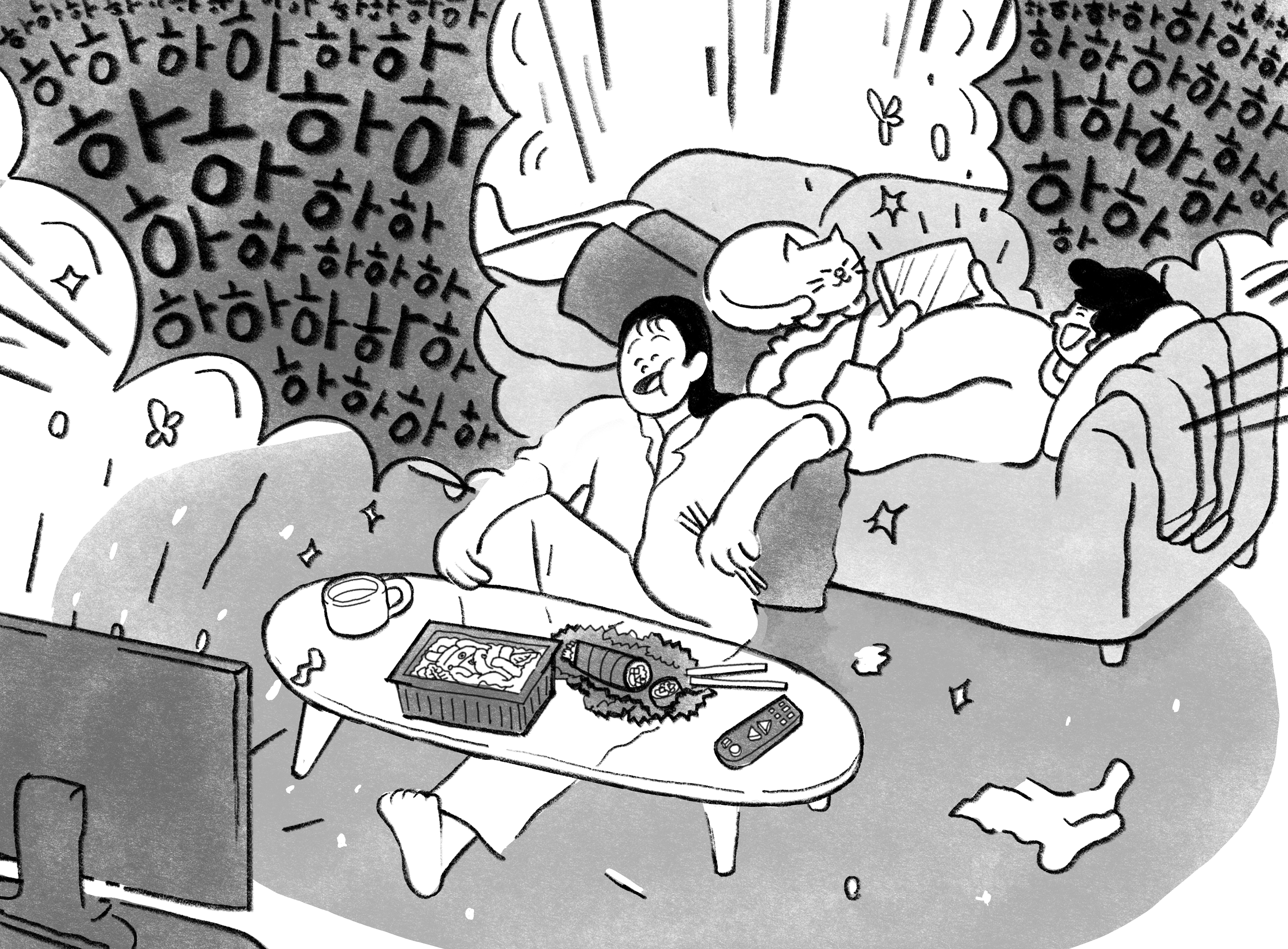
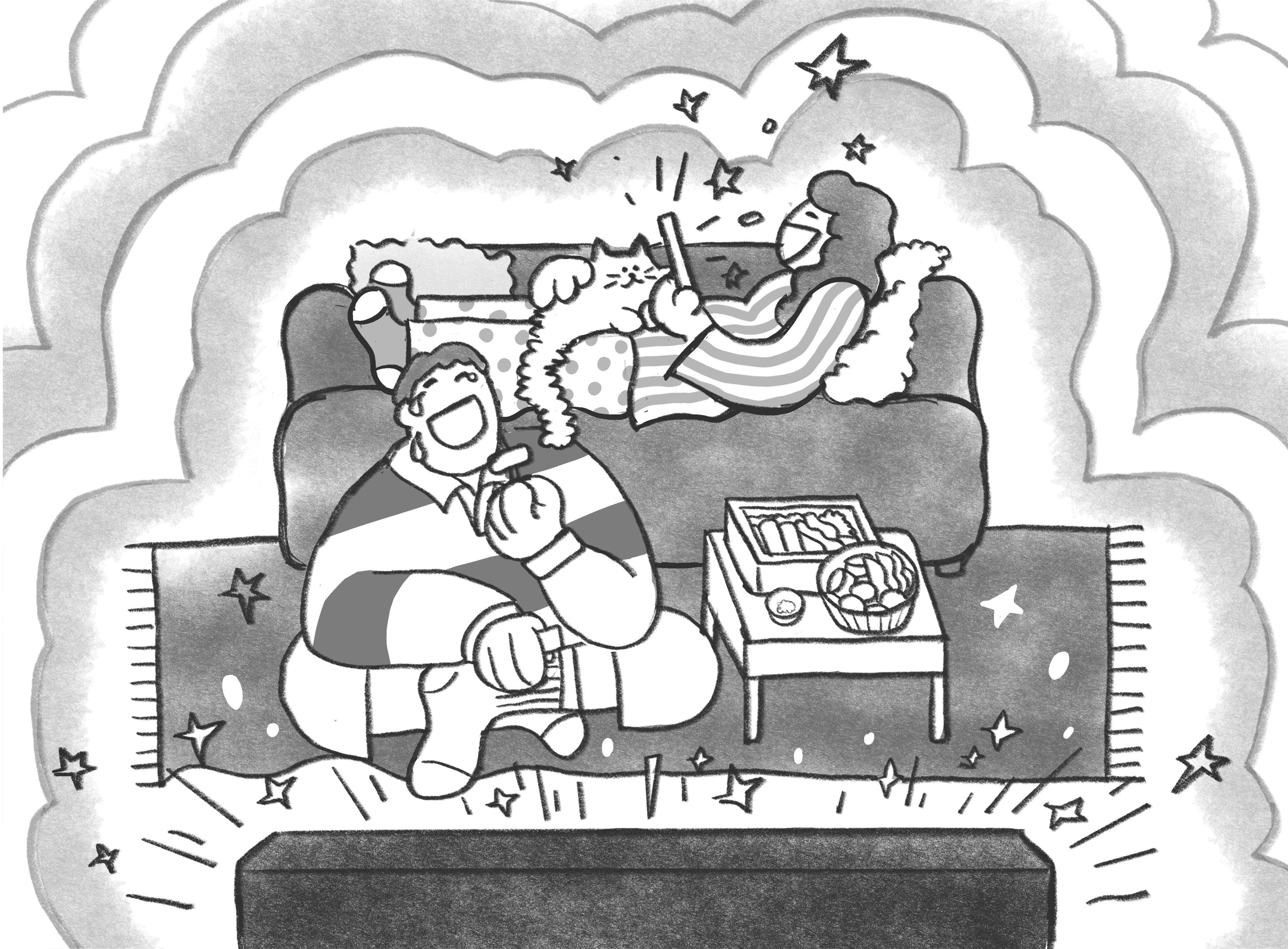
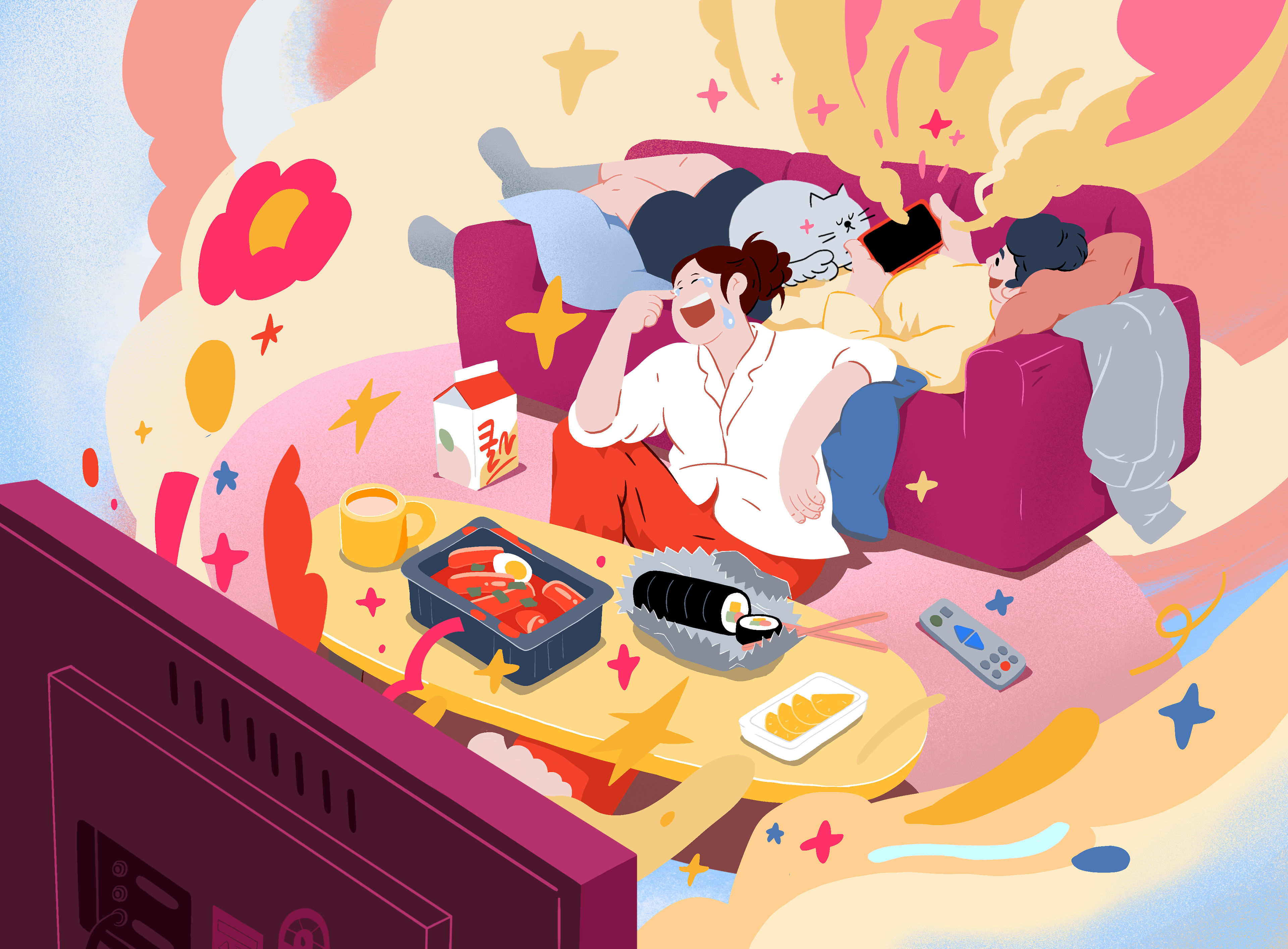
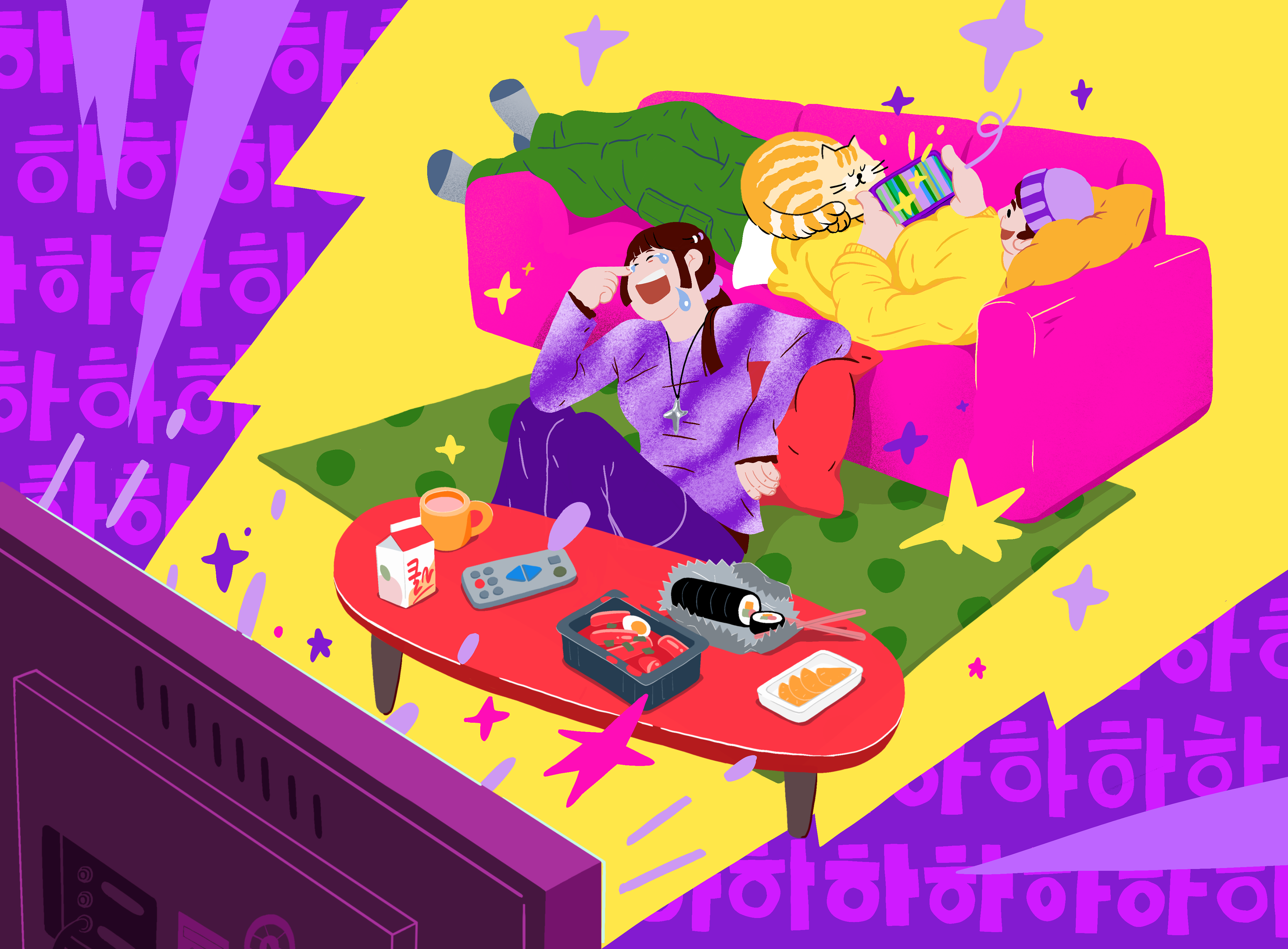
외국인들이 보기엔 다소 낯설고 재미있게 느껴질 수 있지만, 소파에 앉기보다 바닥에 앉아 소파를 등받이로 사용하는 습관은 한국에선 너무나 자연스러운 모습입니다. 떡볶이와 김밥을 먹으며 TV를 보거나, 누운 자세로 모바일 콘텐츠를 보는 모습까지—이러한 아주 일상적인 장면들이 오히려 핵심적인 시청 경험으로 작용합니다. 한국인에겐 익숙하고 당연한 장면이지만, 외부 시선에선 친근하고 인상적인 문화적 특징으로 받아들여질 수 있기에, 이번 아트워크에서 꼭 담고자 했던 중요한 포인트였습니다.
외국인들이 보기엔 다소 낯설고 재미있게 느껴질 수 있지만, 소파에 앉기보다 바닥에 앉아 소파를 등받이로 사용하는 습관은 한국에선 너무나 자연스러운 모습입니다. 떡볶이와 김밥을 먹으며 TV를 보거나, 누운 자세로 모바일 콘텐츠를 보는 모습까지—이러한 아주 일상적인 장면들이 오히려 핵심적인 시청 경험으로 작용합니다. 한국인에겐 익숙하고 당연한 장면이지만, 외부 시선에선 친근하고 인상적인 문화적 특징으로 받아들여질 수 있기에, 이번 아트워크에서 꼭 담고자 했던 중요한 포인트였습니다.
A small but significant detail lies in how Korean viewers physically engage with their screens. While many foreigners find it amusing or curious, it’s common in Korea to use the sofa as a backrest, sitting on the floor rather than on the sofa itself. This visual nuance—eating tteokbokki and kimbap in front of the TV, using the sofa as support, then lying down to watch mobile content afterward—felt essential to capture. For Korean audiences, it’s just part of daily life. But for others, it's a charming cultural detail that adds authenticity and relatability to the scene.
DESIGN PROPOSALS
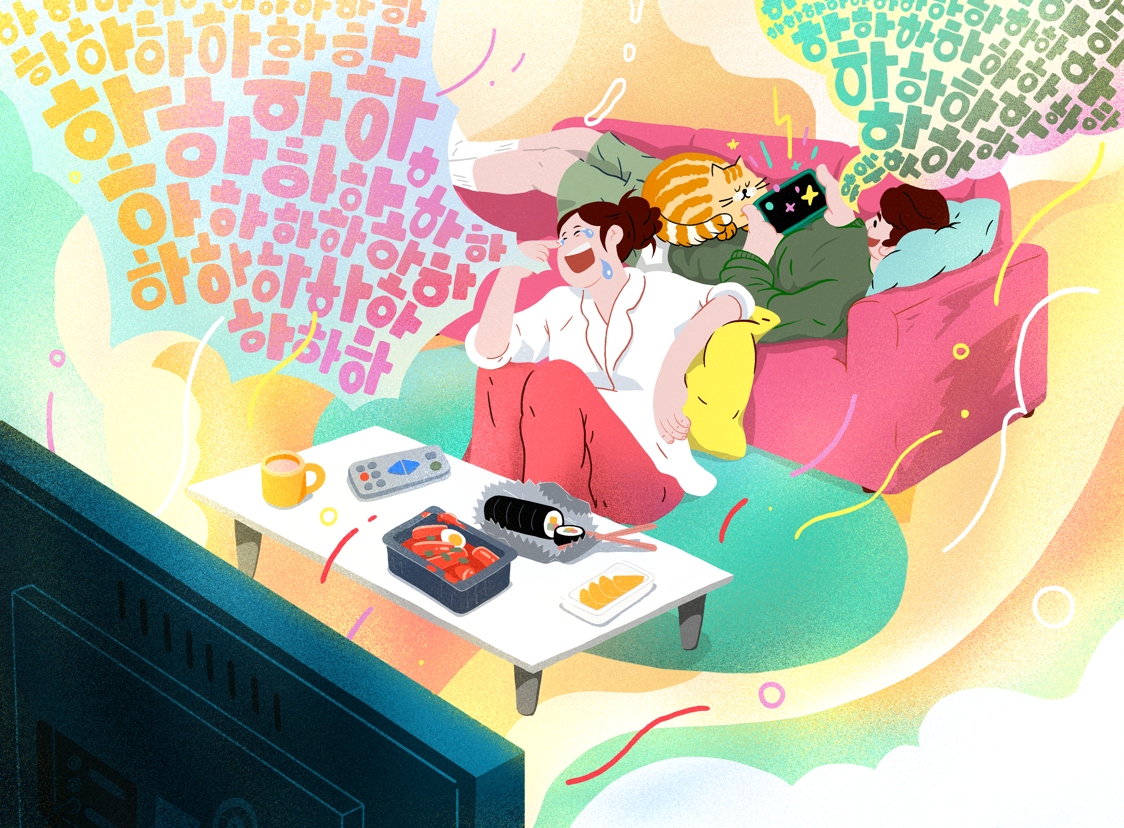
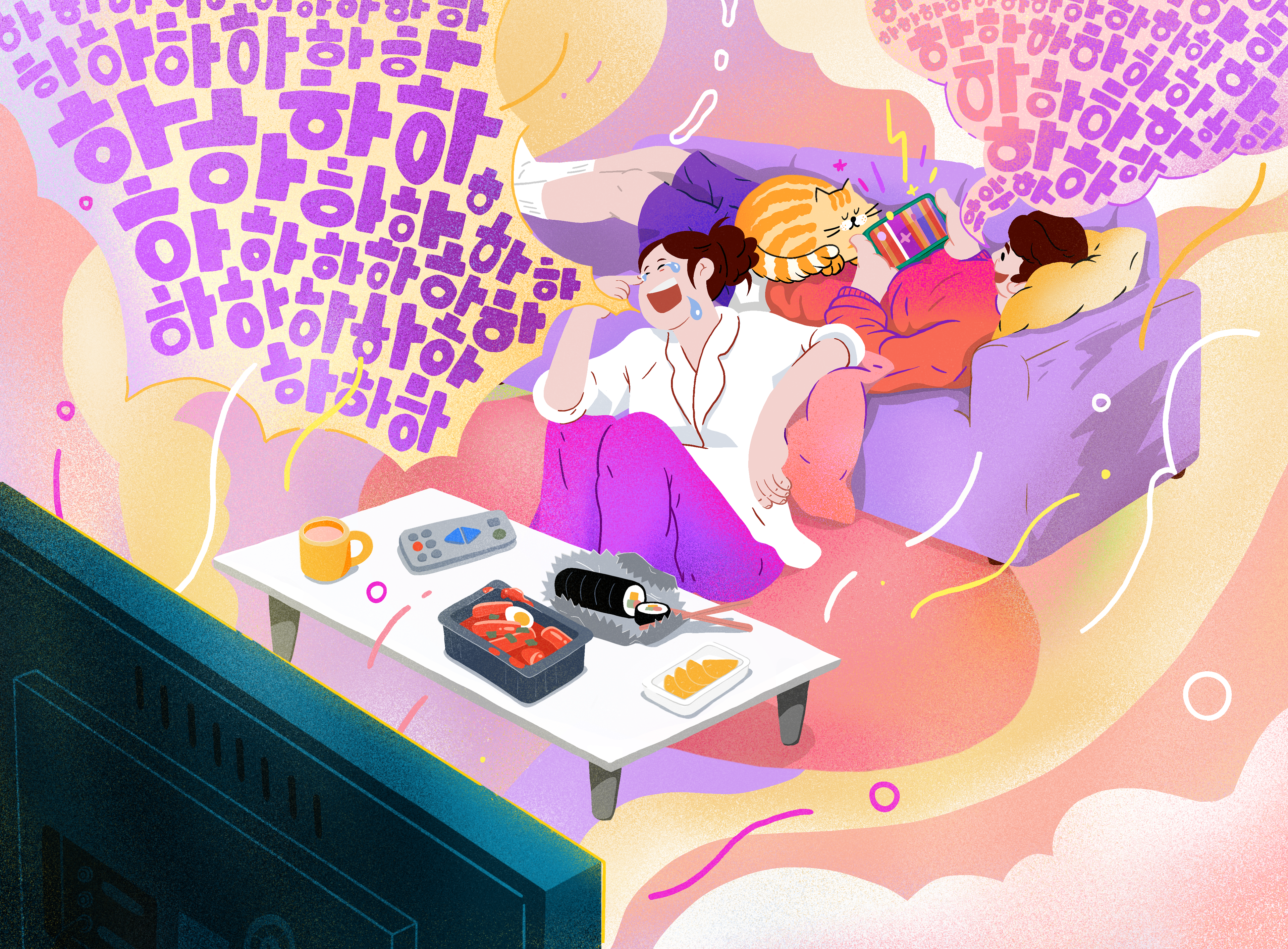
편안하고 현실적인 분위기의 유쾌한 ‘밥친구’ 컨셉을 시각적으로 구현하기 위해, 단순한 형태감과 현실적인 비율을 반영한 캐릭터, 그리고 만화적 구성의 웃음 말풍선을 적극적으로 레이아웃에 활용했습니다. 화면 전체를 가득 채우는 웃음소리처럼, 공간감과 청각적 상상을 유도하는 구성이 주요한 포인트였습니다. 컬러 또한 디자인 무드에 있어 핵심적인 역할을 했습니다. 다양한 컬러 배리에이션을 시도한 끝에, 가장 화려하면서도 따뜻한 인상을 주는 시안이 최종적으로 선택되었습니다. 마지막으로, 시청 경험과 맞닿은 요소인 ‘음식’은 지나치게 강조되기보다 분위기를 살리는 역할로 설정했습니다. 그래서 한국인의 소울푸드인 김밥과 떡볶이를 작고 자연스럽게 배치하여, 시선 흐름을 방해하지 않으면서도 공감을 불러일으킬 수 있도록 표현했습니다.
To bring the warm, relatable feeling of the “Meal Buddy” concept to life, we used characters with simplified shapes and realistic proportions, along with comic-style speech bubbles filled with laughter, actively integrated into the layout. The goal was to create a synesthetic experience, where the entire screen feels filled with sound—as if laughter is echoing through the space. Color also played a key role in setting the overall mood. We explored a range of palettes, and the most vibrant yet warm-toned direction was ultimately selected to emphasize brightness and approachability. Finally, food—an essential part of the Korean viewing experience—was included as a subtle, supporting detail rather than a focal point. Gimbap and tteokbokki, beloved Korean soul foods, were gently placed to evoke familiarity without overwhelming the composition.
FINAL OUTPUT
CREDIT
Release : Netflix, 2025
Client : Netflix Korea
Project Manager : Gin Kim, Yewon Kim
Production : Willo
Creative Director : Jisun Kim
Design Planning, Illustration : Jisun Kim
Food illustration Clean up : Sookyoung Ahn
TV illustration Clean up : Soomin Han