
OUTLINE
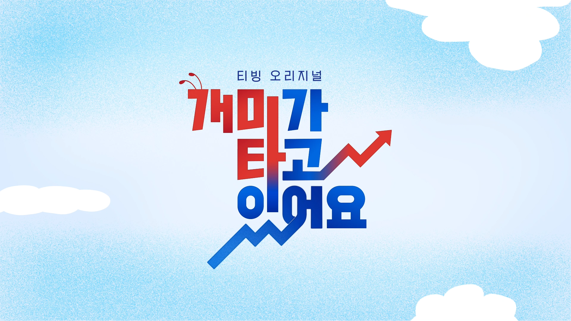
2022년, TVING의 주식 예능 드라마 〈개미가 타고있어요〉의 타이틀 패키지를 디자인했습니다. 예능의 유쾌함과 드라마의 서사를 결합한 OTT 콘텐츠로, 투자 초보들의 현실감 있는 이야기를 시각화했습니다. 로고, 오프닝 타이틀, 트랜지션 등 종합적인 방송용 그래픽을 WILLO만의 위트로 구성했습니다.
We designed the title package for Stock Struck, a finance-themed comedy drama series on TVING, Korea’s OTT platform. Blending reality-based humor with emotional storytelling, the show follows five quirky beginners navigating the stock market. WILLO created the full visual package—logo, title sequence, and transitions—infused with playful, character-driven motion.
FINAL OUTPUT
LOGO DESIGN
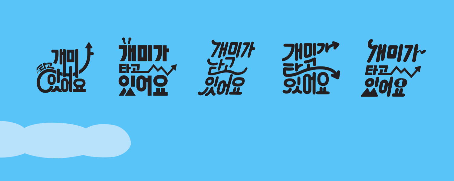
로고 디자인에서는 주식이라는 소재가 가진 상승과 하락의 감정 기복을 시각적으로 담아내는 데 집중했습니다. 주가 그래프의 흐름, 레드와 블루의 수치 변화, 그리고 투자에 참여하는 ‘개미’들의 메타포를 적용하여 드라마의 중심 정서를 로고에 녹여냈습니다.
너무 진지하거나 무거워 보이지 않으면서도, 단순한 예능 톤으로 흐르지 않도록 중간 지점을 유지하는 균형 잡힌 디자인을 목표로 했습니다.
너무 진지하거나 무거워 보이지 않으면서도, 단순한 예능 톤으로 흐르지 않도록 중간 지점을 유지하는 균형 잡힌 디자인을 목표로 했습니다.
The logo design reflects the emotional ups and downs of investing—mirroring the show’s stock-themed narrative.
Inspired by market graphs, fluctuating red-and-blue visuals, and a subtle metaphor of the small “ant” investor,
we aimed to express the theme without leaning too far into drama or comedy. Striking the right balance between seriousness and playfulness was key.
Inspired by market graphs, fluctuating red-and-blue visuals, and a subtle metaphor of the small “ant” investor,
we aimed to express the theme without leaning too far into drama or comedy. Striking the right balance between seriousness and playfulness was key.

Final Logo Design
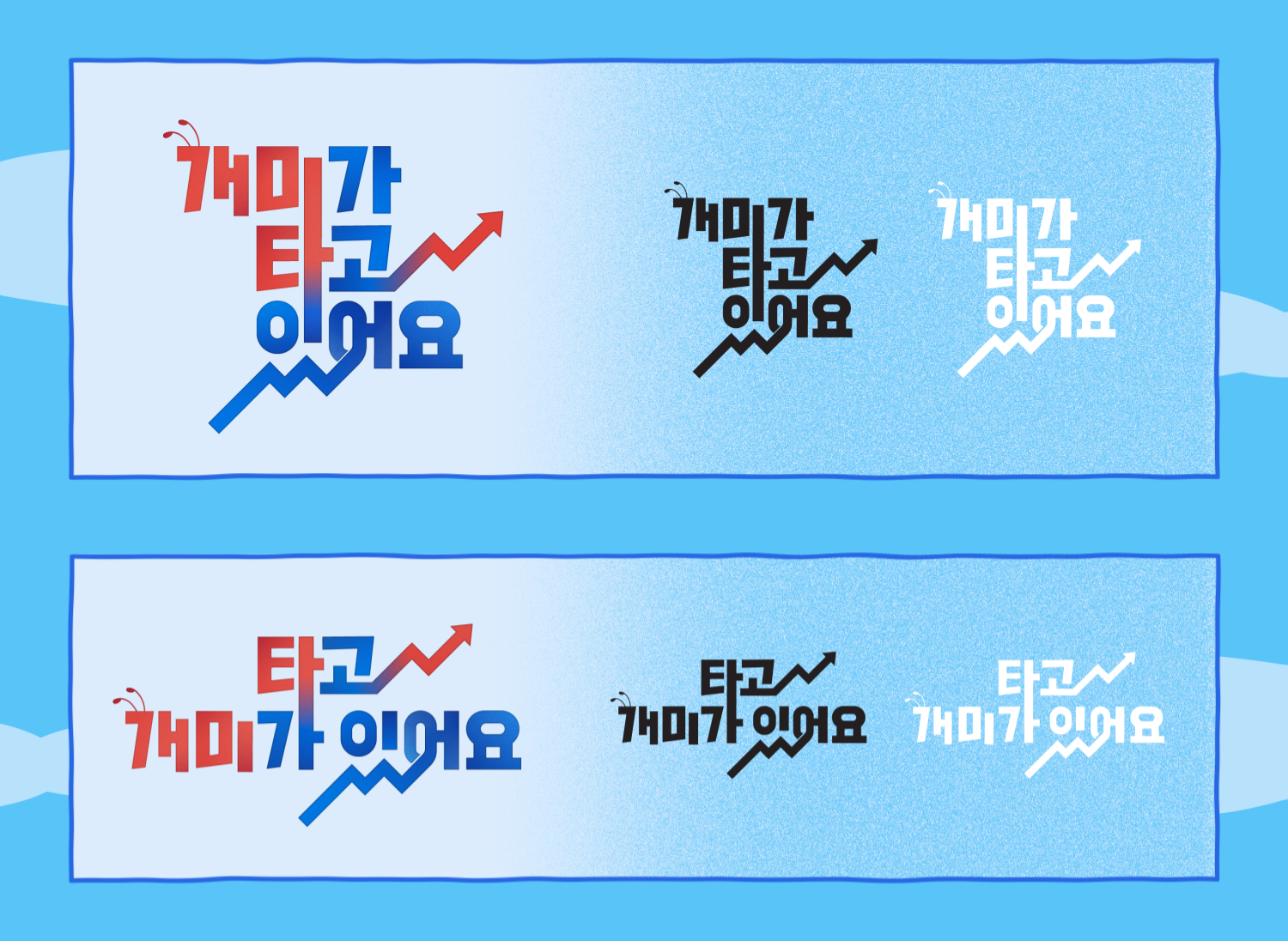
Draft
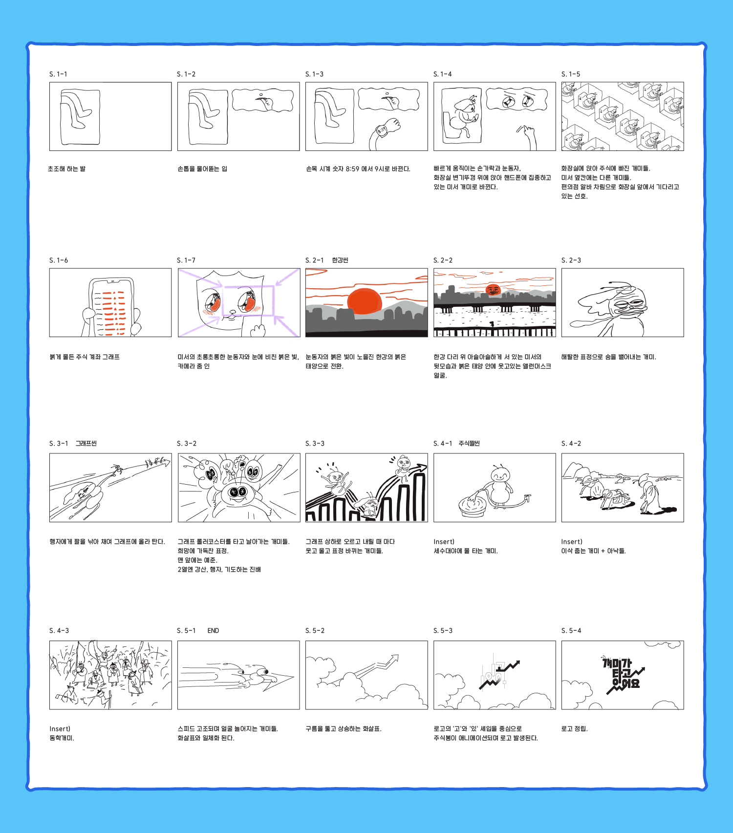
STORYBOARD
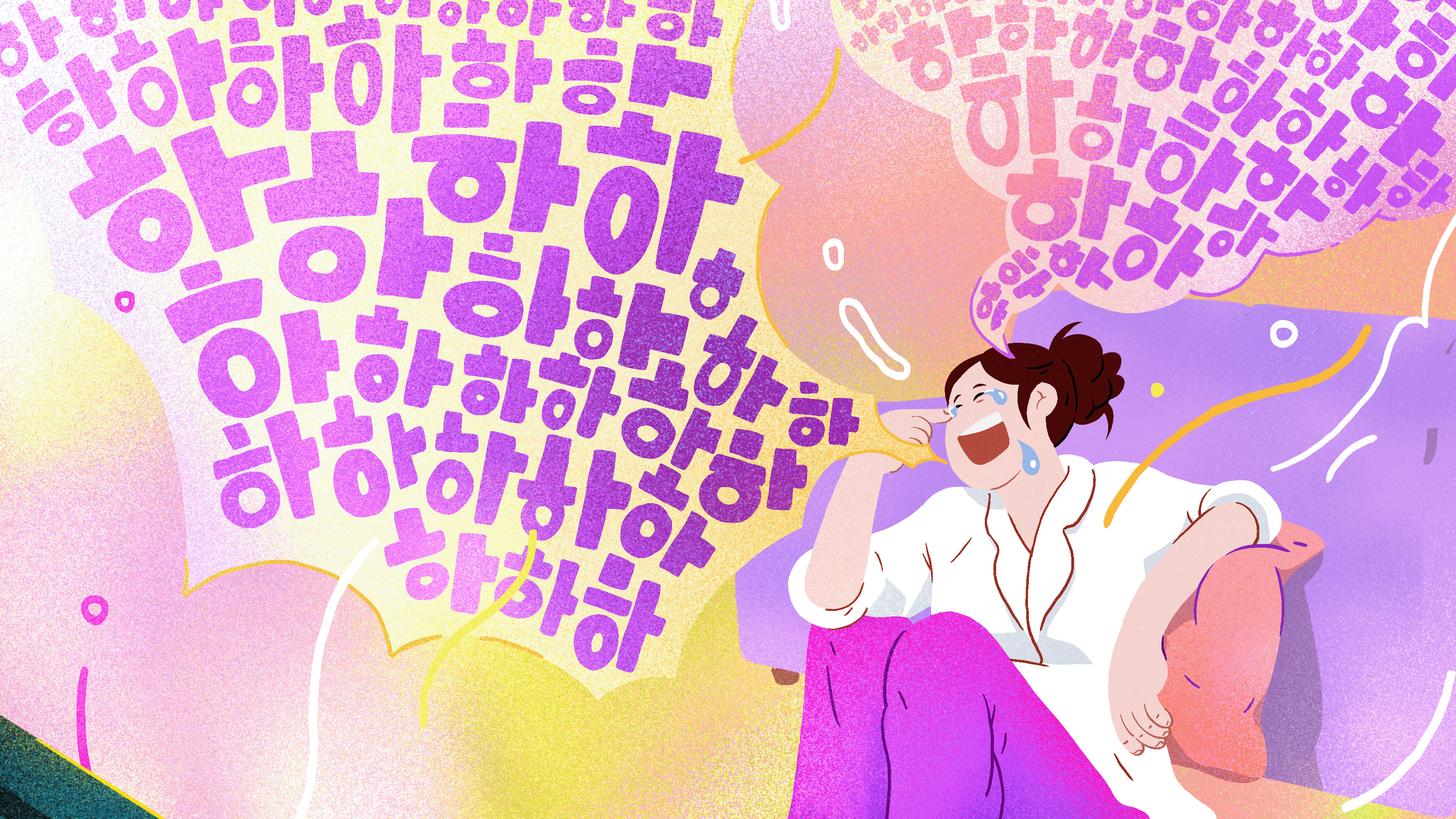
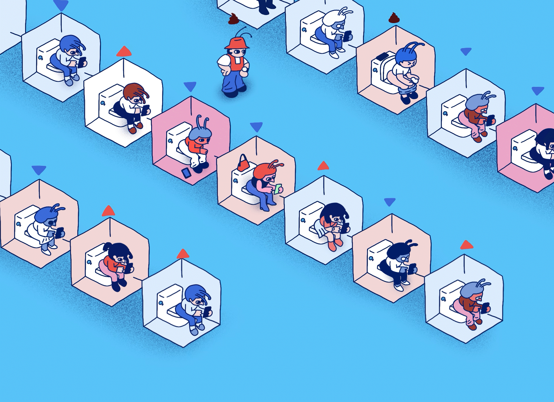
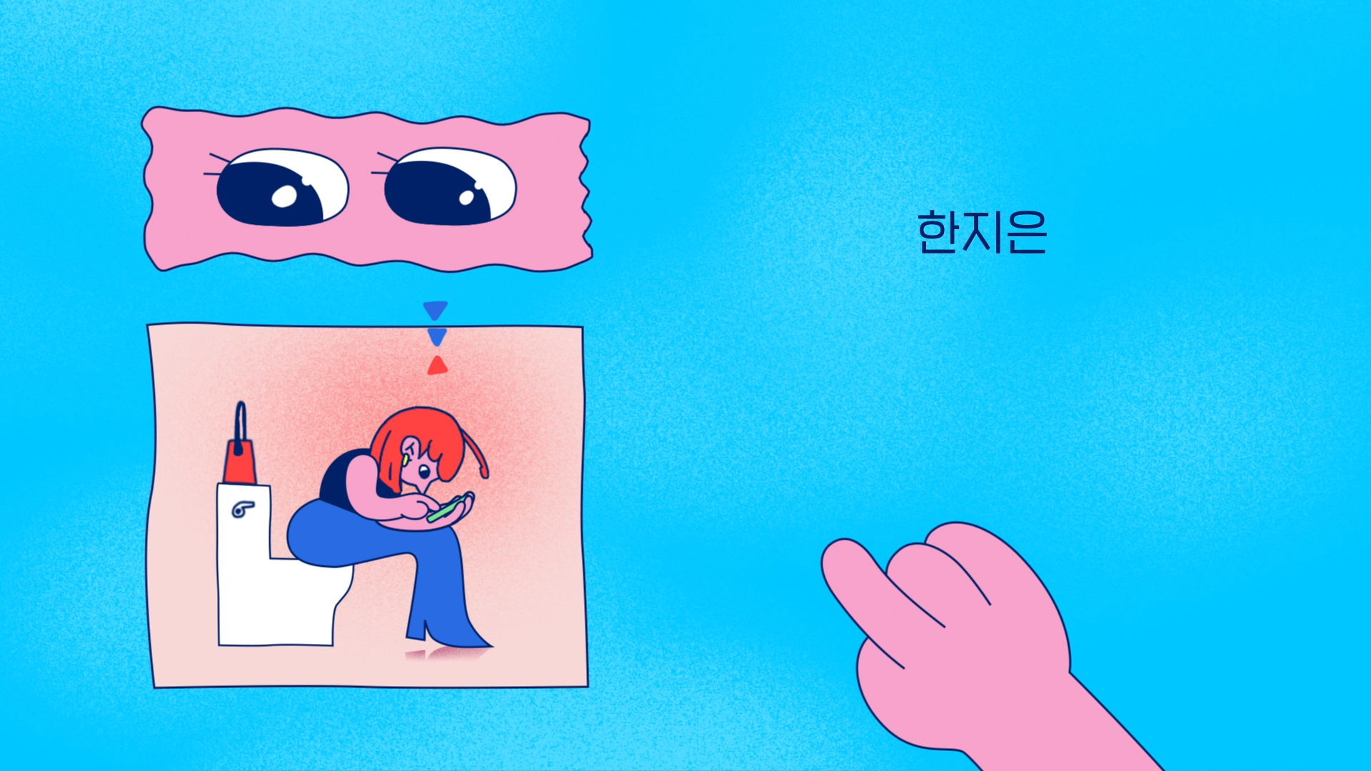
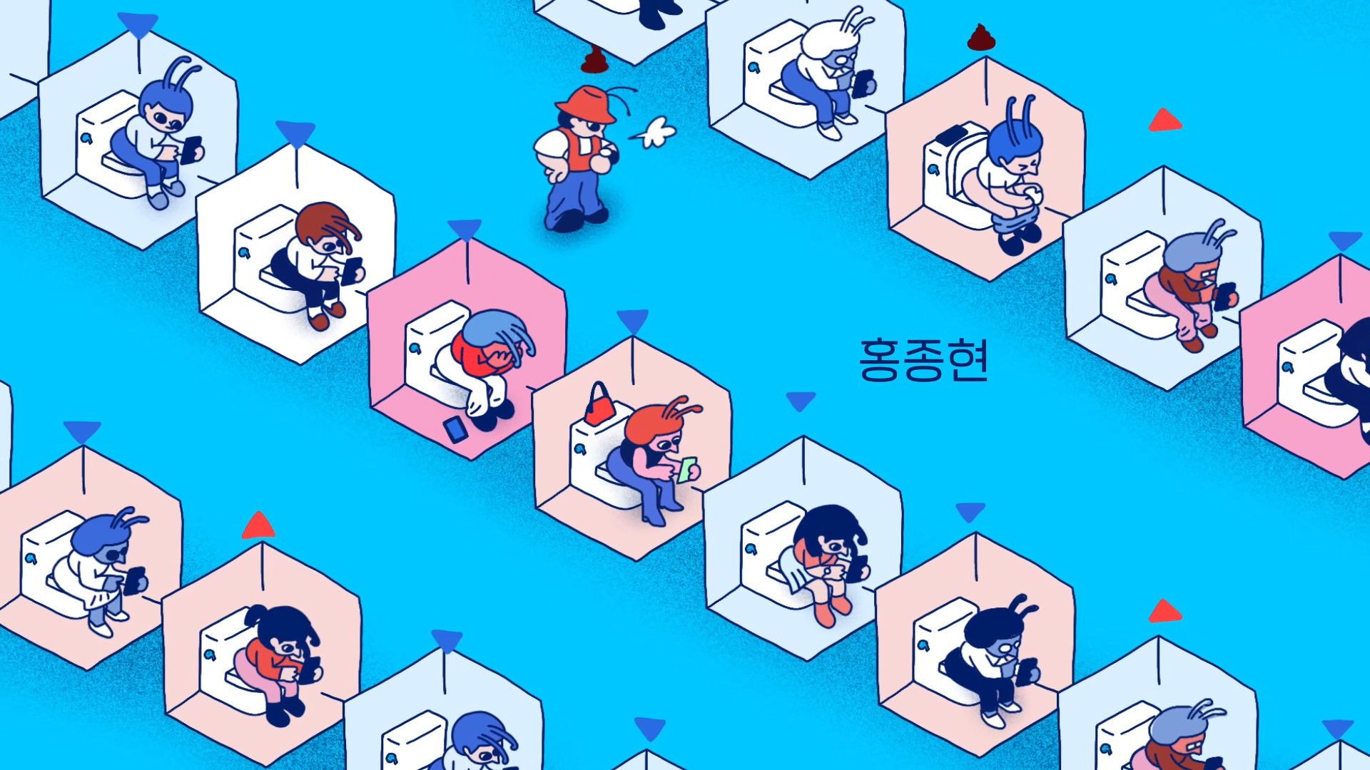
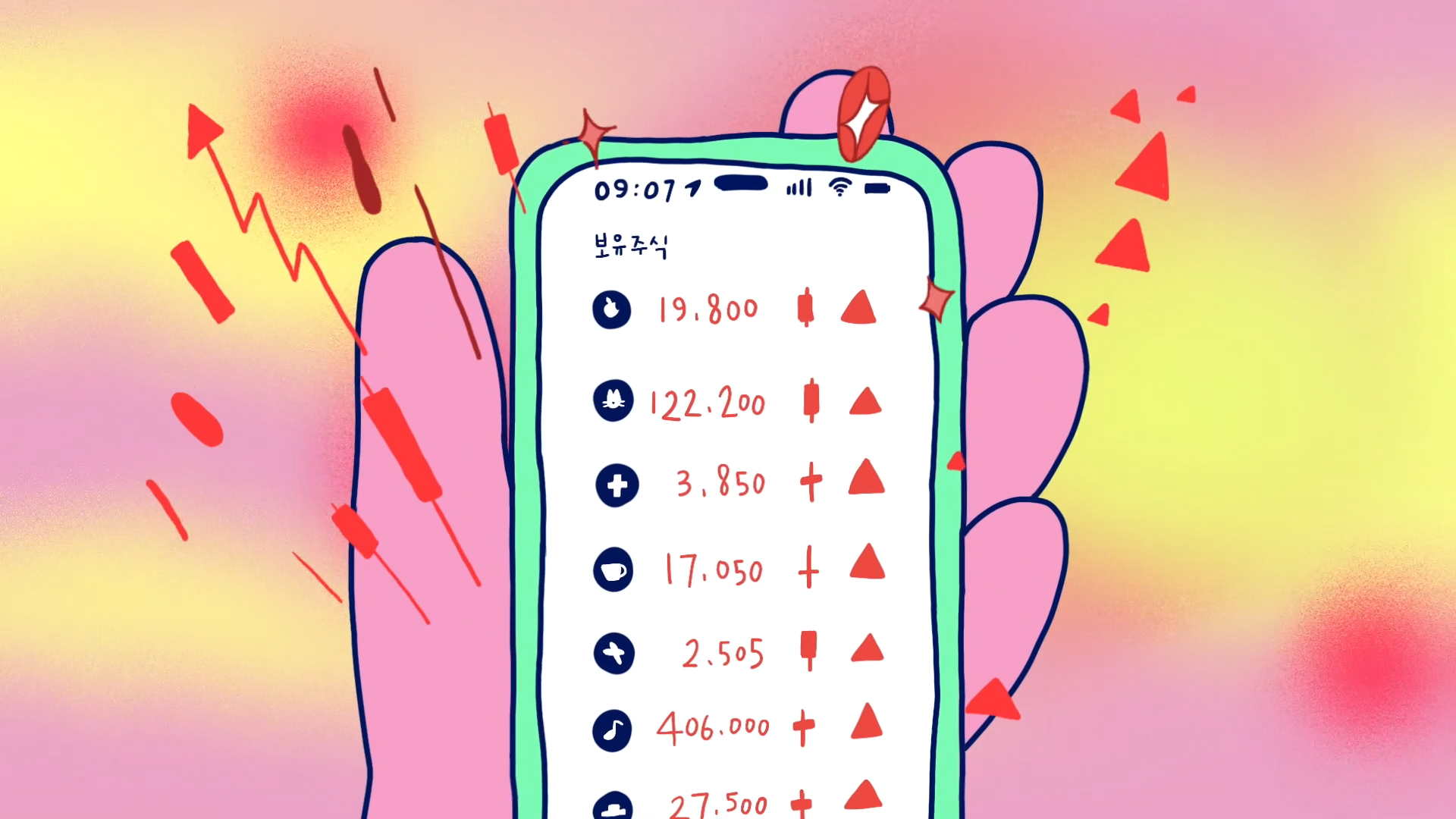
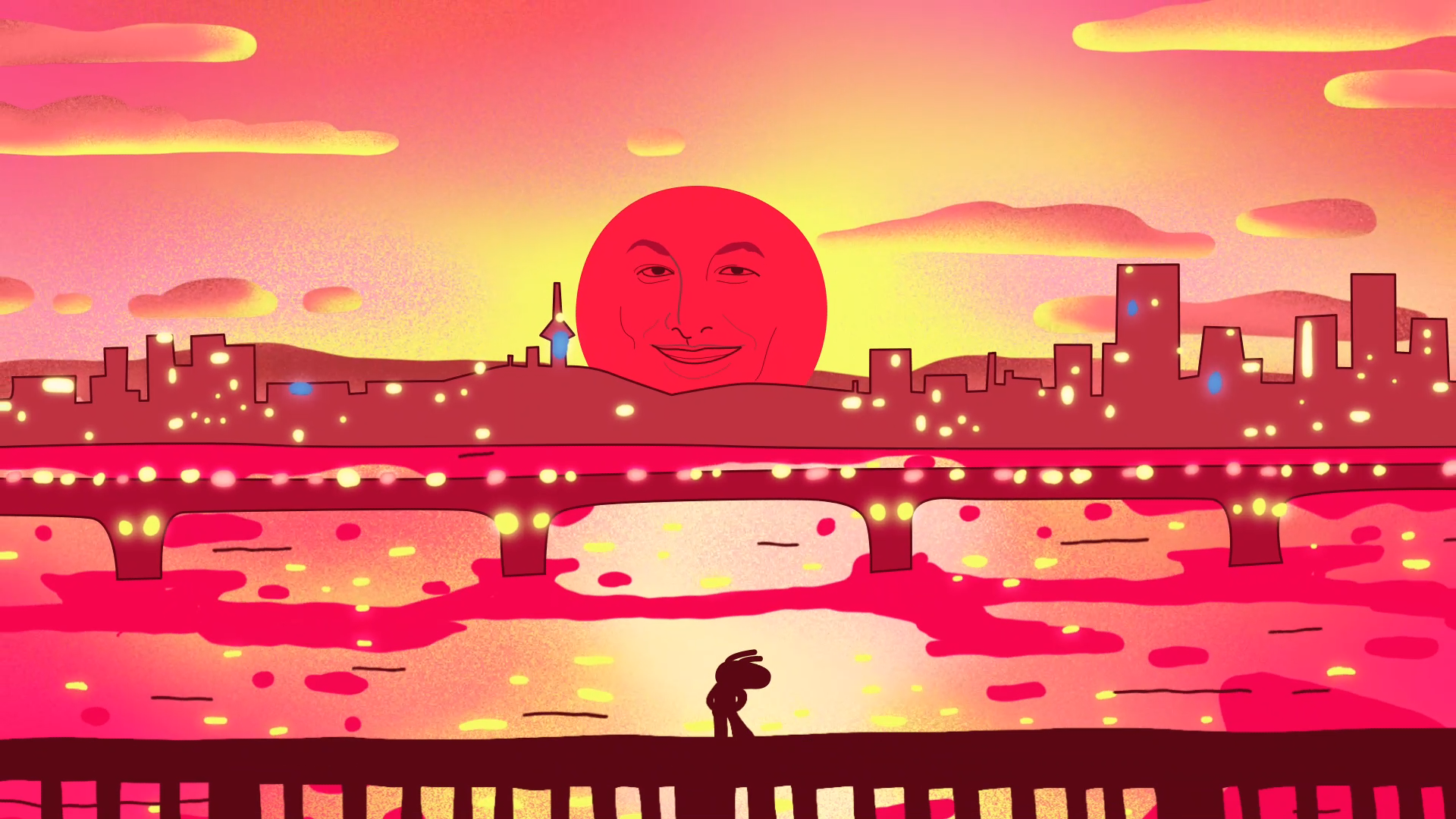
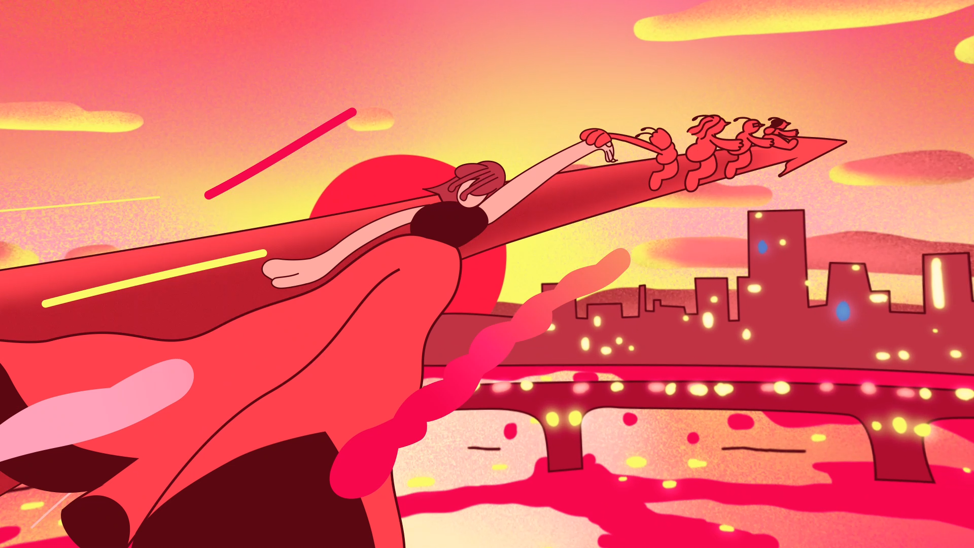
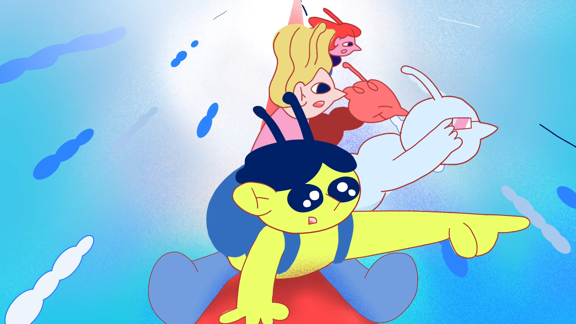
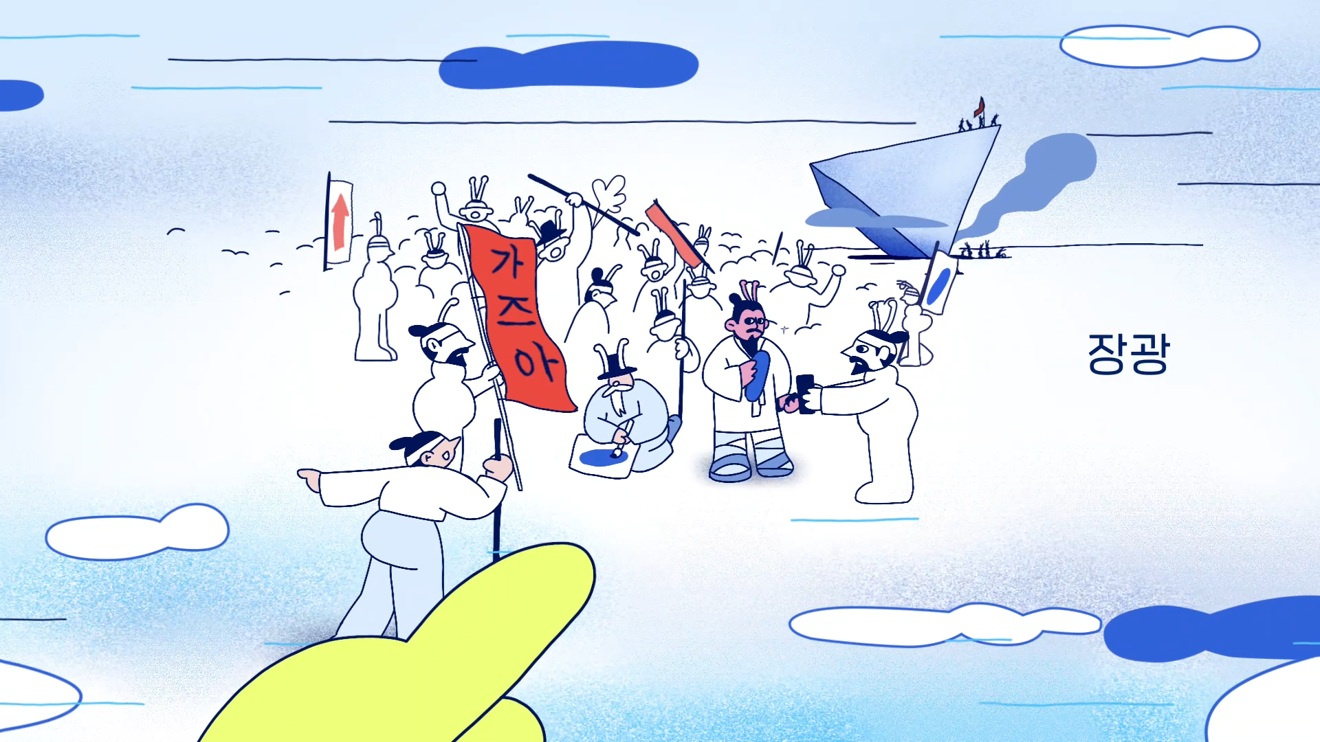
타이틀 시퀀스는 극 중 주인공 미서가 주식에 점점 빠져드는 순간을 시작으로, 주식의 흥망성쇠와 감정 기복을 짧은 내러티브로 구성했습니다. 특히 실제 투자자라면 누구나 웃을 수 있는 주식 관련 밈 요소들을 적극 활용해 개미들의 일상을 공감과 위트로 풀어냈으며, 이 타이틀은 드라마의 핵심 정서와 리듬을 압축적으로 보여주는 시각적 오프닝이 되도록 구성했습니다.
The title sequence begins with the main character Miso falling down the rabbit hole of stock investing, unfolding a brief yet vivid journey through the highs and lows of the market—and her emotions. Packed with stock memes and references that real-life investors will instantly relate to, the sequence humorously captures the daily life of small-time traders. It acts as a fast-paced, emotionally resonant prologue to the story ahead.
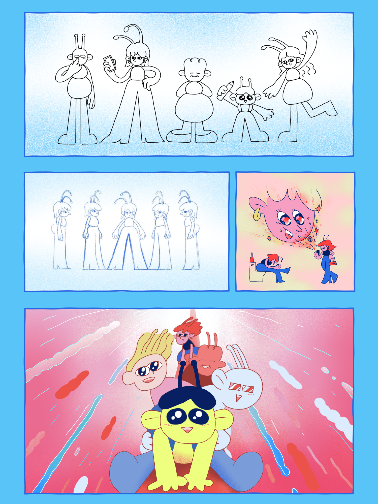
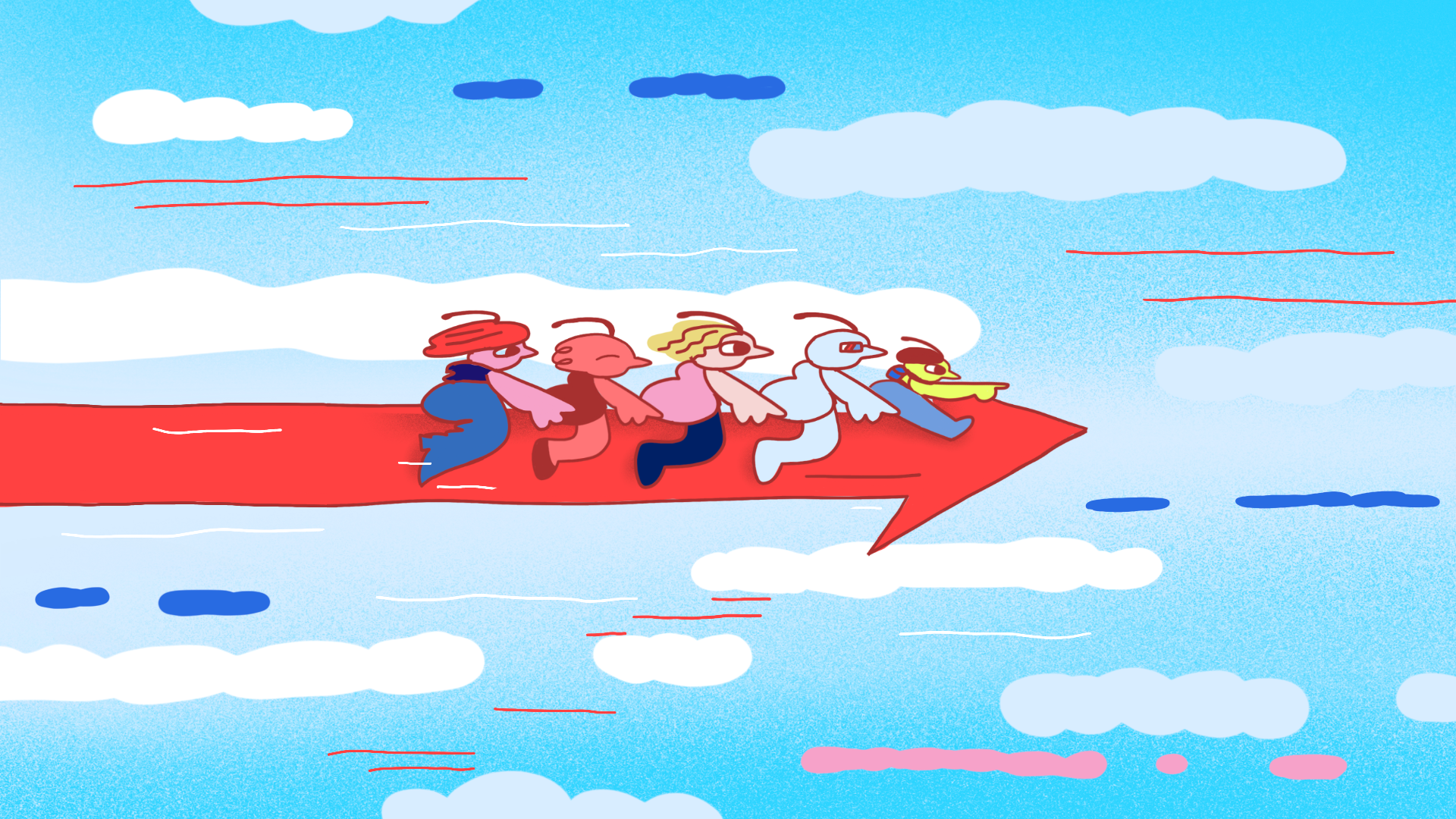
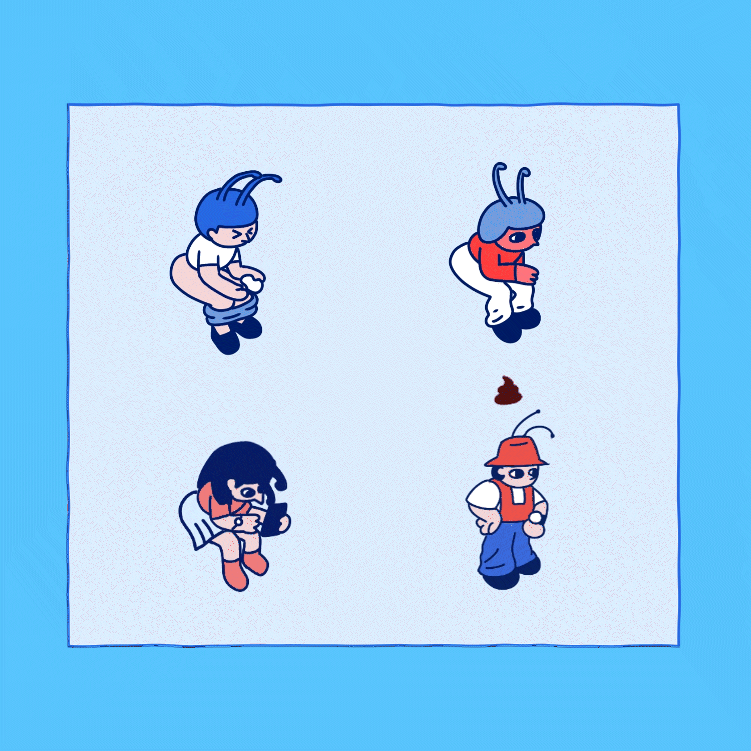
CHARACTER DESIGN
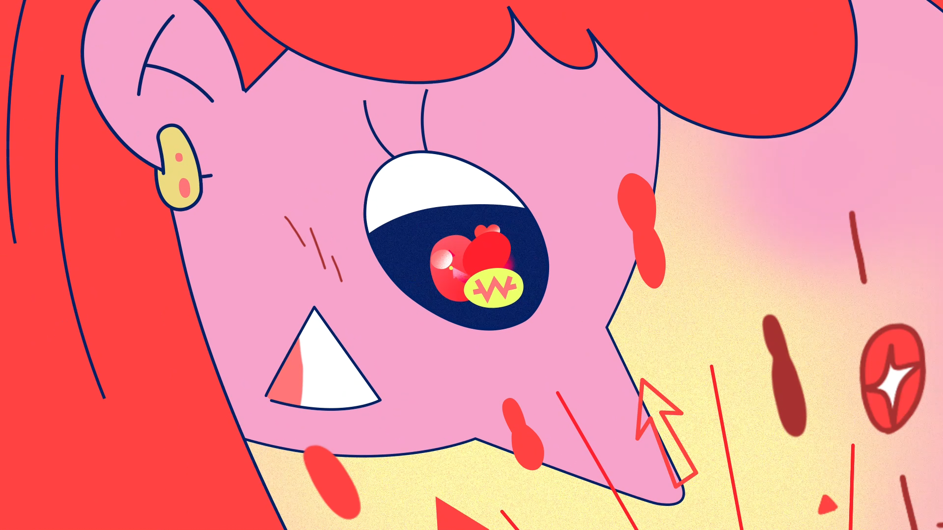
이 프로젝트는 전반적으로 친근하고 공감 가는 감정선을 시각화하는 것이 핵심이었고, 그래서 캐릭터 디자인에서도 손으로 그린 듯한 낙서 스타일의 일러스트레이션을 적용해 유쾌하고 위트 있는 톤을 유지했습니다. 특히 5명의 실제 등장인물을 각기 다른 성격의 '개미'로 의인화해, 개성은 살리되 지나치게 설명화되지 않도록 균형을 맞췄습니다. 개미의 몸통 구조와 더듬이 요소를 활용하면서 인물의 특징을 최소한으로 반영했고, 애니메이션으로도 다양한 리듬과 움직임을 표현할 수 있도록 디자인에서부터 움직임을 고려한 유연한 구조로 발전시켰습니다.
Given the project’s focus on relatability and emotional warmth, we adopted a hand-drawn doodle illustration style to keep the tone light, expressive, and approachable. The five lead characters were reimagined as personified ants,
each design capturing their individual personality without sacrificing clarity or charm. Using ant-like elements—body segments, antennae, and silhouette shapes—we created characters that feel both humorous and sincere. The designs were developed with animation in mind, allowing for flexible movements and playful exaggeration within the motion.
each design capturing their individual personality without sacrificing clarity or charm. Using ant-like elements—body segments, antennae, and silhouette shapes—we created characters that feel both humorous and sincere. The designs were developed with animation in mind, allowing for flexible movements and playful exaggeration within the motion.
Draft-A
Draft-B
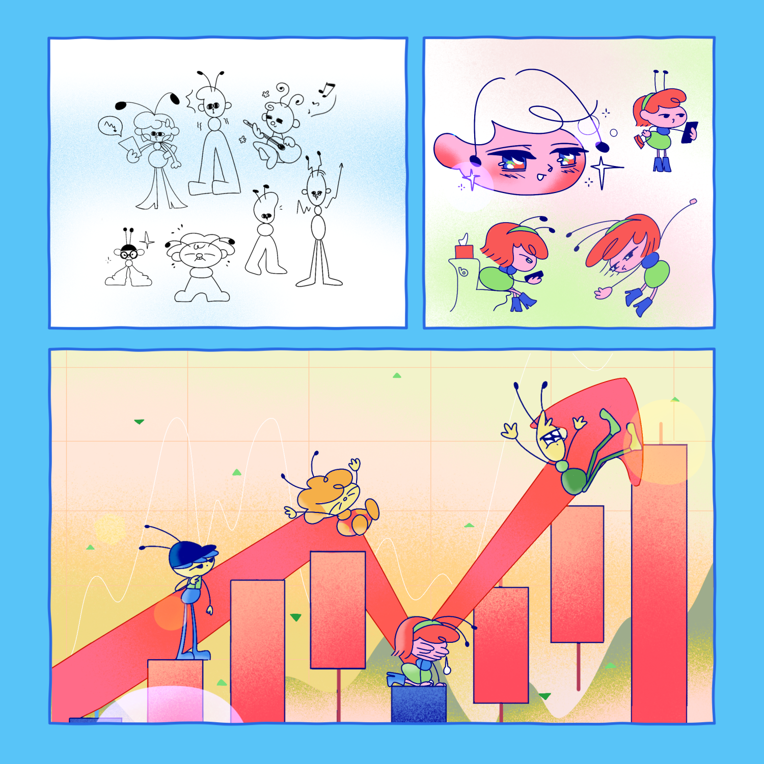
STYLE FRAME

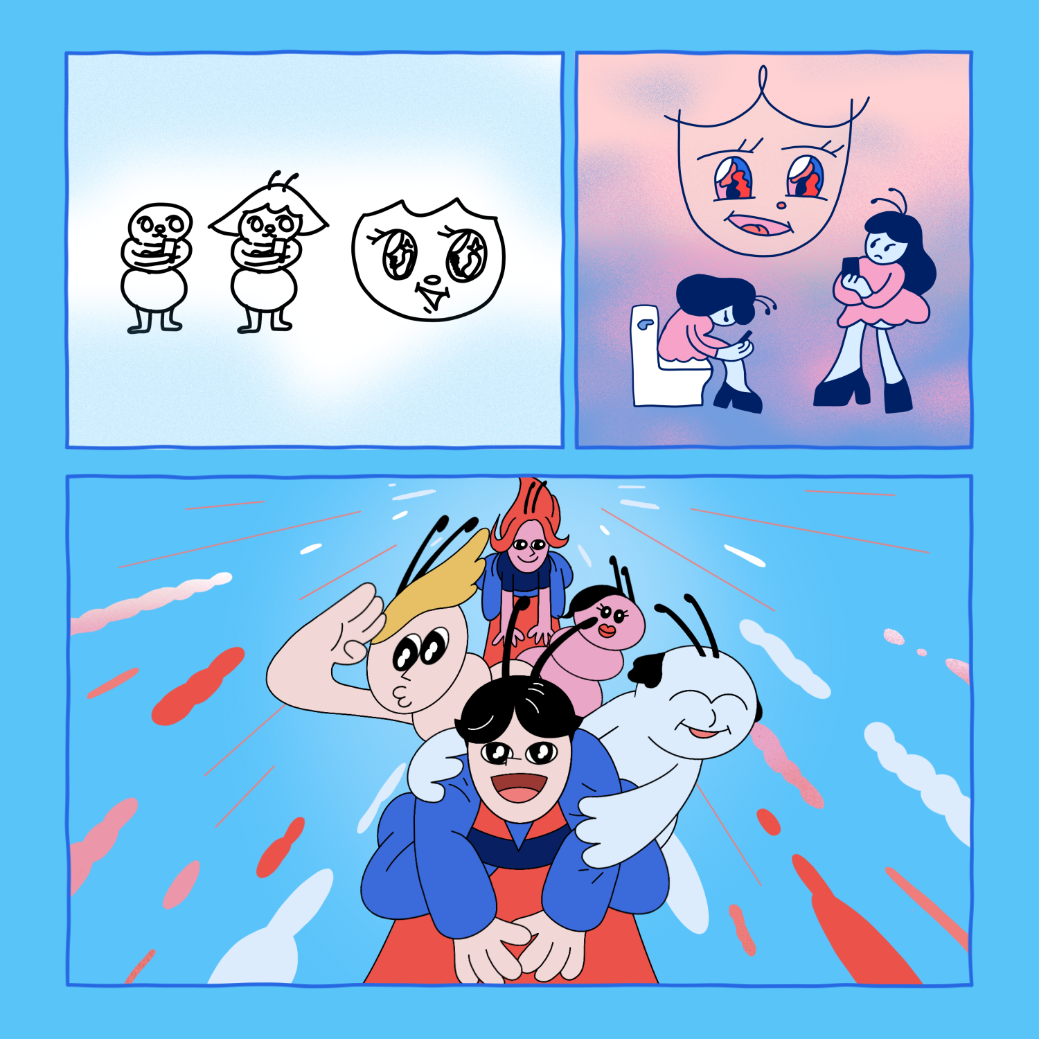
CHARACTER ANIMATION
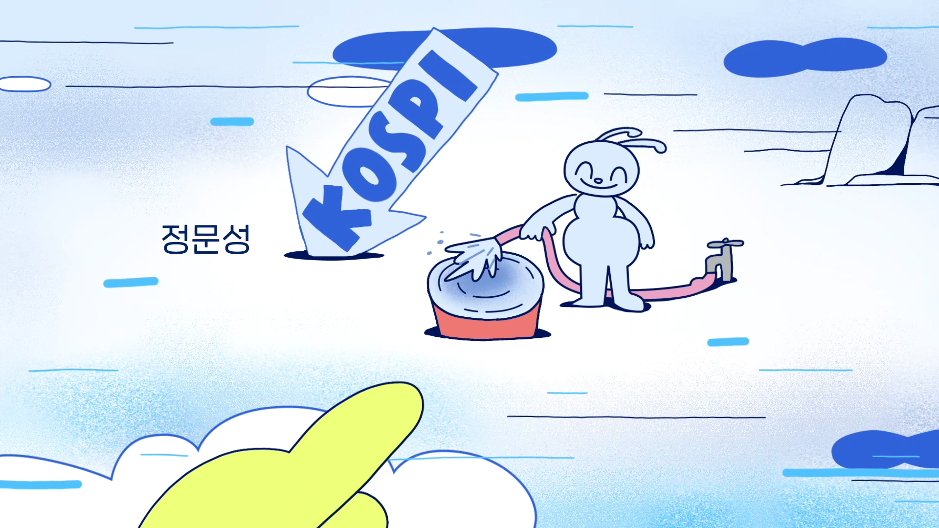
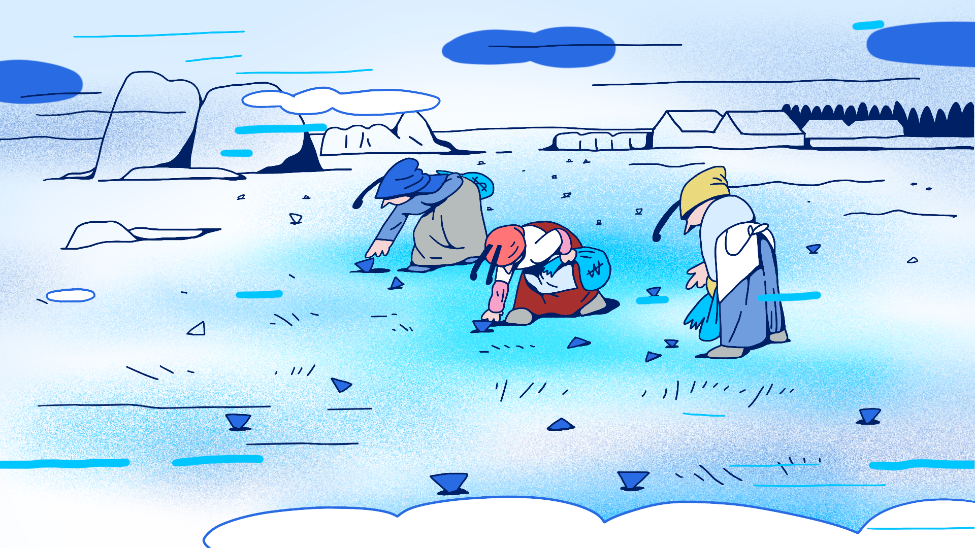
타이틀 시퀀스에는 실제 투자자들이라면 누구나 경험했을 법한 주식 밈들을 익숙하면서도 위트 있는 장면으로 재구성했습니다.
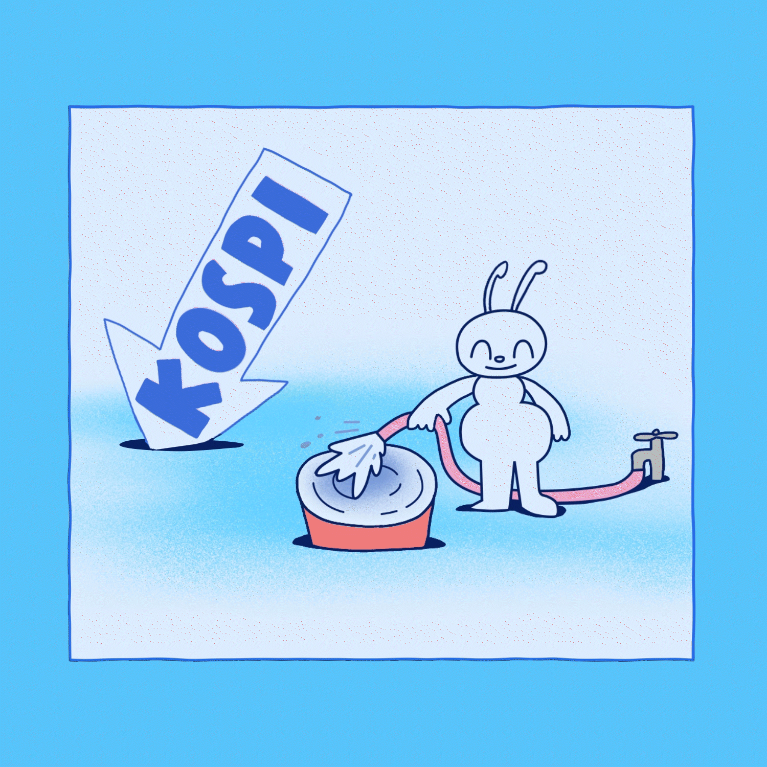
코스피가 바닥나 물을 타는 개미들,
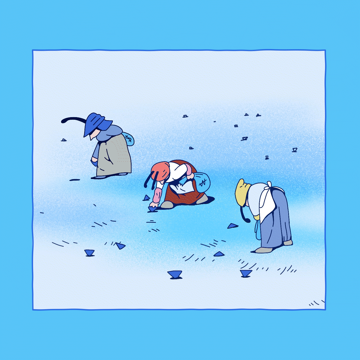
떨어진 주식을 이삭 줍듯 줍줍하는 아낙네들,
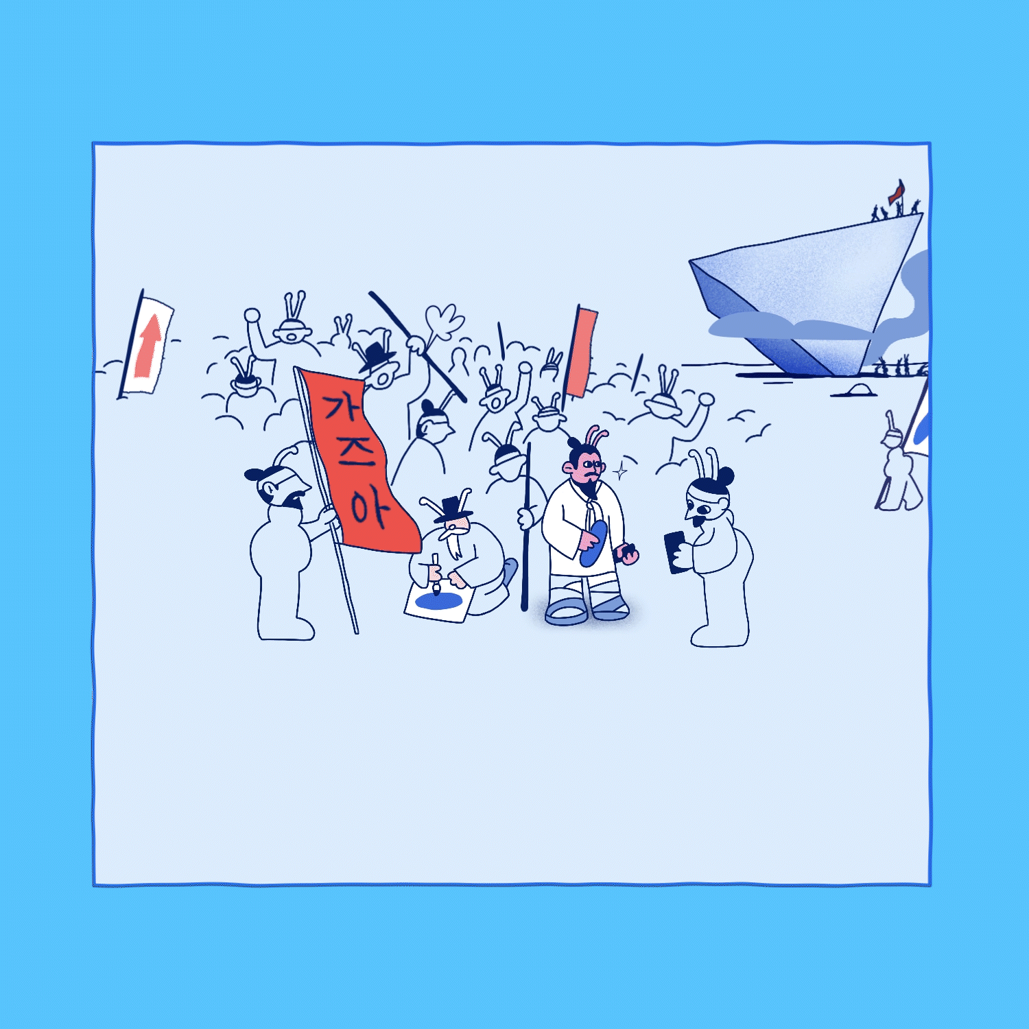
그리고 산산조각난 주식을 다시 일으켜 세우려는 동학개미 군단까지,
WILLO 특유의 재치 있는 연출로 현실감과 과장을 적절히 버무려, 웃음과 공감을 동시에 유도하는 시각적 포인트로 완성했습니다.
WILLO 특유의 재치 있는 연출로 현실감과 과장을 적절히 버무려, 웃음과 공감을 동시에 유도하는 시각적 포인트로 완성했습니다.
The sequence features humorous reinterpretations of iconic stock market memes, especially relatable for anyone who's ever dabbled in investing:
Ant investors averaging down hopelessly as KOSPI crashes,
Ajummas gathering fallen stocks like harvest leftovers,
and a chaotic swarm of retail traders trying to revive broken shares—East Ant Army style.
These scenes mix realism with satire, creating a punchy visual rhythm full of wit and relatabili
These scenes mix realism with satire, creating a punchy visual rhythm full of wit and relatabili
CREDIT
[TVING] 개미가 타고 있어요 로고 타이틀 디자인 (Stock Struck Title Design)
Release : TVING, 2022
Client : TVING
Project Manager : Yuhye Kang
Production : Willo
Creative Director : Jisun Kim
Supervisor : Heejin Choi
Project Manager : Jisun Kim
Design Planning : Jisun Kim, Jeongwon Kim
Logo Design, Title Storyboard : Jisun Kim
Logo Draft : Jisun Kim, Jeongwon Kim
Style Frame lllustration : Jisun Kim
Character Design : Jisun Kim
Charactger Design Draft : Jisun Kim, Sook young Ahn
Animation : Jisun Kim, Sook young Ahn