
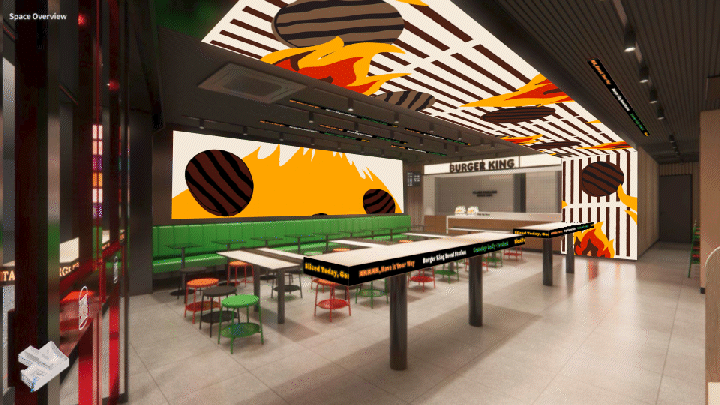
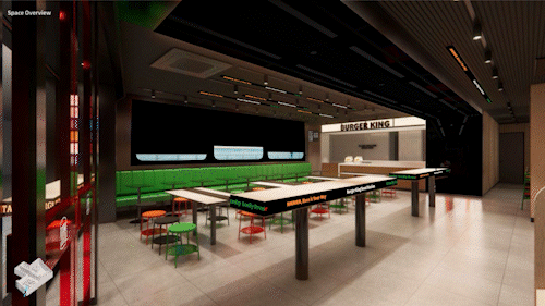
Overview
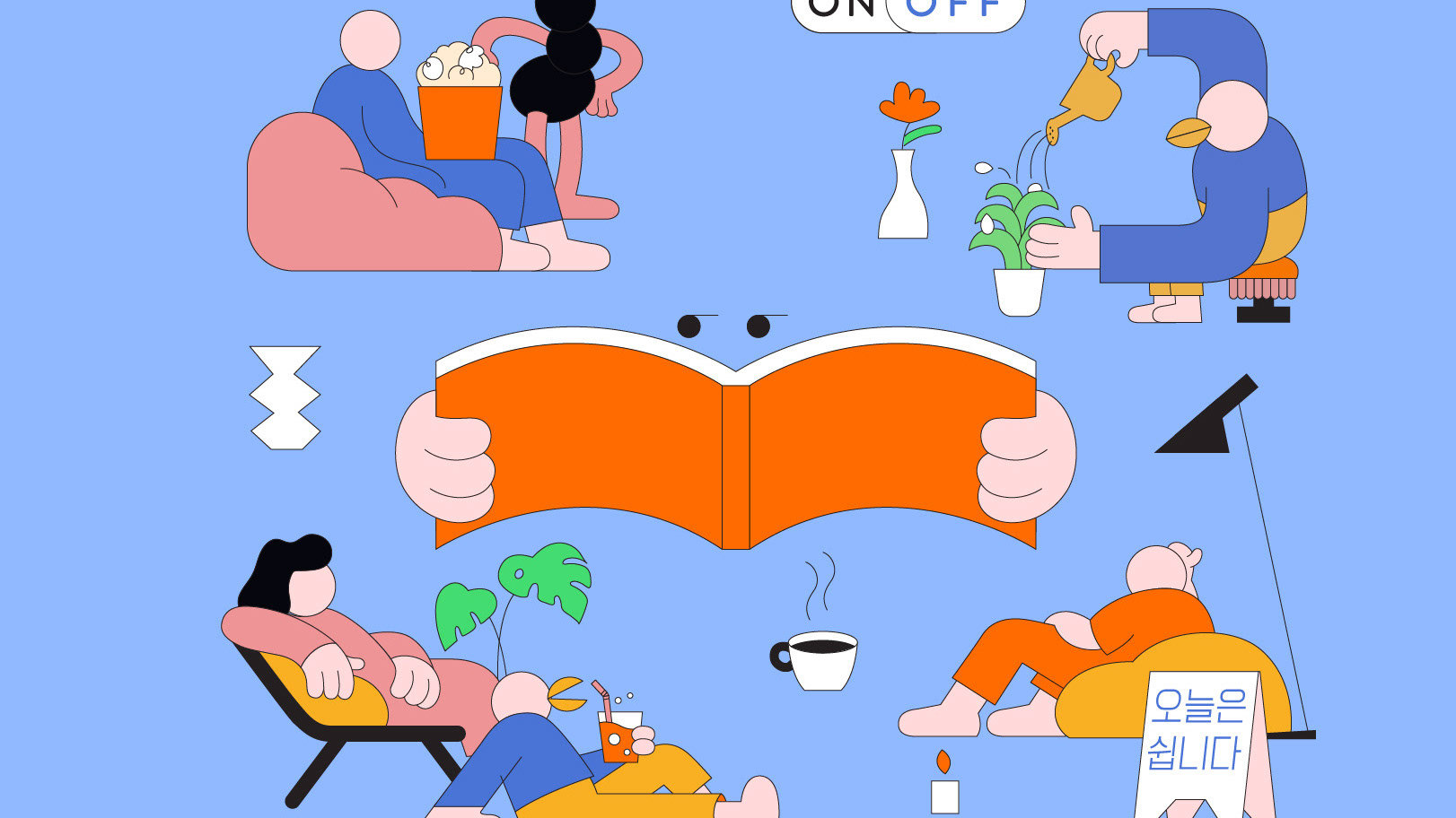
윌로는 버거킹 서울역 디지털 매장 콘텐츠를 기획, 제작했습니다. 브랜드에서 제공한 팝하고 플레이풀한 일러스트 애셋을 기반으로, 공간 구조에 맞춘 리듬감 있는 연출을 설계해 복잡하지 않으면서도 살아 움직이는 화면을 구현했습니다. 특히 ‘Burger Geek’ 캐릭터의 사랑스럽고 익살스러운 움직임을 강조해, 매장 공간에 유쾌한 에너지를 더했습니다.
이번 프로젝트는 브랜드의 정체성을 직관적으로 전달하는 메인 영상과 서울역이라는 상징적 공간의 특성을 반영한 로케이션 영상 두 가지 버전으로 구성되었습니다. 브랜드 무드와 공간 맥락을 유기적으로 연결하여 매장을 방문하는 고객에게 더욱 인상적인 브랜드 경험을 제공하는 데 중점을 두었습니다.
Willo produced digital in-store content for Burger King’s Seoul Station location. Using pop and playful illustration assets provided by the brand, the visuals were designed to move dynamically without overwhelming the space, enhancing the architectural structure and customer experience. Special attention was given to bringing the “Burger Geek” character to life through charming and mischievous animation, adding a vibrant and joyful atmosphere to the retail environment.
The project consisted of two versions: a brand-focused film that communicates Burger King’s core identity, and a location-specific film that reflects the unique characteristics of Seoul Station.
By organically connecting the brand’s visual language with the spatial context, the content was designed to deliver a more immersive and memorable digital experience for visitors.
Brand Film
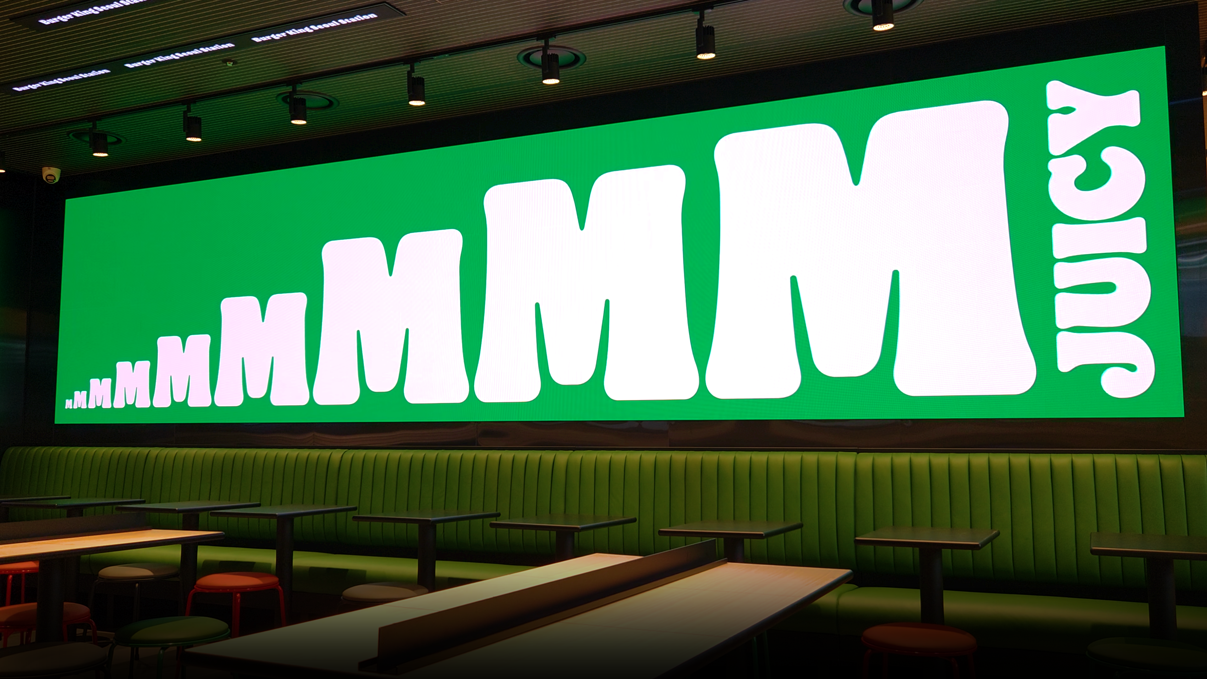
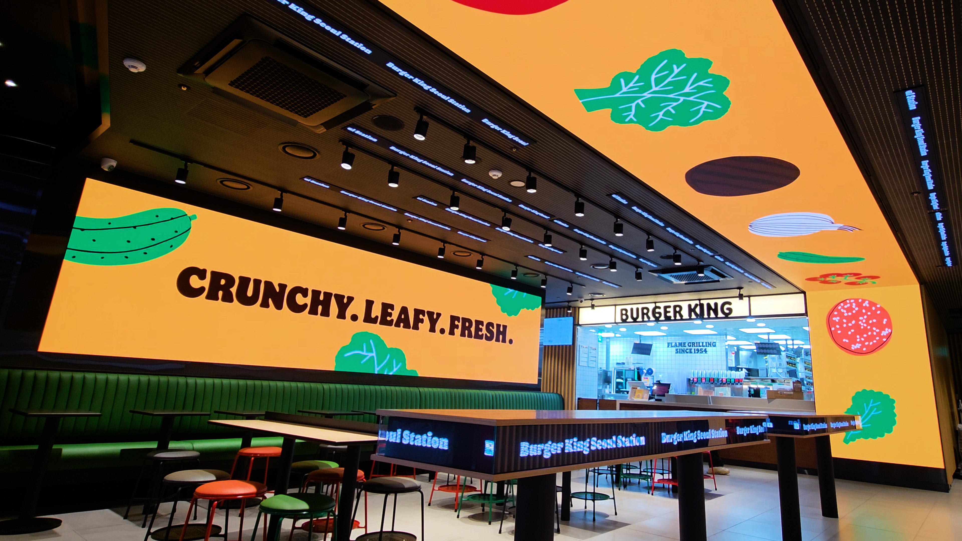
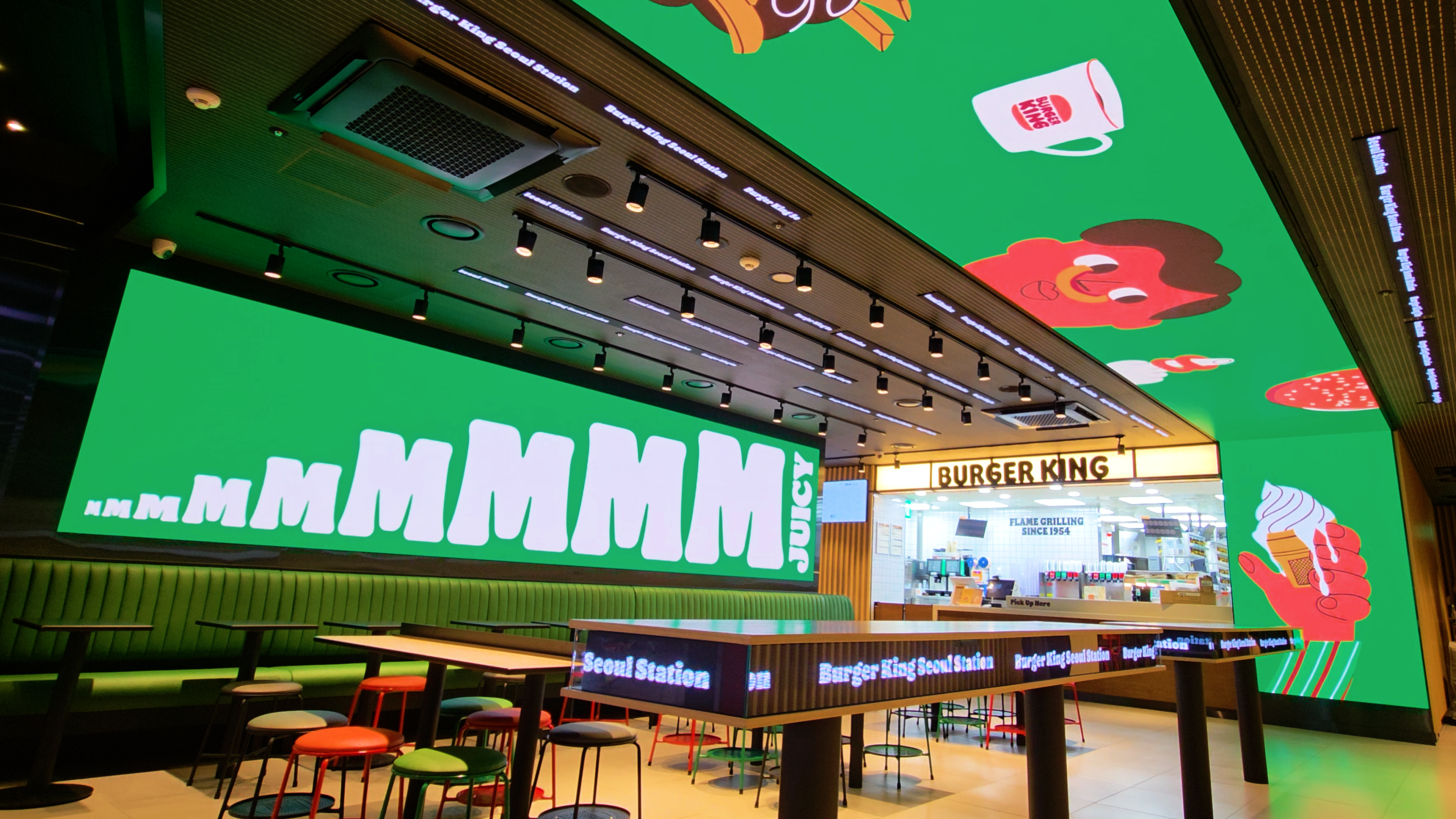
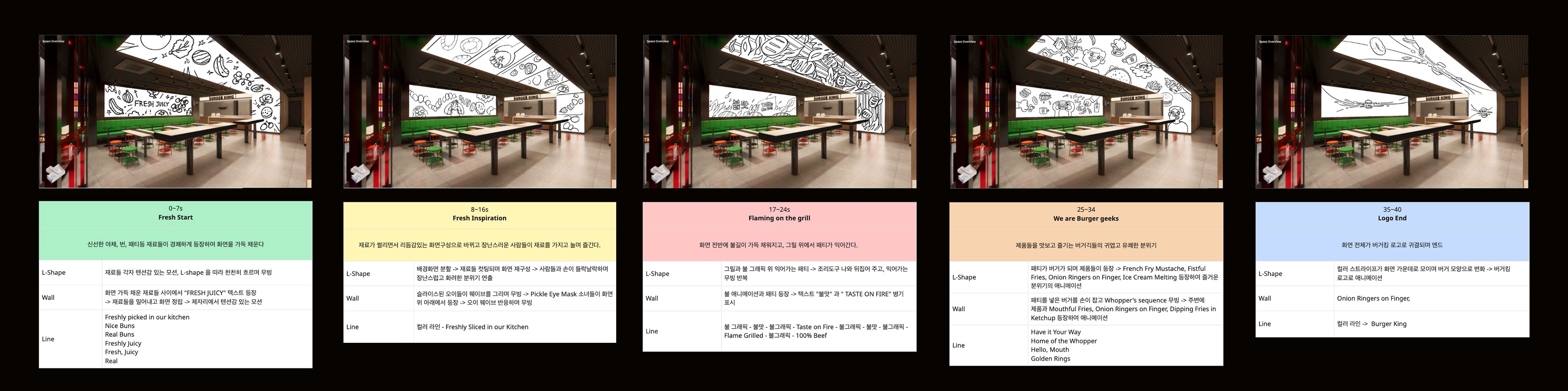
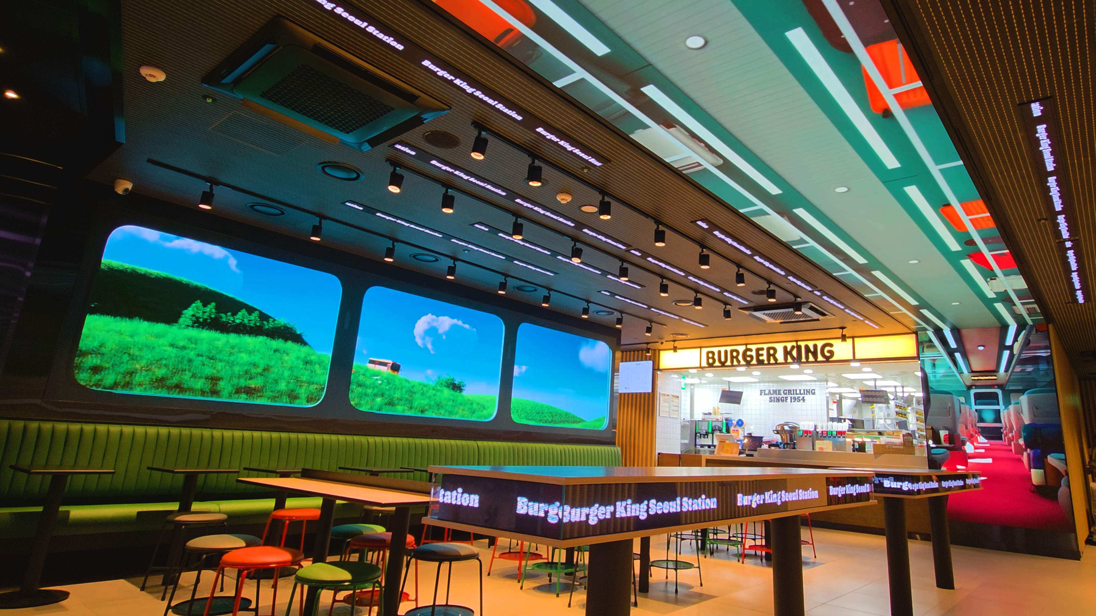
서울역 매장은 천장을 감싸는 L자형 LED와 소파 뒤 LED, 그리고 라인형 LED까지 총 세 가지 디지털 미디어로 구성되어 있습니다.
특히 L자형 LED와 소파 LED는 서로 다른 영상이 동일한 타이밍에 맞춰 유기적으로 연동되도록 설계되었습니다. 각 화면은 개별적으로 작동하지만, 특정 순간에는 하나의 장면처럼 연결되며 공간 전체를 하나의 무대로 확장시킵니다.
이를 통해 매장을 찾은 방문객들이 단순히 영상을 ‘보는 것’을 넘어, 버거킹의 유쾌하고 컬러풀한 브랜드 세계관을 공간 속에서 직접 경험할 수 있도록 연출했습니다.
The Seoul Station store features three primary digital media installations: an L-shaped ceiling display, a media wall positioned behind the seating area, and a linear media wall.
In particular, the L-shaped display and the main media wall were designed to operate in synchronized timing while playing different video content. Although each screen functions independently, key moments are choreographed to connect seamlessly, transforming the entire space into a unified stage.
Through this spatial orchestration, visitors move beyond simply watching content and instead experience Burger King’s playful and colorful brand world within the environment itself.
Process
콘티 단계부터 현장 목업 이미지를 적극적으로 활용하여, 실제 매장 환경에서 영상이 구현되었을 때 발생할 수 있는 이질감을 사전에 최소화했습니다. 이를 통해 공간과 콘텐츠 간의 괴리를 줄이고, 설치 이후 발생 가능한 문제 요소들을 미리 점검·보완하는 방식으로 완성도를 높였습니다.
On-site mockup images were incorporated from the storyboard stage to minimize potential visual discrepancies when the content was installed in the actual store environment.
This approach reduced the gap between spatial context and media output, allowing potential issues to be identified and resolved in advance, ultimately enhancing the overall level of execution.
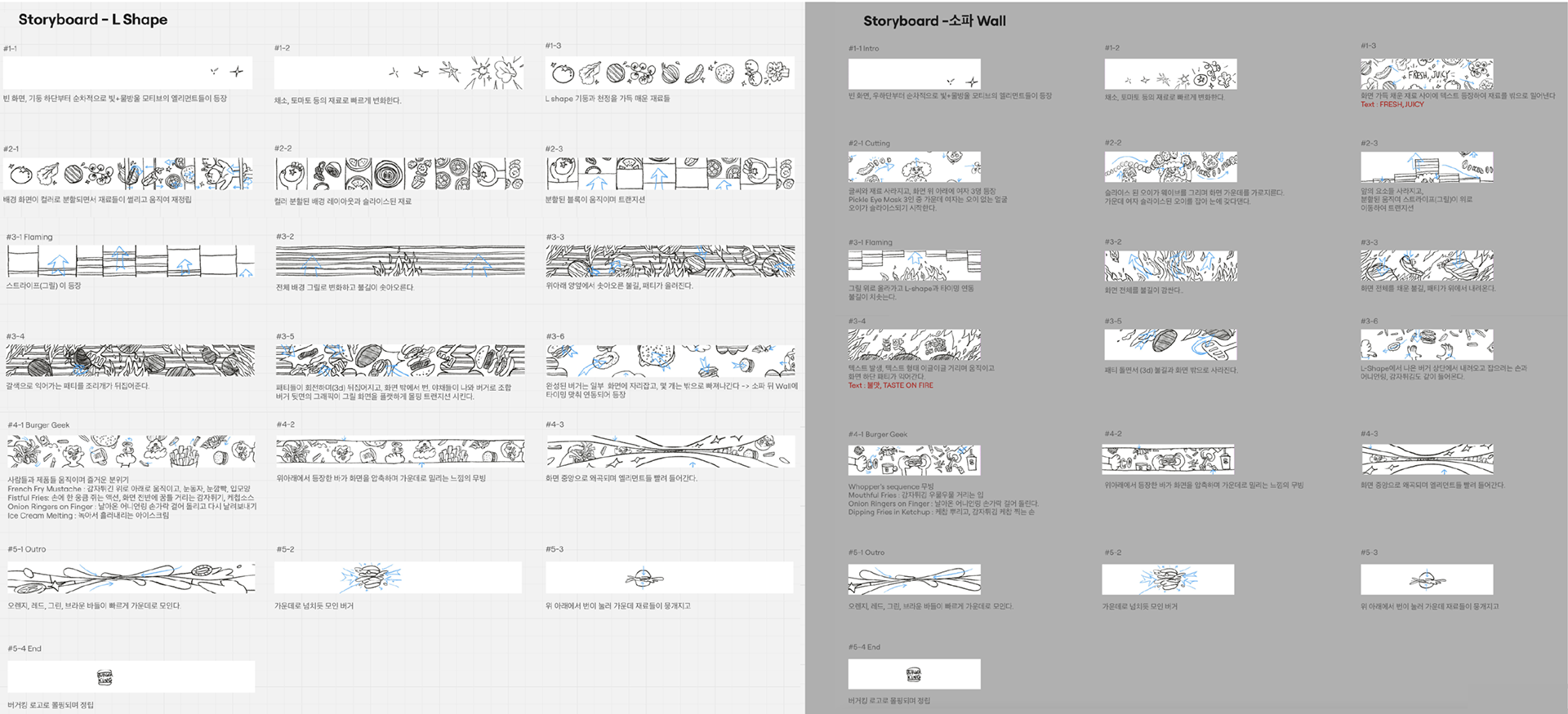
중간 과정 콘티 및 목업 이미지
Animation
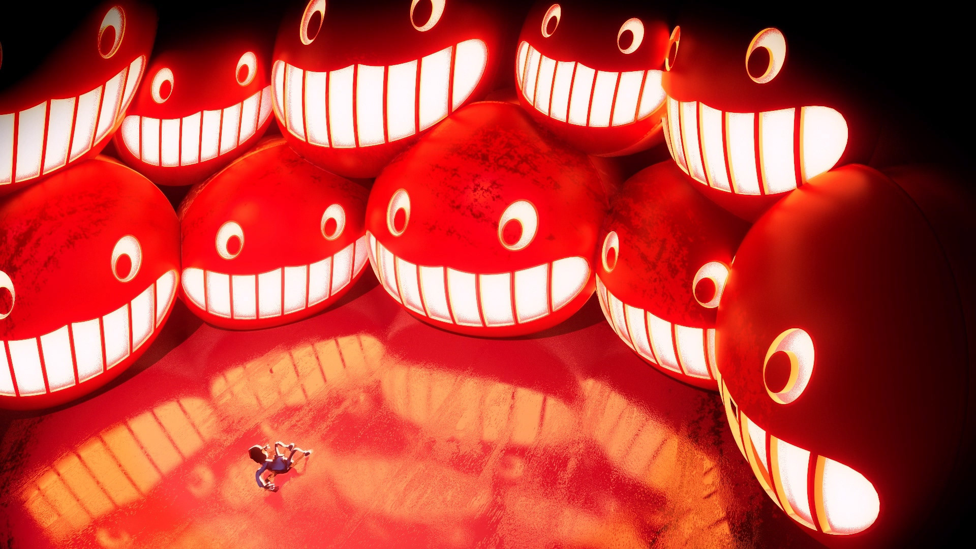
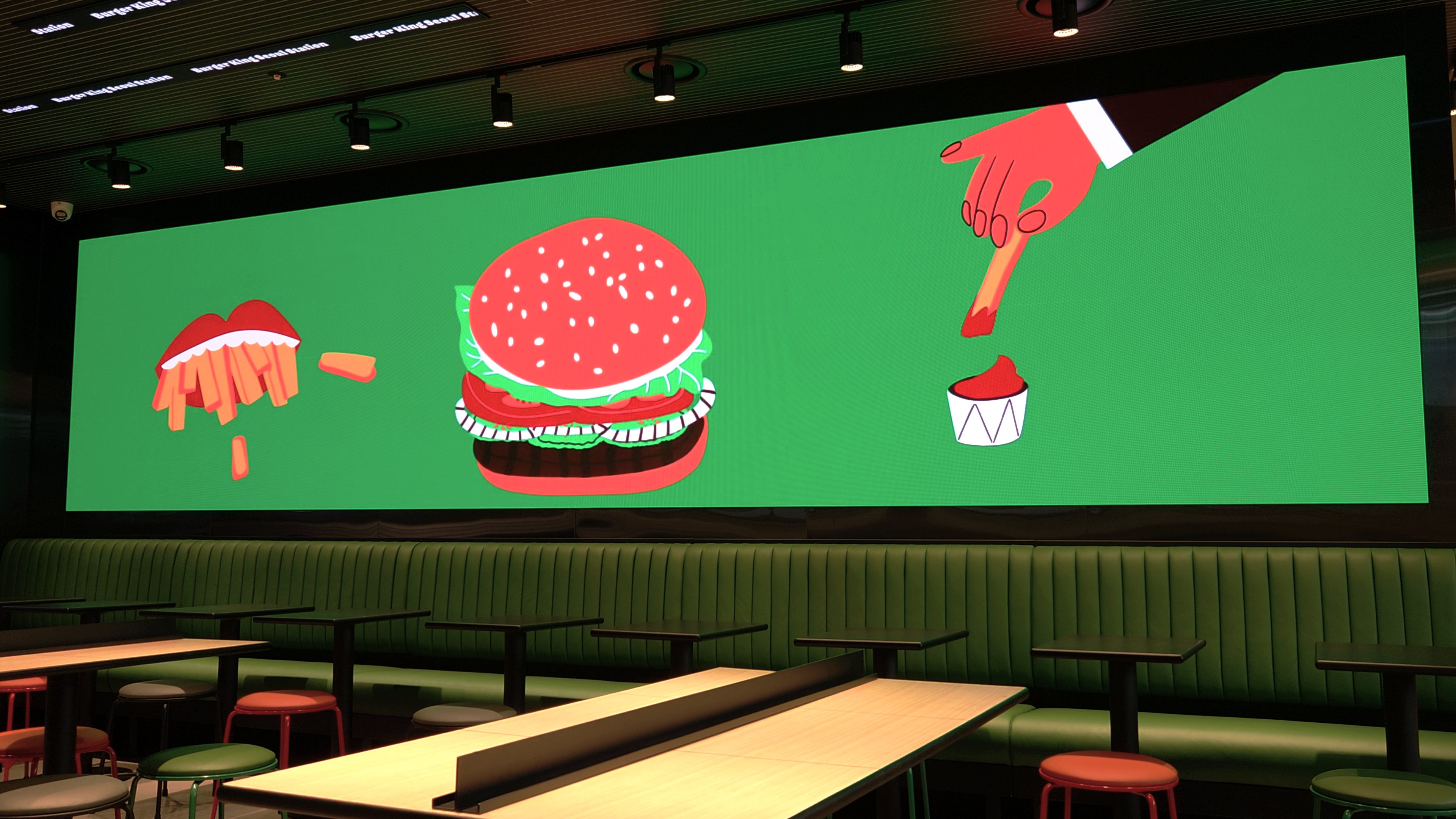
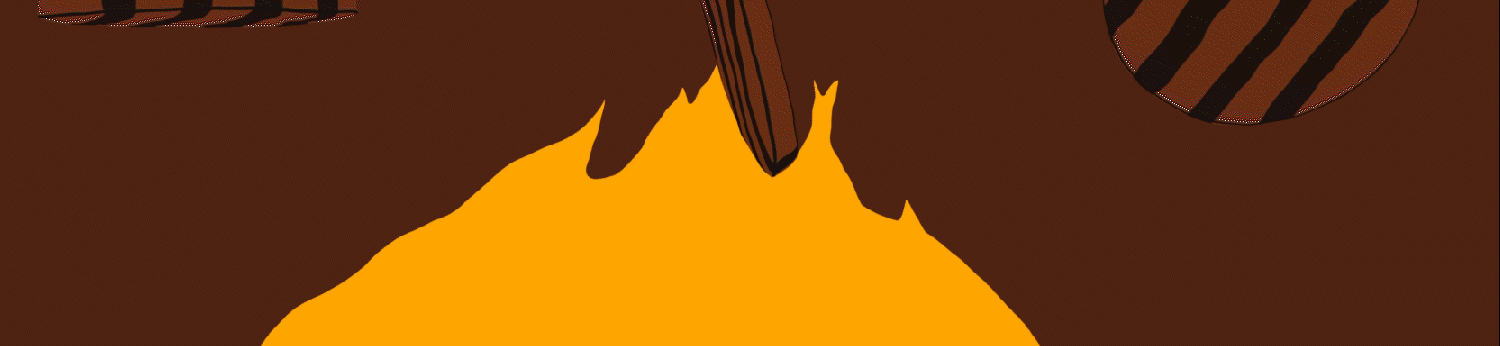
우리는 버거킹에서 제공받은 브랜드 애셋 고유의 분위기를 살린 위트 있는 움직임과 돌출감 있는 액션을 통해 브랜드 이미지를 시각적으로 구현했습니다. 또한 씬과 씬 사이를 과감하면서도 유려하게 연결하는 트랜지션을 활용해, 경쾌하고 리드미컬한 ‘Play’ 무드를 완성했습니다. 특히 Burger Geek 캐릭터들의 무드와 익살스러운 표정에 집중해, 특유의 귀여움이 자연스럽게 드러날 수 있도록 레이아웃을 설계했습니다. 캐릭터의 표정과 움직임이 공간 안에서 살아 숨 쉬도록 조율하는 과정은 무척 즐거운 작업이었습니다. 그 결과, 매장 전체에 유쾌하고 사랑스러운 에너지를 더할 수 있었습니다.
The brand image was visually articulated through witty movements and dimensional, forward-projecting actions that highlight the unique character of the provided brand assets. Bold yet fluid transitions were used to seamlessly connect each scene, reinforcing a rhythmic and upbeat “Play” mood throughout the film. Special attention was given to the mood and playful expressions of the Burger Geek characters, carefully designing the layout to highlight their distinctive charm. Shaping their expressions and movements to feel alive within the space was an especially enjoyable process. The result adds a joyful and lovable energy throughout the store environment.


Location Point
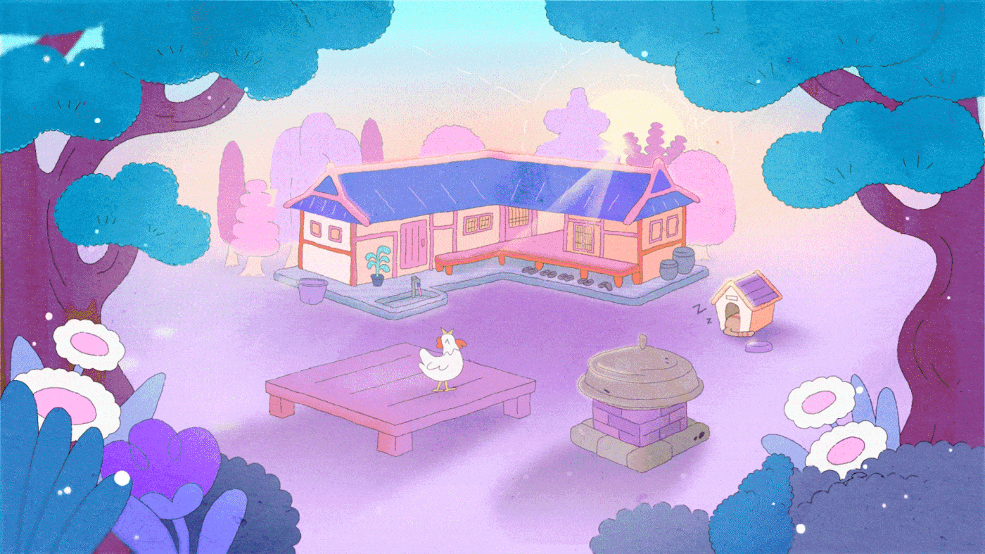
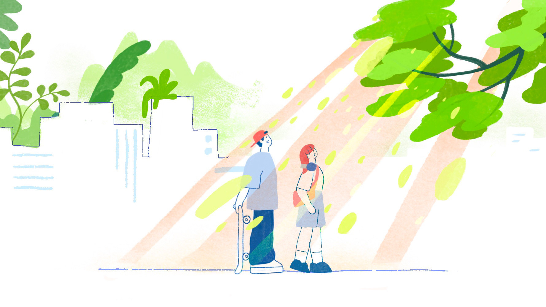
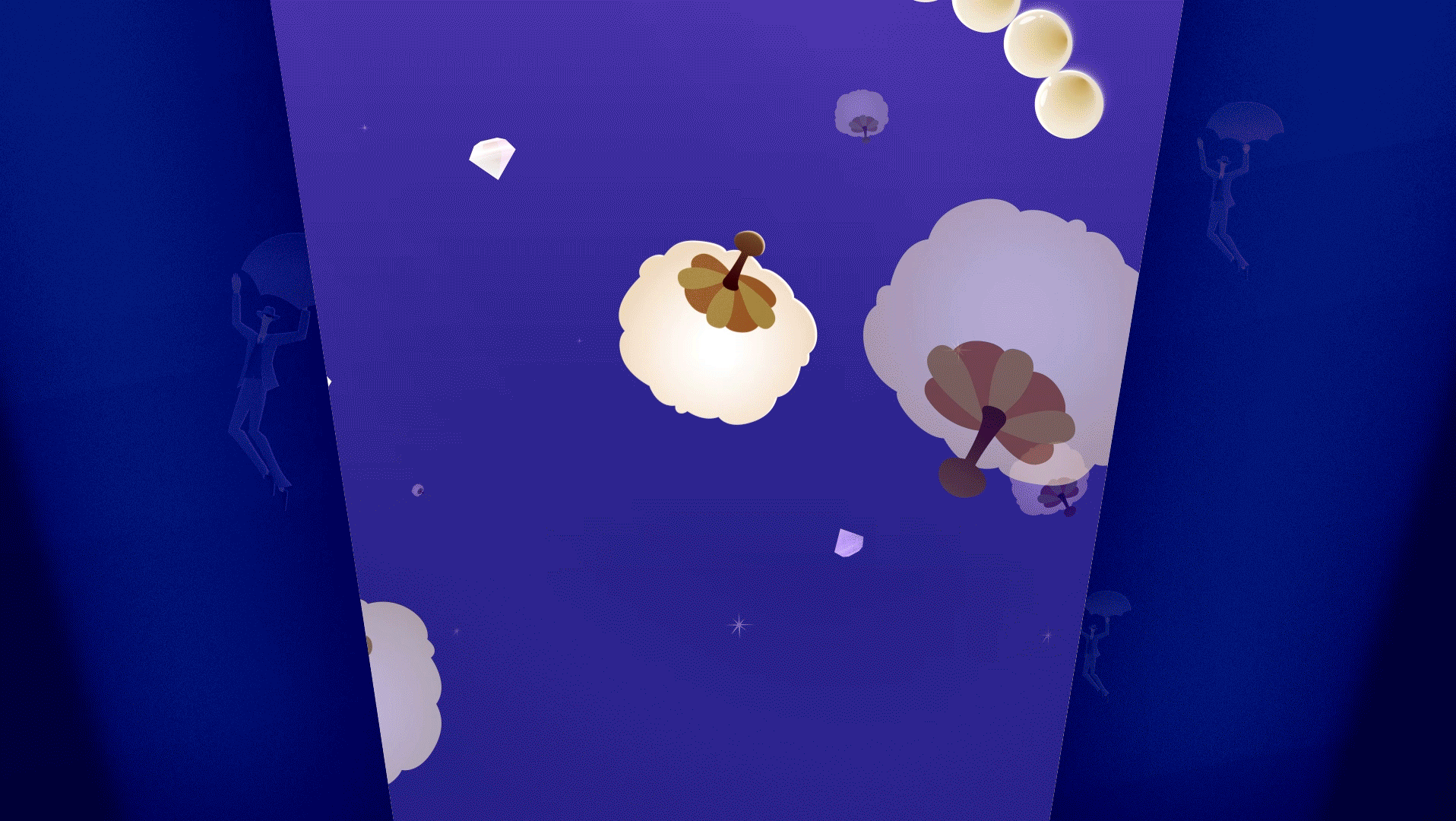
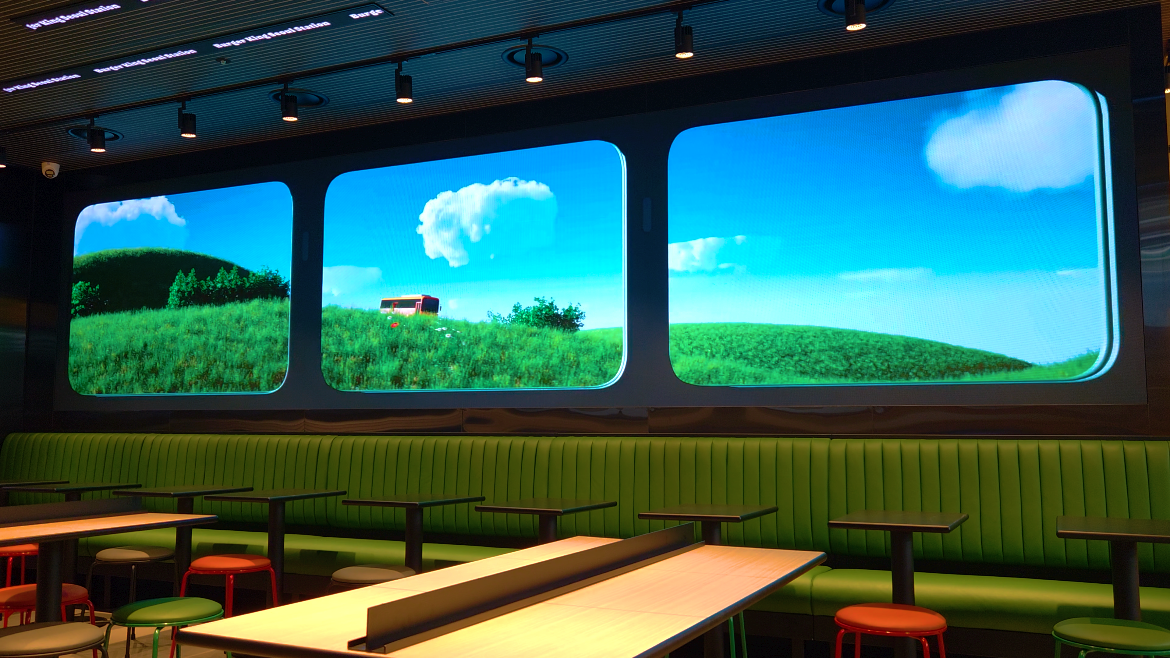
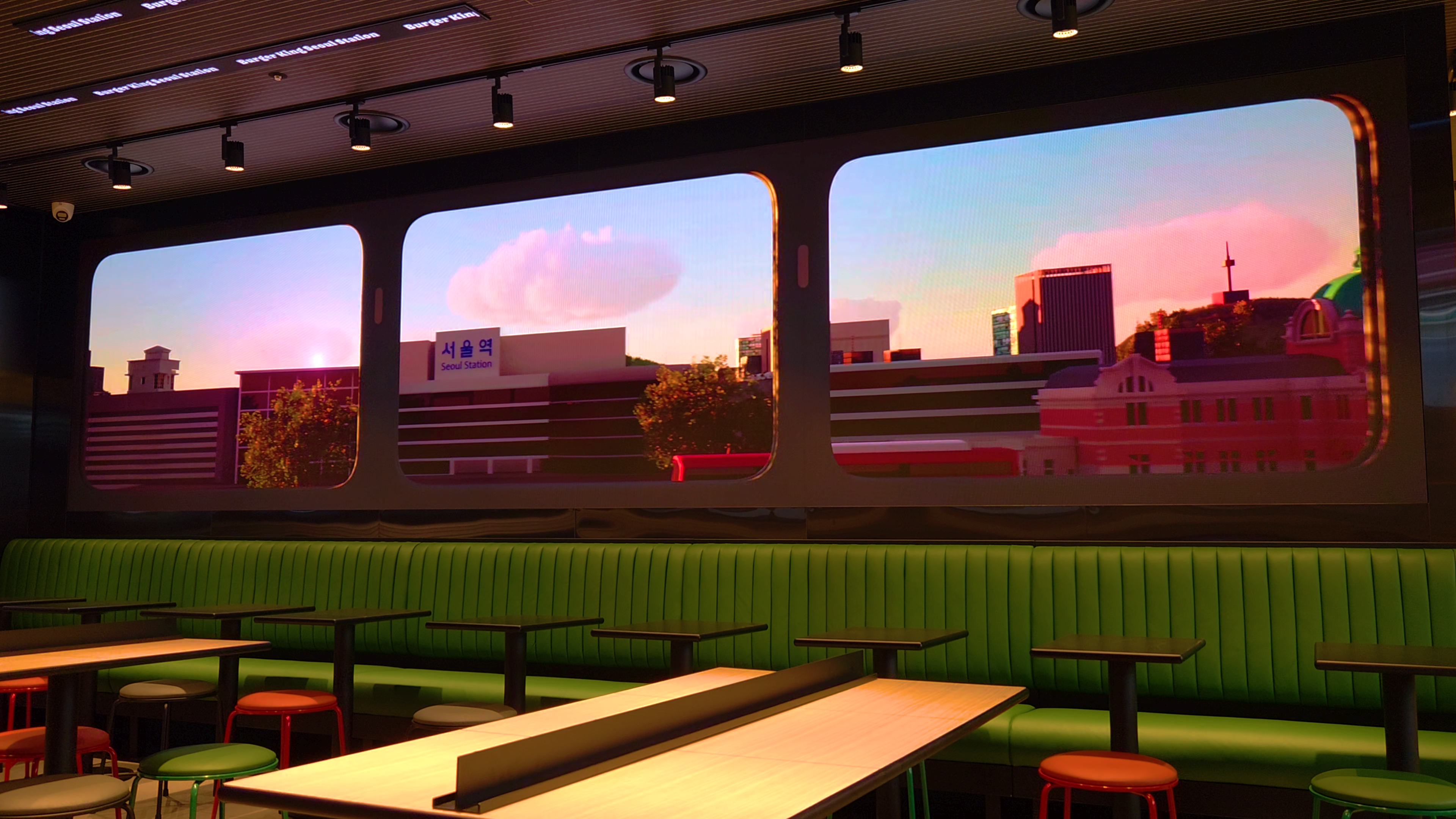
로케이션 포인트 버전은 브랜든 픽쳐스 스튜디오와 협업으로 제작되었습니다. 기차를 타고 세 개의 공간을 지나가는 구성으로, 브랜드필름과는 대조적으로 보다 심플한 설정 안에서 기차 공간 자체에 집중했습니다. 서울역의 혼잡한 환경 속에서 잠시 기차여행을 떠나는 듯한 연출을 통해, 매장 안이 잠깐 숨을 고를 수 있는 작은 휴식의 공간으로 느껴지도록 표현했습니다.
실제 기차에 탑승한 듯한 임팩트를 전달하기 위해, 탁 트인 창밖 풍경과 기차 내부를 디테일하게 그려냈습니다. 또한 이동하는 기차의 시점에서 바라본 서울역의 경관을 구현함으로써, 매장 공간이 마치 기차 안으로 전환되는 듯한 공간적 변화를 의도했습니다. 이를 통해 방문객이 일상의 동선 속에서 짧은 여행을 경험하는 듯한 몰입감을 연출했습니다.
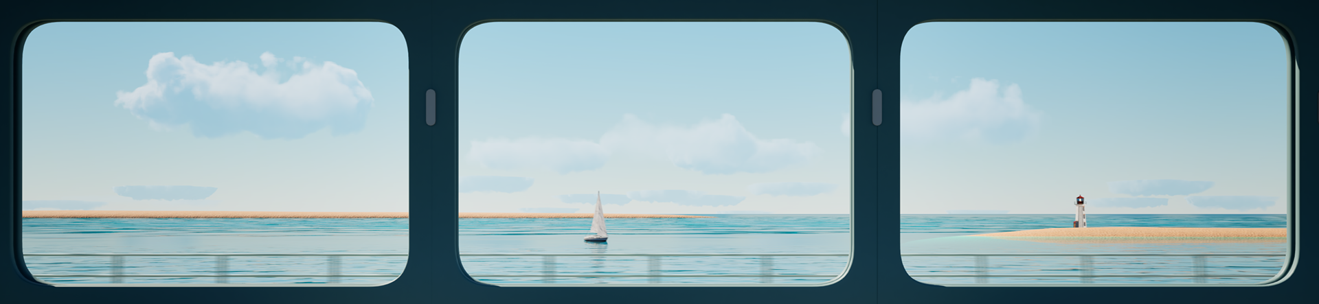
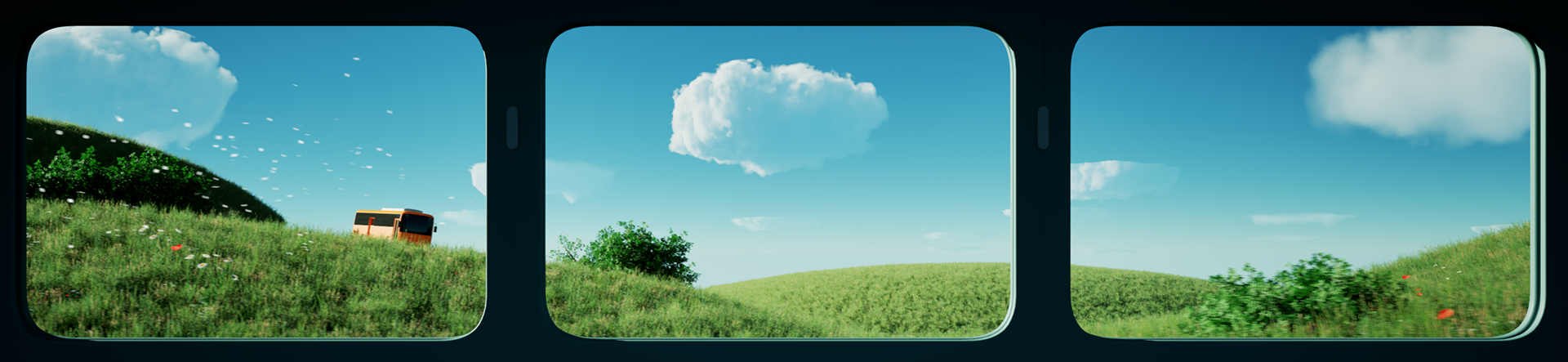
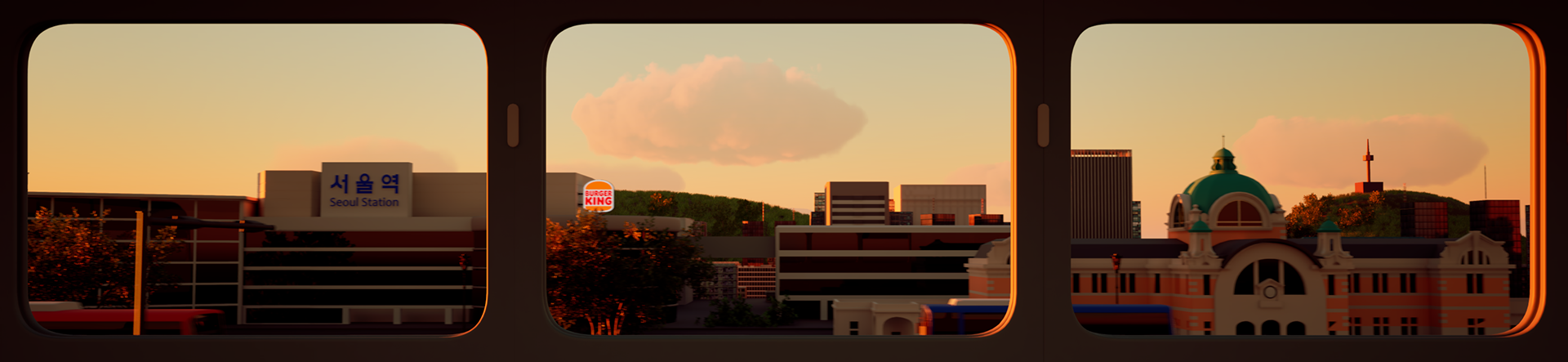
The location-point version was produced in collaboration with Brandon Pictures Studio. Structured around a train journey passing through three spaces, this version contrasts with the main brand film by focusing on a simplified setting centered on the train environment. Amid the busy atmosphere of Seoul Station, the concept creates a brief escape, transforming the store into a momentary pause, like a short train ride within the city.
To create the impact of boarding a real train, expansive window views were designed to evoke a calming, scenic atmosphere. By recreating the perspective of looking out from a moving train toward Seoul Station, the space was transformed to feel as if the store itself had shifted into a train carriage. Through this spatial illusion, visitors were invited to experience a brief sense of travel within their everyday routine.
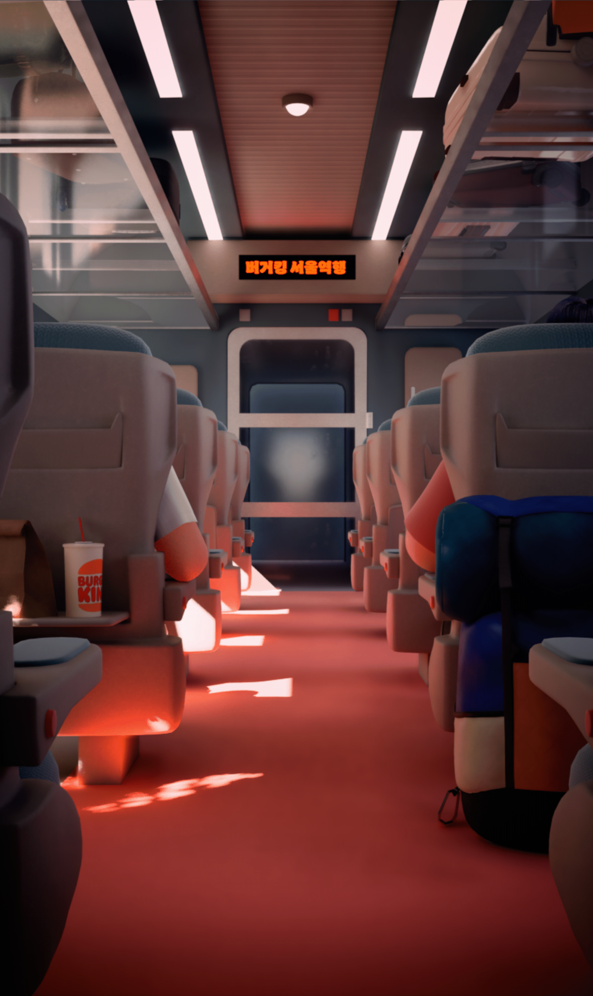
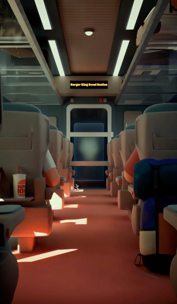
천장에는 기차의 짐 보관함을 연상시키는 비주얼을, 벽면에는 기차 통로 이미지를 배치하여 실제 열차에 탑승한 듯한 공간감을 연출했습니다. 심플한 구성의 영상이지만, 짧은 시간 안에 섬세한 감성을 전달하기 위해 기차의 움직임에 따른 빛의 변화를 구현했습니다. 창문이 덜컹이며 흔들리는 모션을 더해 이동 중인 열차의 현실감을 강화하고, 공간 몰입도를 한층 높였습니다. 또한 캐릭터의 움직임을 최소화해 달라는 클라이언트 요청에 따라 인물의 모든 동작을 배제하고, 버거킹 음료 컵을 건네는 단 하나의 액션만으로 장면을 구성했습니다. 이 절제된 연출은 오히려 시선을 한 동작에 집중시키며, 브랜드 디자인을 강조하는 핵심 장치로 작용했습니다.
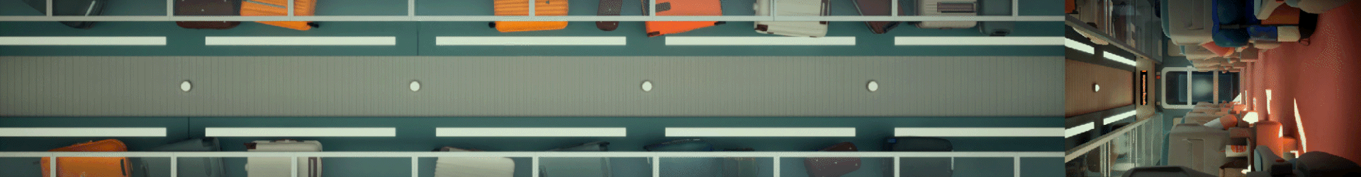

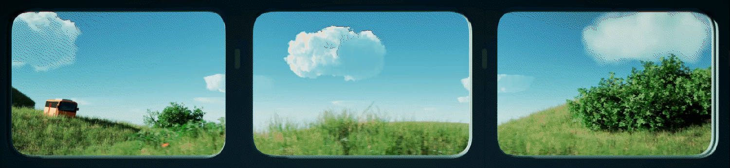
Overhead visuals referencing train luggage racks were installed on the ceiling, while imagery of a train corridor was placed along the walls to evoke the feeling of being inside an actual carriage. Although the film follows a simple structure, subtle lighting changes were introduced to reflect the motion of the train, delivering refined emotional detail within a short duration. Subtle window-shaking motion was incorporated to enhance realism, reinforcing the sensation of movement and deepening the overall spatial immersion.
In response to the client’s request to minimize character movement, all human actions were removed, leaving only a single gesture—the passing of a Burger King drink cup.
This restrained approach ultimately became the key visual device, drawing focus to the movement while highlighting the brand’s design identity.
Credit
Release : 2025
Client : BKR
Project Manager : Jaehyun Shim, Hwaeun Sim
Production : Willo, Brandon
Creative Director: Jisun Kim
Storyboard, Mock-ups : Jisun Kim
<V1. Brand Film>
Style Frames : SookYoung Ahn, Kichun cho, Saemi Park, Soomin Han
Animation : SookYoung Ahn, Saemi Park, Soomin Han
<v2. Location Point>
Director : Shawn
3D Director : Han-jin Jang
3D Motion Design : Suk-soo Kang, Han-jin Jang
3D Motion Design : Suk-soo Kang, Han-jin Jang
Shooting : Jisun Kim, SookYoung Ahn, Saemi Park, Soomin Han
Editing : Saemi Park