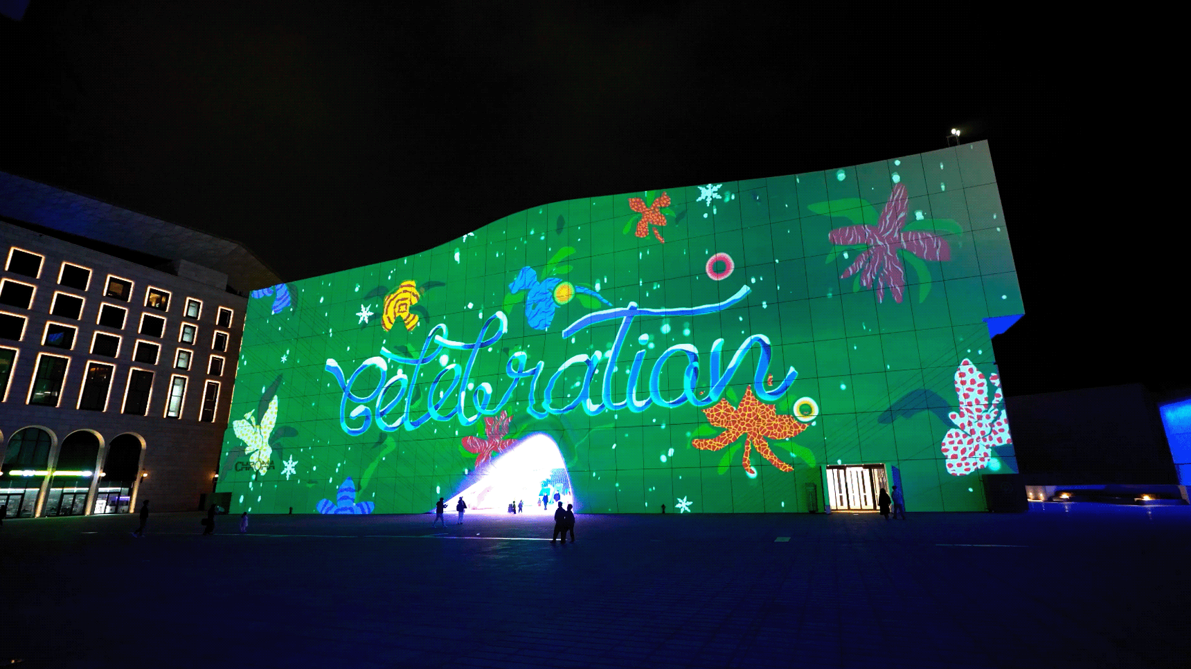
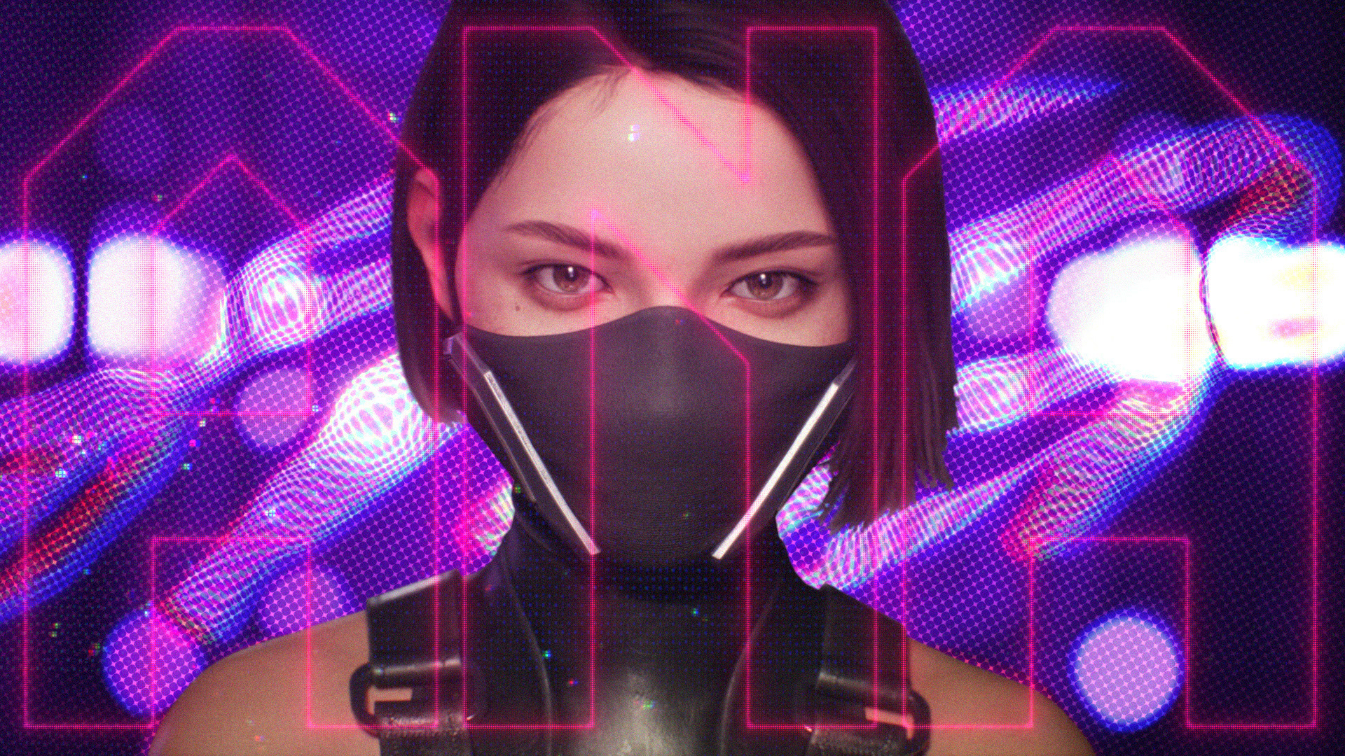
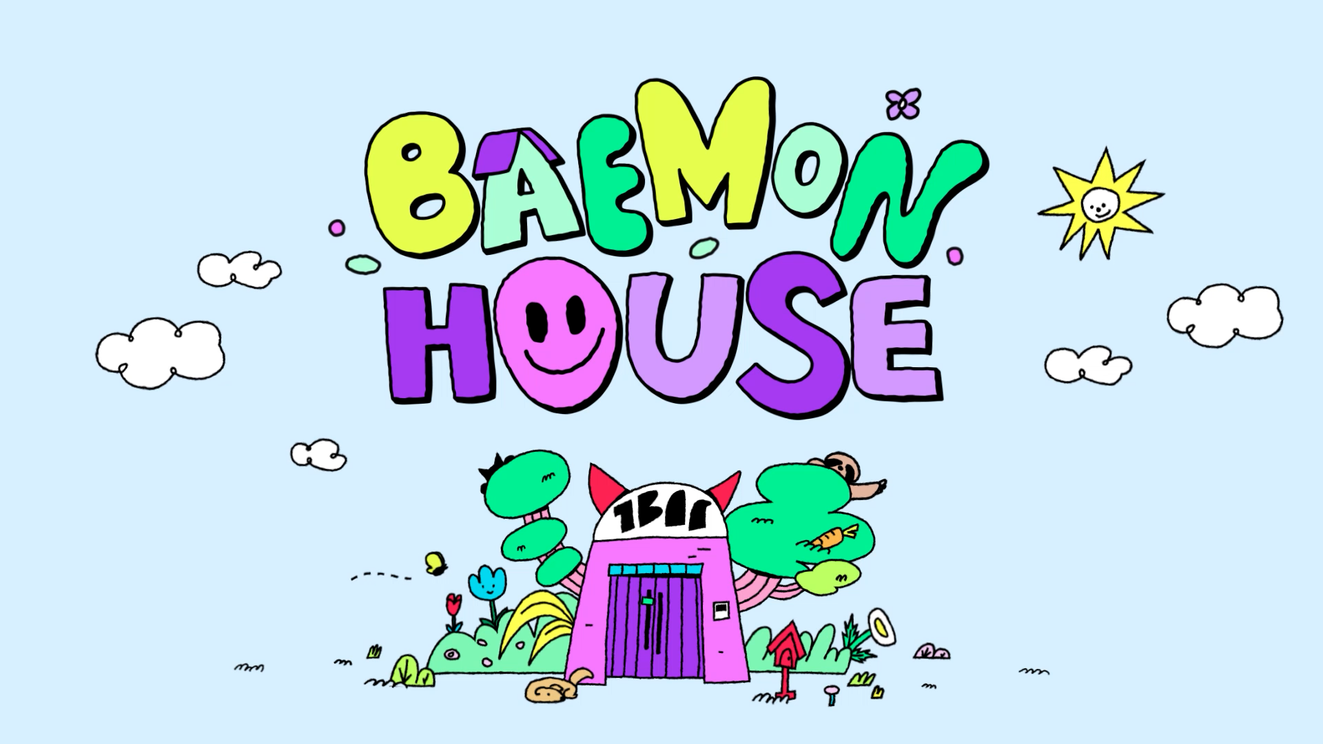
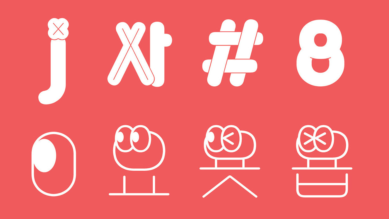
With the change of SBS MTV, one of Korea's leading music channels, to SBS M, Willo led a massive channel branding from the channel's identity to logos, slogans, network design, and design guides.
Design keywords
To target increasingly diversifying TV viewers, there was a channel's requirement to reflect the music and life of the 3059 generation in a sophisticated way. New design package should be able to express channel identity in all directions with vibrant colors that can catch the eyes of many people and give them positive energy, fun and rhythmical motions and sounds, and flexible extensions. The big challenge was how much design sensitivity should be captured to not lose the hip sensitivity of music channels while capturing a wide range of target groups and diversity.
Logo Design
The logo design, which was first carried out, was based on legible lettering, but there was a request to add an edge so that you can feel the characteristics of music and entertainment genres at a glance.
The M basic type in a structural and simple form was added with the motif of light on the stage.
The M basic type in a structural and simple form was added with the motif of light on the stage.
Two sides that symbolize Music and Life meet to create a single form M, and the shape of light surrounding the M silhouette reminds us of the birth of a new music lifestyle channel with a design that stimulates our imagination.
Color Palette
Integrate Design Concept
Key Design that integrate online and offline should be preceded by key concepts so that they can look like a single package, even if they vary according to various media characteristics. It develops an integrated design concept based on a solid shape and vivid color logo design. We developed a design methods that can show the following three personalities.
-Based on logo characteristics
-Revealing the properties of light
-Concentrating
-Revealing the properties of light
-Concentrating
Design motif
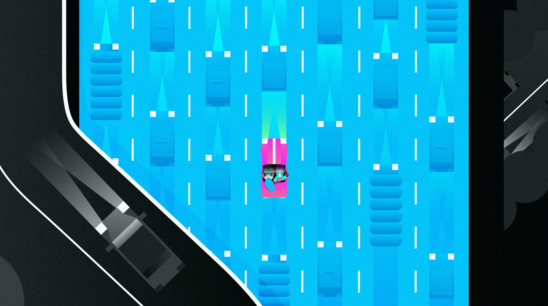
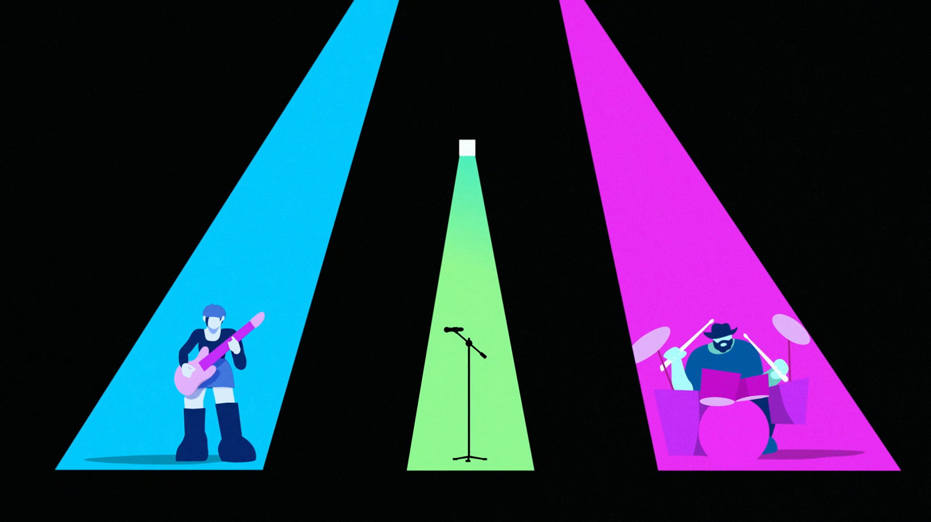
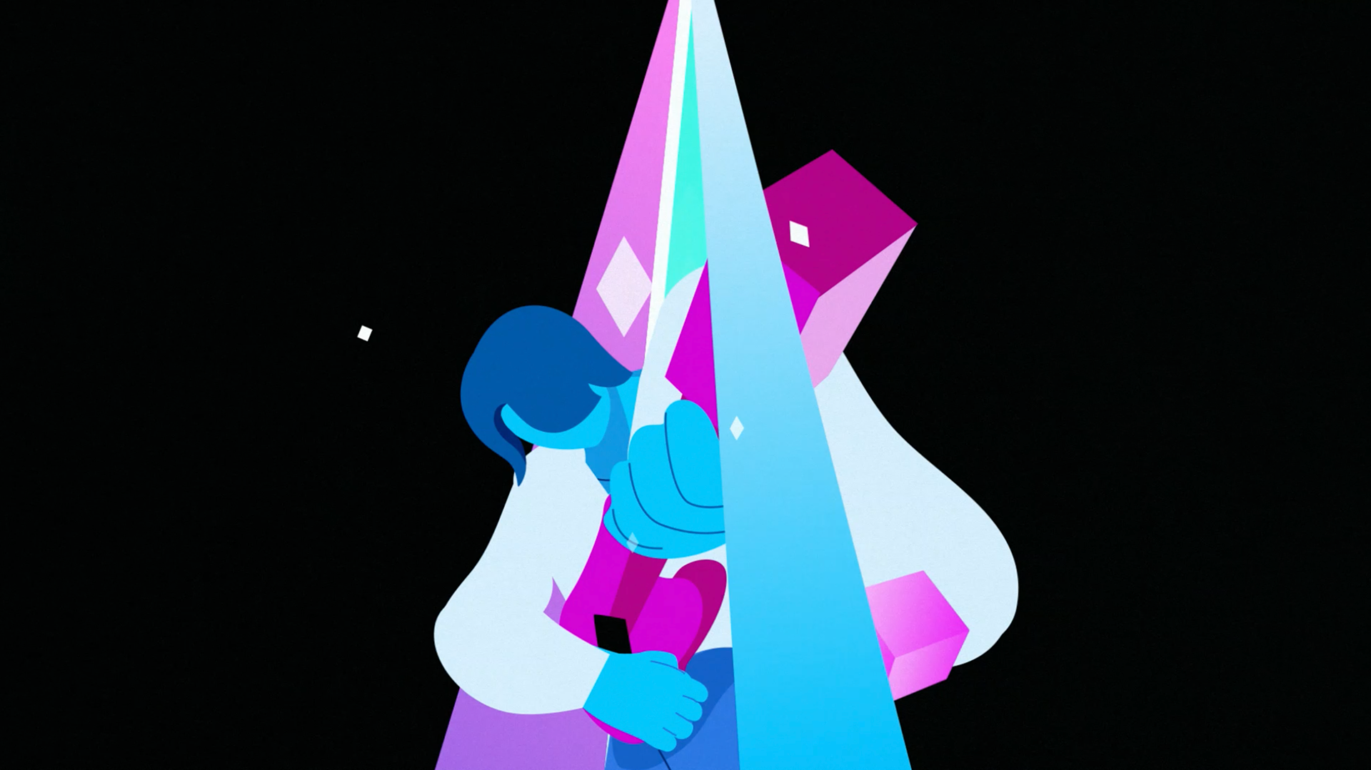
Simple and intense graphics consisting of boxes, diagonal lines, and straight lines derived from logo design attributes are found in searchlights and expressed in a variety of overlapping animation characteristics. The moment searchlight shed light on new music and life, Bang! A new M is born. Key visual was established through end tags and basic design grids reflecting these elements and characteristics.
EndTag
Basic Design Grids


Elements layout
Layout Grids
Network design
Toolkits


Notifications

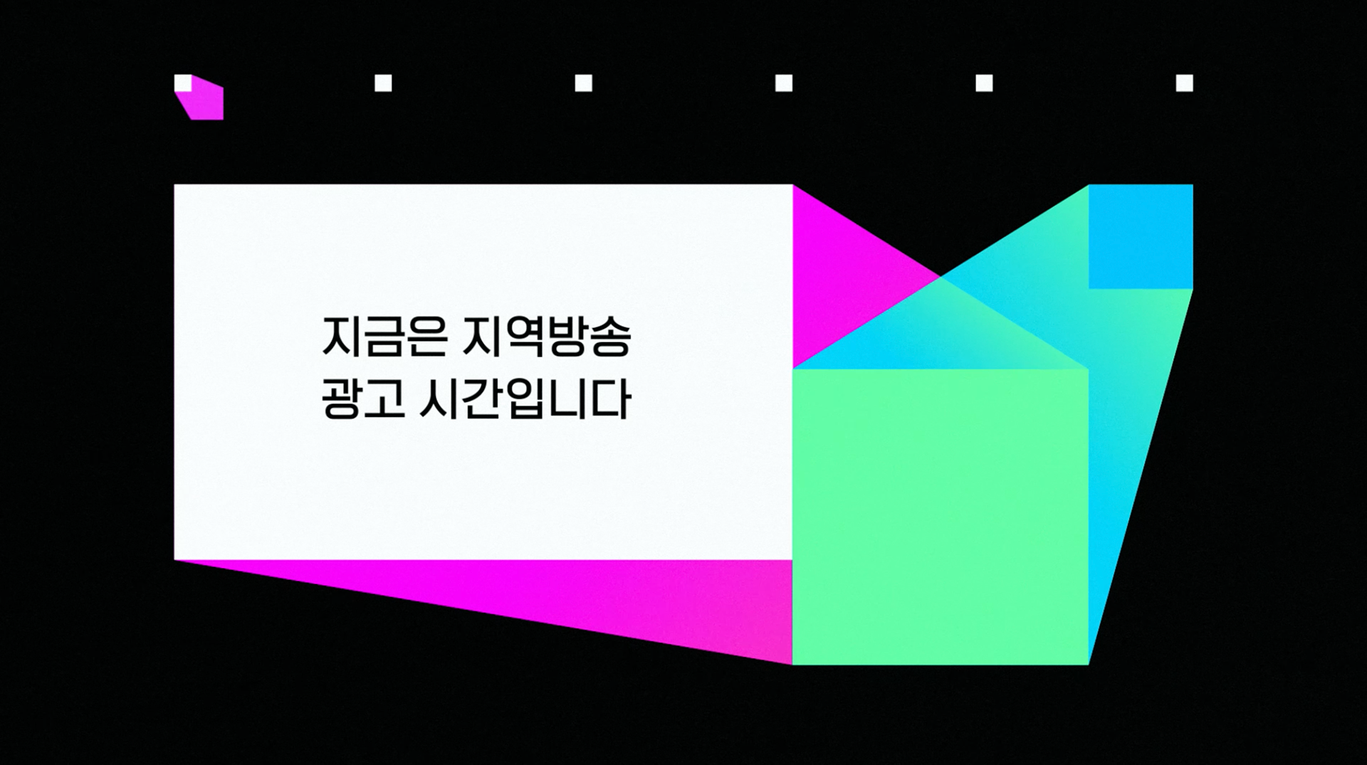
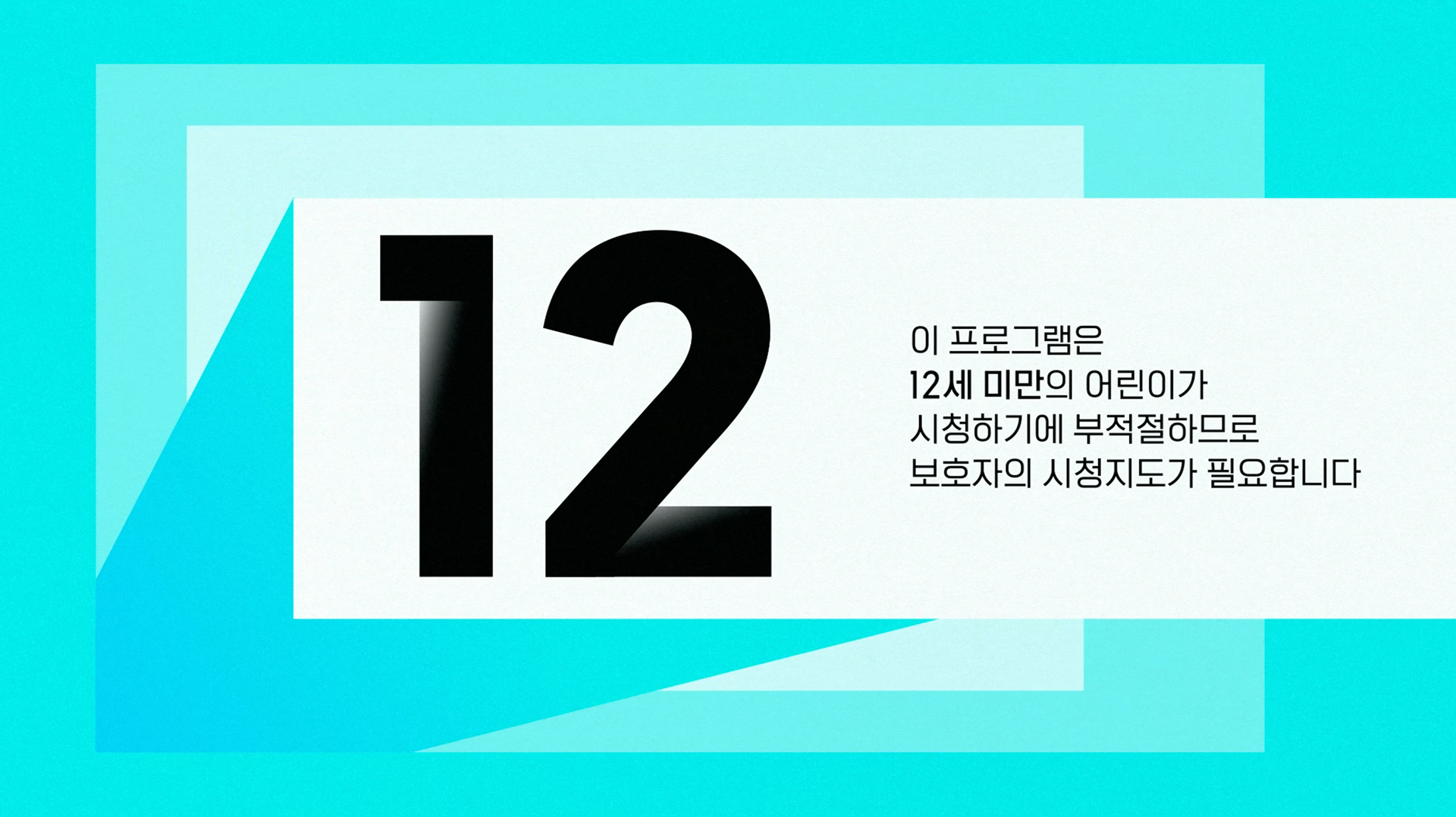
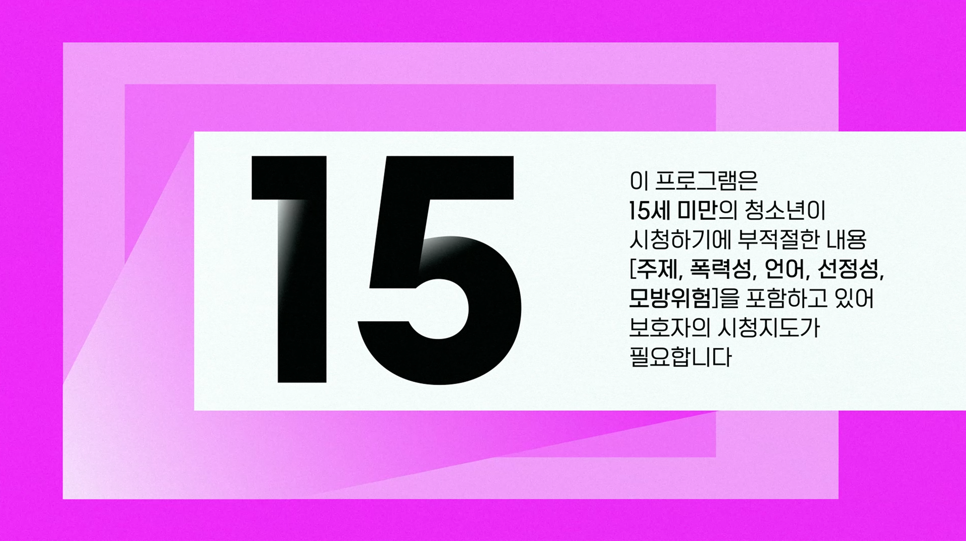
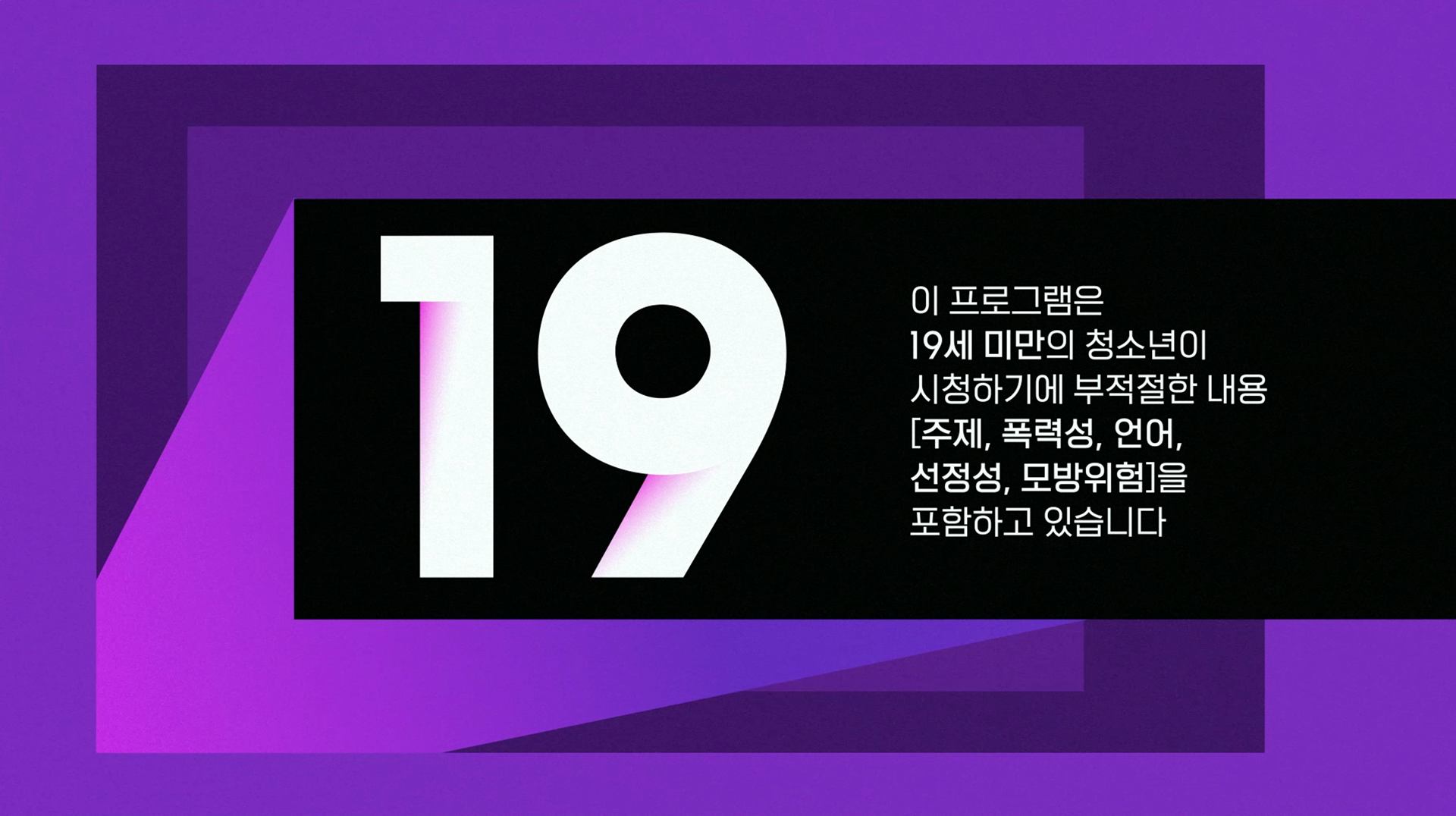
Rating Boards

Idents





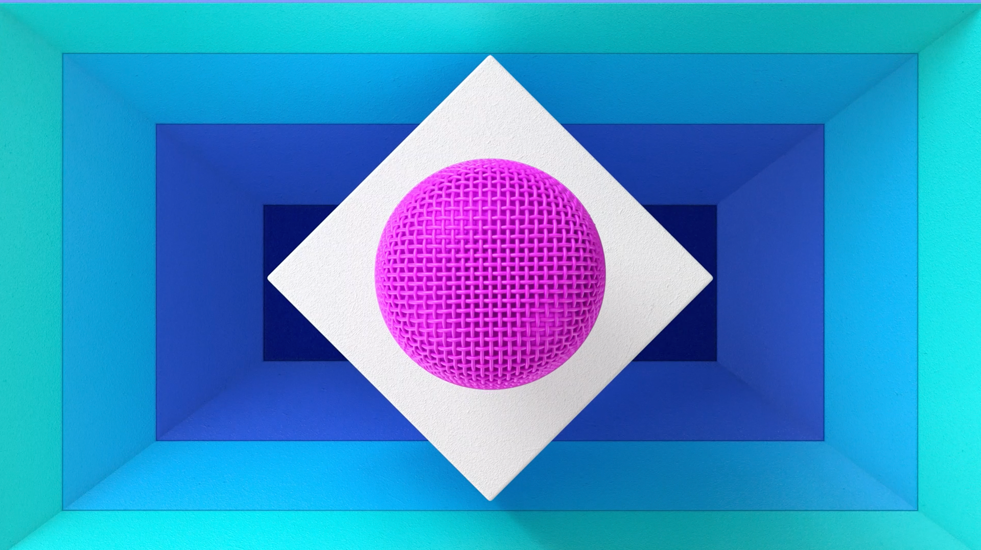
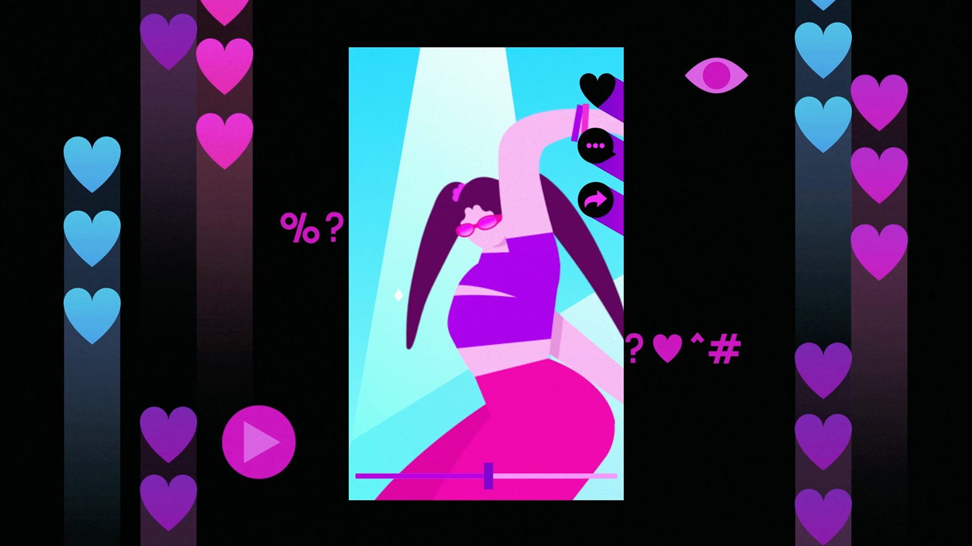

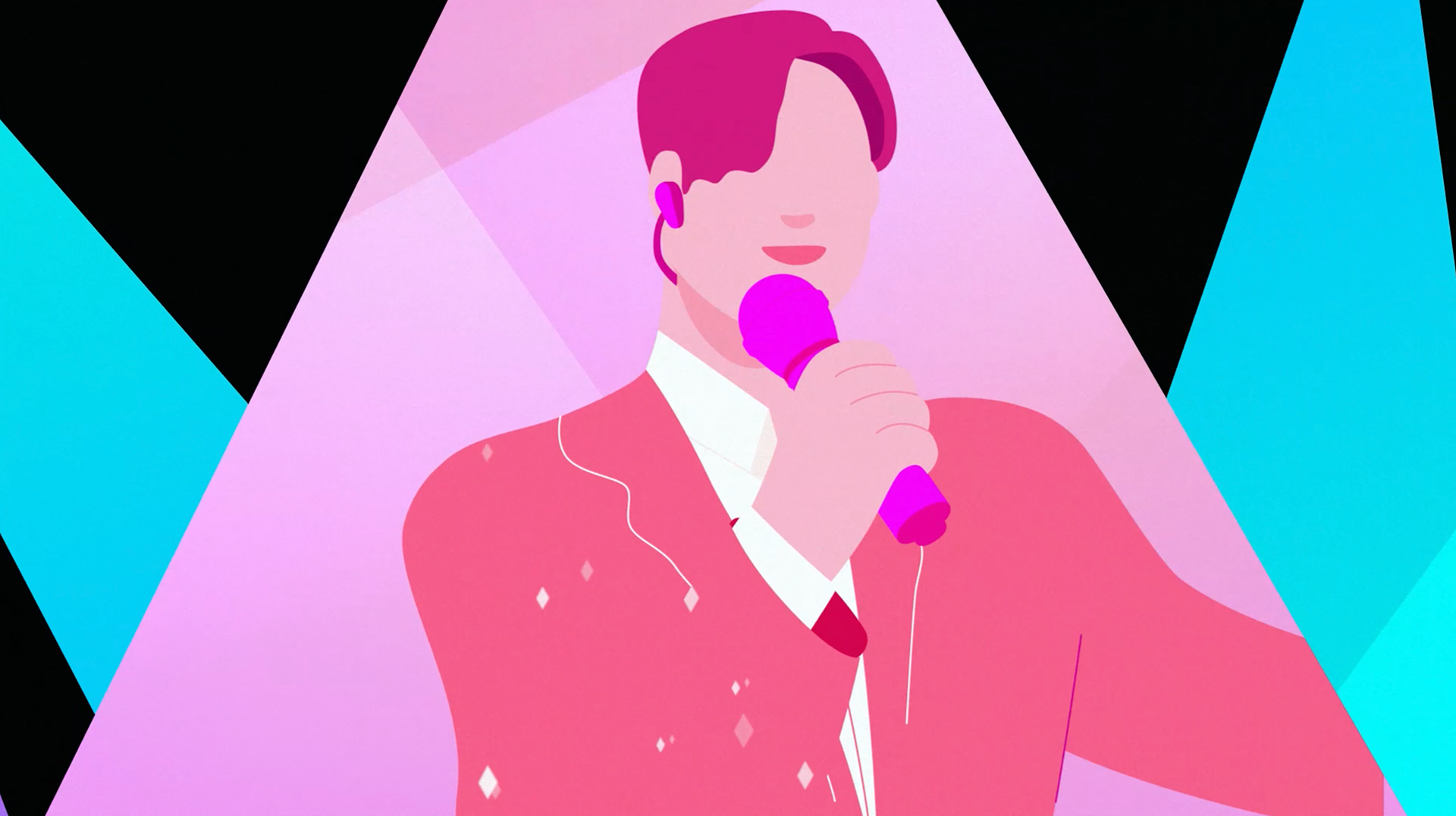
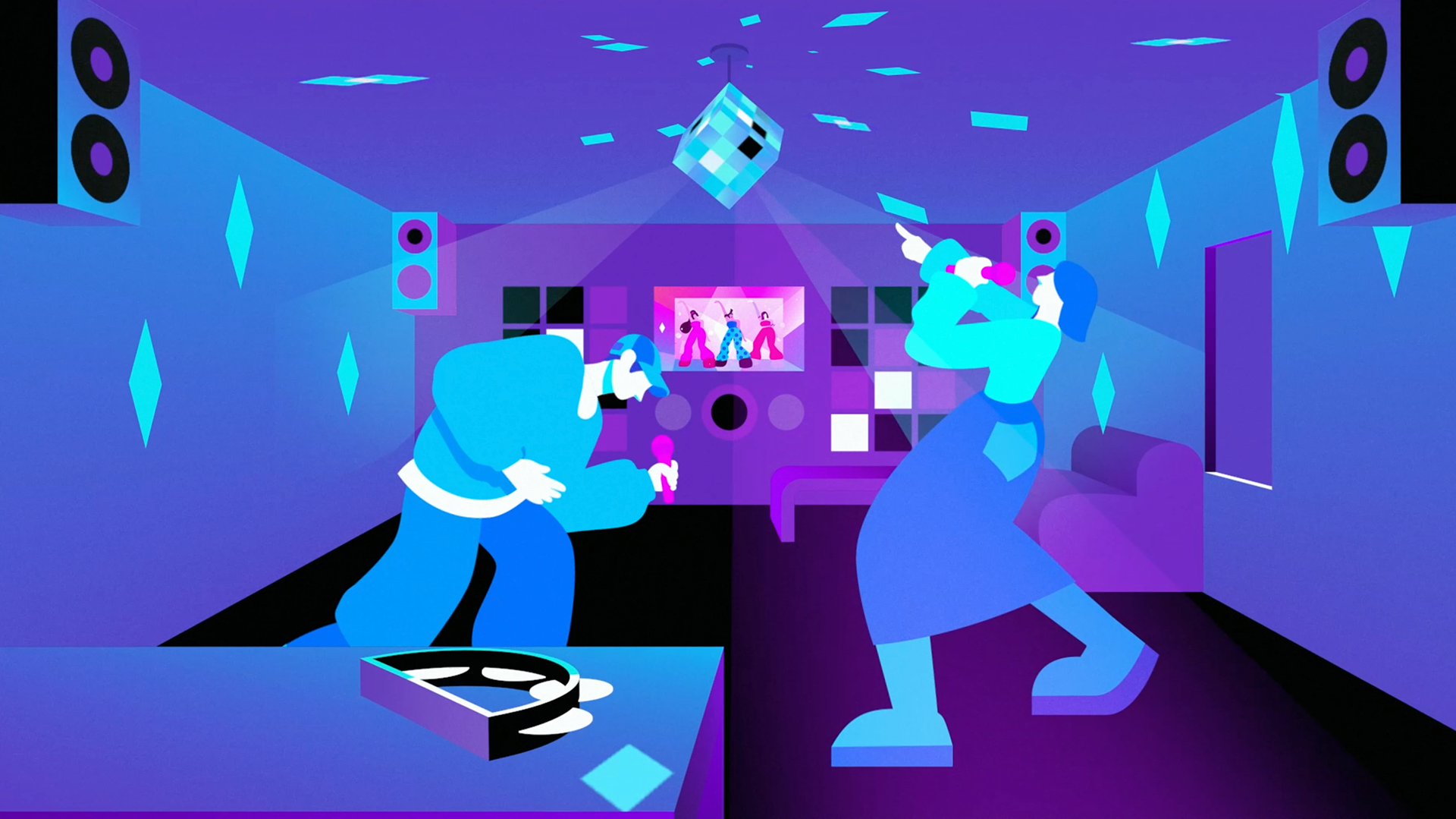
APPLICATIONS
[SBS M] Channel Branding
Release : SBS M, 2022
Client : SBS M
Project Manager : Dayeon Lee
Sound Designer : Roi Audio,
Sound Designer (Sign On, SO Bumper) : Chang-gyu Choi
Production : Willo
Creative Director : Jisun Kim
Supervisor : Heejin Choi
Project Manager : Jisun Kim
Design Planning : Jisun Kim, Heejin Choi
BI Design, Logo Guide, Graphic System : Jisun Kim
Slogan Design : Heejin Choi
Basic Grids : Jisun Kim, Jeongwon Kim
Application Design : Jisun Kim, Sook-young Ahn
Network Design
End Tag : Jisun Kim
Next : Jeongwon Kim, Jisun Kim
Rating Board, Sign On, SO Bumer, Line Up : Heejin Choi
Element Design : Hyejin Song, Heejin Choi, Jisun Kim
Teaser, Main ID, Sub ID A, Sub ID B
Design, Animation Lead, Composition : Jisun Kim, Heejin Choi
Character, Cell Animation Lead : Jisun Kim
Style Frames : Jisun Kim, Heejin Choi, Jeongwon Kim, Sook-young Ahn
2D Animation : Jisun Kim, Heejin Choi, Jeongwon Kim, Sook-young Ahn
3D Animation : Seokmin Yoon

