OVERVIEW
BABYMONSTER는 YG 엔터테인먼트 소속의 글로벌 걸그룹으로, 음악 뿐 아니라 다양한 SNS 콘텐츠를 통해 멤버 개개인의 개성과 크리에이터적 면모를 적극적으로 보여주고 있습니다. 윌로는 이러한 방향성에 맞춰 유튜브 콘텐츠 전반에 적용되는 로고, 타이틀, 자막 디자인 패키지를 제작했습니다. 그룹의 에너지와 리듬을 해치지 않으면서도, 일관된 톤 앤 매너로 브랜드 완성도를 강화하는 데 집중했습니다.
BABYMONSTER is a global girl group under YG Entertainment, actively building their identity through self-driven YouTube content that highlights each member’s individuality. WILLO designed a comprehensive logo, title, and caption design package tailored for their YouTube channel. The system was developed to maintain visual consistency while amplifying the group’s energy, rhythm, and creator-focused tone.
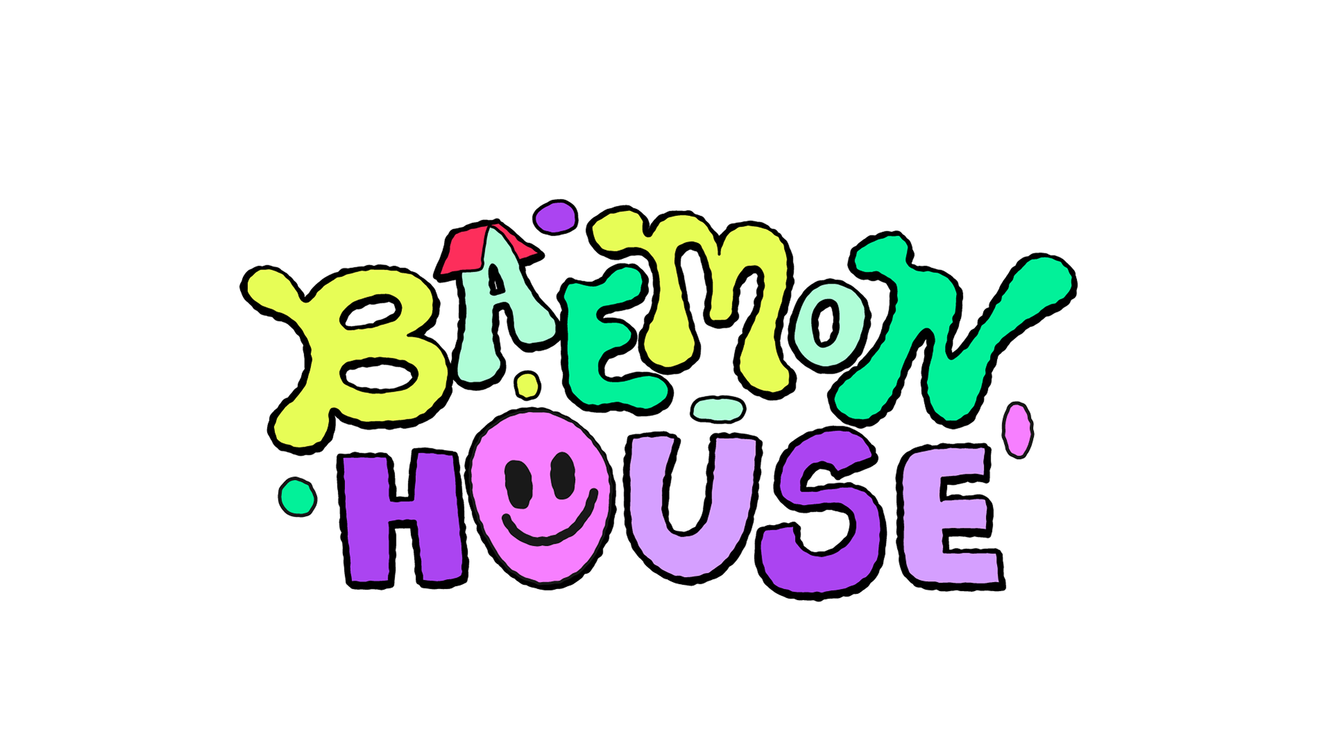
LOGO DESIGN
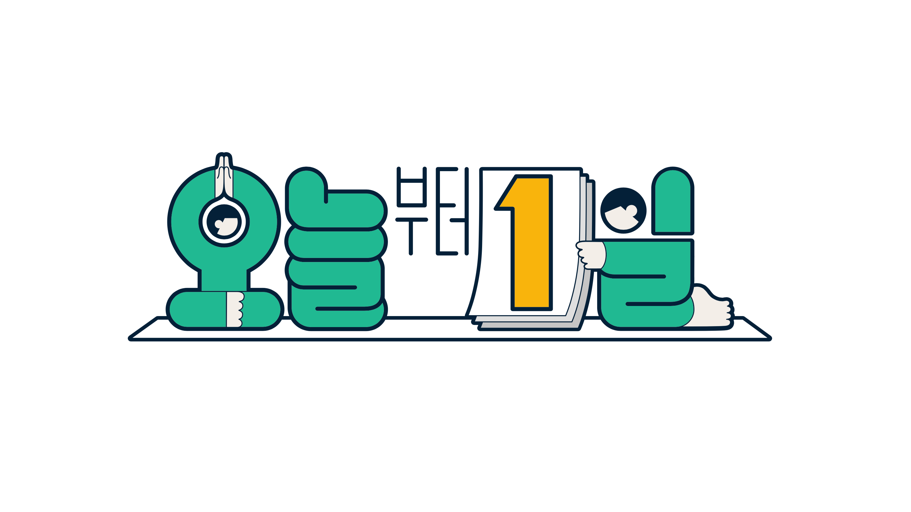
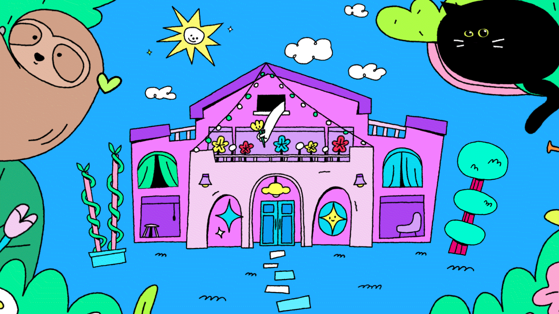
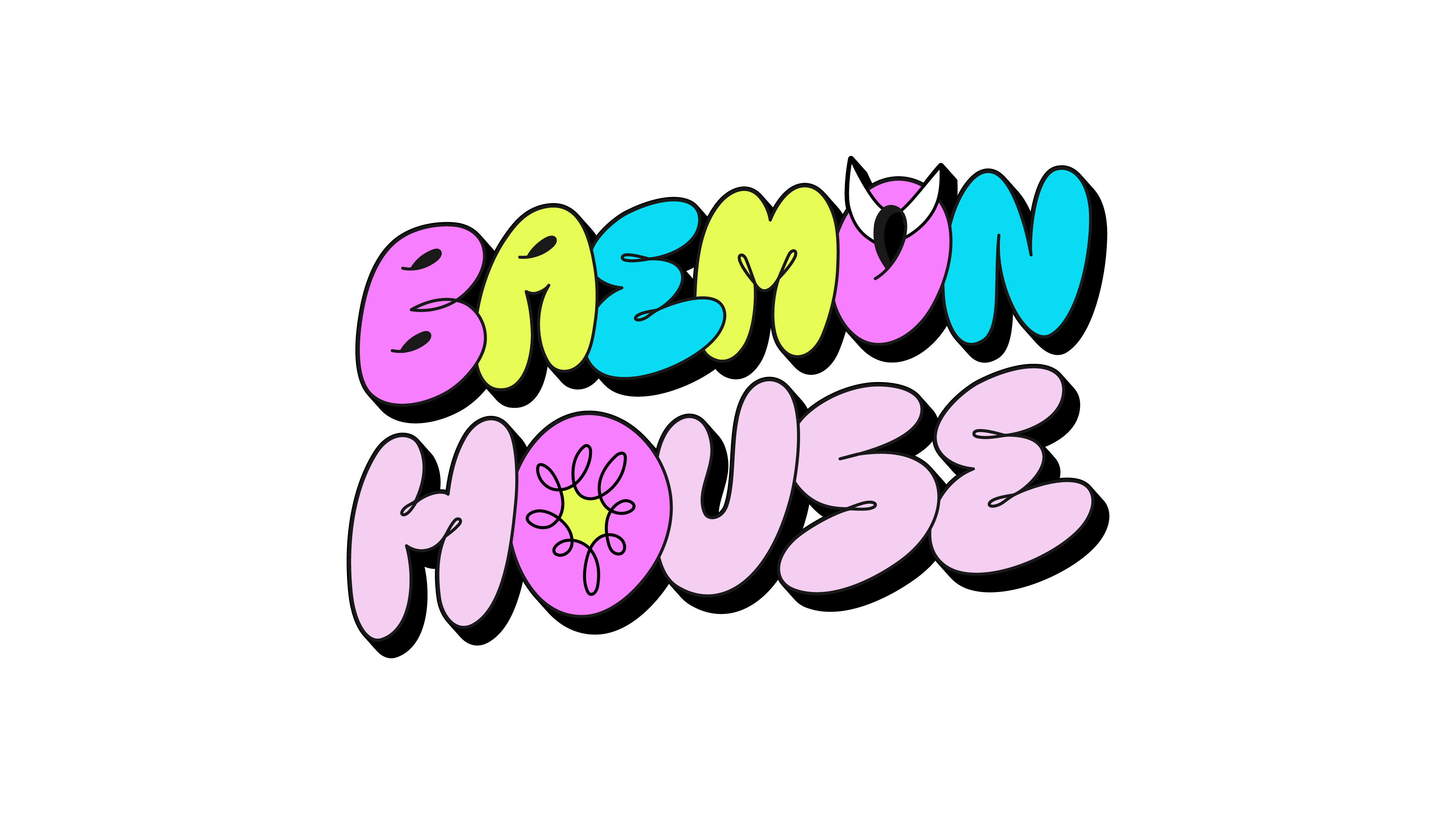
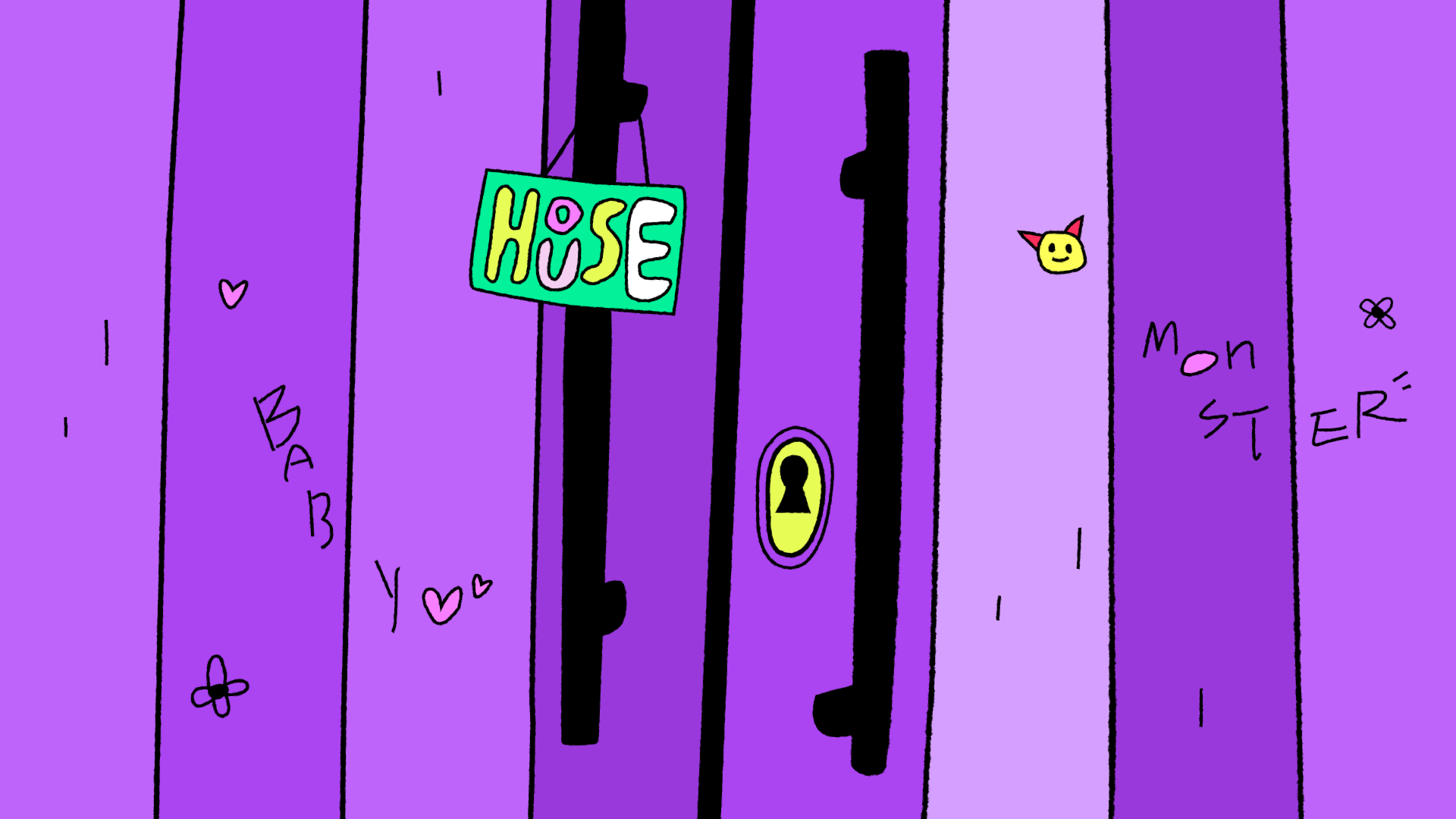
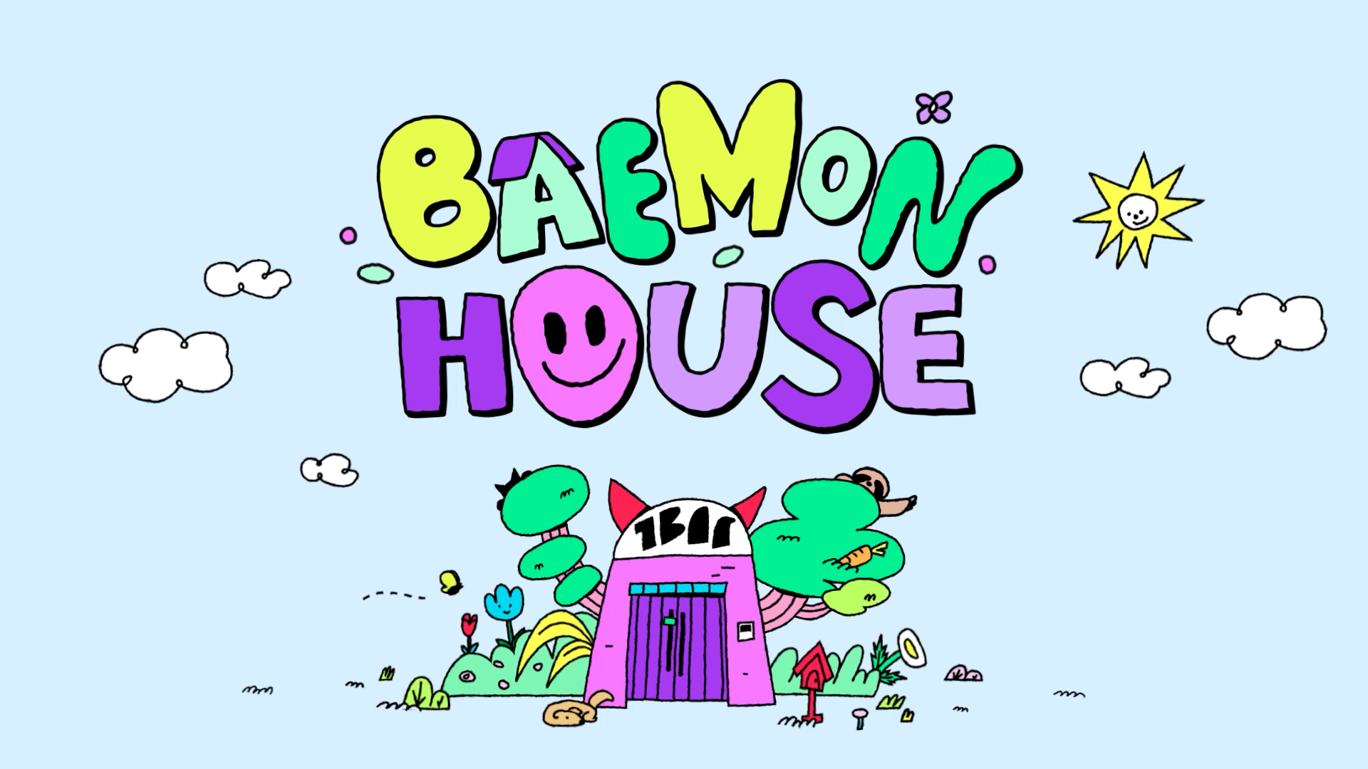
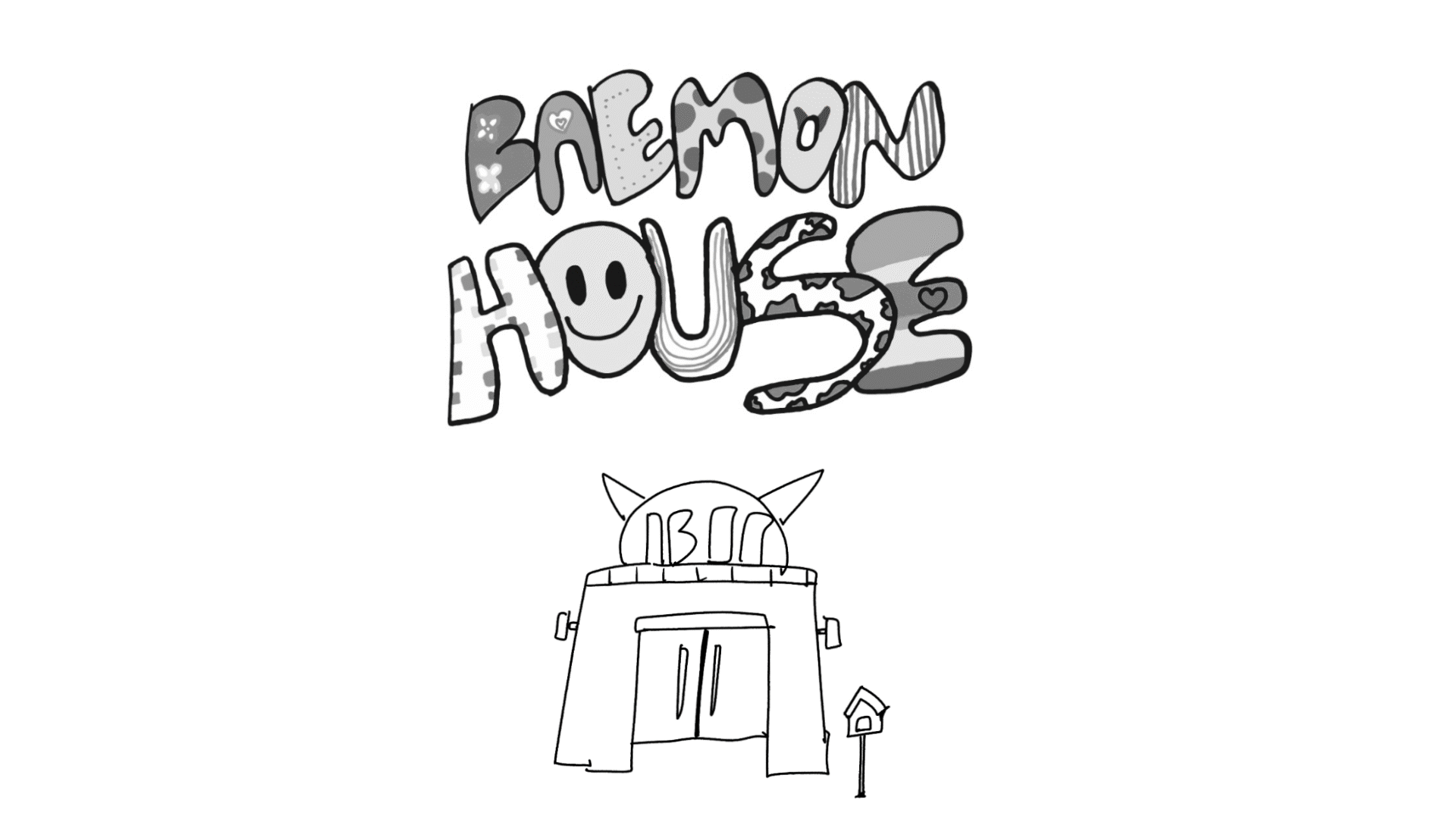
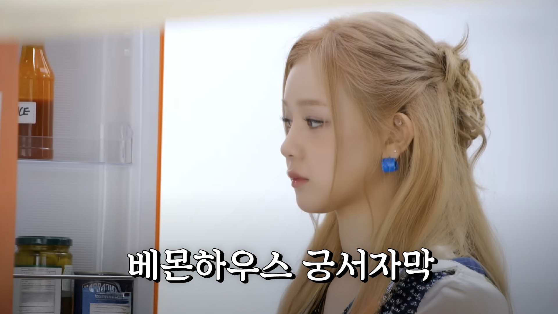
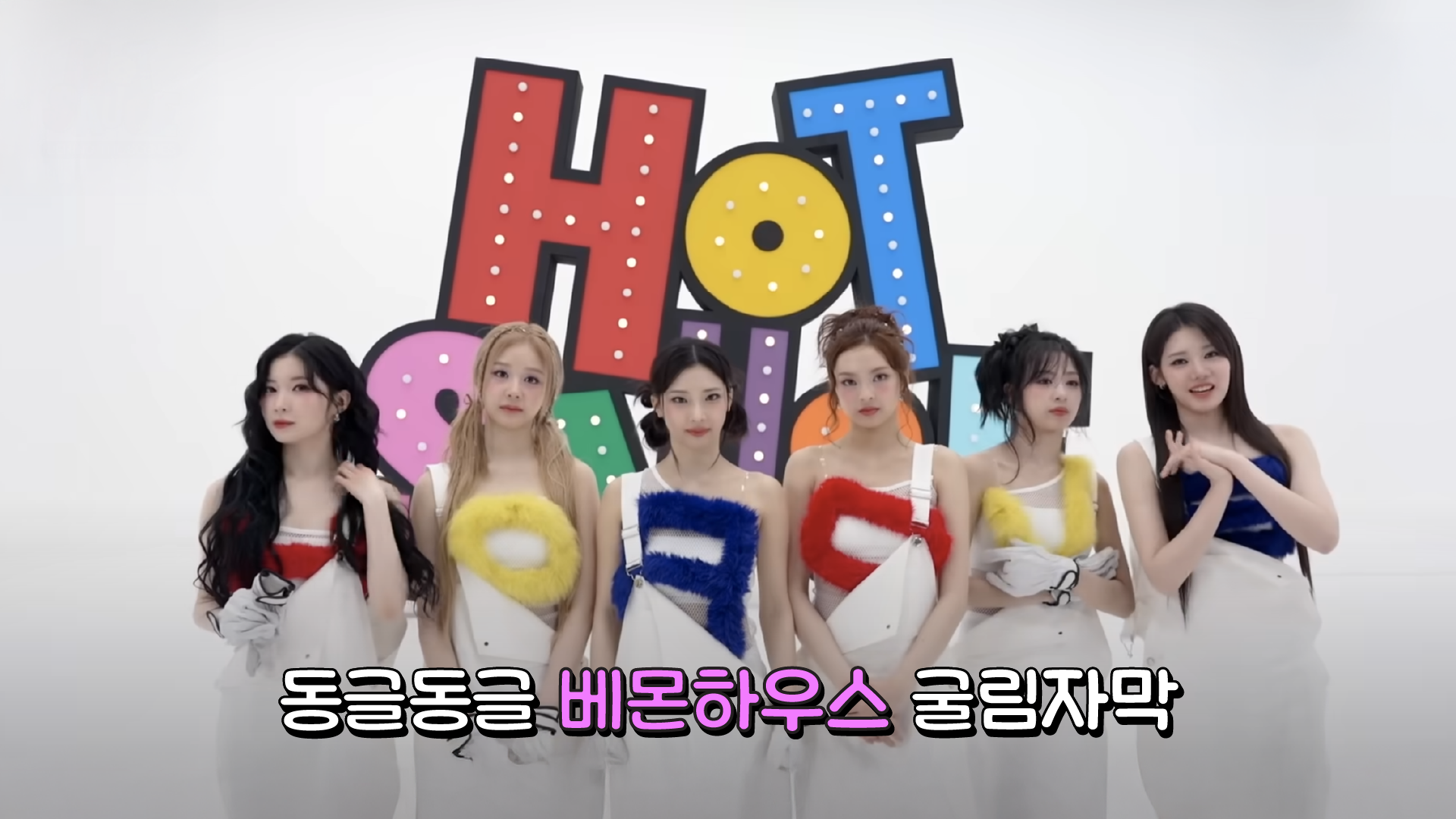
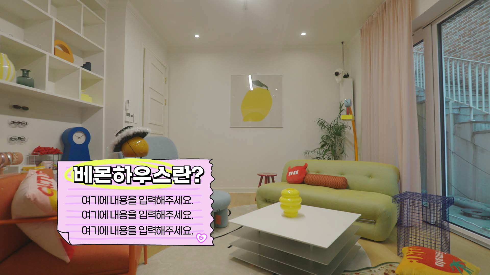
BABYMONSTER가 머무는 공간인 BAEMON HOUSE를 모티프로 한 로고 디자인으로, 소녀들의 귀엽고 발랄한 성격이 한눈에 전달되면서도 높은 가독성을 유지하는 것을 목표로 했습니다. 집의 형태를 중심으로, 뿔 모티프, 멤버를 연상시키는 실루엣, 다양한 귀여운 아이콘 등 여러 시각적 요소를 폭넓게 탐색하며 캐릭터성과 가독성 사이의 균형을 검토했고, 최종적으로 가장 직관적이고 확장성이 높은 방향으로 정리했습니다.
하나의 집 아래 장난스럽게 모여 있는 소녀들의 이미지는 핸드 드로잉 기반의 비정형 형태로 표현했으며, 레몬 옐로우–민트 컬러의 상단 타이포그래피와 마젠타–퍼플 컬러의 하단 대비를 통해 경쾌하고 유쾌한 무드를 완성했습니다.
The logo design is based on BAEMON HOUSE, the symbolic space where BABYMONSTER come together. The primary goal was to convey the group’s playful and youthful personality at a glance while maintaining strong legibility. Various visual approaches were explored throughout the process, including horn motifs, member-inspired silhouettes, and cute icon elements,
with careful consideration given to the balance between character expression and readability, leading to the most intuitive and scalable solution. The image of the girls gathered under one roof is expressed through hand-drawn, irregular shapes, while the contrast between lemon yellow–mint on the top line and magenta–purple on the bottom line creates a bright and energetic tone.

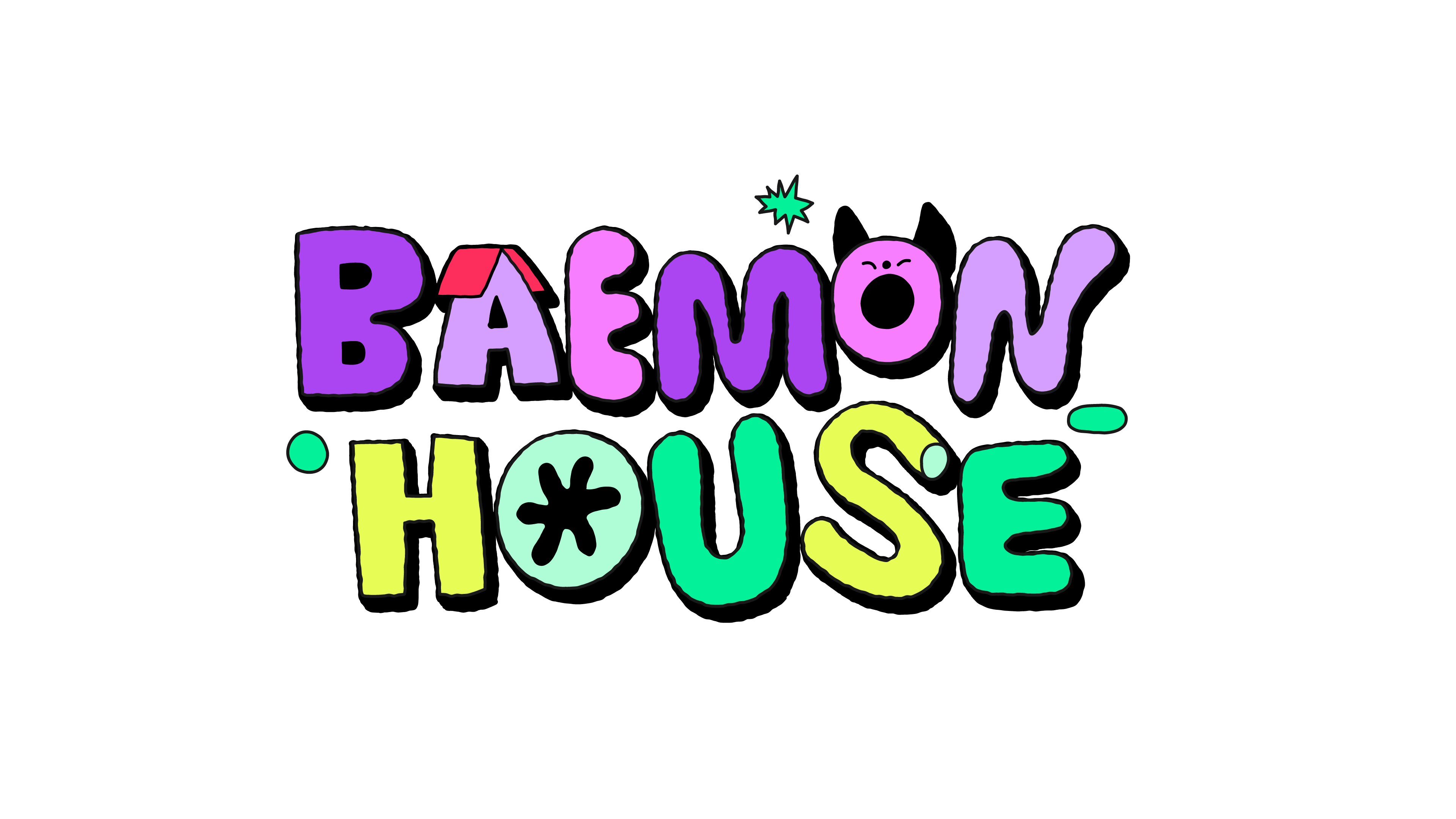
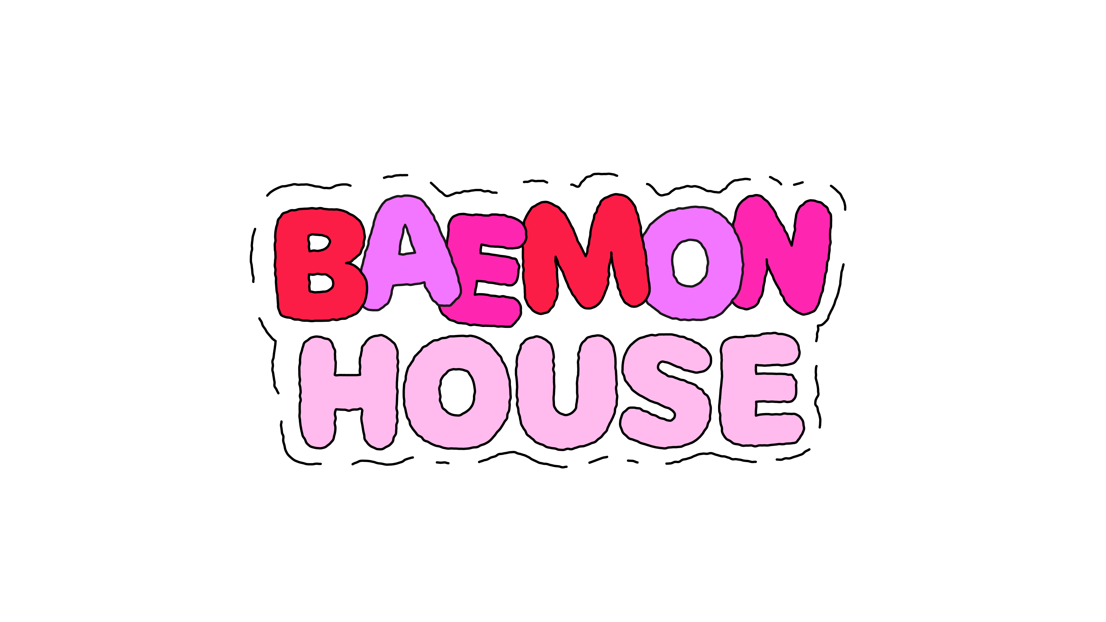
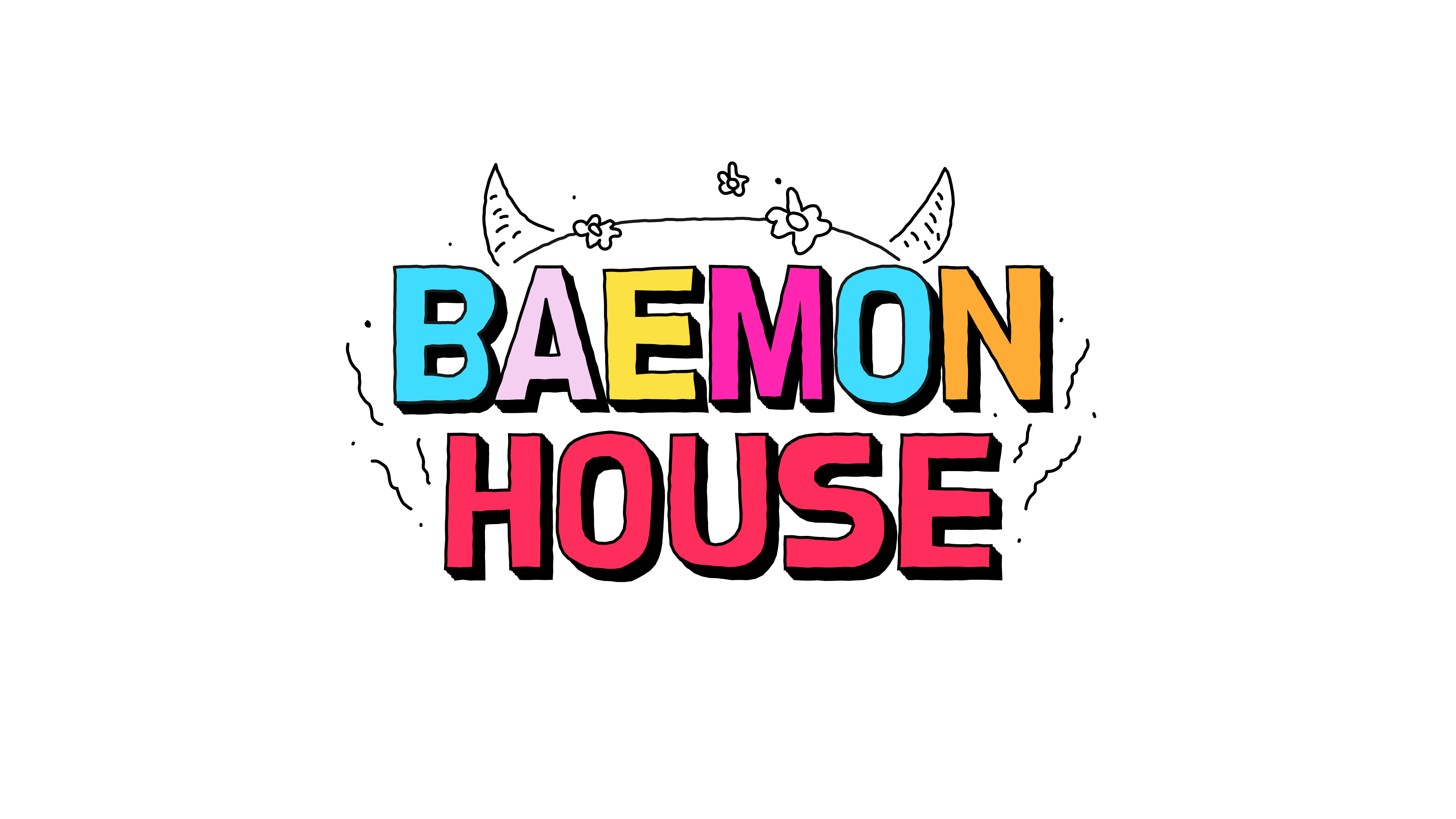
LOGO DRAFT
STYLE FRAMES
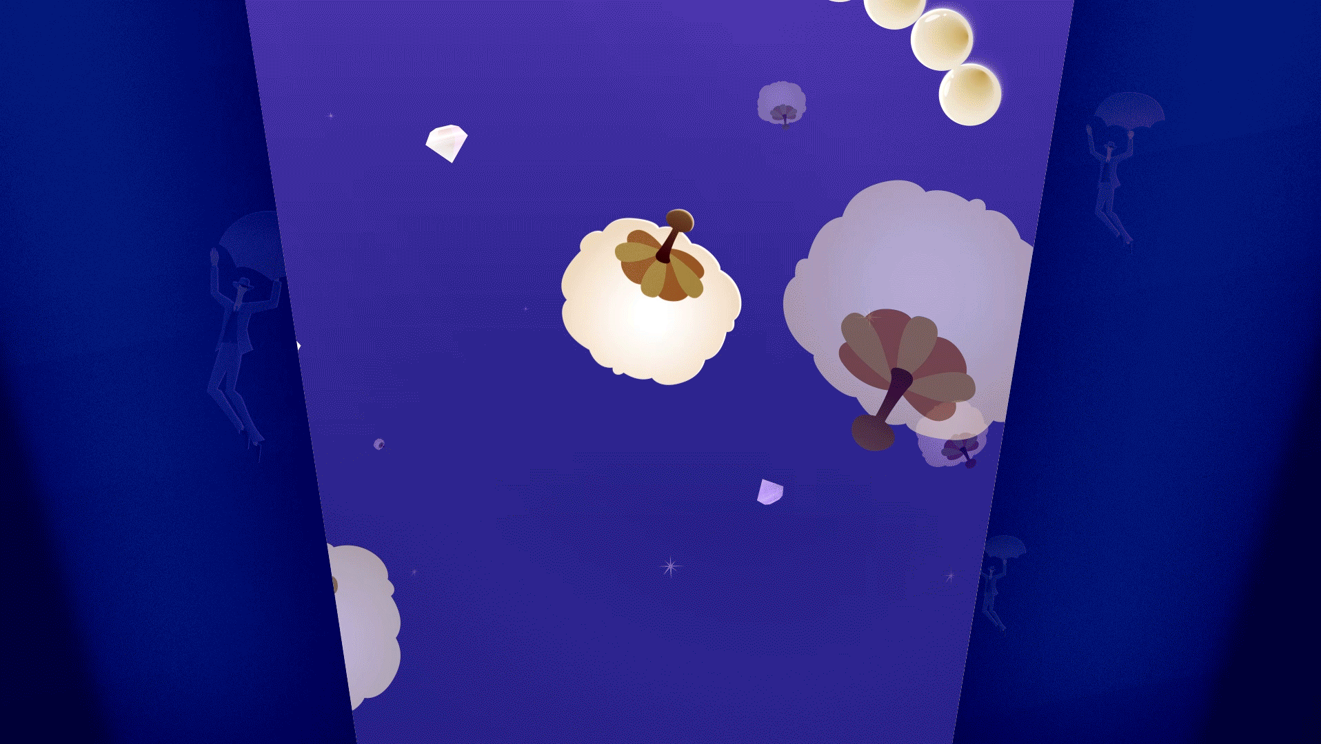
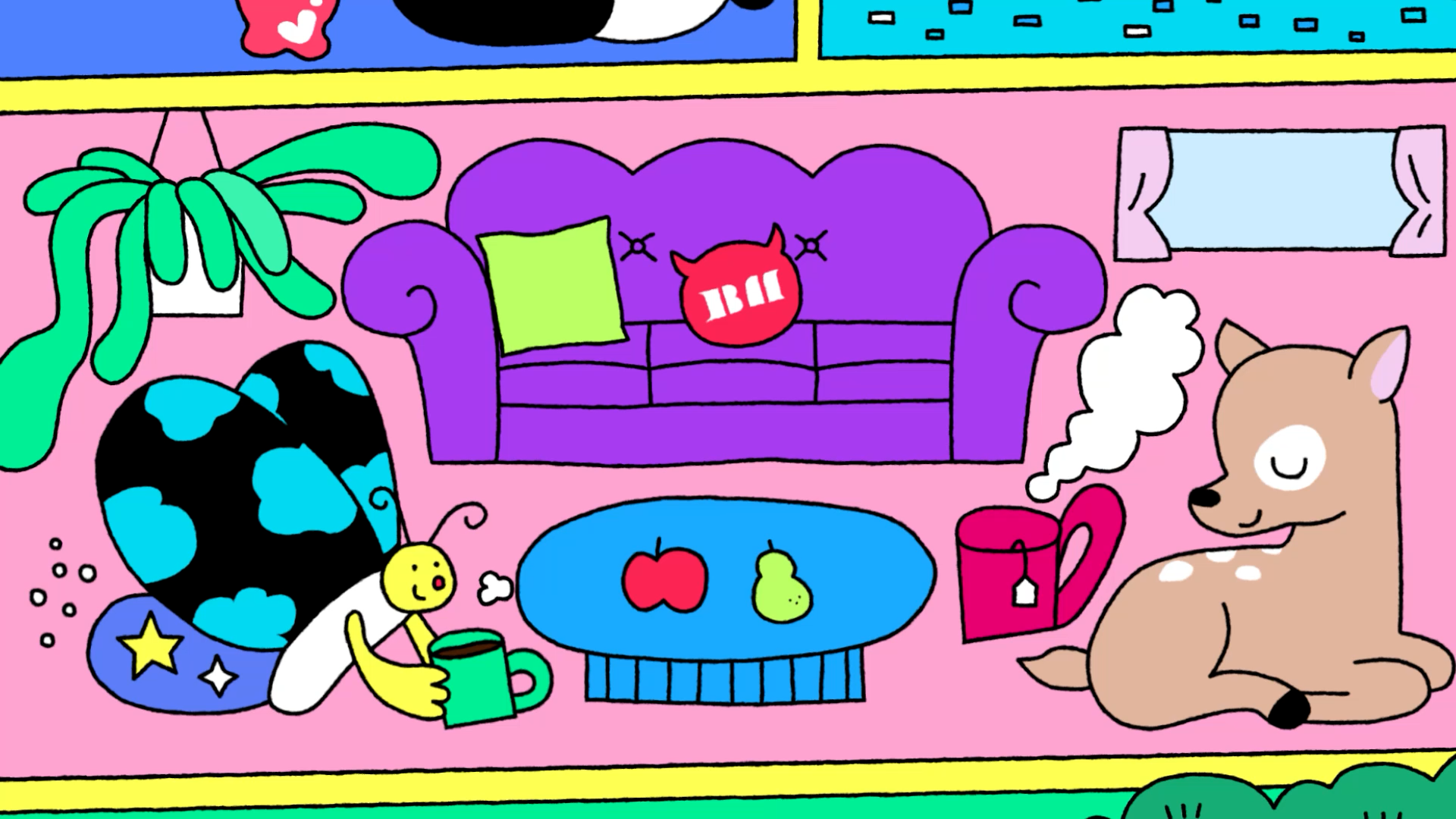
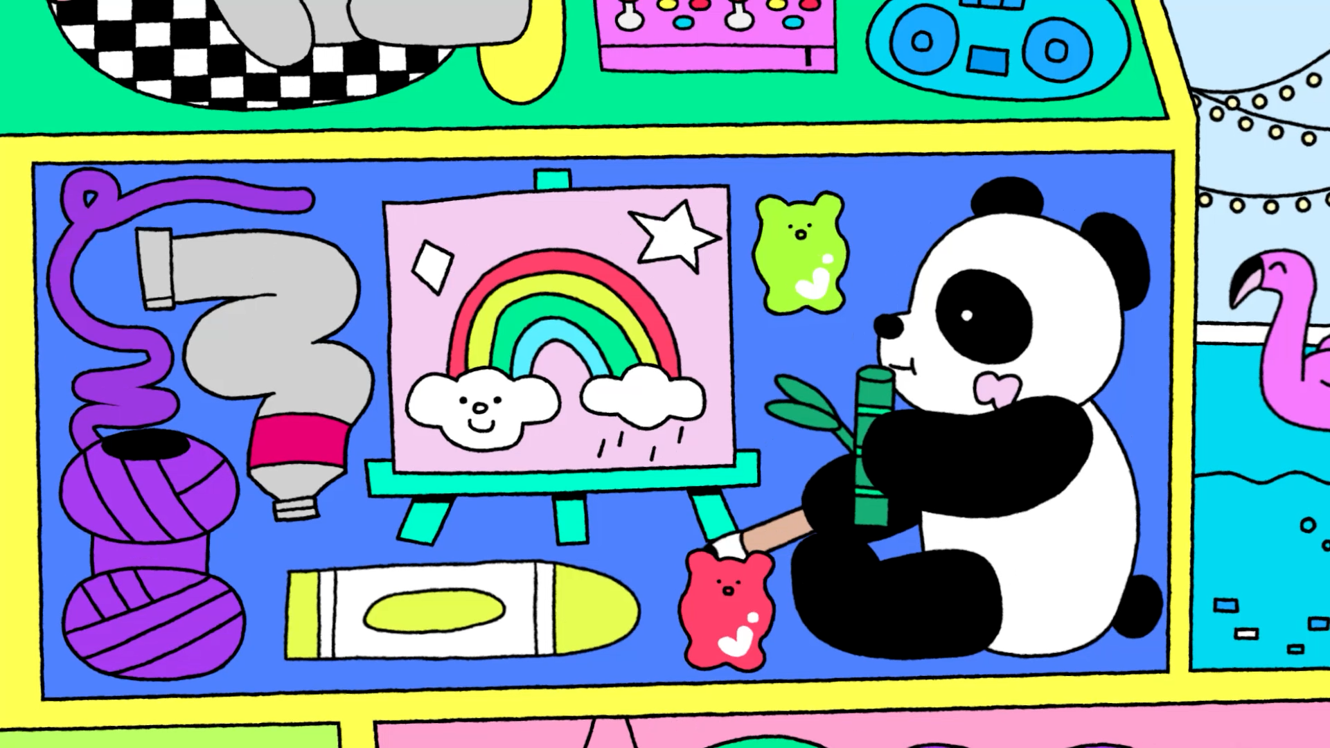
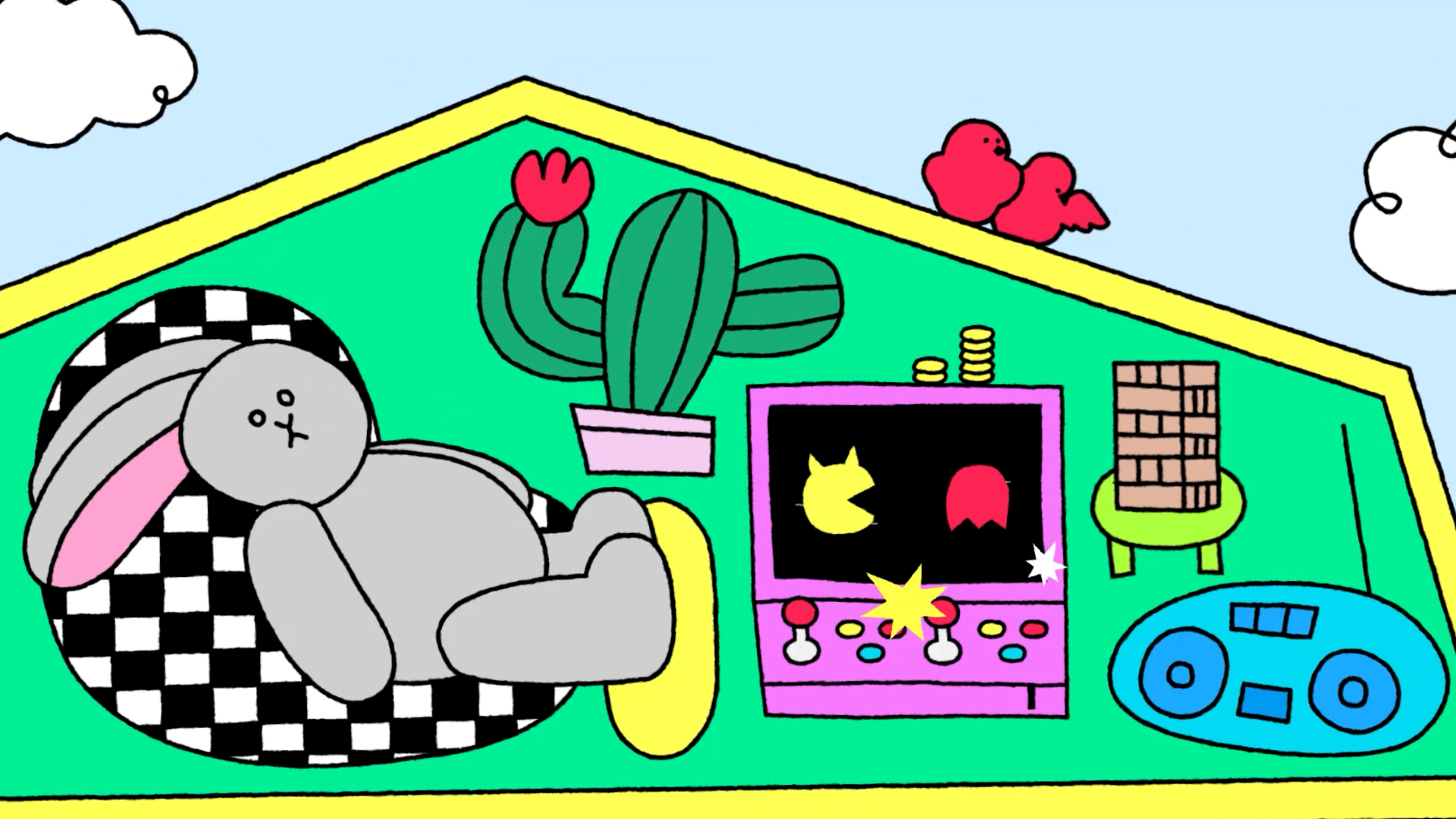
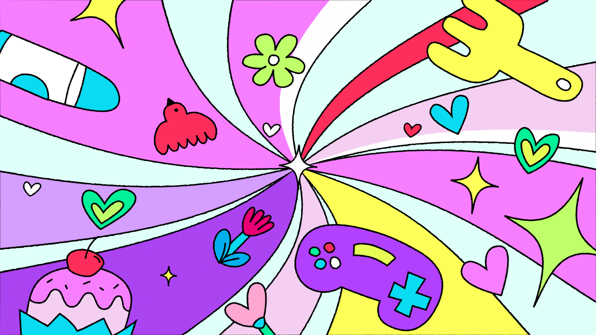
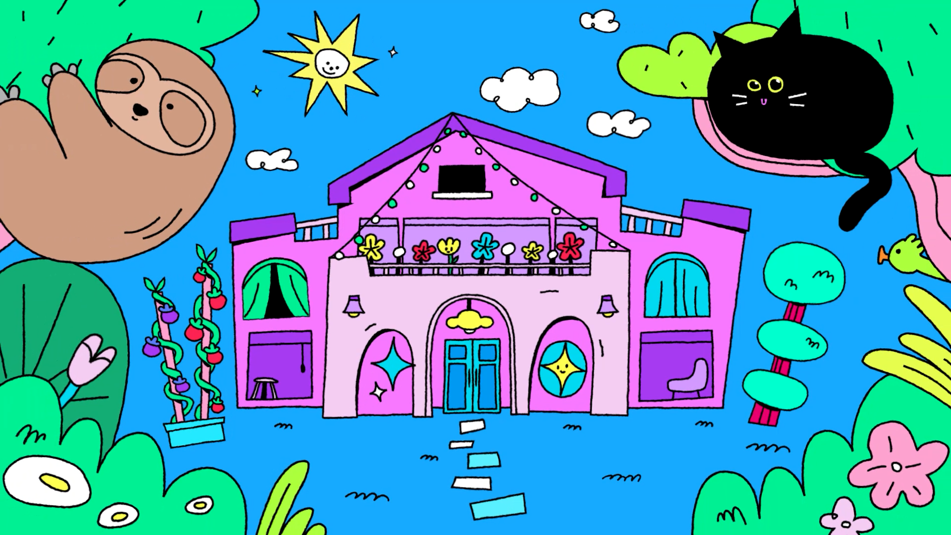
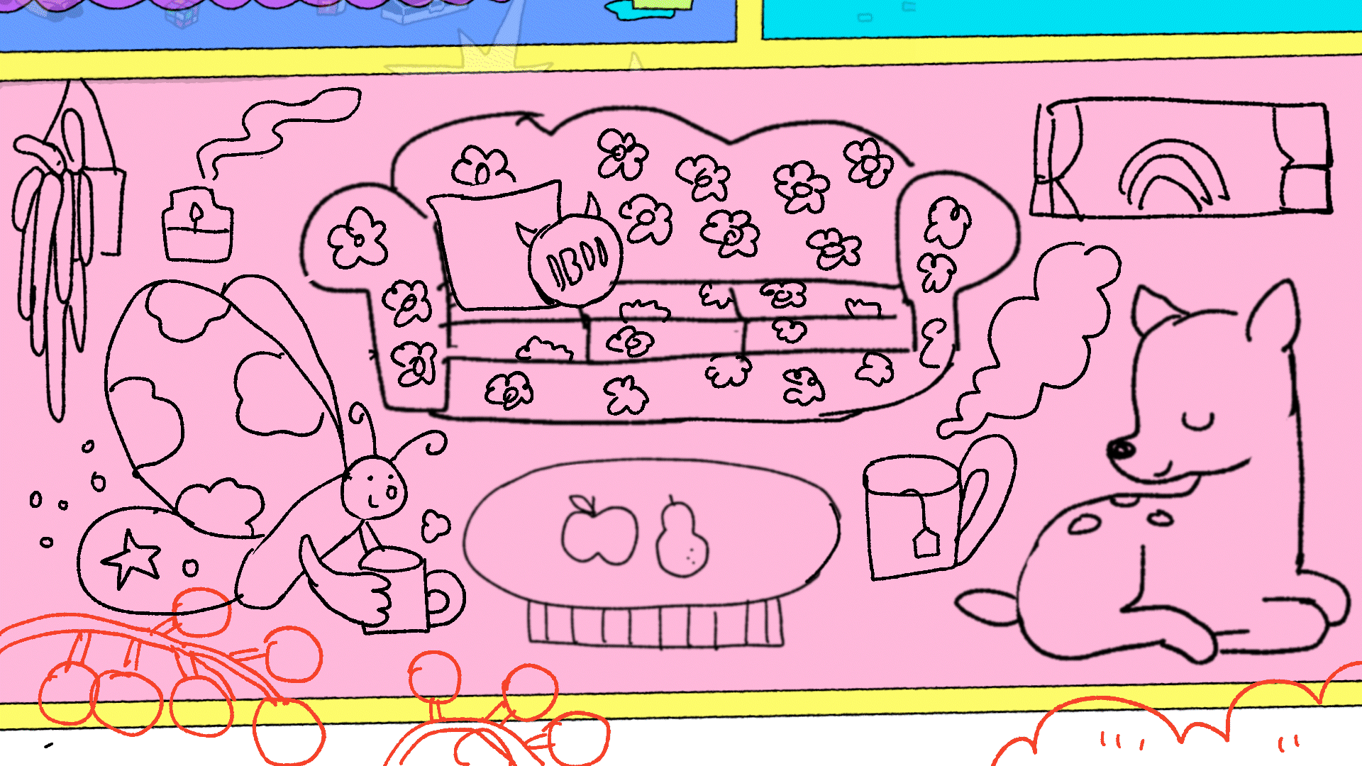
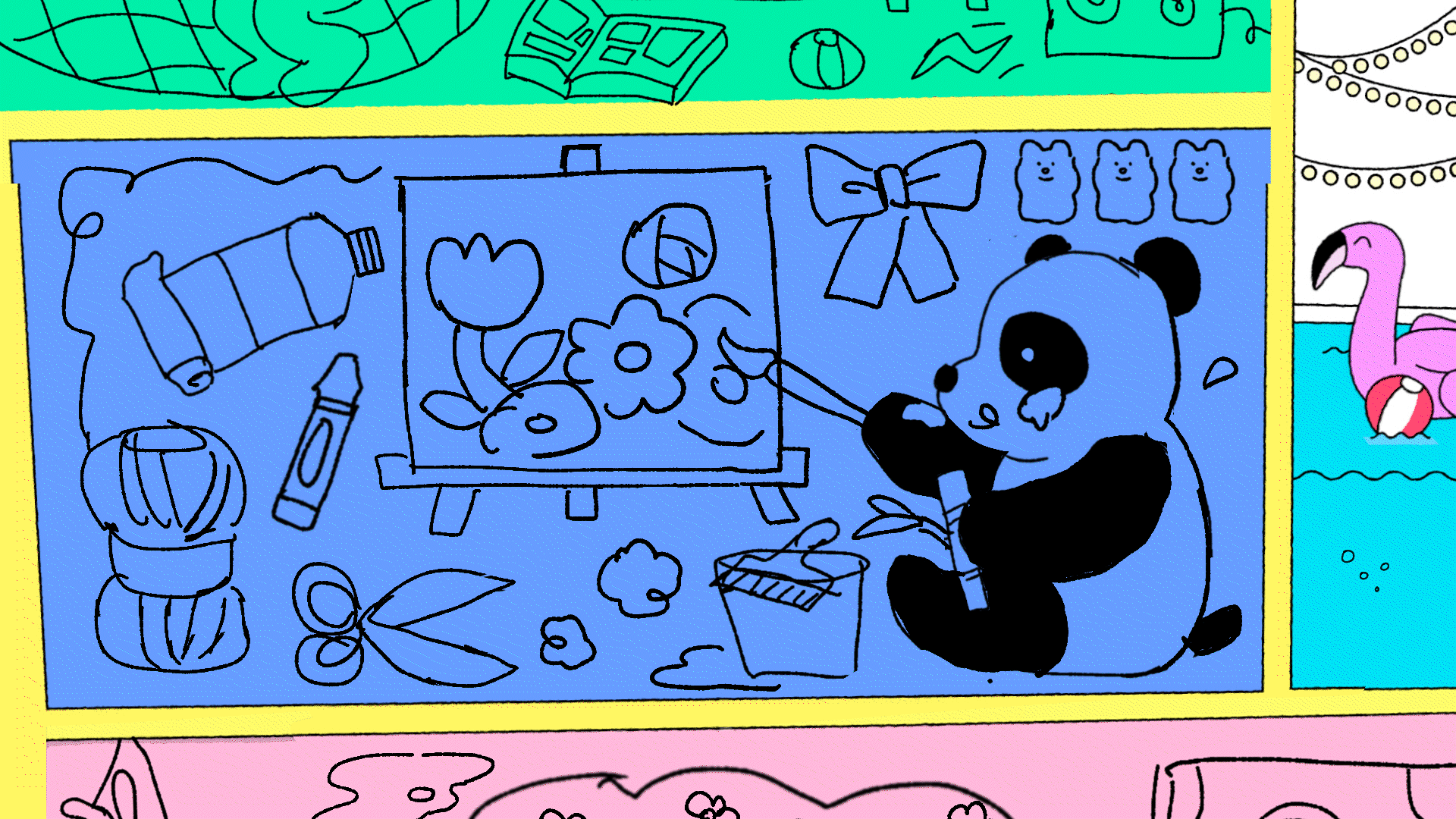
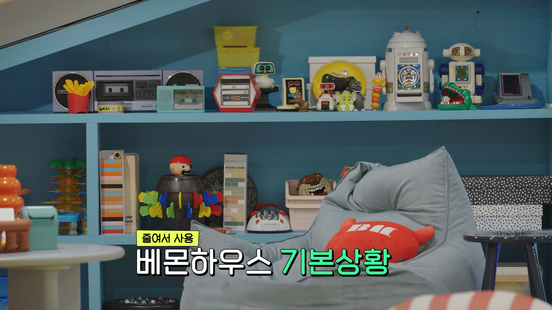
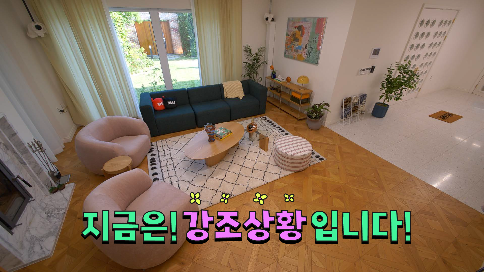
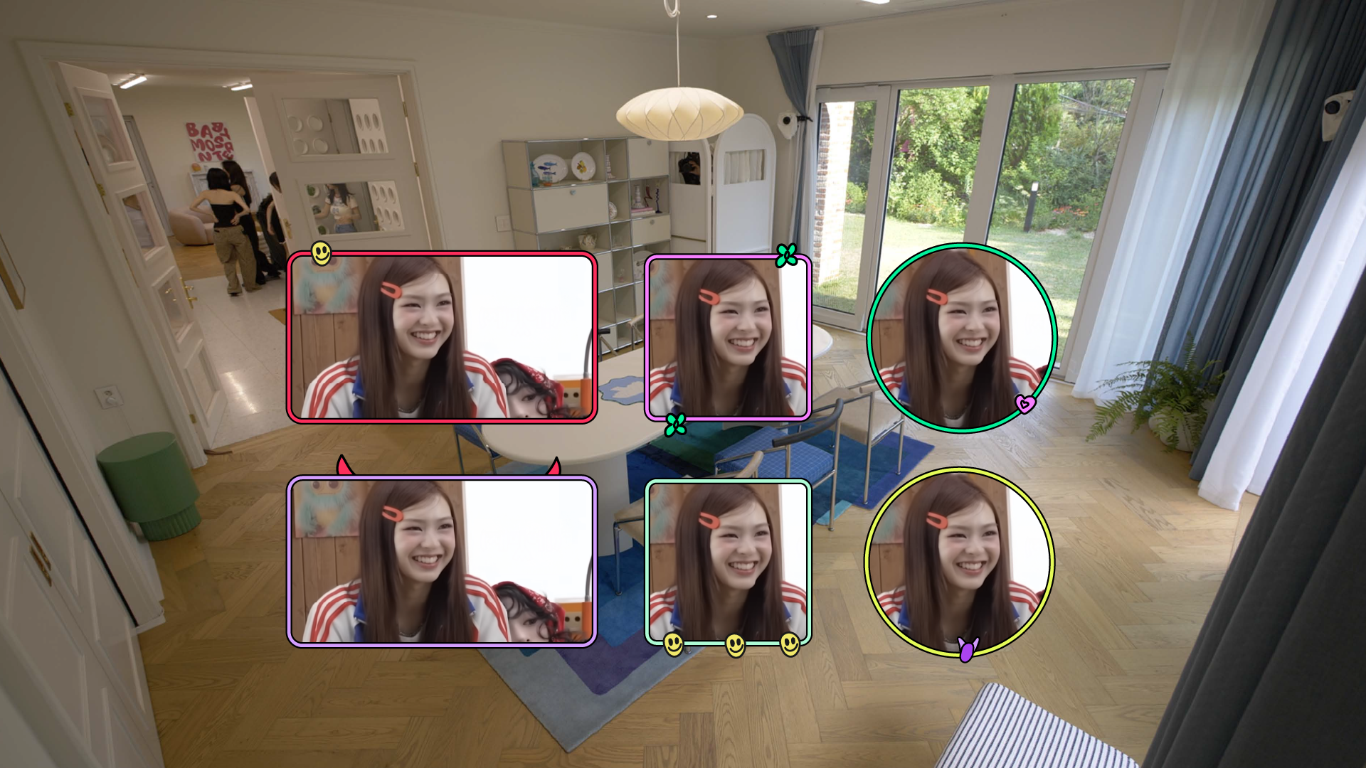
BABYMONSTER의 타이틀 스타일프레임은 로고에서 사용된 대비감 있는 컬러를 확장해, 콘텐츠의 시작부터 시선을 사로잡는 시각적 리듬과 에너지를 전달하는 데 초점을 맞췄습니다. 베몬하우스를 하나의 공간적 무대로 설정하고, 그 안에서 벌어지는 다양한 활동을 멤버들이 선호하는 동물과 오브제를 매개로 집의 단면을 이동하는 구조로 해석했습니다. 귀엽고 경쾌한 오브제와 다채로운 컬러 레이어를 통해, 밝고 유쾌한 콘텐츠의 시작을 표현하고자 했습니다.
The title style frames expand upon the contrasting color palette established in the logo, aiming to create a visually engaging and energetic opening for the content. BAEMON HOUSE is treated as a spatial stage, where various activities unfold through cross-sectional movements of the house, guided by animals and objects inspired by the members’ personal preferences. Playful objects and vibrant color layers come together to deliver a joyful and lively introduction to the content.
ANIMATION PROCESS
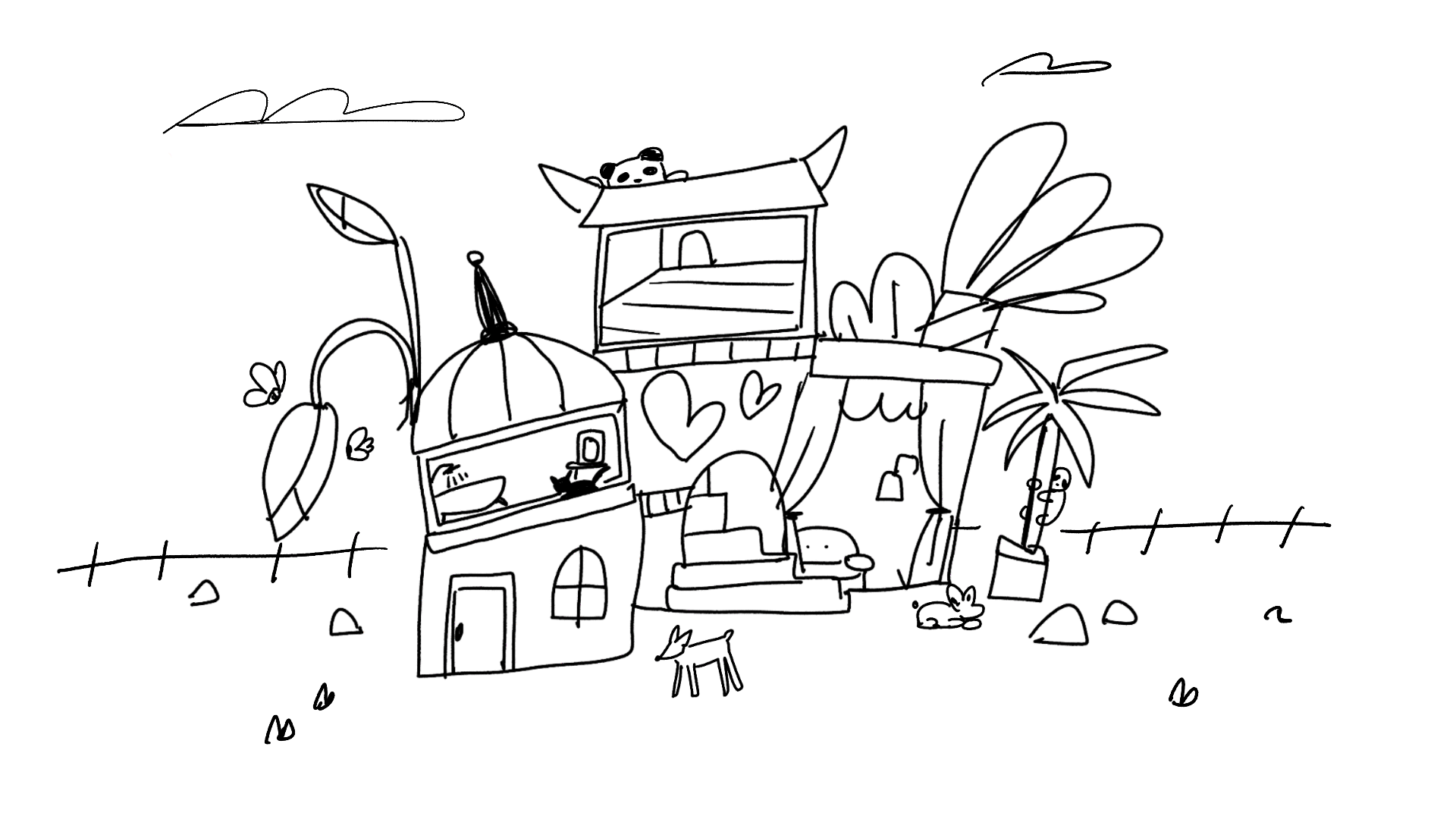
BABYMONSTER의 애니메이션은 짧은 듀레이션 안에서 다수의 씬 전환이 이루어지는 구조이기 때문에, 시청자의 이해를 돕기 위해 표현 방식은 최대한 심플하게 유지하는 데 중점을 두었습니다. 특히 엔딩 마감이 전체 인상을 좌우한다고 판단해, 앞부분의 복작복작하고 에너지 넘치는 화면을
베몬하우스의 대문이 닫히고 카메라가 이동하며 정리되는 방식으로 종결했습니다. 마지막 장면에는 베몬하우스의 시그니처 뿔 장식을 더해, 한눈에 공간과 상황을 인지할 수 있도록 명확한 마무리를 완성했습니다.
As the animation features multiple scene transitions within a short duration, the visual approach was intentionally kept simple to ensure clear viewer comprehension. Special attention was given to the ending, as it plays a key role in defining the overall impression. The lively and visually dense scenes gradually conclude as the main gate of BAEMON HOUSE closes and the camera pulls away, with the addition of the house’s signature horn decoration to clearly communicate the setting and provide a decisive, recognizable ending.

Bumper, Transition
Graphic Back, Ending Card
LAYOUTS
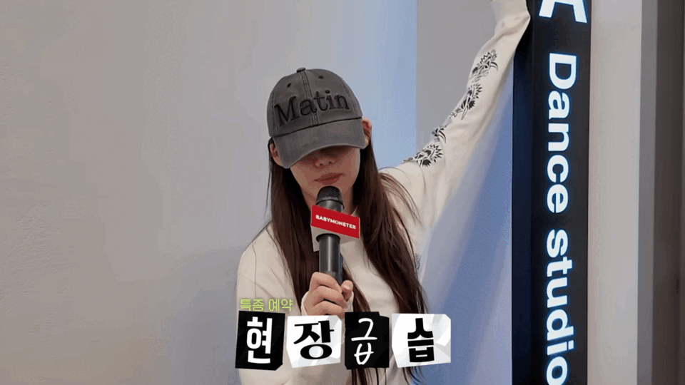
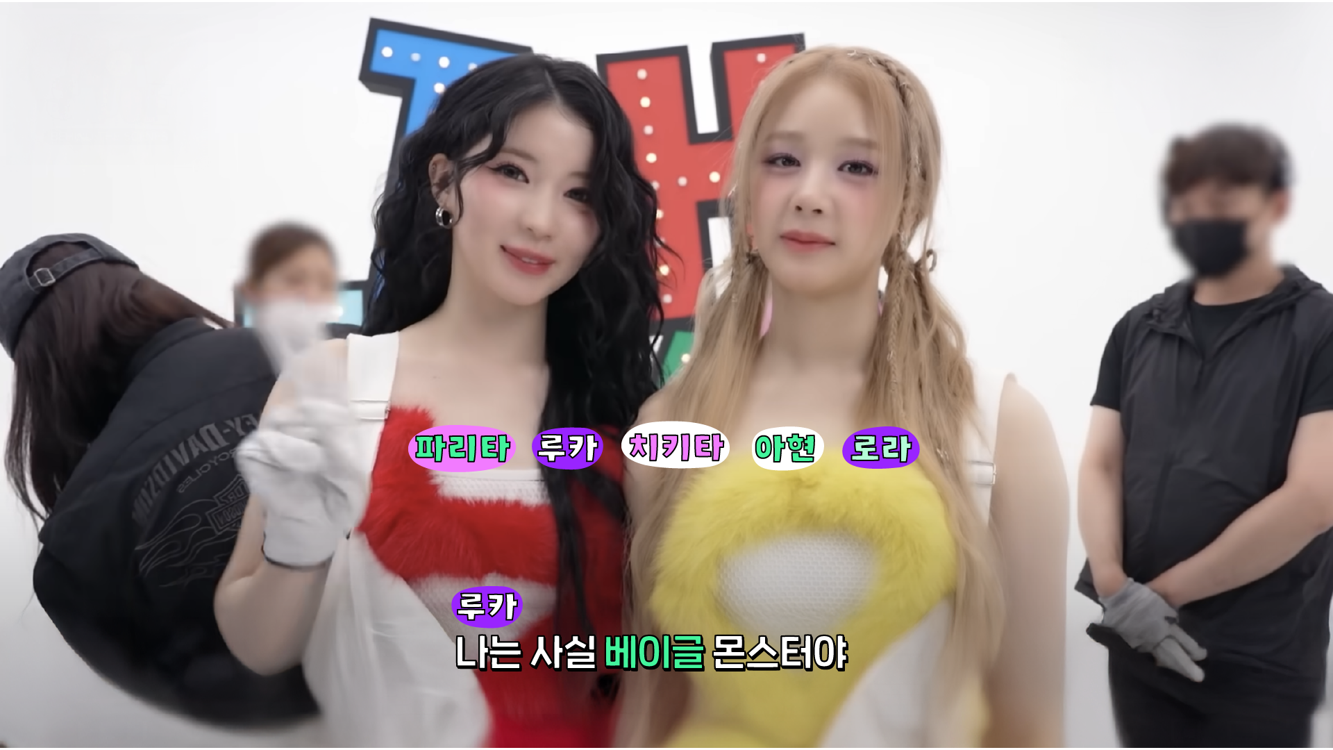
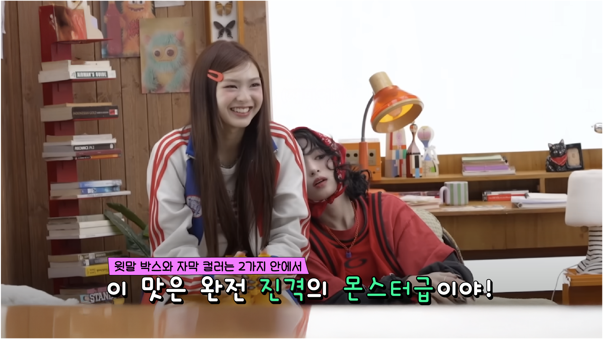
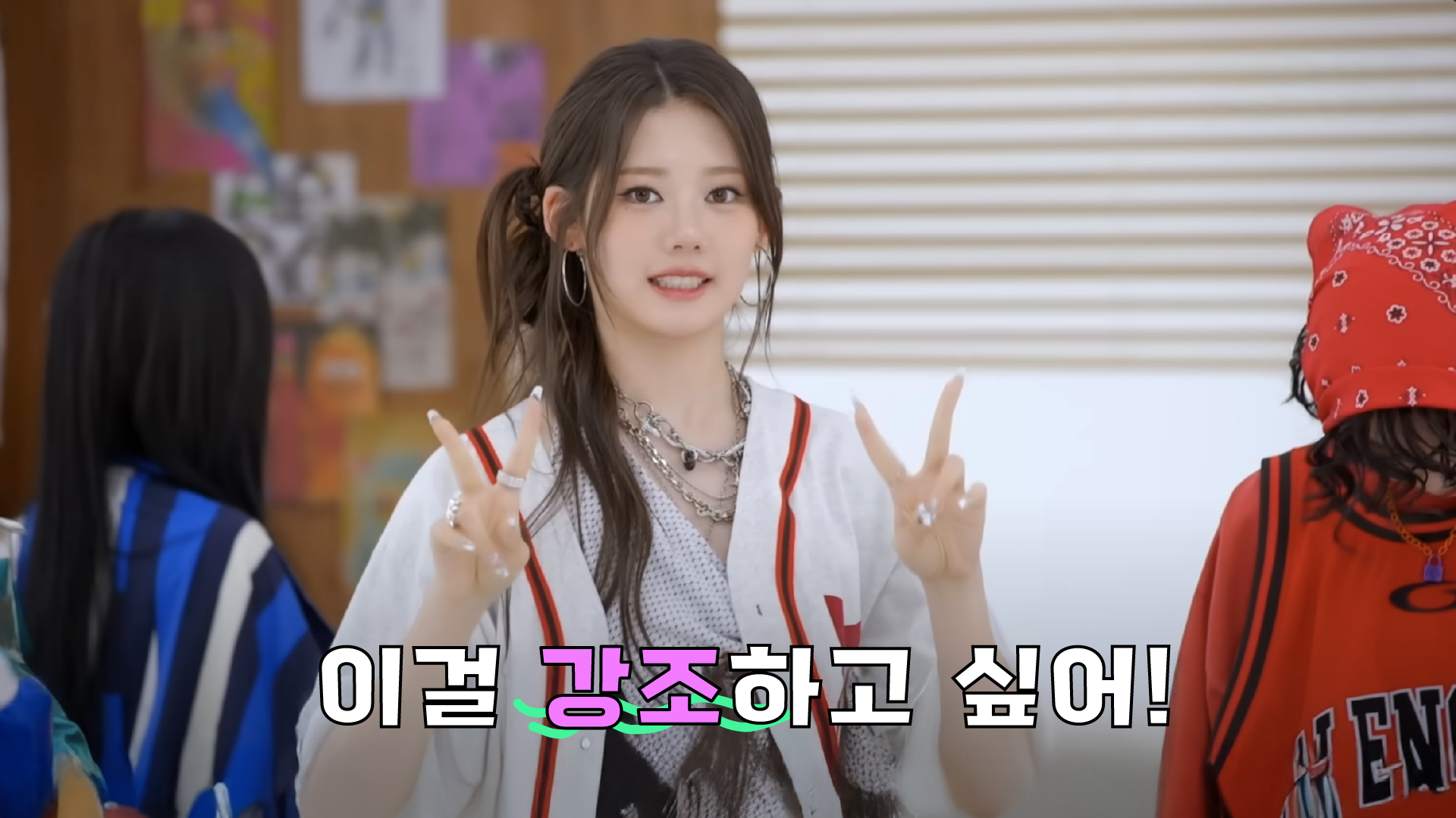
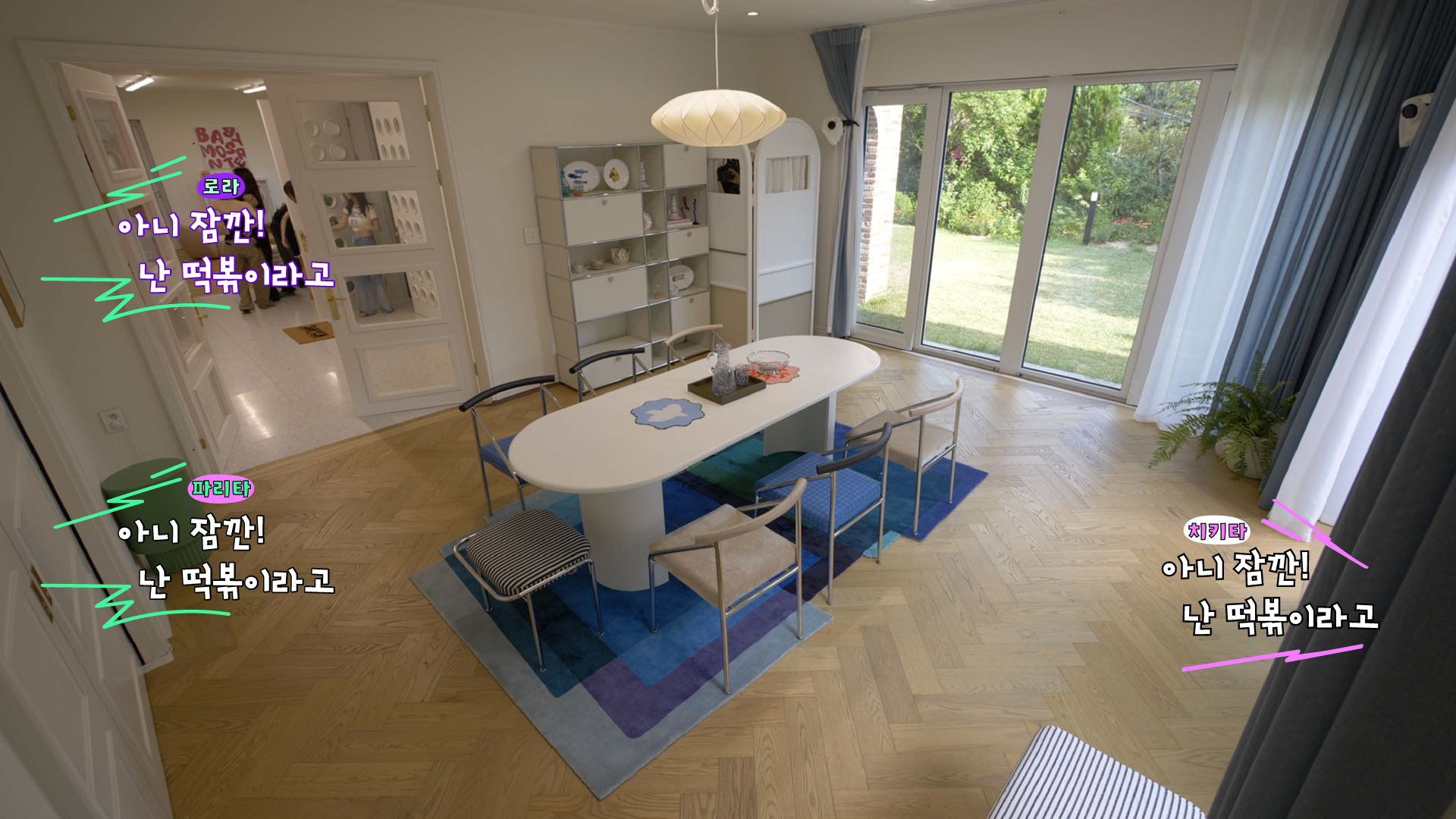
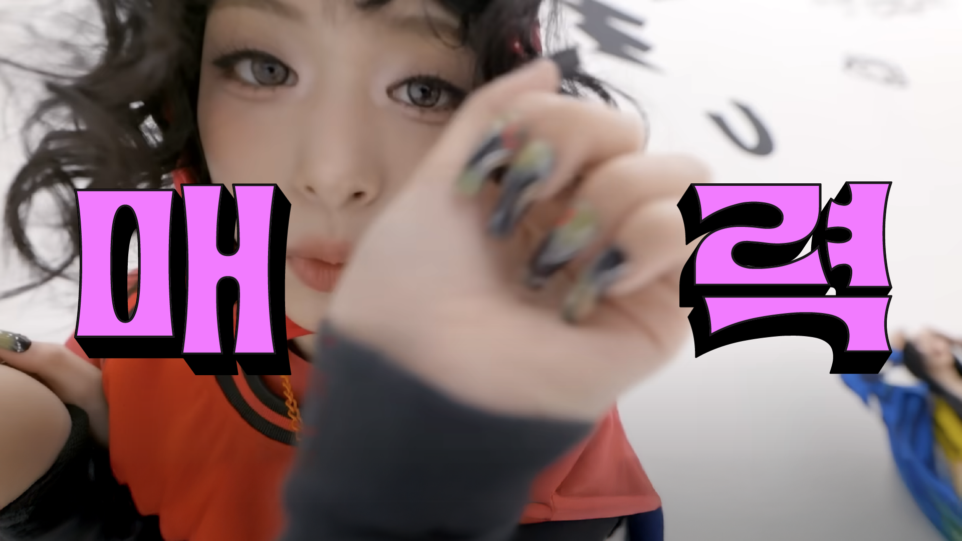
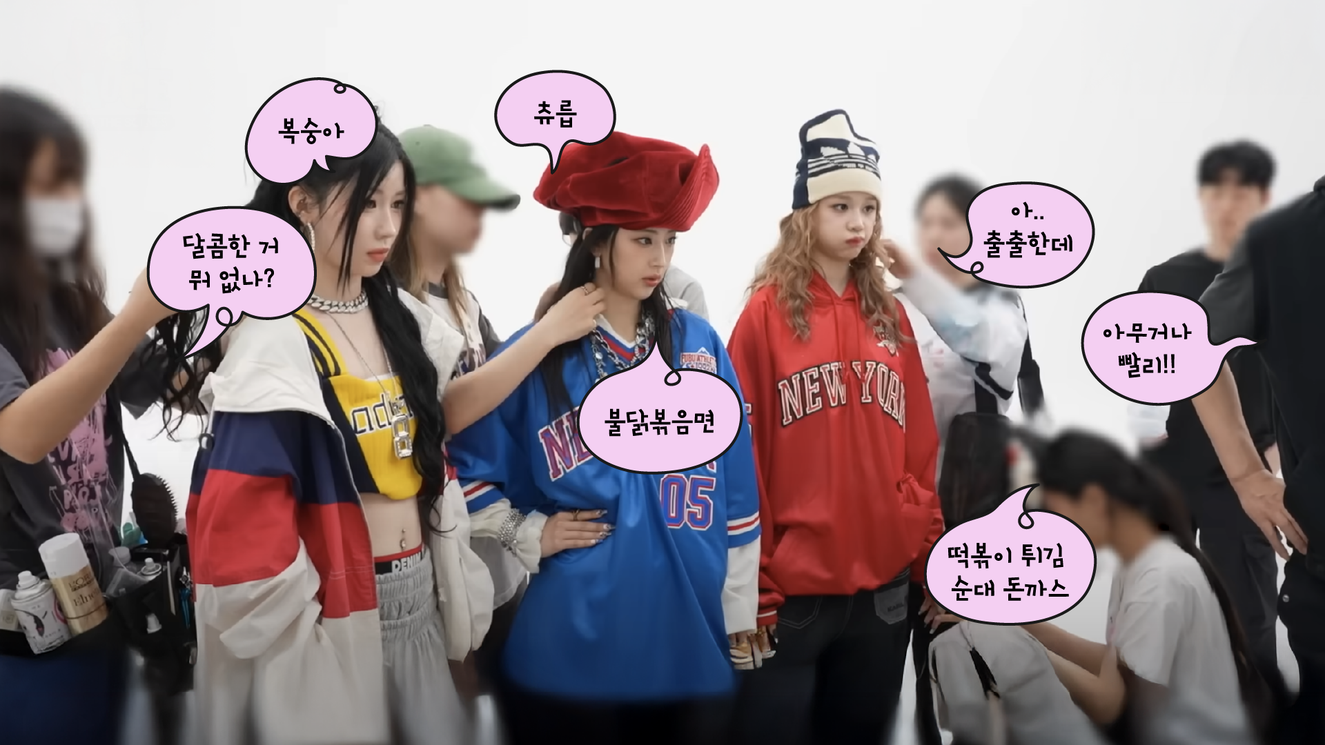
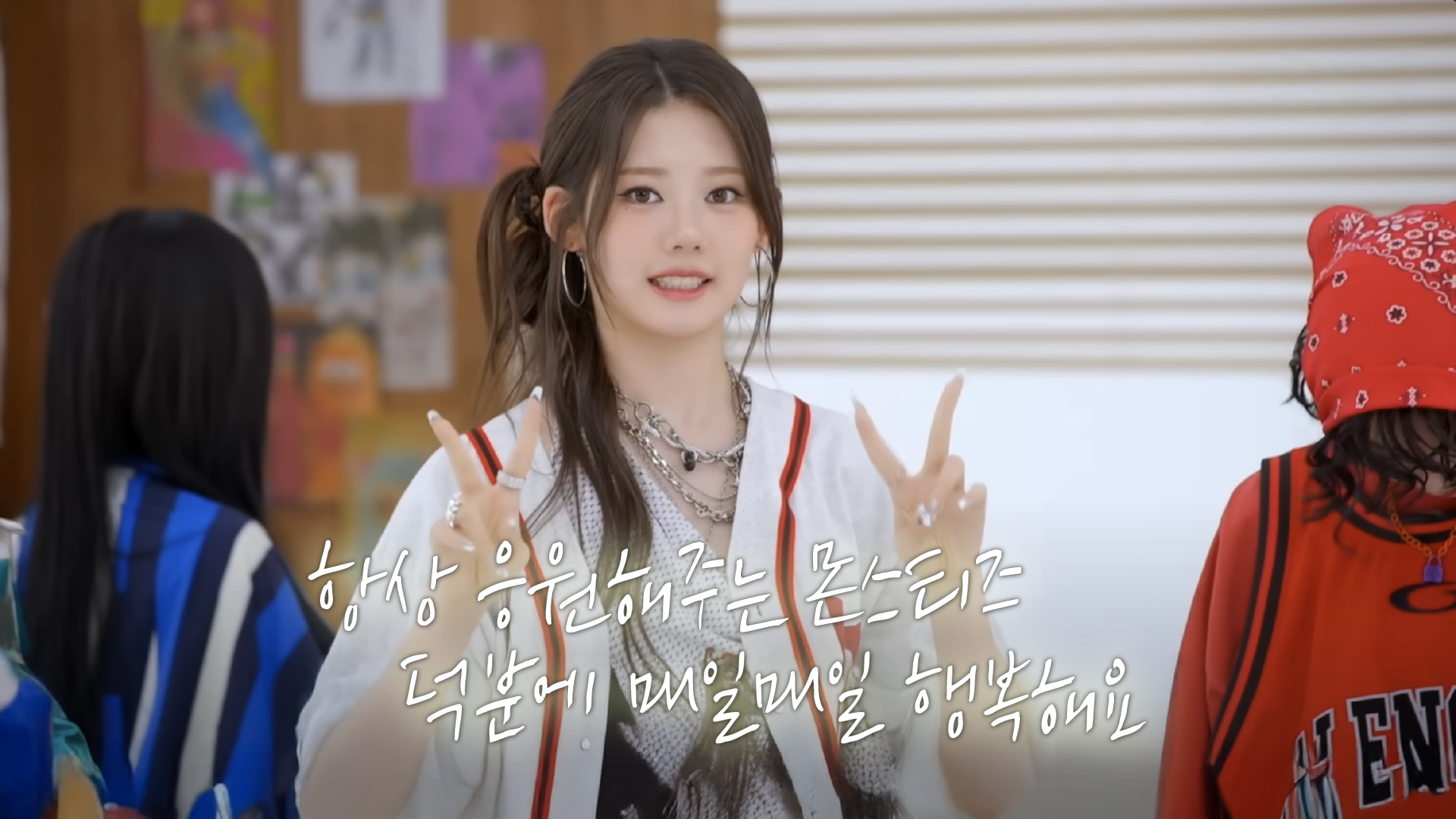
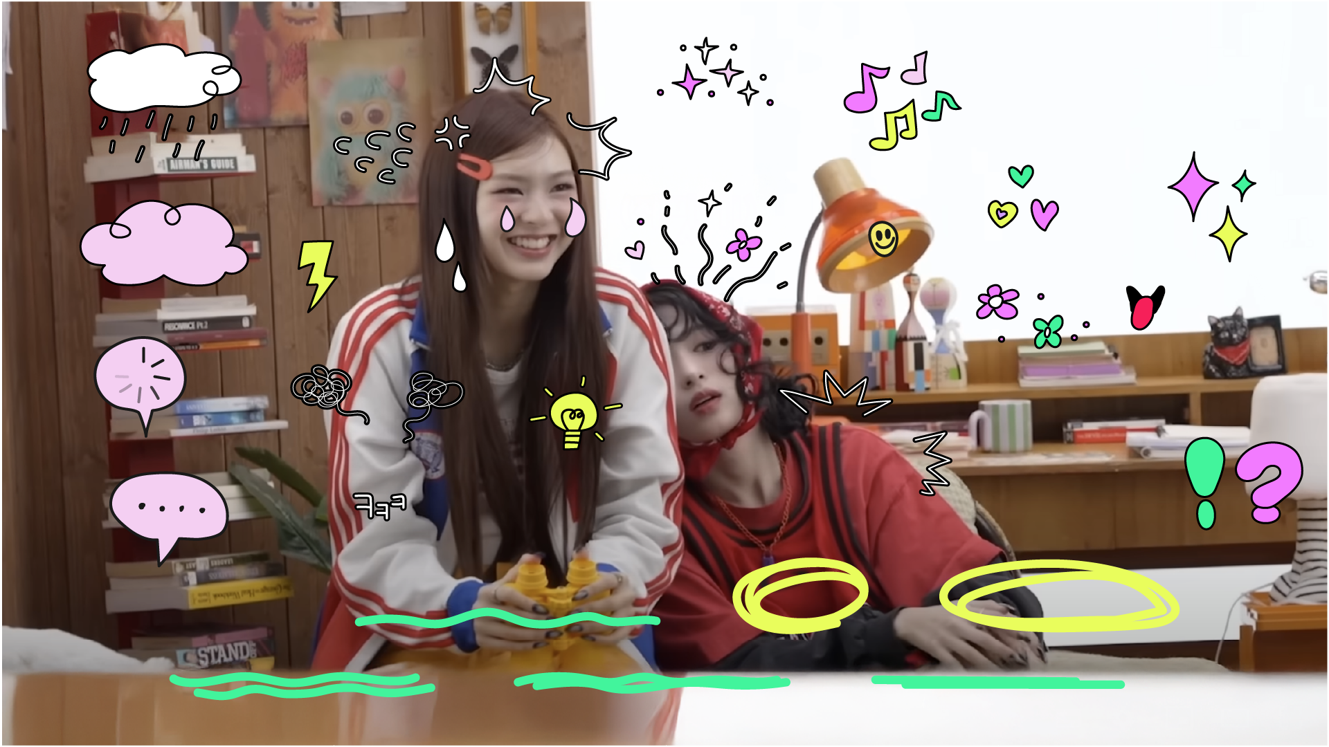
자막 디자인은 멤버들의 목소리를 시각적인 문자로 옮기는 요소인 만큼, 그 어떤 디자인 요소보다도 멤버들의 성격과 밀접하게 맞닿아 있다고 판단했습니다. 어리고 사랑스러운 그녀들의 분위기와 가장 잘 어울리는 인상을 찾기 위해 폰트 선택에 많은 시간을 들였으며, 컬러는 타이틀과 달리 로고에서 사용한 컬러보다 그 수를 줄여 보다 선명하고 집중도 높은 인상을 목표로 설계했습니다.
The caption design serves as a visual translation of the members’ voices, making it the element most closely connected to their personalities. Significant time was dedicated to selecting a typeface that best reflects the group’s youthful and charming tone. In contrast to the title design, the color palette was intentionally reduced from the logo’s range to create a sharper, more focused visual impression.
BAEMONHOUSE 유튜브 콘텐츠를 위한 디자인 패키지는 로고, 타이틀, 애니메이션, 자막을 하나의 시각 시스템으로 통합했습니다.
베몬하우스를 중심으로 대비감 있는 컬러와 심플한 모션을 적용해, 짧은 영상 환경에서도 명확한 흐름과 높은 가독성을 유지했습니다.
밝고 경쾌한 오브제와 컬러의 조합으로, 콘텐츠의 시작부터 즐거운 에너지를 전달합니다.
BAEMOHOUSE YouTube design package integrates logo, title, animation, and captions into a unified visual system.
Centered around BAEMON HOUSE, contrasting colors and simple motion were applied to maintain clarity and readability within short-form content. Bright objects and playful color combinations deliver an energetic and enjoyable opening to the content.
CREDITS
Client : YG ENT, BABYMONSTER
Release : Youtube, 2025
Production : Willo
Creative Director : Jisun Kim
Manager : Saemi Park
[Logo]
Logo Design : Jisun Kim
Logo Draft : Jisun Kim, Soomin Han
[Layouts]
Layout Design : Jisun Kim
[Title]
Conti, Design Lead : Saemi Park
Style Frames : Saemi Park, Soomin Han
Animation : Saemi Park, Soomin Han
Bumper, Transition : Saemi Park
Ending Card : Soomin Han
Layout Design : Jisun Kim
[Title]
Conti, Design Lead : Saemi Park
Style Frames : Saemi Park, Soomin Han
Animation : Saemi Park, Soomin Han
Bumper, Transition : Saemi Park
Ending Card : Soomin Han