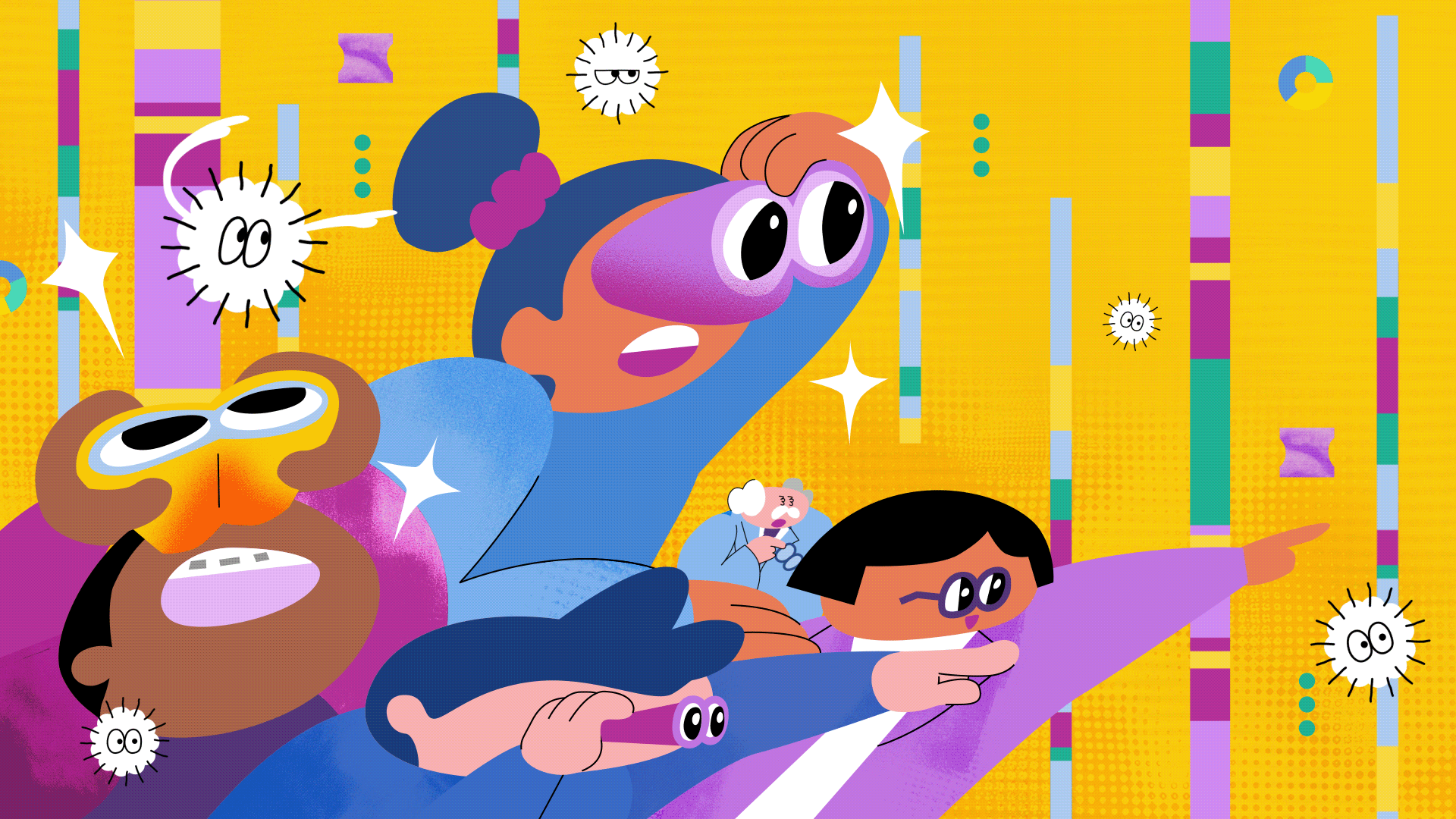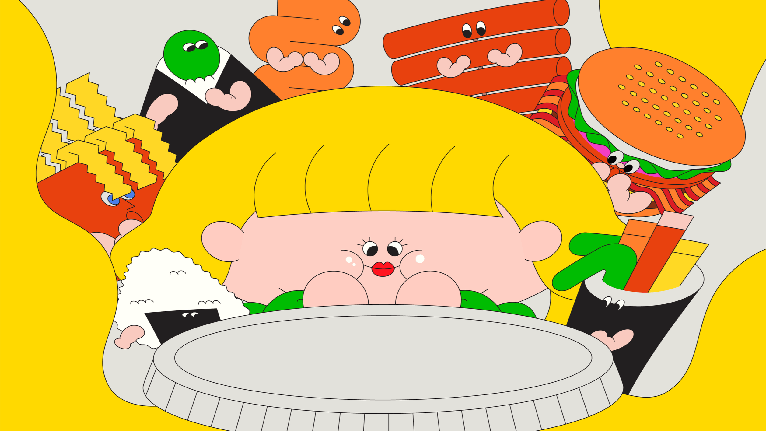
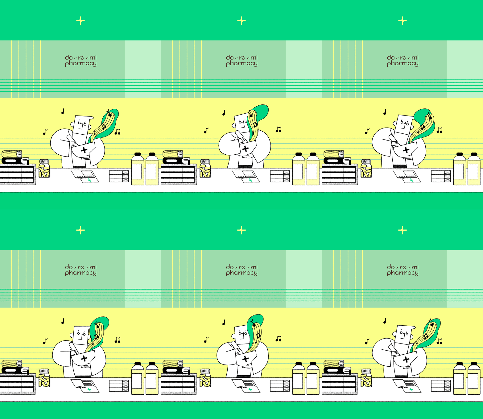

OVERVIEW
DOREMI Pharmacy - Expanding Everyday Wellness through Motion Identity
Located in Seoul, DOREMI is a modern drugstore-concept pharmacy that seamlessly bridges the boundary between healthcare, beauty, and daily lifestyle. Moving away from clinical stereotypes, DOREMI curates wellness into an approachable, rhythmic everyday experience.
Spatial design studio T-FP (THE FIRST PENGUIN) directed the brand and interior architecture, while WILLO directed and produced the official brand film, translating the physical brand identity into dynamic motion. Designed specifically for in-store media displays across the flagship spaces in Seongsu and the upcoming Gangnam location, the film bridges spatial ambiance with contemporary visual rhythm—delivering an uplifting, sensory care experience.
도레미약국 - 일상적 건강 경험을 확장하는 브랜드 필름
서울에 위치한 도레미약국(DOREMI)은 의약품과 뷰티의 경계를 허물고 건강한 일상을 제안하는 새로운 감각의 드럭스토어형 약국입니다. 전문적인 큐레이션과 경쾌한 케어 경험을 통해, 약국을 치료의 공간을 넘어 일상 속 웰니스를 만나는 장소로 재정의합니다.
공간 브랜딩 디자인 스튜디오 T-FP(THE FIRST PENGUIN)가 브랜딩과 공간 디자인을 총괄했으며, 윌로(WILLO)는 브랜드 아이덴티티를 감각적인 영상 언어로 재해석한 브랜드 필름을 기획·제작했습니다. 공간의 질감과 브랜드 메시지가 자연스럽게 녹아들도록 비주얼과 리듬을 설계했으며, 완성된 영상은 도레미약국 성수점과 오픈 예정인 강남점의 매장 내 디스플레이 미디어 콘텐츠로 공간을 완성합니다.
GRAPHIC DESIGN
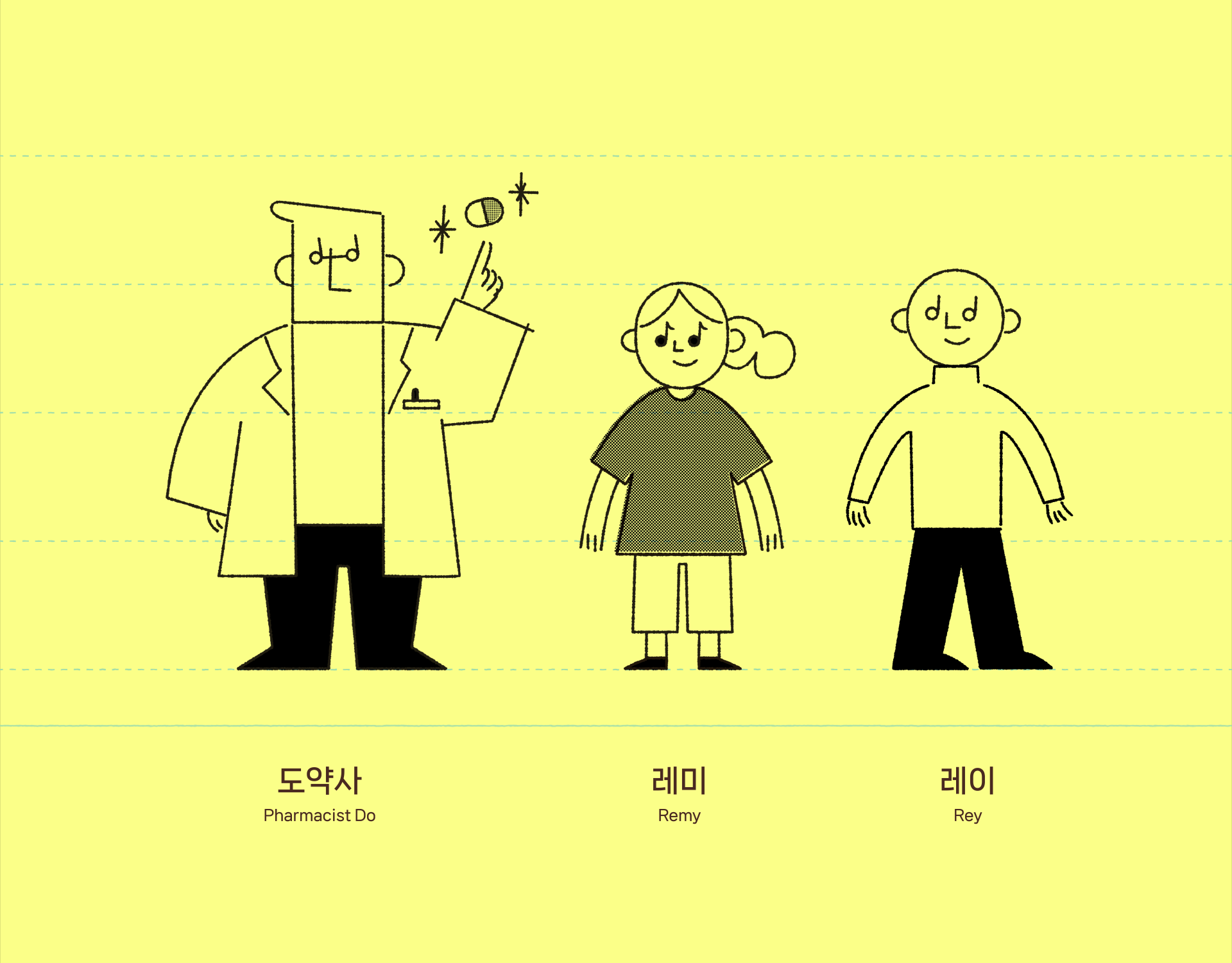
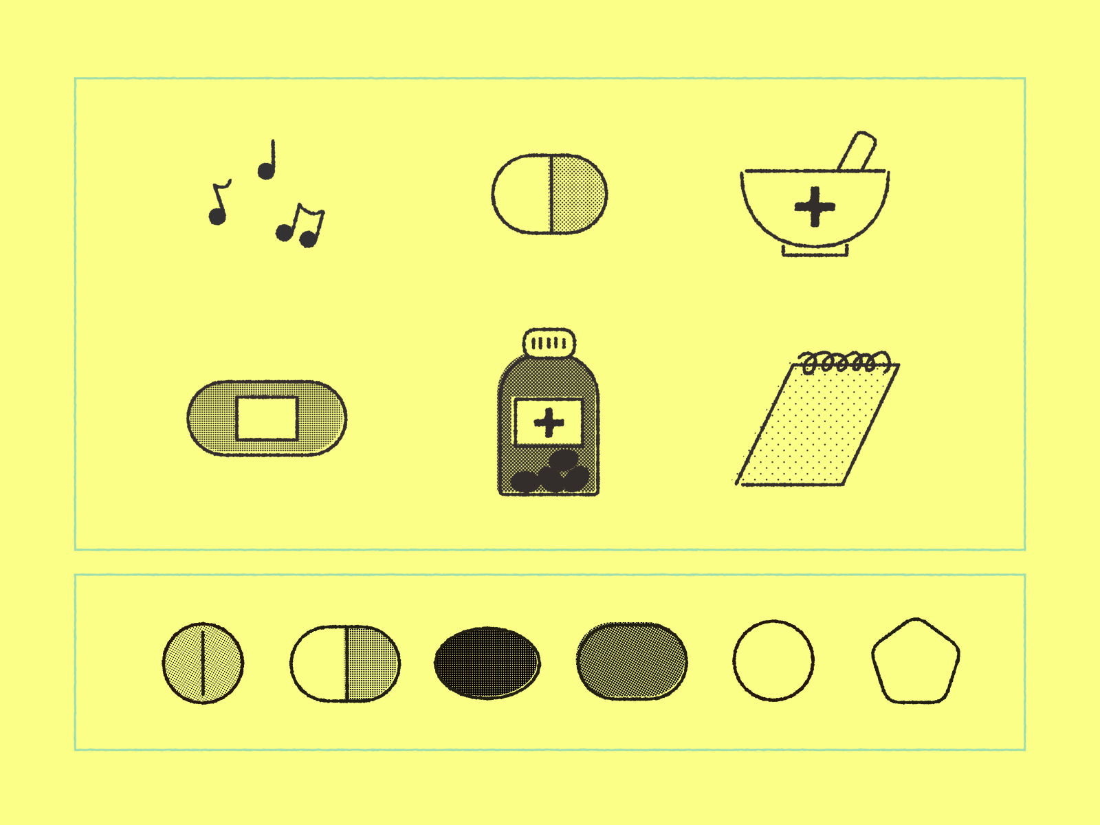
T-FP 제작
Translating Static Graphics into Rhythmic Motion
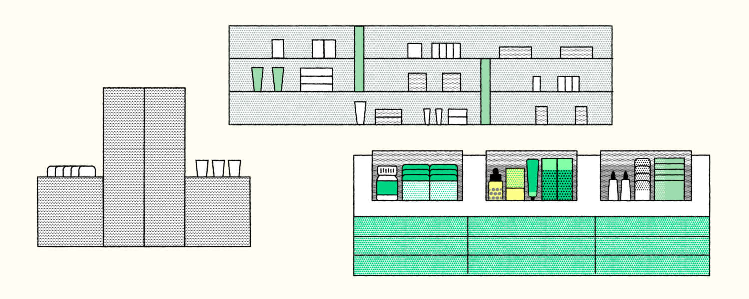
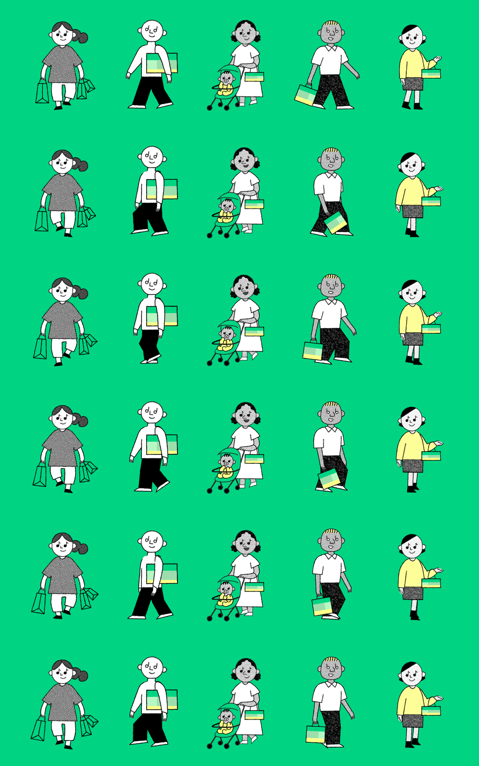
The graphic identity developed by T-FP is defined by flat vector illustrations featuring subtle risograph dot textures, uniform monoline strokes, a restrained color palette, and charmingly simplified character forms.
WILLO focused on translating this distinct print-based visual language into the medium of motion graphics, ensuring the brand identity resonates seamlessly across spatial video displays. Rather than overcomplicating the original assets with unnecessary dimensions, we respected the flat, tactile sensibility of the risograph aesthetic. We introduced playful pacing, organic frame-rate modulation, and thoughtful secondary animations to breathe life into the static illustrations—creating an engaging, approachable brand world.
정적 그래픽에서 리드미컬한 모션으로의 확장
T-FP가 구축한 그래픽 아이덴티티는 리소그래피(Risograph) 특유의 질감 있는 도트 텍스처, 균일한 굵기의 모노라인, 절제된 컬러 팔레트, 그리고 단순화된 캐릭터 일러스트레이션이 어우러진 감각적인 플랫 벡터 스타일을 특징으로 합니다.
윌로(WILLO)는 이러한 고유한 그래픽 자산의 디자인 언어를 온전히 계승하면서, 공간 디스플레이용 영상에서도 브랜드의 톤앤매너가 일관되고 생생하게 전달되도록 모션 시스템을 설계했습니다. 2D 원화가 지닌 따뜻하고 아날로그적인 인쇄 질감을 훼손하지 않으면서, 경쾌한 템포감과 유기적인 움직임, 섬세한 텐션 조절을 더해 정적인 그래픽에 생명력을 불어넣었습니다.


STORYBOARD
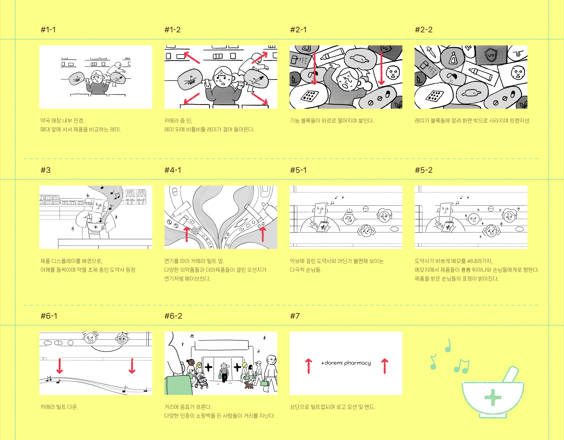
Narrative Design: Harmonizing Clinical Care with Derma Fantasy
The storytelling revolves around three distinct characters embodying the rhythmic spirit of DOREMI: Pharmacist Do (도약사), Remi (레미), and Ray (레이). To clearly define the store's unique positioning as an innovative drugstore, the primary narrative highlights Remi’s modern derma-cosmetic skincare journey, complemented by Ray’s pharmaceutical care experience.
WILLO choreographed the sequence with energetic character animation and bold visual transitions driven by Pharmacist Do. By weaving between realistic pharmacy interior environments and imaginative, surreal visual metaphors, the film transcends conventional clinical narratives—delivering an engaging, unforgettable brand story that imprints
스토리텔링 & 스토리보드 연출: 일상과 판타지를 잇는 케어 경험
스토리라인은 도레미의 경쾌한 정체성을 담은 세 인물—도약사, 레미, 레이를 중심으로 전개됩니다. 뷰티와 헬스케어가 공존하는 도레미약국만의 차별화된 경험을 직관적으로 전달하기 위해, 레미의 더마 코스메틱 경험을 메인 축으로 두고 레이의 의약품 큐레이션 경험을 보조적으로 자연스럽게 교차시켰습니다.
윌로(WILLO)는 극을 이끄는 도약사의 경쾌한 움직임과 과감한 트랜지션을 모션의 핵심 축으로 설정했습니다. 친숙한 현실의 약국 공간 속에서 출발해, 감각적인 판타지 비주얼로 확장되는 과감한 연출 대비를 통해 신생 브랜드의 에너지를 직관적이면서도 매력적으로 각인시켰습니다.
STYLEFRAMES
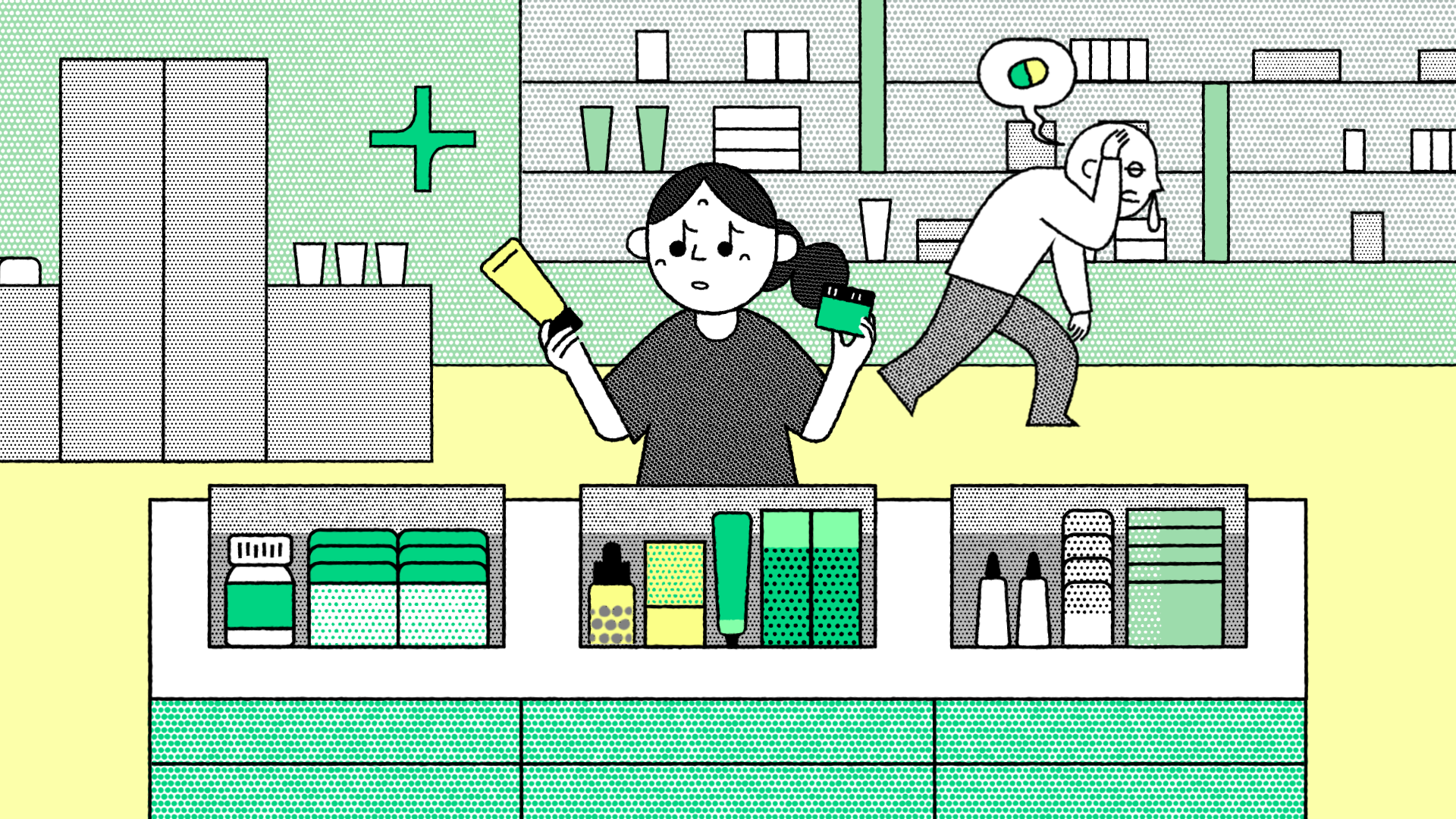




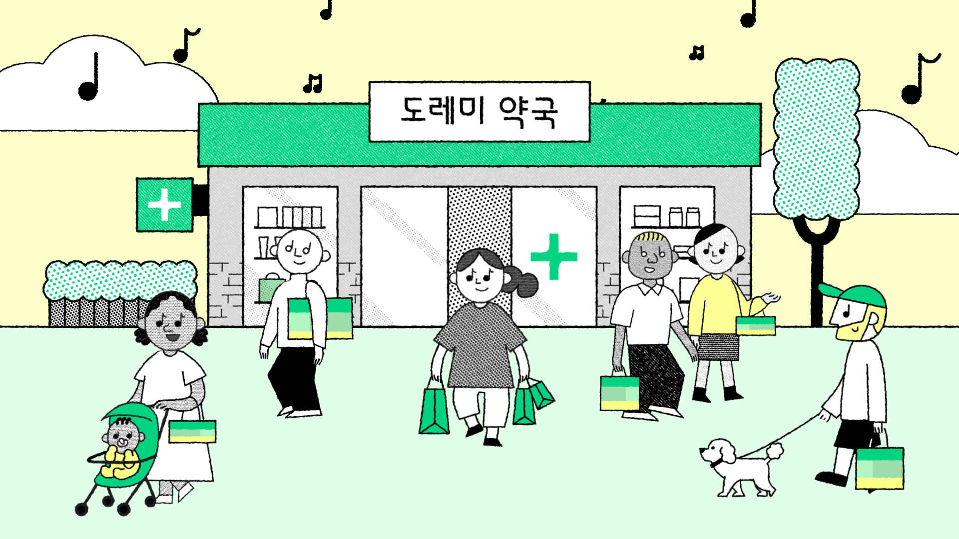
ANIMATIC
ANIMATION
Kinetic Personality: Cartoon Logic Meets Melodic Characters
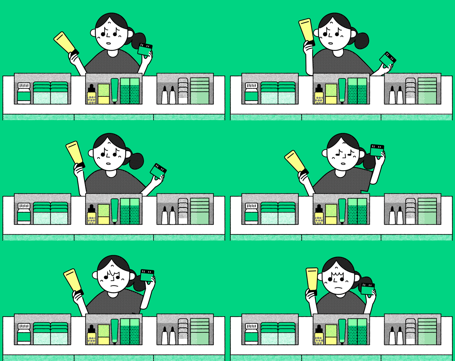
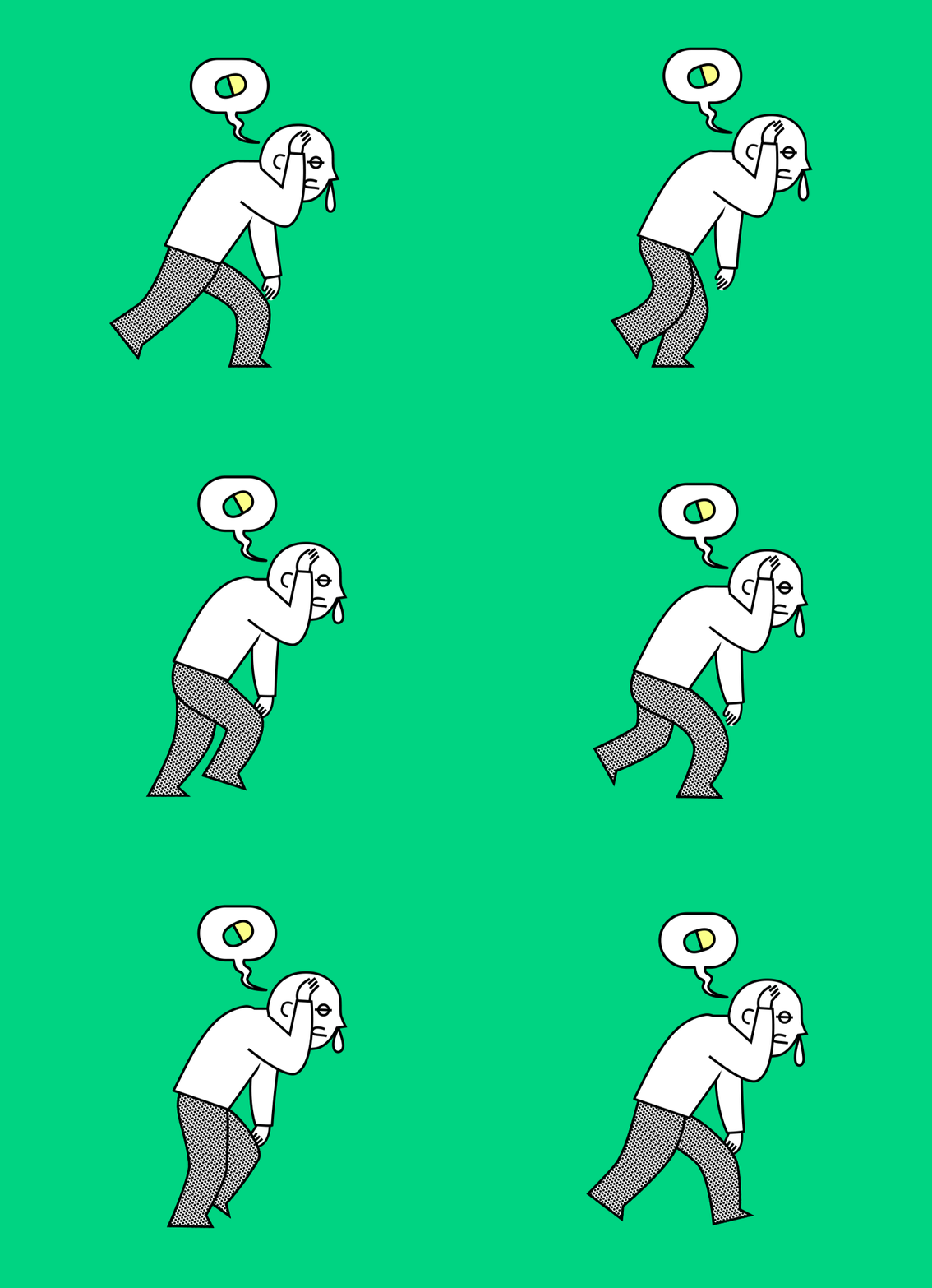
How do you transform geometric shapes and musical note motifs into deeply endearing characters? Our answer lay in the expressive, bouncy physics of classic cartoon animation. Facial expressions built around musical note motifs became a playful catalyst, inspiring lively facial transformations and bouncy squash-and-stretch movements. To reflect the global community visiting Seoul, we brought to life an inclusive cast spanning diverse cultural backgrounds—infusing the world with vibrant, universal charm.
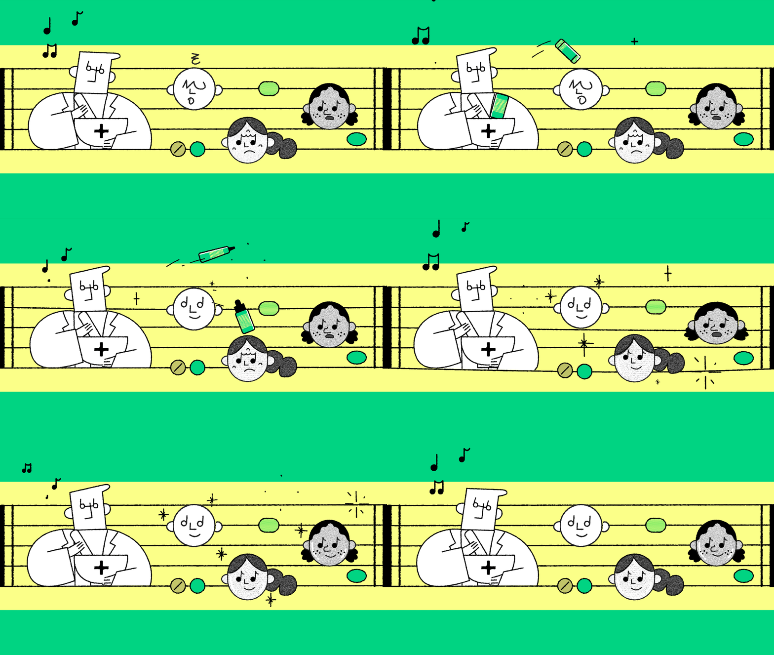
Amid the global surge of K-Beauty, the challenge was distinguishing DOREMI from ordinary cosmetic drugstores. Pharmacist Do is the heart of this differentiation. Instead of a sterile, routine medical task, we choreographed the traditional mortar-and-pestle compounding action into an ecstatic, dance-like performance. This rhythmic, joyful compounding motion transforms pharmaceutical expertise into a memorable, vibrant spectacle right before the visitor's eyes.
캐릭터 모션 연출: 음표의 리듬과 만화적 생명력
도형과 음표 모티브로 디자인된 사랑스러운 캐릭터들을 어떻게 살아 숨 쉬게 만들 것인가? 윌로는 과장되고 탄력 넘치는 클래식 카툰 애니메이션의 움직임 원리에서 해답을 찾았습니다. 특히 음표 기호를 활용한 재치 있는 표정 변화는 모션의 풍성한 영감이 되었으며, 성수를 찾는 글로벌 여행자들의 다채로운 모습을 반영해 다양한 인종의 캐릭터들이 함께 어우러지는 활기찬 세계관을 완성했습니다.
전 세계적인 K-뷰티 열풍 속에서 일반적인 H&B 드럭스토어와 차별화되는 도레미약국만의 독보적인 정체성은 바로 '도약사'라는 전문적인 존재입니다. 단순한 화장품 판매처를 넘어 전문적인 케어를 제공한다는 브랜드의 핵심 가치를 보여주기 위해, 약을 짓는 약사발 제조 행위를 마치 신명나게 춤을 추는 듯한 리드미컬한 시그니처 액션으로 연출했습니다. 정적인 조제 과정을 경쾌한 퍼포먼스로 치환함으로써, 도레미약국만의 유쾌한 전문성을 강렬하게 각인시킵니다.


CREDIT
Release : 2026
Client : DOREMI PHARMACY
Brand Design : T-FP (THE FIRST PENGUIN)
Project Manager : Seohoon Choi, Miae Bae
Motion Graphic Production : Willo
Creative Director : Jisun Kim
Project Manager : Seohoon Choi, Miae Bae
Motion Graphic Production : Willo
Creative Director : Jisun Kim
Project Manager : Sookyoung Ahn
Storyboard : Sookyoung Ahn, Soomin Han
Styleframes : Sookyoung Ahn, Soomin Han
Animation : Sookyoung Ahn, Soomin Han
Sound Design : Sookyoung Ahn